It started back last Christmas when I made an e-card to send to family and friends. Three colours only, blue, pink and white, painted onto tinted board and then worked over with a black pencil. The idea was to produce something relatively quickly.
…

…
But I liked the result so much that I thought I’d pursue it, and when I began producing new works for a one-man exhibition at Oriel Tegfryn, I used the same technique and characters for portraits of Oberon and Titania from A Midsummer Night’s Dream.

…

…
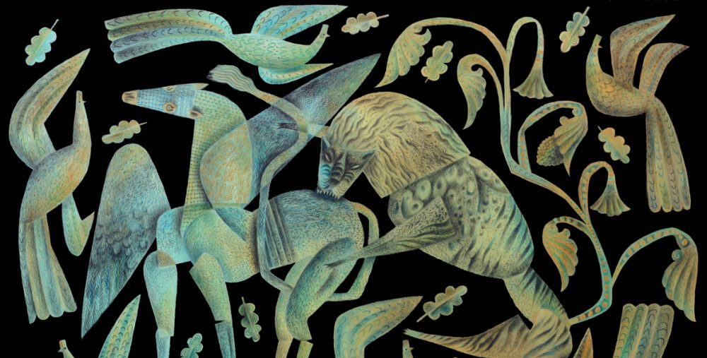
I turned then to a regular theme I’ve been exploring for ten years, the blind saint Hervé and his wolf…

…

…
… before trying the same technique worked on panel rather than board, which gave a much grainier effect.

…
The most recent work has been on two illustrations for a forthcoming edition of Alice in Wonderland.

…
What started as a brief foray, has turned into an obsession.

…

Oh Toby Twirl. how I loved him! His fingers always fascinated me. Your images are so powerful with their limited palette. The Hervé series especially.xL
I’m recalling that you liked some limited-color picture books from the early 20th-century… I do like the effect!
True. I loved my early Toby Twirl books, with two-colour illustrations printed onto quite cheap, thick, absorbent paper. Two or three colour images make you really think hard about the compositional form. Everything has to work hard and punch above its weight.
This makes me feel more confident about my obsession with red and blue…these are scrummy!
Go with the red and blue. Great combo.
I’m going to have to wade back into your archives., Clive…I searched to find out more about St. Herve and all these images surfaced….all yours. The short and sweet of it is … I’m a pencil fan. And you are the Gabriel Garcia Marquez of pencil.
Well, j.h., that’s made me smile. Can I quote you on that?
Click on Hervé and the Wolf in my topics box, and all will be revealed.
Glad it tickled your fancy….