Hello, Peter Slight of the Puppet Challenge here.
In this recent post Clive talked about the importance of negative space and placement within an image. In the comments I mentioned the illustrator George Him who I feel displays a mastery of these skills. It also got me thinking about a book I own loosely connected to the Puppet Challenge theme and illustrated by Him.
So I thought this would be a good/slightly tenuous excuse to post a few of Him’s lovely illustrations.
‘Folk tales for reading and telling‘ is by Leila Berg, my copy is dated 1966.

Above: Him has created an effective spooky atmosphere using very little detail.

Above: I love all these naughty red critters, particularly the ones piling through the window.
…
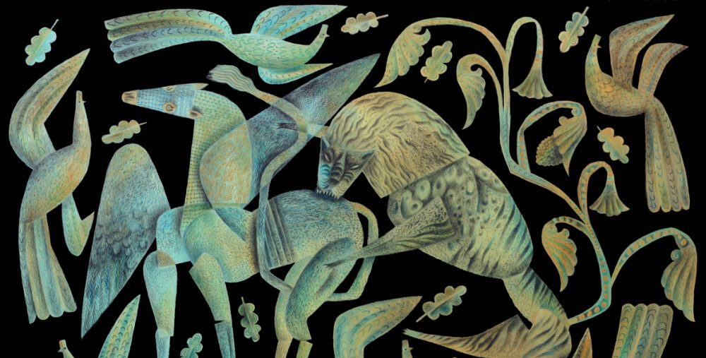
Him’s drawings have such a lively economical line. His designs have nothing wasted and nothing spare.


…

Above: the books end-papers. I think this would make handsome wall-paper for any child’s bedroom, or mine for that matter!
…

I’m not sure whats going on in the scene above, but I love the forced perspective, something else Clive touched upon. It can be necessary to get the eye moving around a picture for it to be ‘read’ correctly, in this case clockwise from the bottom left hand corner. The placement of every element is very well-considered, from the hills and figure in the background to the bucket in the foreground. It all works and fits wonderfully, almost like pieces in a puzzle.
…

…
George Him (1900 – 1982) was a very prolific and successful commercial artist during his lifetime, and deservedly so in my opinion. You can learn more about Him here.
…
Footnote by Clive.
One of the delights of sharing the responsibilities of the Artlog with Peter Slight for the duration of the Puppet Challenge, is that occasionally I come to the blog and find that something marvellous has appeared overnight, as if by magic. It was a delight to discover today’s post on George Him, who Peter had recommended to me as a graphic-designer/artist whose work I might appreciate. It turned out that although the name was unfamiliar to me, I recognised many of the images.
Peter has limited himself to posting some of Him’s illustrations from Folk Tales for Reading and Telling. I’ve taken the liberty of adding more beautiful work, some done by Him in collaboration with Jan Lewitt between 1933 and 1955, when the two ran a graphic design company. To introduce the images, here’s George Him describing himself in 1976.
‘I belong, I suppose, to the leading graphic artists of my generation, and my name was internationally known in the days when individuality in graphic design was valued – an attitude by now long forgotten. All that is left for me today – apart from carrying on with my work – is to preach the old gospel of design based on art, and not on market research, to the growing generations of students.’
…

Lewitt-Him 1941
…

Lewitt-Him 1943
…

George Him 1961
…

George Him 1958
…

Lewitt-Him 1952
…

I love the last one, it’s delicious, everything about it is perfect. Such style!
Yes, it’s very fine. But my own favourite is the ‘Vegtabull’, for its surreal strangeness coupled with charm.
Yes, I love the pun, and the gentle colours.
What a lovely way to start the day! These images are lovely …. and new to me (I do wonder why I was never introduced to things like this at art college). I was reminded of the lovely work of Betty Swanwick (who taught me…lucky me!) and her early posters for London Transport.
Her later paintings are terrific and there is a wonderful book of her work by (I think) Paddy Rossmore…well worth the price.
I think that we’re talking of a ‘golden age’ of artists, who were without prejudice toward product design and manufacture, and moreover had the skills required to translate ideas into products. There was Eric Ravilious, a painter and engraver of great distinction, and yet who was happy to turn his hand to the engraving of trade-cards for businesses, or designing beautiful china for Wedgwood. John Piper never shied away from design, and besides his paintings and prints, he produced book illustrations, and designs for film-posters, the stage, stained-glass, commissioned tapestries and commercially produced textiles, as well as producing art-pottery from his own kiln. Edward Bawden was a respected artist/printer/illustrator, though many would have known him best for his charming graphic designs for Fortnum & Mason.
In these artists there was a respect for craft that I fear was jettisoned by later generations. Art and design somehow became separated, and the practical skills that had once held sway were no longer taught on the fine-art courses in colleges. Luckily you caught the tail-end with the wonderful Betty Swanwick. I recall her work for London Transport with great pleasure.
Talking of which, it’s hard to imagine a company these days employing artists to create images of such merit as were once regularly produced for the old London Transport and British Rail. All that is largely past.