Like the Hollywood actors of old who concealed their dates of births so as to seem forever youthful, I have a bit of a blank spot when it comes to remembering dates. I’m just not good with putting the significant incidents of my life in chronological order, which is why I get evasive whenever required to provide a conventional biography. In fact the sole thing that can place me in the general vicinity of something for which I’m attempting to recall the date, is by thinking about which dog I had at that time. I keep a ‘significant dates’ book for birthdays and anniversaries, though alas almost invariably forget to look at it. I certainly don’t hold the departure dates of loved ones in my head, save with the one exception: May Day 2005.

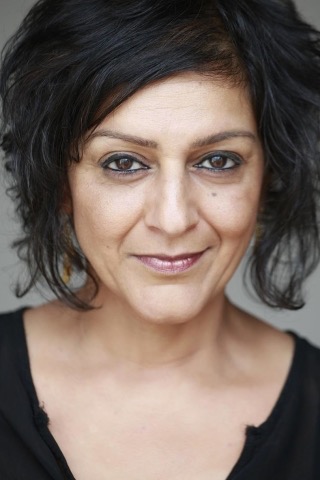
My friend Catriona Urquhart was a shy writer. She wrote obsessively all her life, mostly poetry, but it was a private passion that she rarely shared. Because Catriona was such an extraordinarily good story-teller in conversation, when she one day asked Peter what he’d like for his forthcoming birthday gift, he replied he’d like a short story, which was a cunning ploy because though she looked a tad uneasy at having been caught in a trap of her own making, she knew she’d have to deliver. Peter wasn’t about to let things rest until she had, and in the lead up to his birthday he regularly reminded her of her promise. On the night when Catriona and Ian arrived for dinner, as I took their coats she requested writing-paper, a glass of wine and the use of an upstairs room to work in. She hadn’t begun the promised story, but said she’d have it down in half and hour. And she did just that, reappearing with a slim sheaf of sheets which on later examination we found to be neat and perfect, written smoothly with no hesitations or corrections. She was persuaded to read Palmyra Jones to the assembled guests that evening, and although she feigned a becoming nervousness, she read it as well as anyone ever will, in her soft Glaswegian brogue, and all present were mesmerised by it.

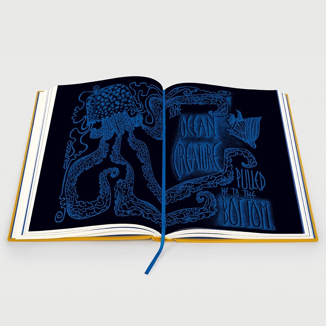
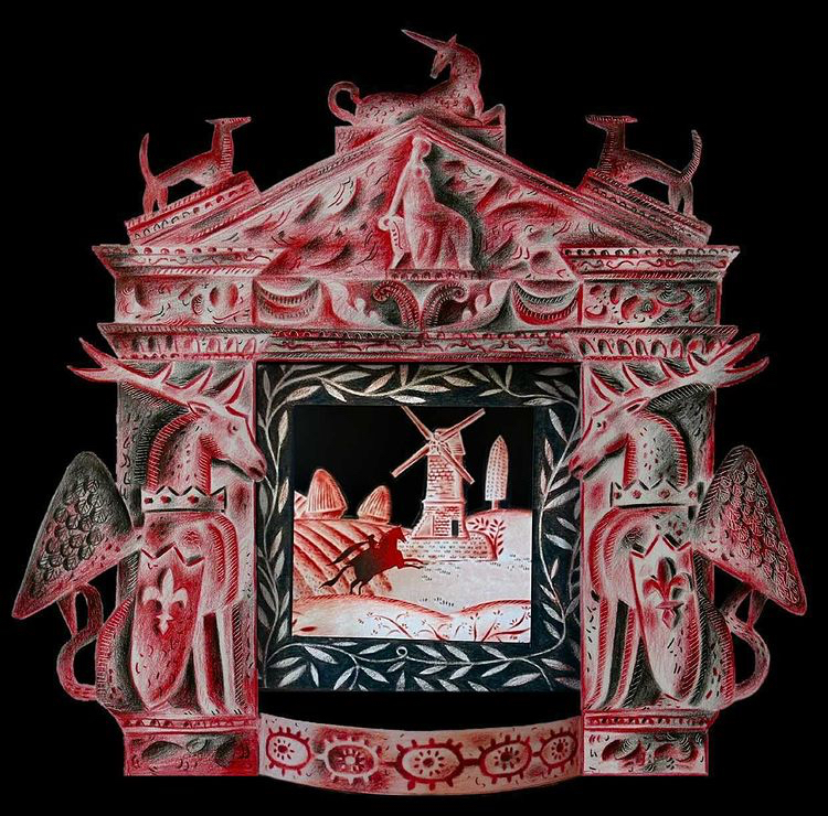
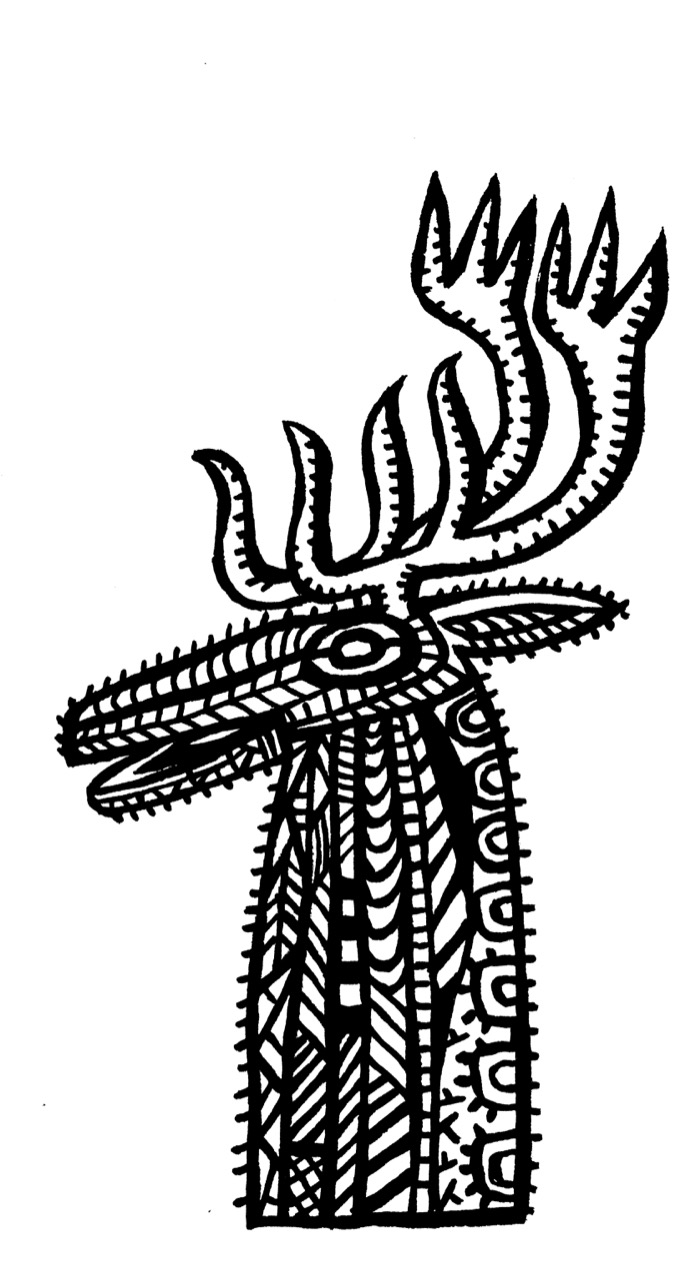
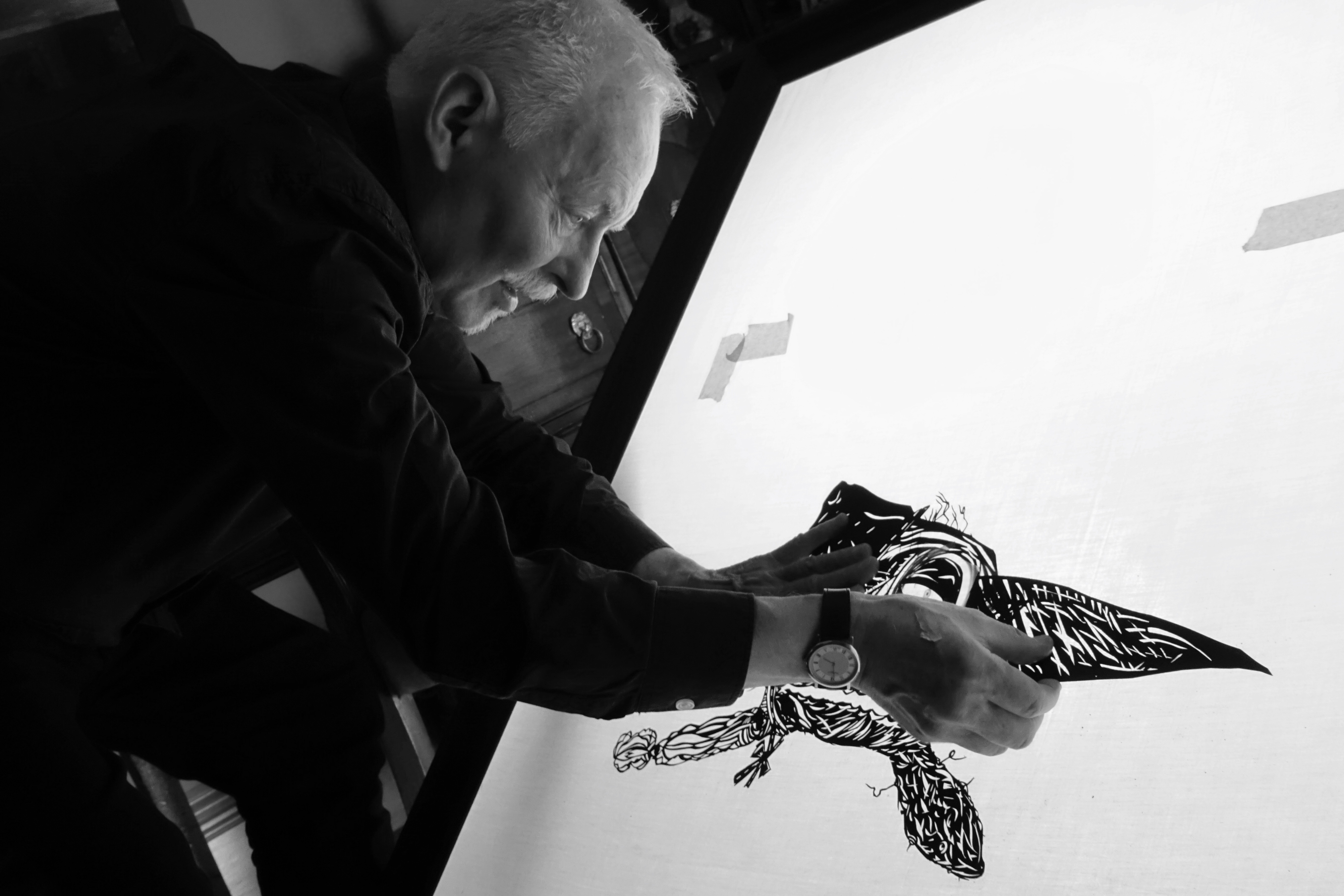
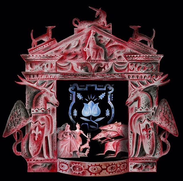
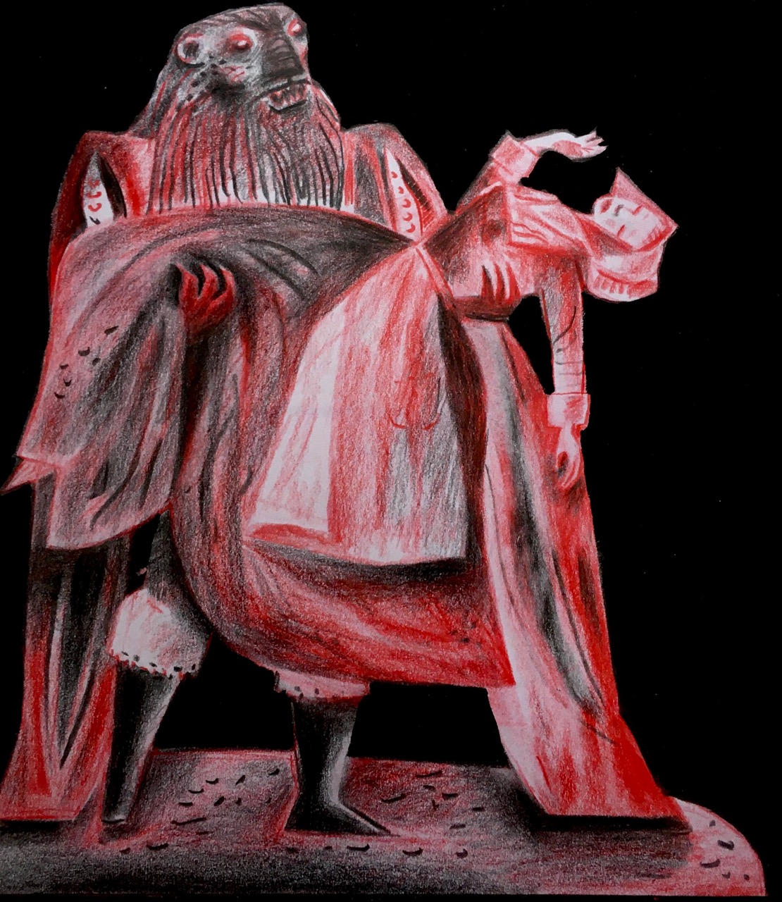
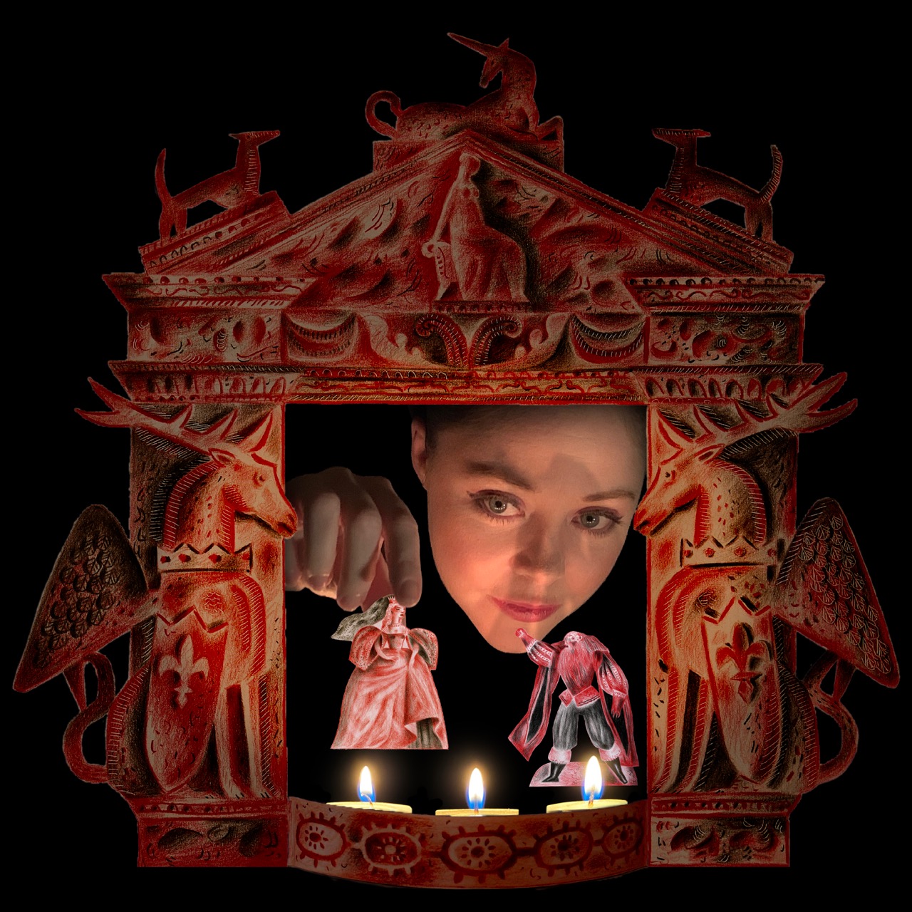
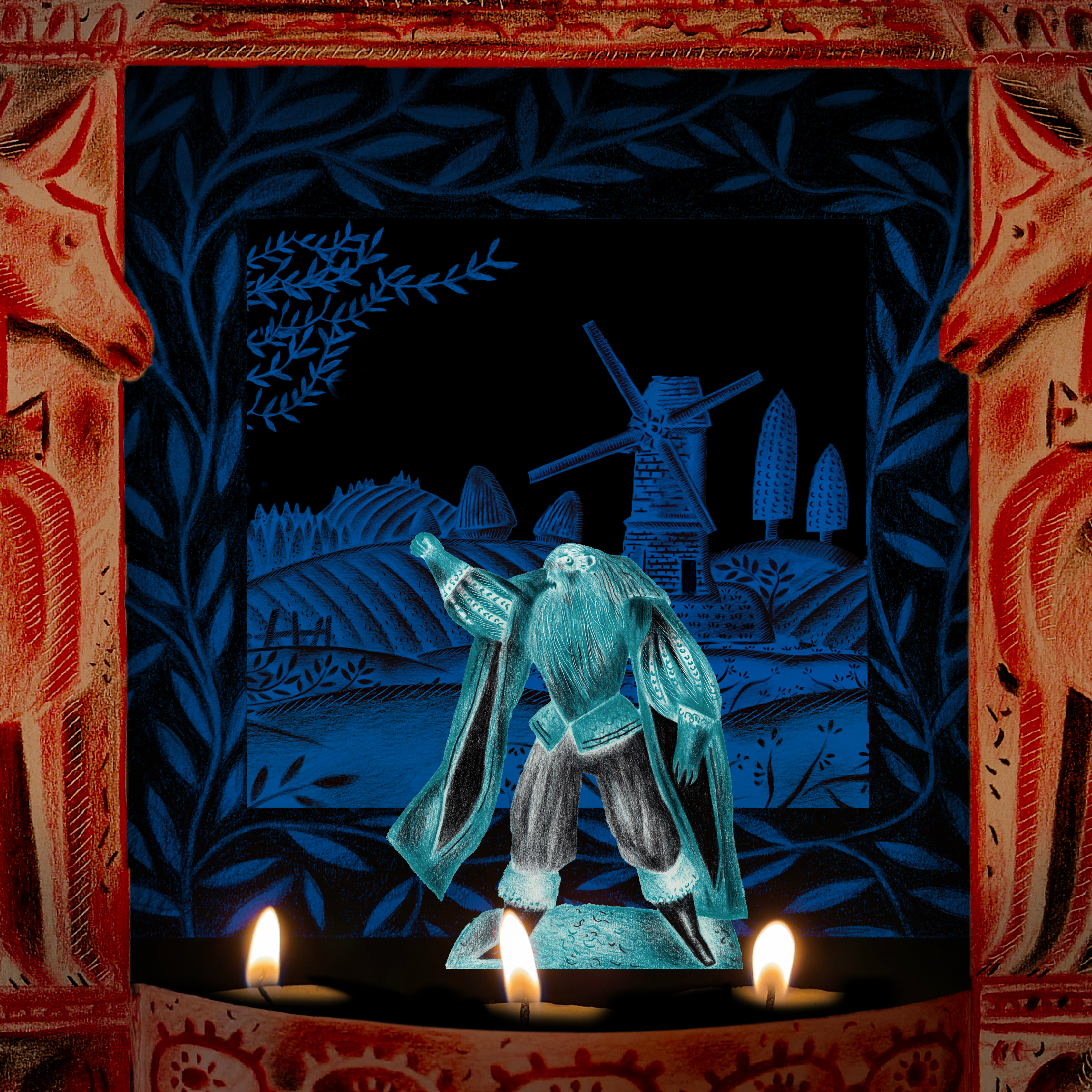
So much so that Nicolas and Frances McDowall of Old Stile Press, present that evening, asked her permission for them to publish it in a small inkjet edition, which they did, and I made the illustrations for it. This was in 1997, and it was the first book I made with Nicolas, marking the beginning of a long collaboration with OSP.

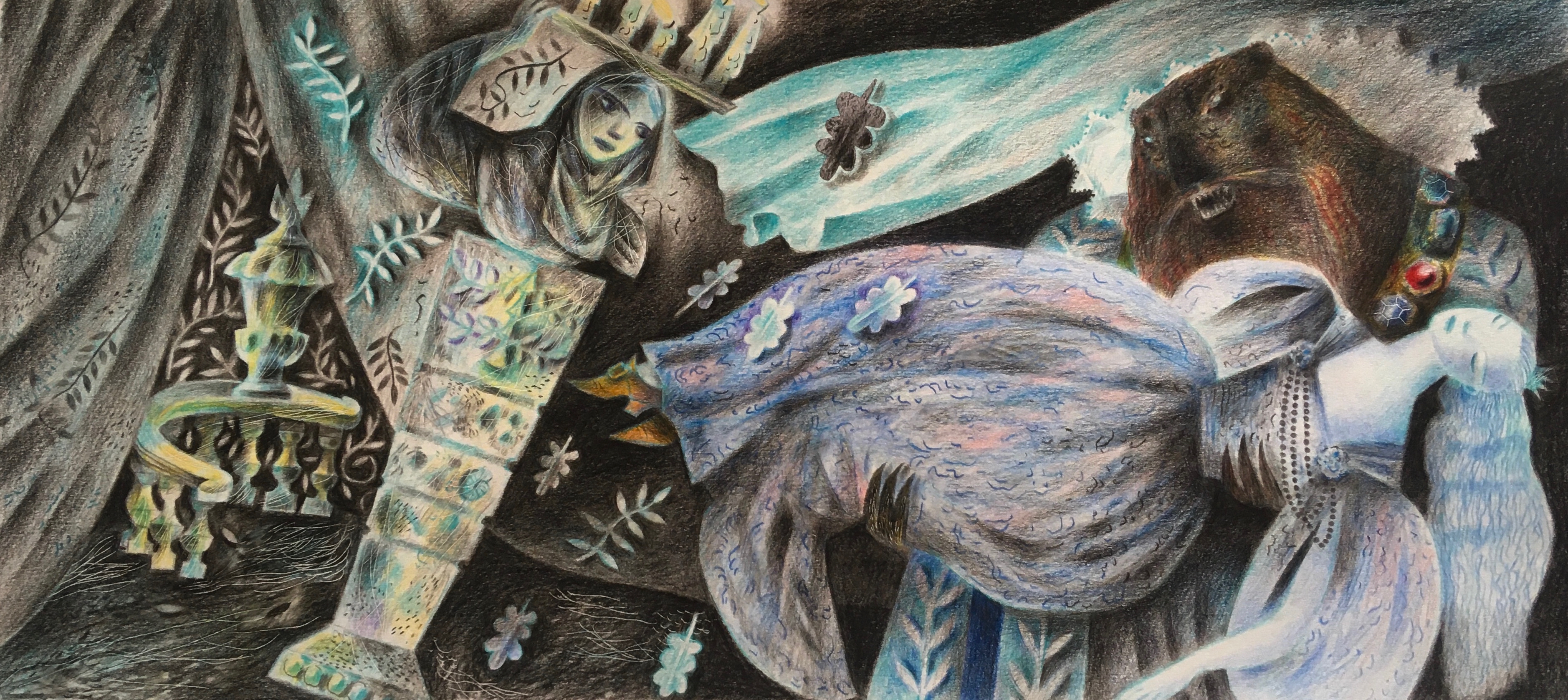
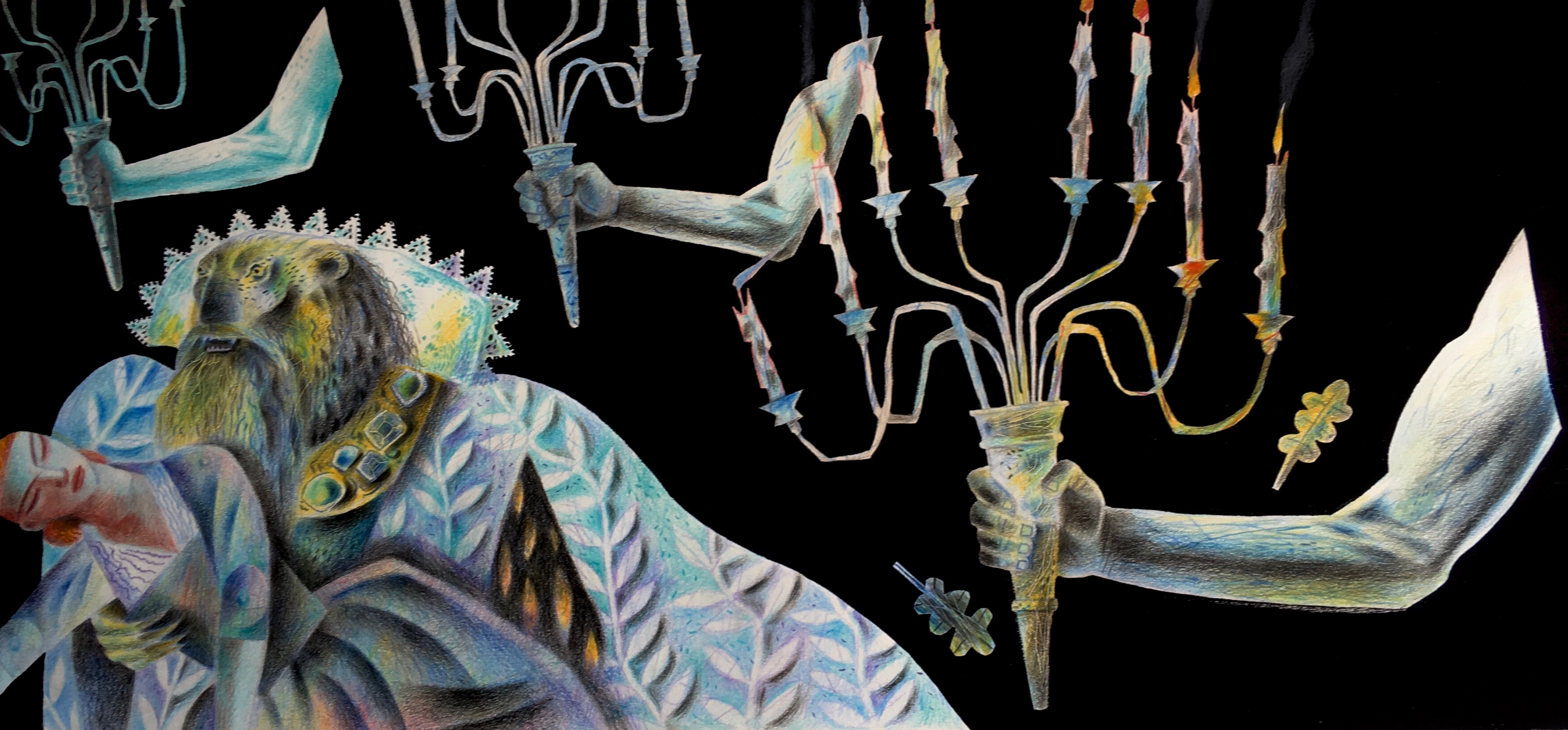
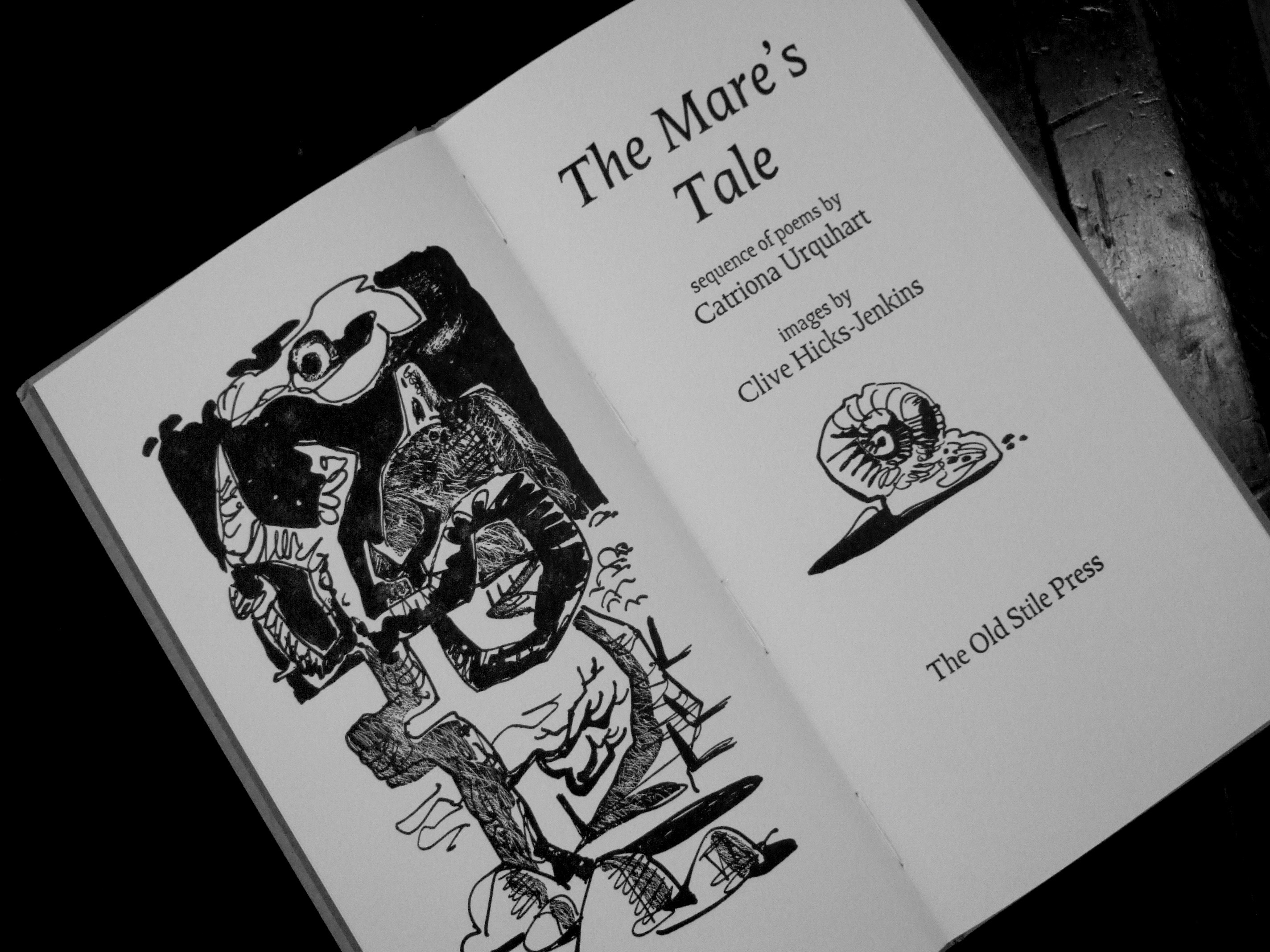
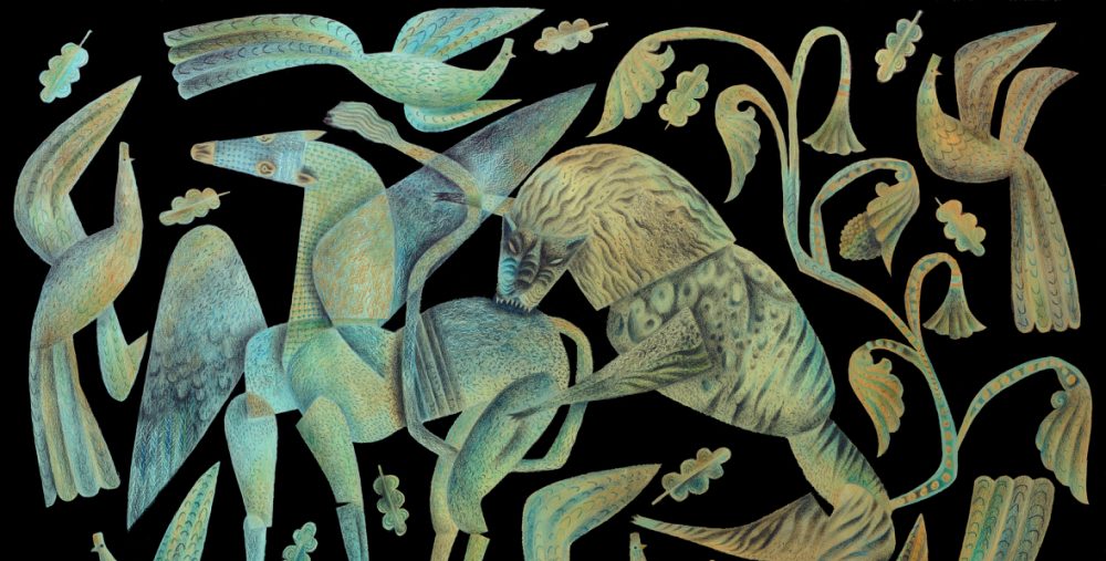
Catriona would never put herself forward. When first I knew her she was working as a librarian in Caerleon. She wrote secretly, and it wasn’t until much later that she let slip that she’d once studied poetry under Seamus Heaney, who had been sufficiently impressed to tell her to stay in touch with him, though she never did. Whatever came over her to make the suggestion she’d write a poetic text to accompany my 2001 exhibition The Mare’s Tale, I’ll never know. It was completely out of character, perhaps fuelled by her love for my late father Trevor, and the fact that the heart of the exhibition was to be his story, about which she felt fully qualified to write because in his last years he’d opened so readily to her with his accounts of past times. Catriona stored up stories as her treasures. She was a ‘curator’ of stories, and of lives, and truthfully by the time Trevor died, she’d had more stories from him than he’d ever shared with us. She was a wonderfully appreciative audience for him, which of course his children could never be.

The original intention had been to print Catriona’s poems on information boards in the gallery, but Nicolas McDowall discovered them on A4 sheets scattered on our kitchen table when he visited, and for the second time was impressed enough to seek Catriona’s permission to print her work in a slender but beautifully produced edition.

Once again I was asked to illustrate, and again had to produce the drawings in a weekend rush in order to meet the printing deadline for the book to be available in time for the exhibition opening.

Catriona was working on a new translation of the Ramuz libretto for Stravinsky’s The Soldier’s Tale, a project we’d planned together for Old Stile Press, when she died of cancer on May Day 2005. Peter and I were in the process of re-locating from Cardiff to Aberystwyth where he’d taken up the post of head of the Royal Commission for Ancient and Historical Monuments Wales. Right at the point when we were making a significant change in our lives, I lost the person who had most anchored me at a dark time of my life before Peter.

I thought I would never get over grieving for her. Every day in the months after her death felt like a climb out of deep well. A year into Peter’s posting, we found Ty Isaf, purchased it and moved in. Almost the first thing we planted was a stick-in-a-pot that Catriona had given me, assuring it would one day grow into a walnut tree. This didn’t seem likely because when removed from the pot, it was discovered the little tap-root had rotted clean away. Yet thrive it did, as she’d promised, and here it is today, close on thirty feet high and coming into leaf on the eve of May Day, which anniversary tomorrow will mark the fact that Catriona left us, aged just fifty-two, nineteen years ago.

Peter delivered the eulogy at her funeral. Titled Golden Catriona, you can read it if you scroll down on the page you’ll find here. And if interested, you can read a more detailed account of her speed-writing Palmyra Jones, here.
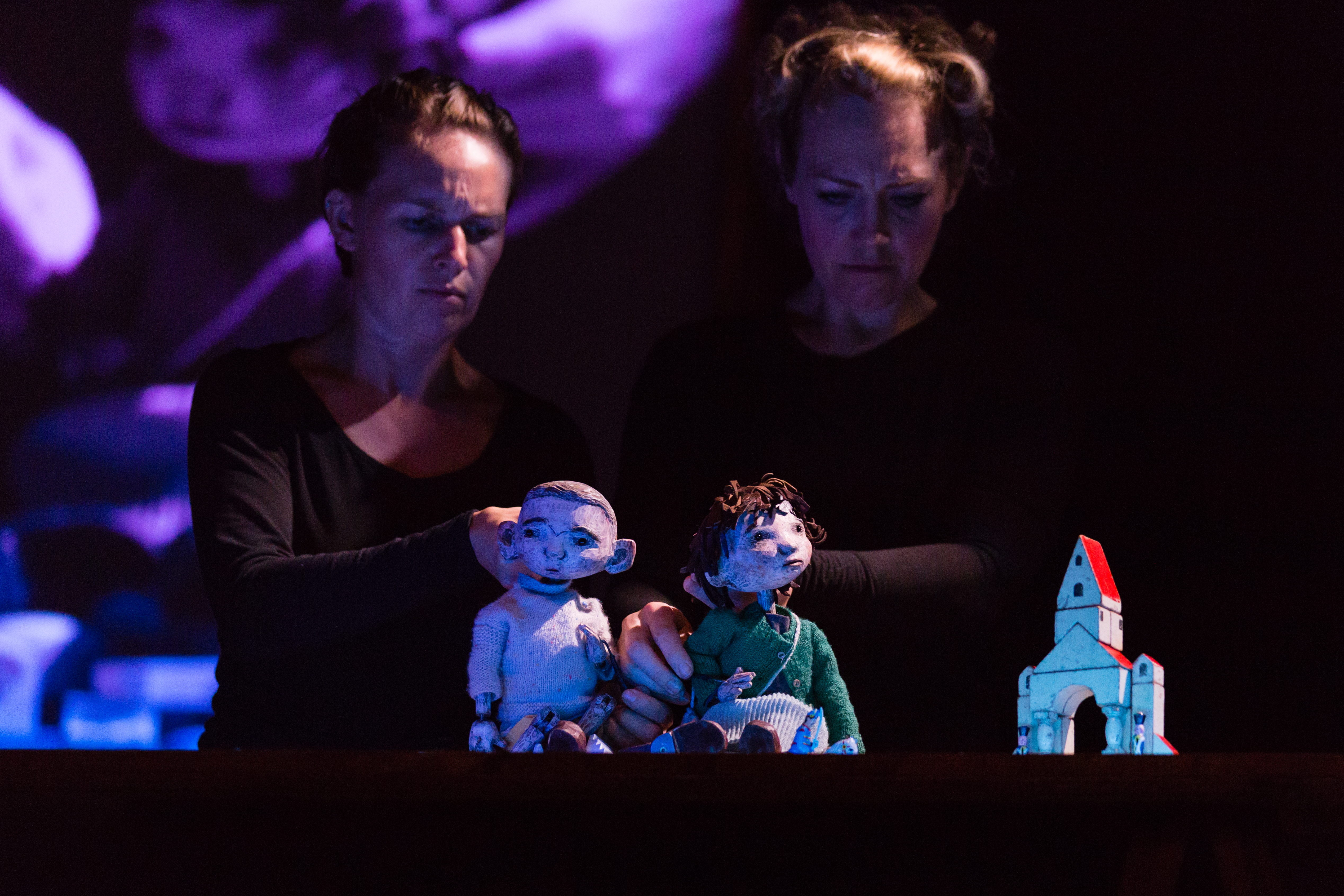
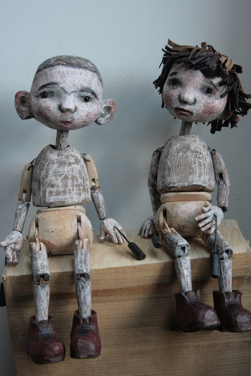
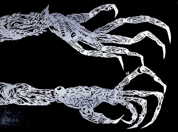
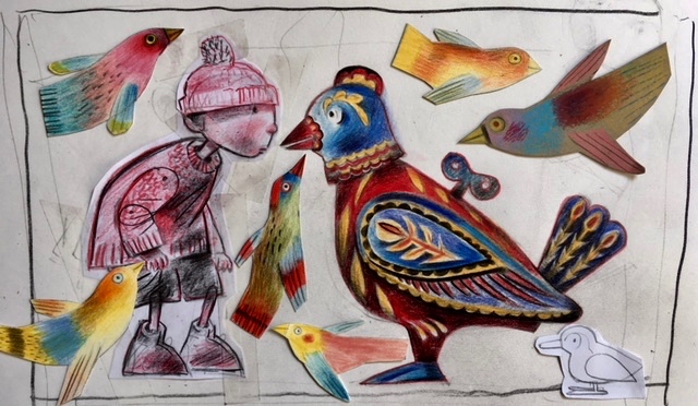
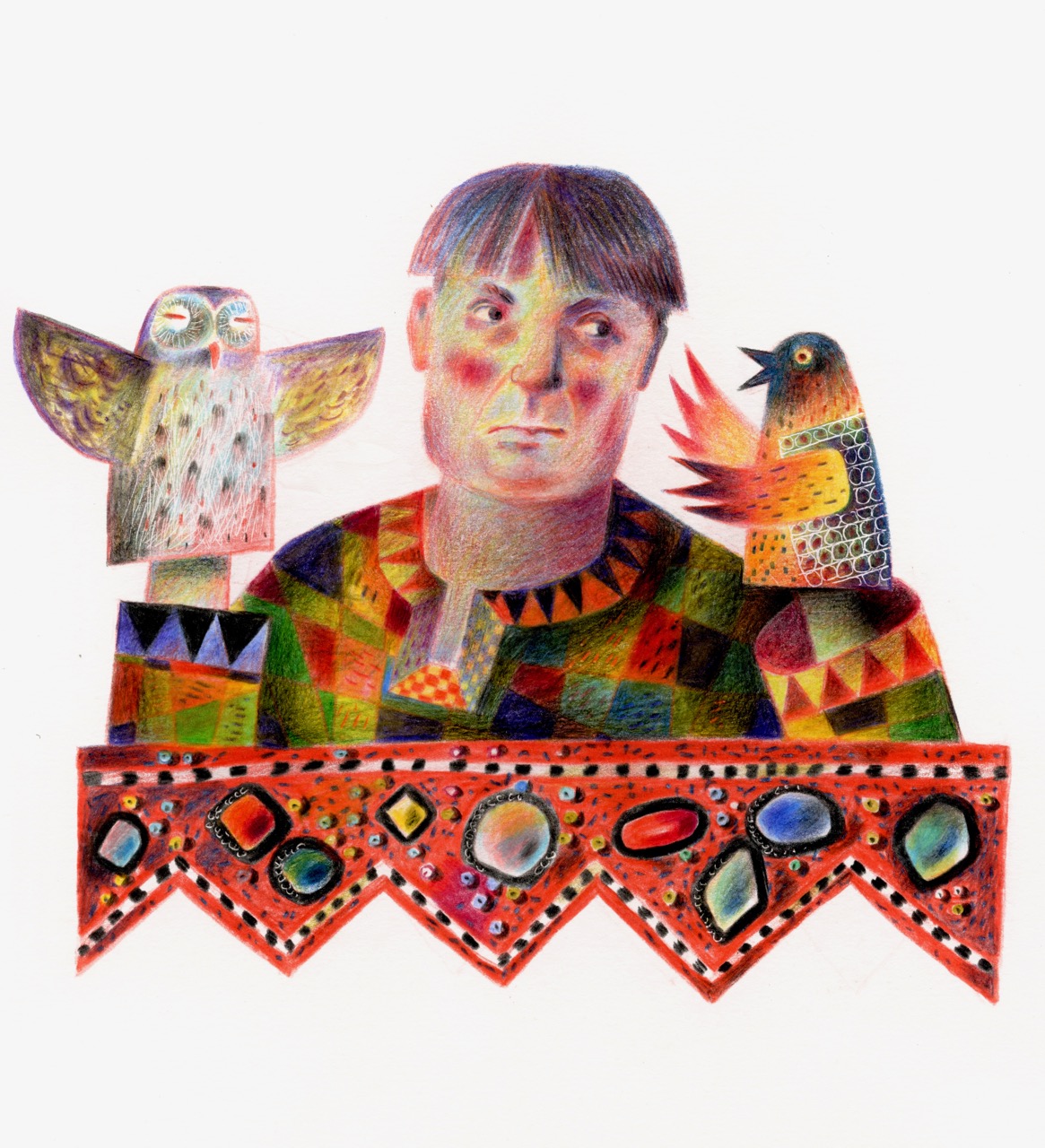
Though I illustrated the sixteenth century poet Richard Barnfield’s The Affectionate Shepherd for Old Stile Press, Catriona was the first living poet with whom I collaborated. Had we been able to look into the future at where my career would carry me in terms of working with poetry after The Mare’s Tale, we both would have been dumfounded. After Catriona had gone I didn’t expect there to be another poet in my life. But then quite suddenly Marly Youmans in the US drifted into my world, and our friendship was instantaneous, deep, and I think unexpected for both of us. (We work together still.) With Marly the list grew: Damian Walford Davies and Callum James in the UK, and Andrea Selch, Dave Bonta and Jeffery Beam in the US, all wrote poems about my work.

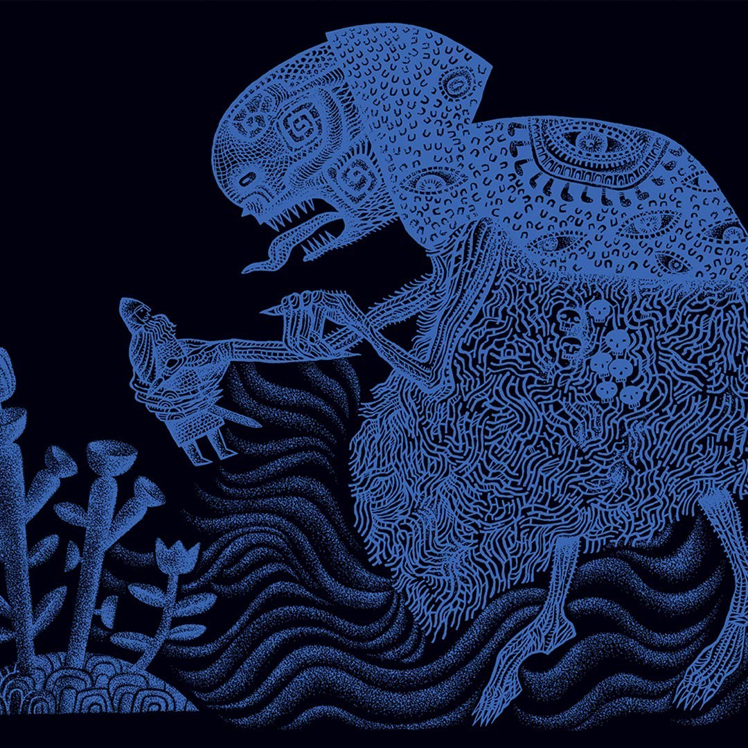
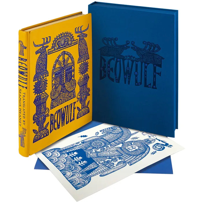
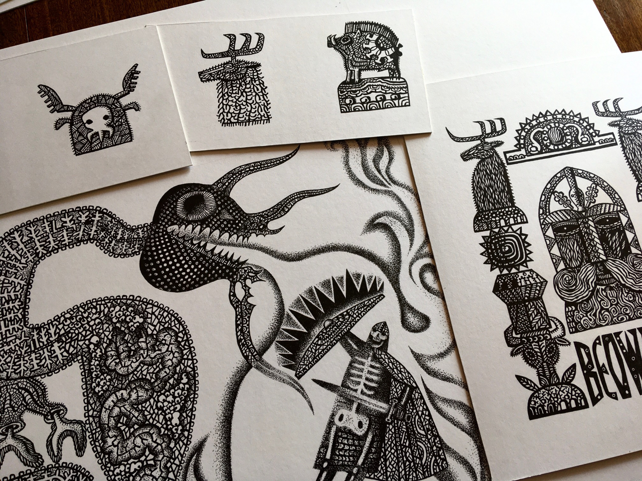
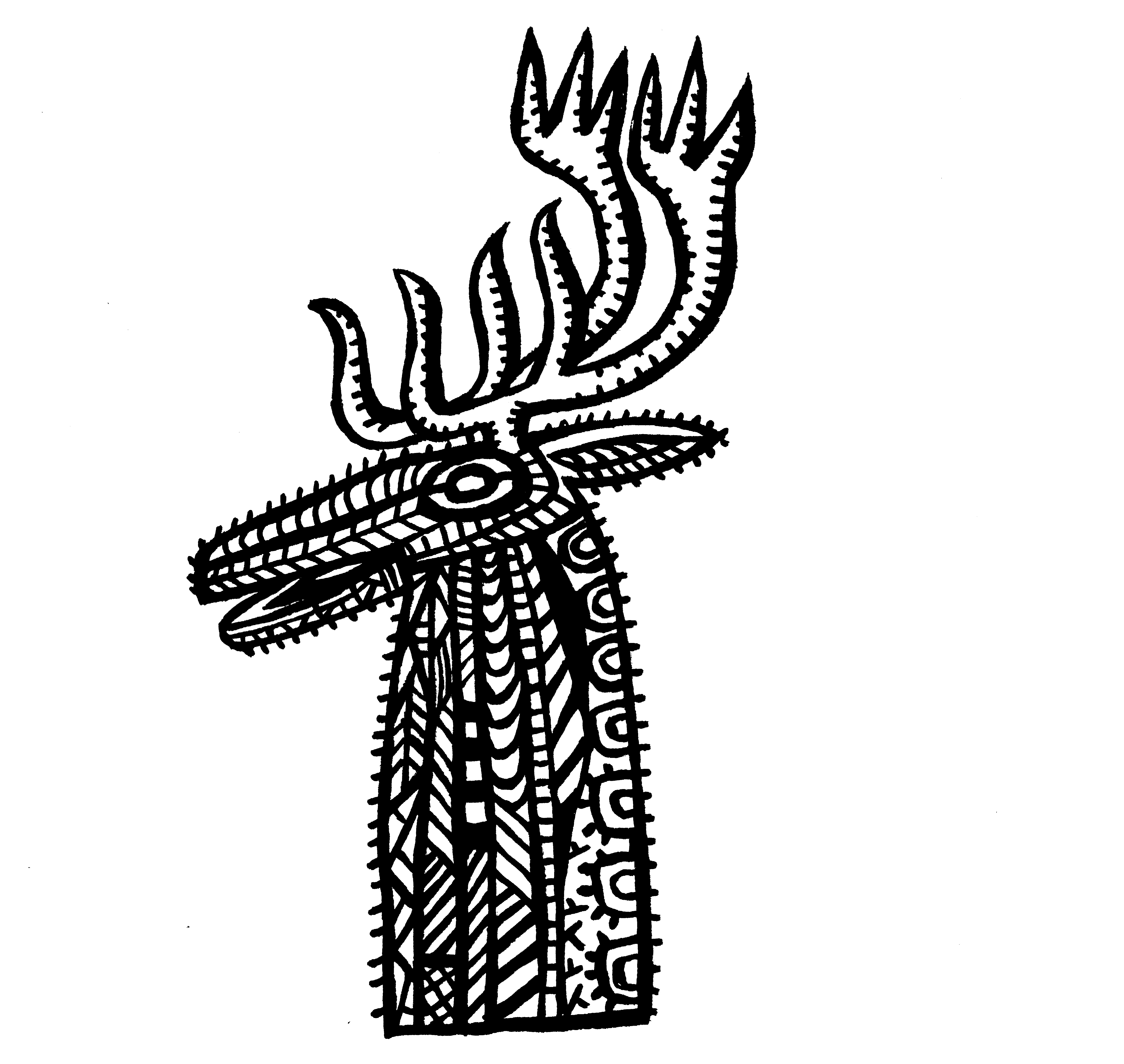
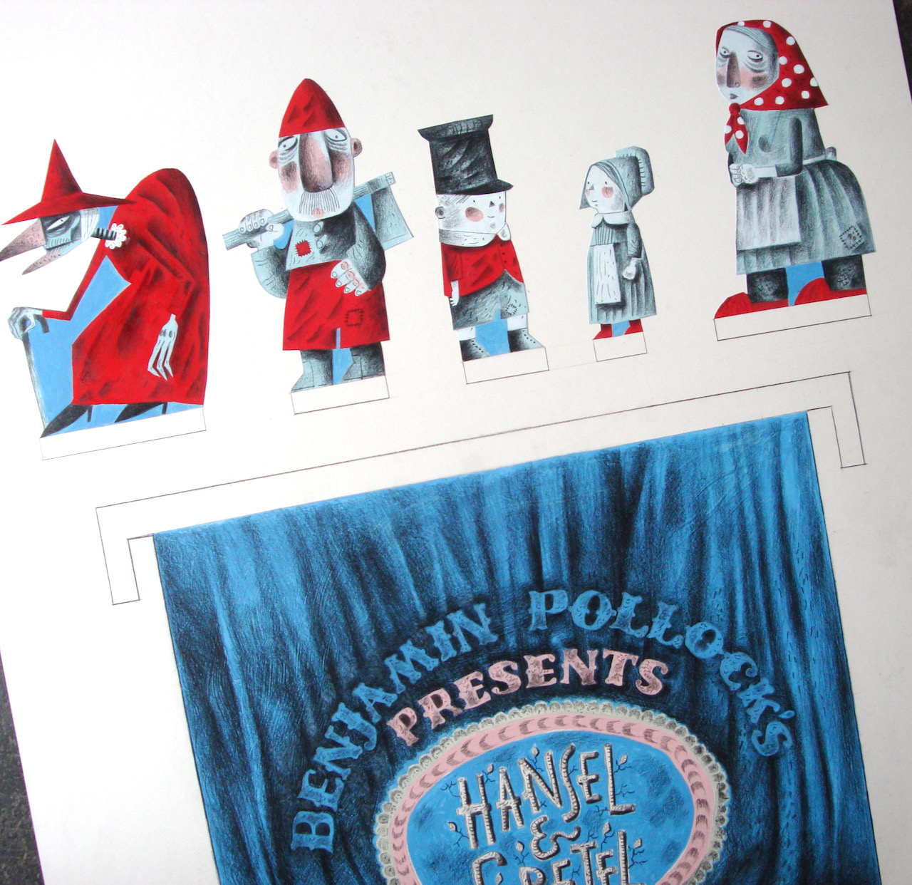
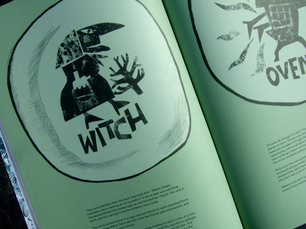
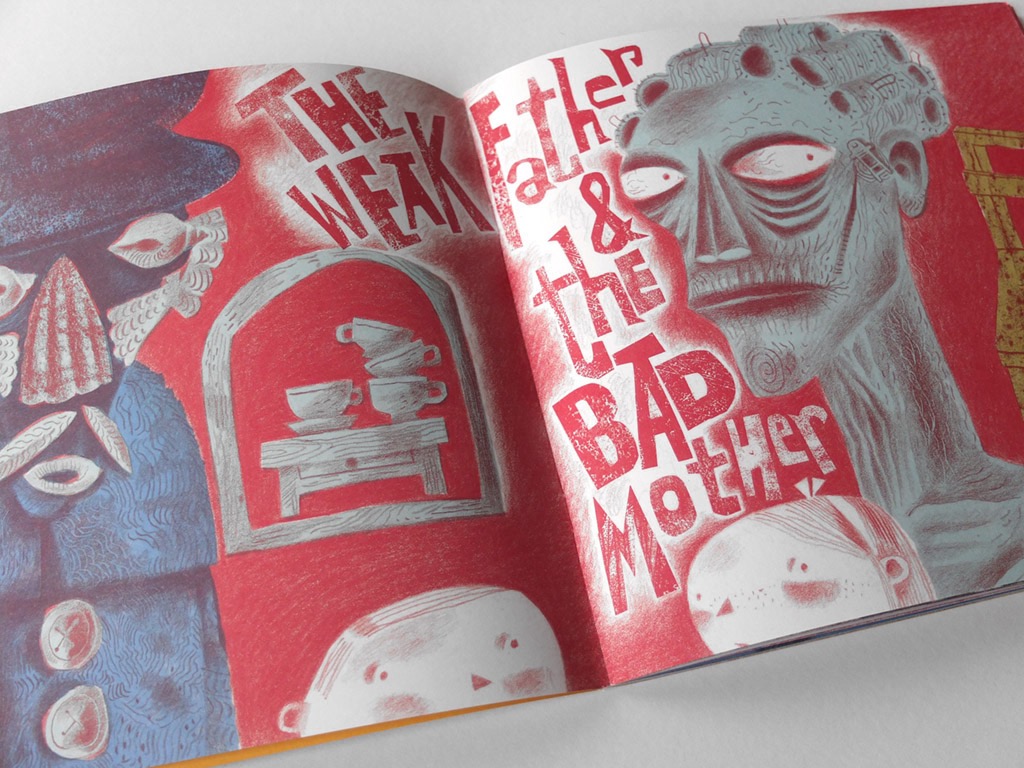
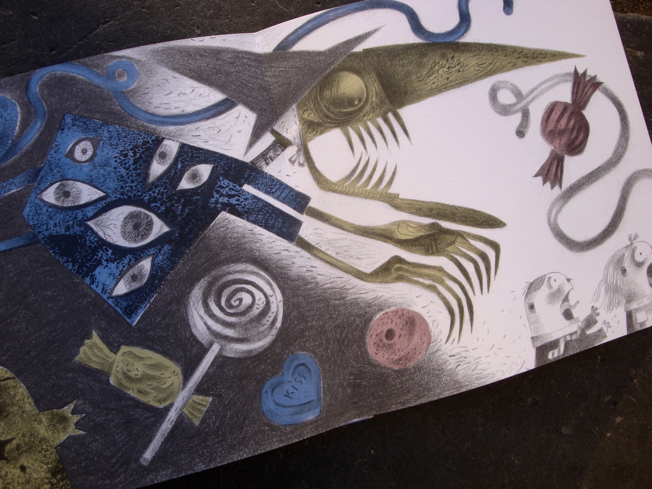
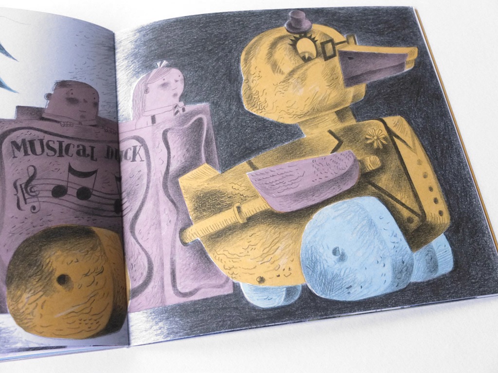
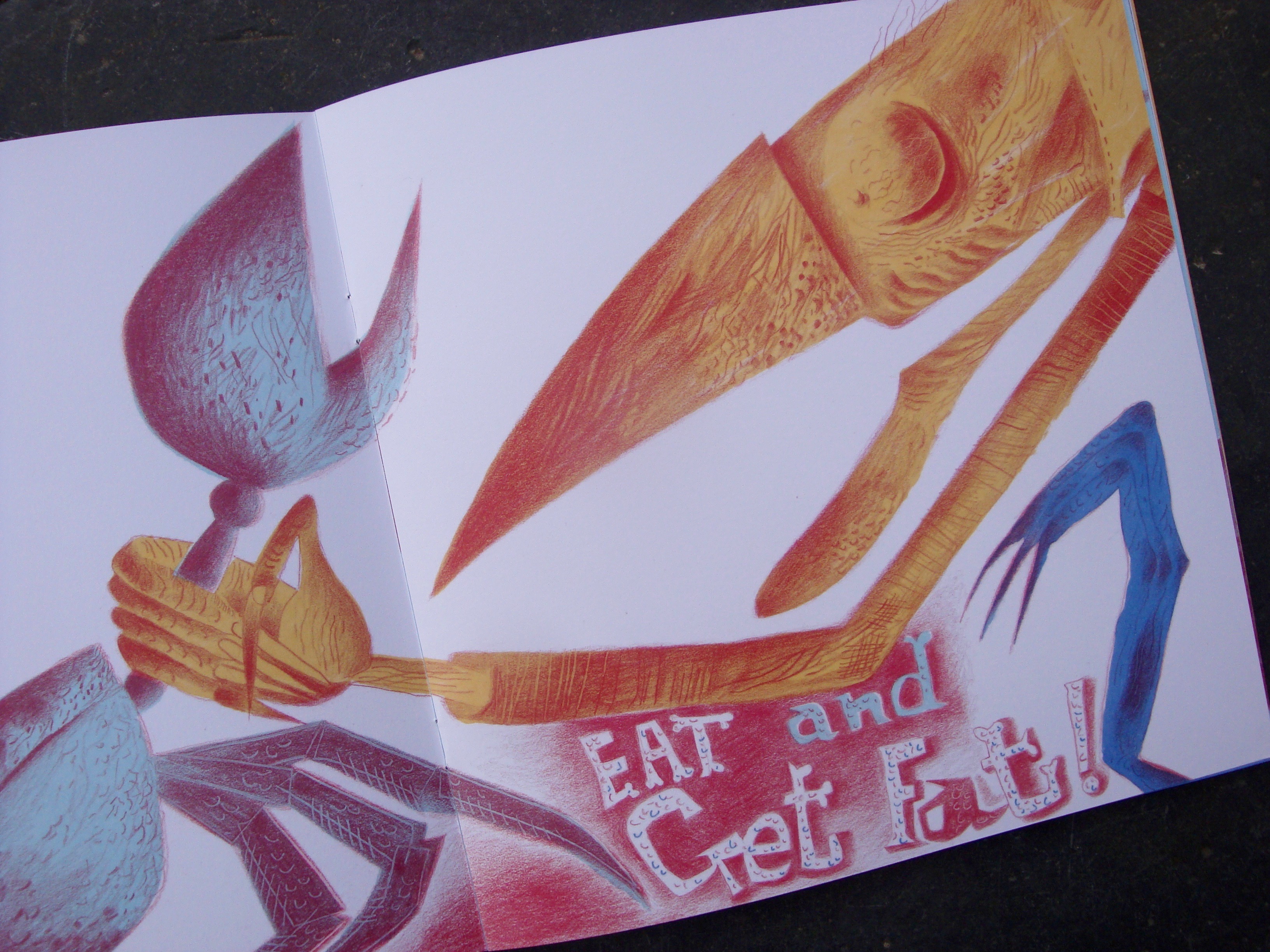
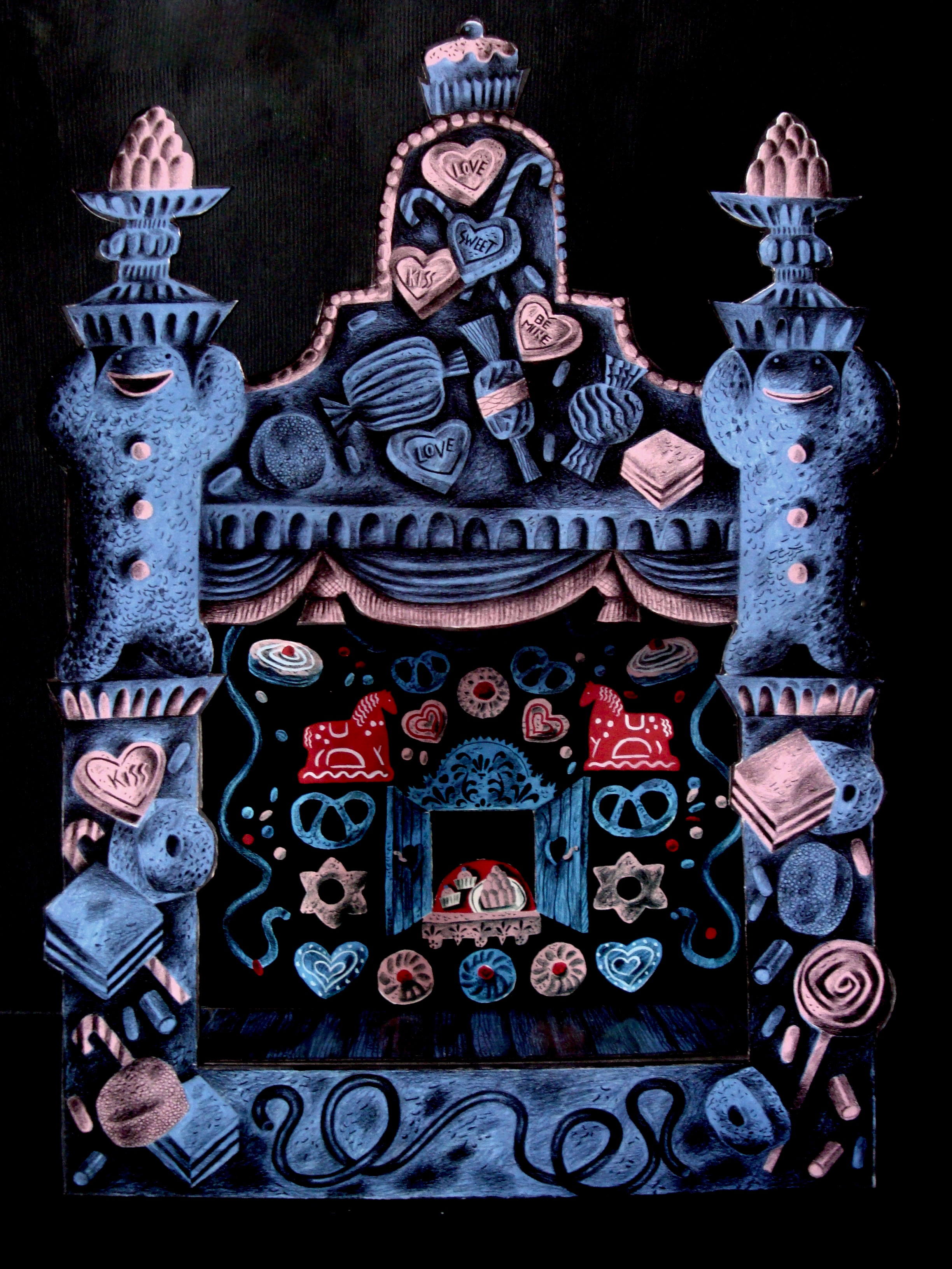
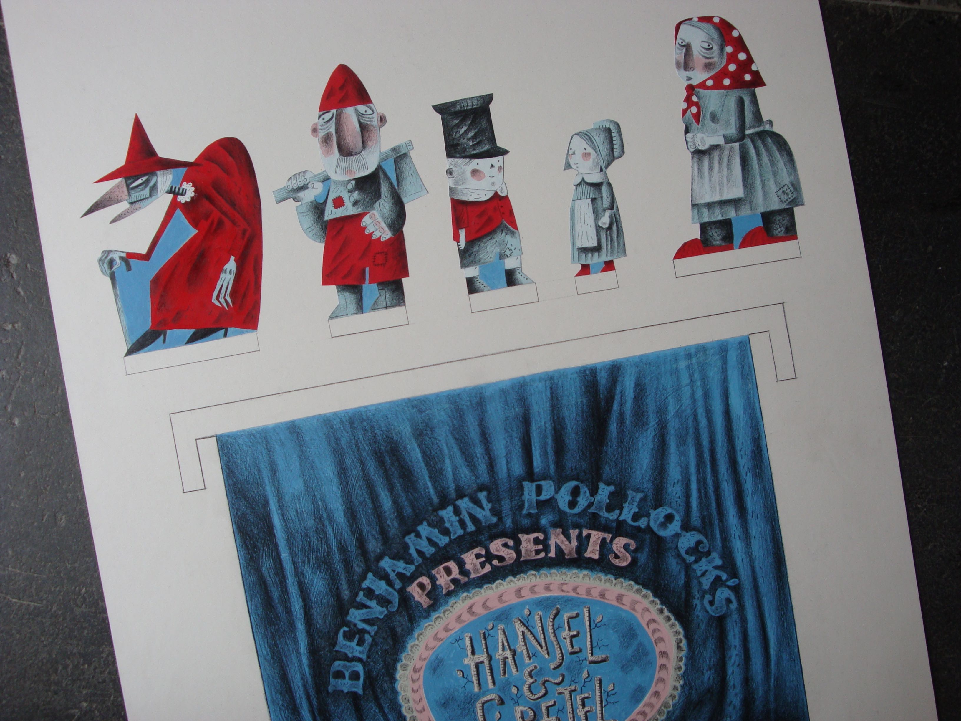
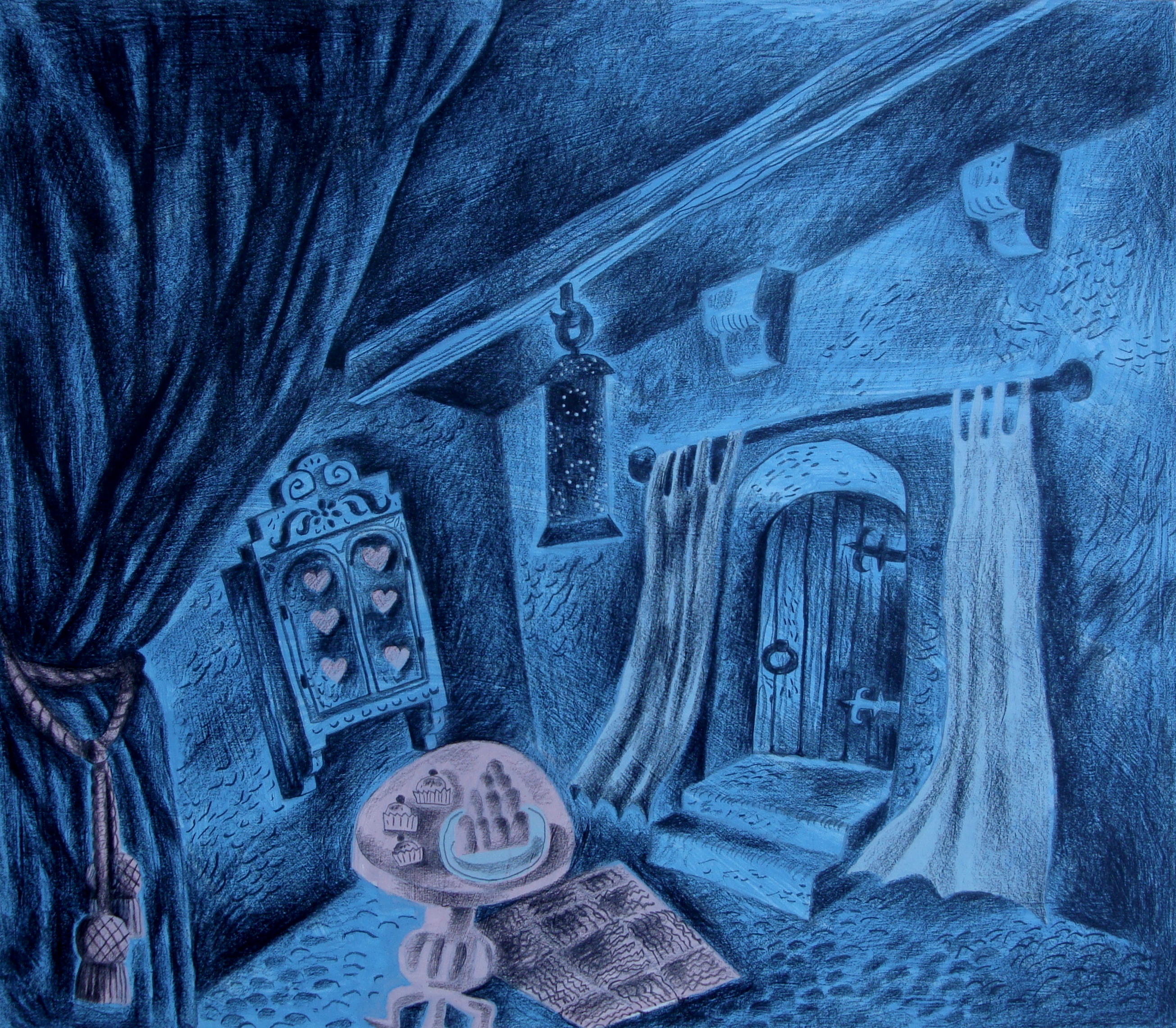
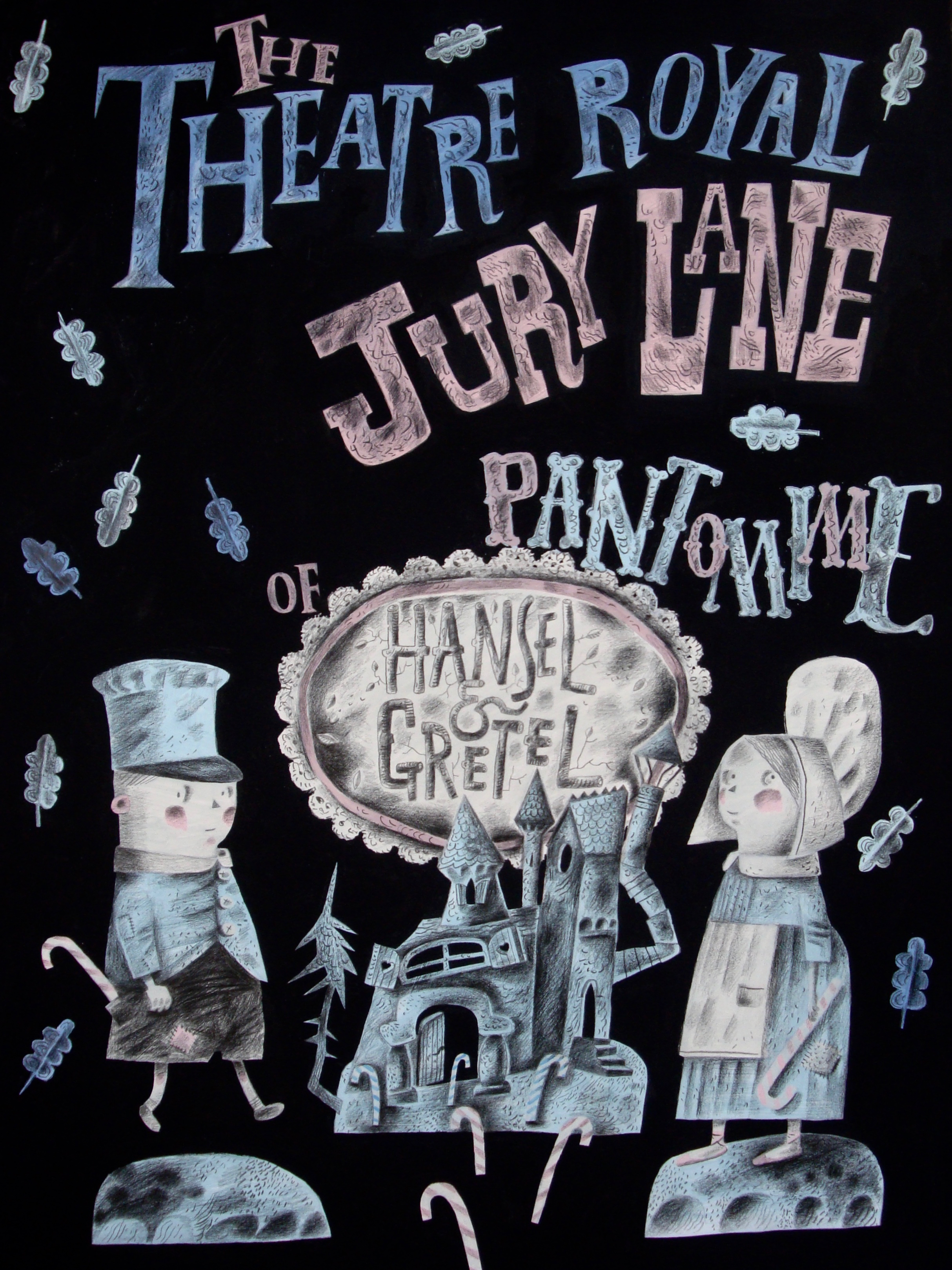
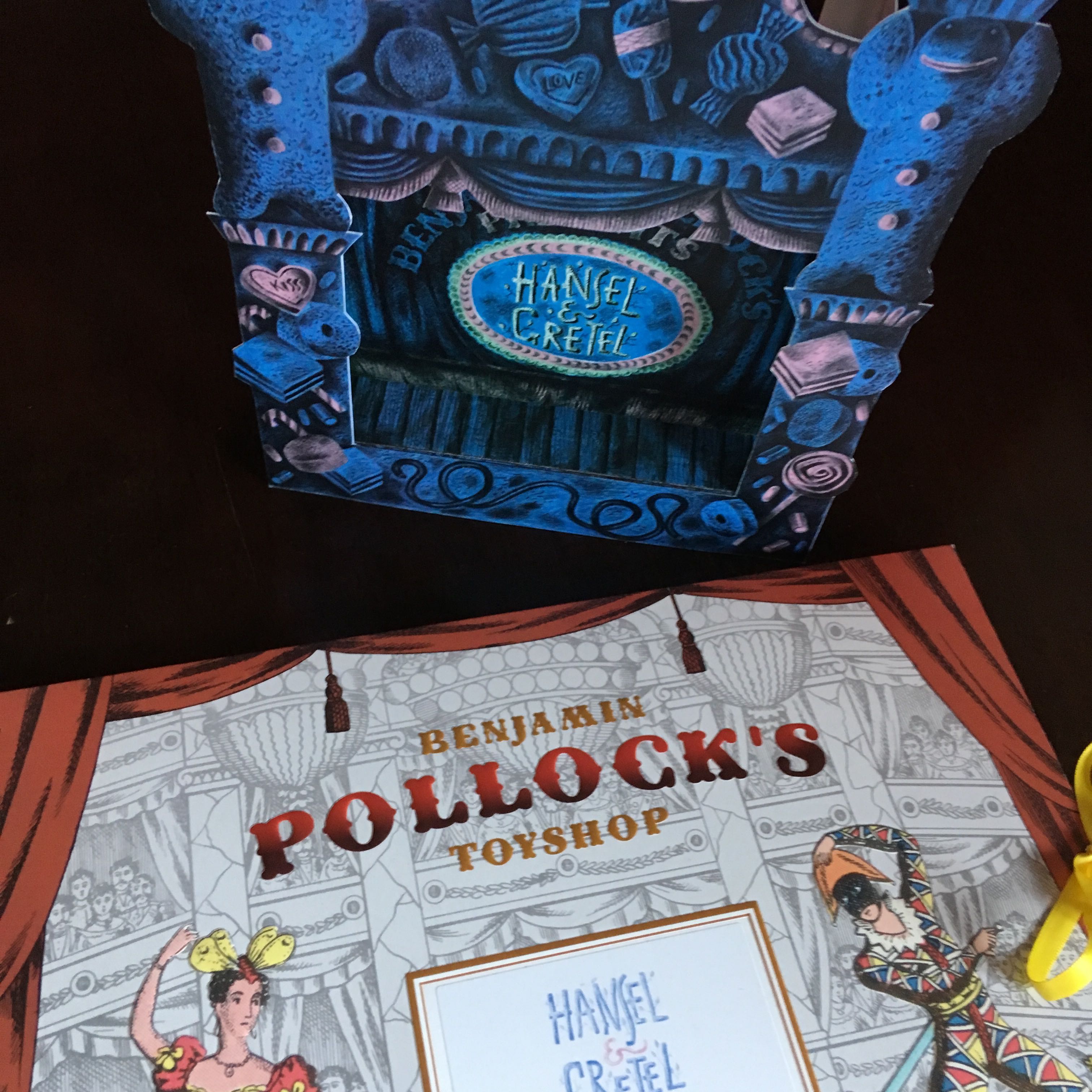
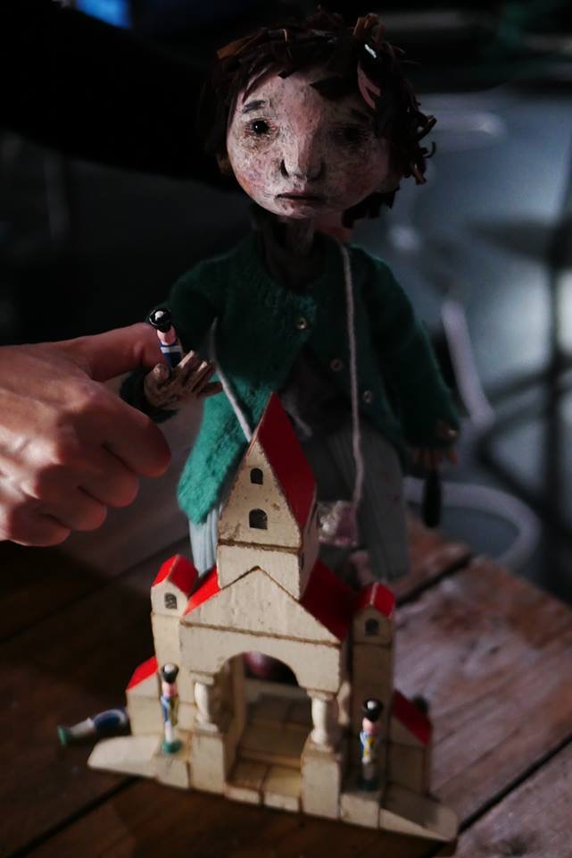
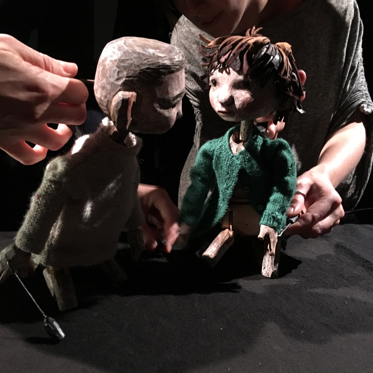
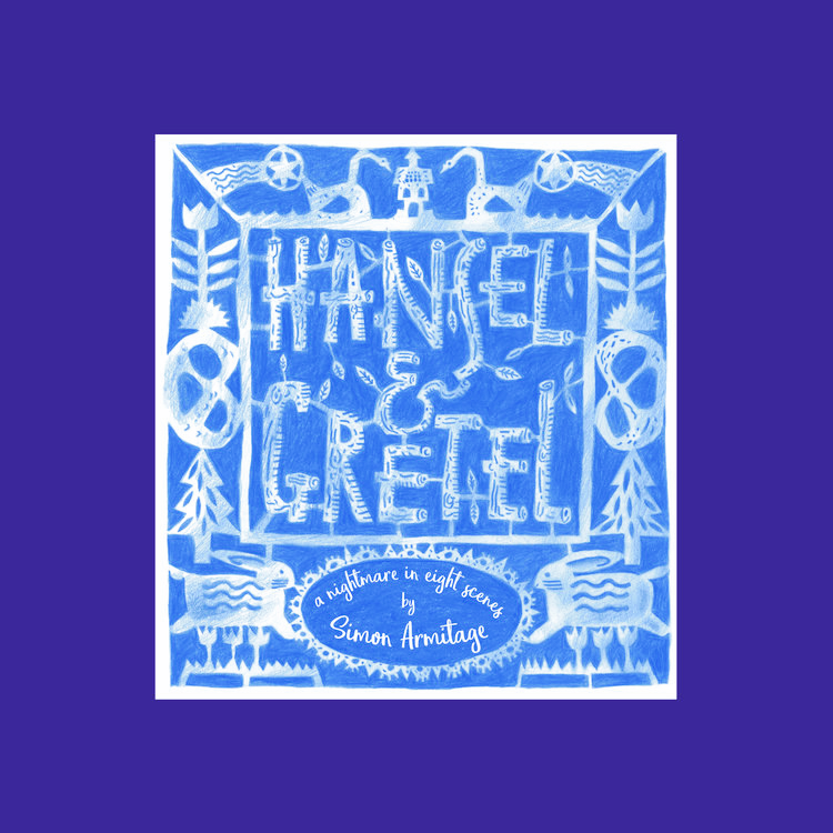
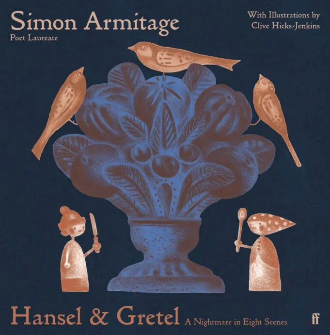
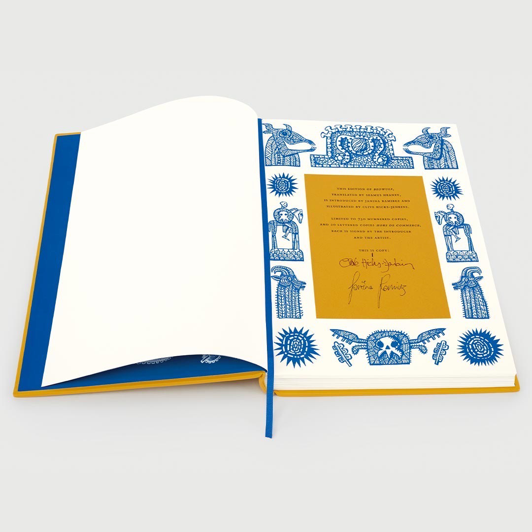
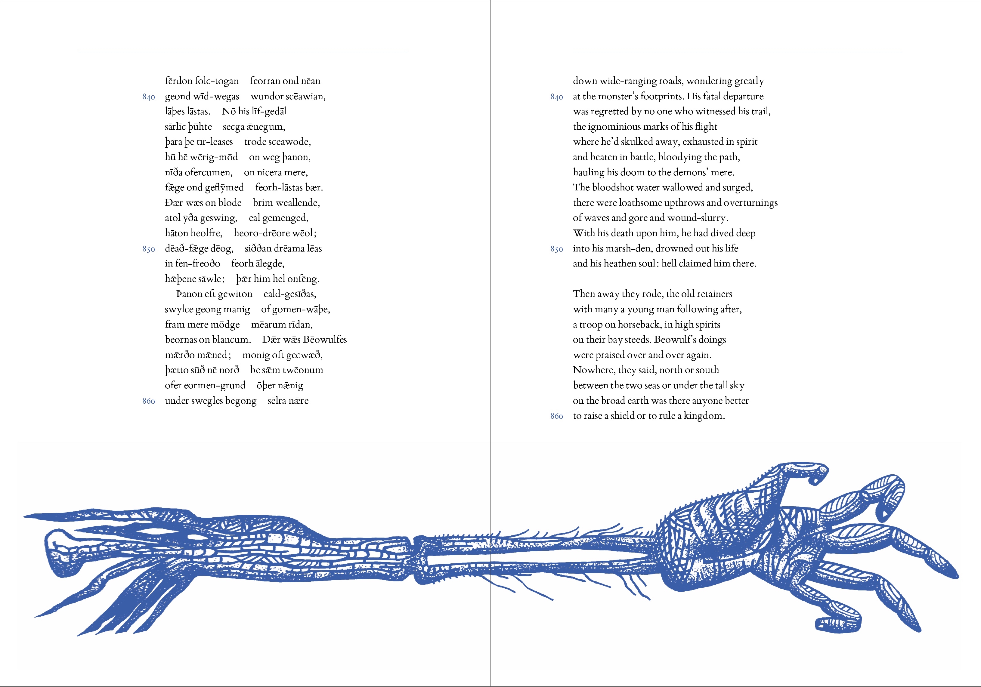
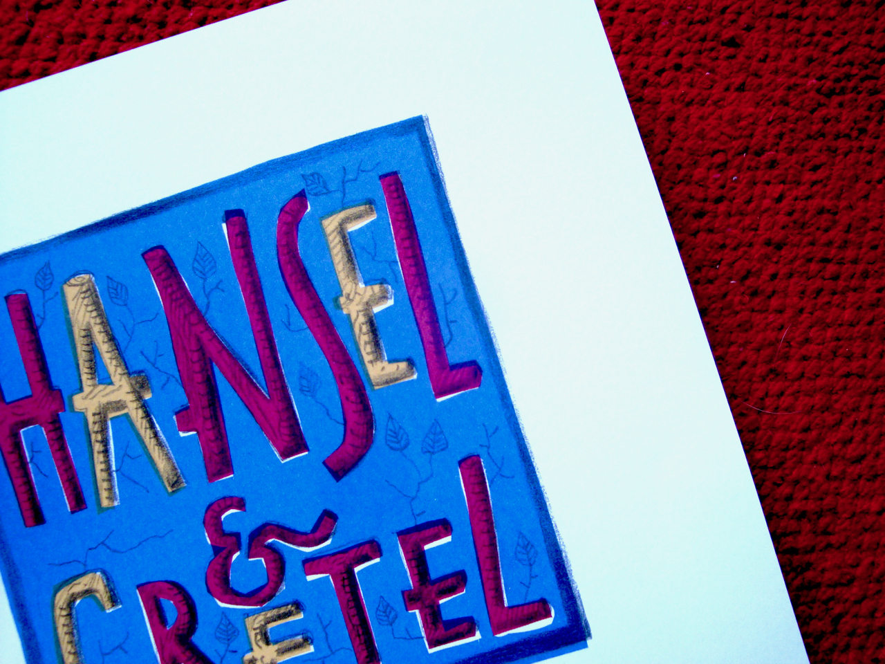
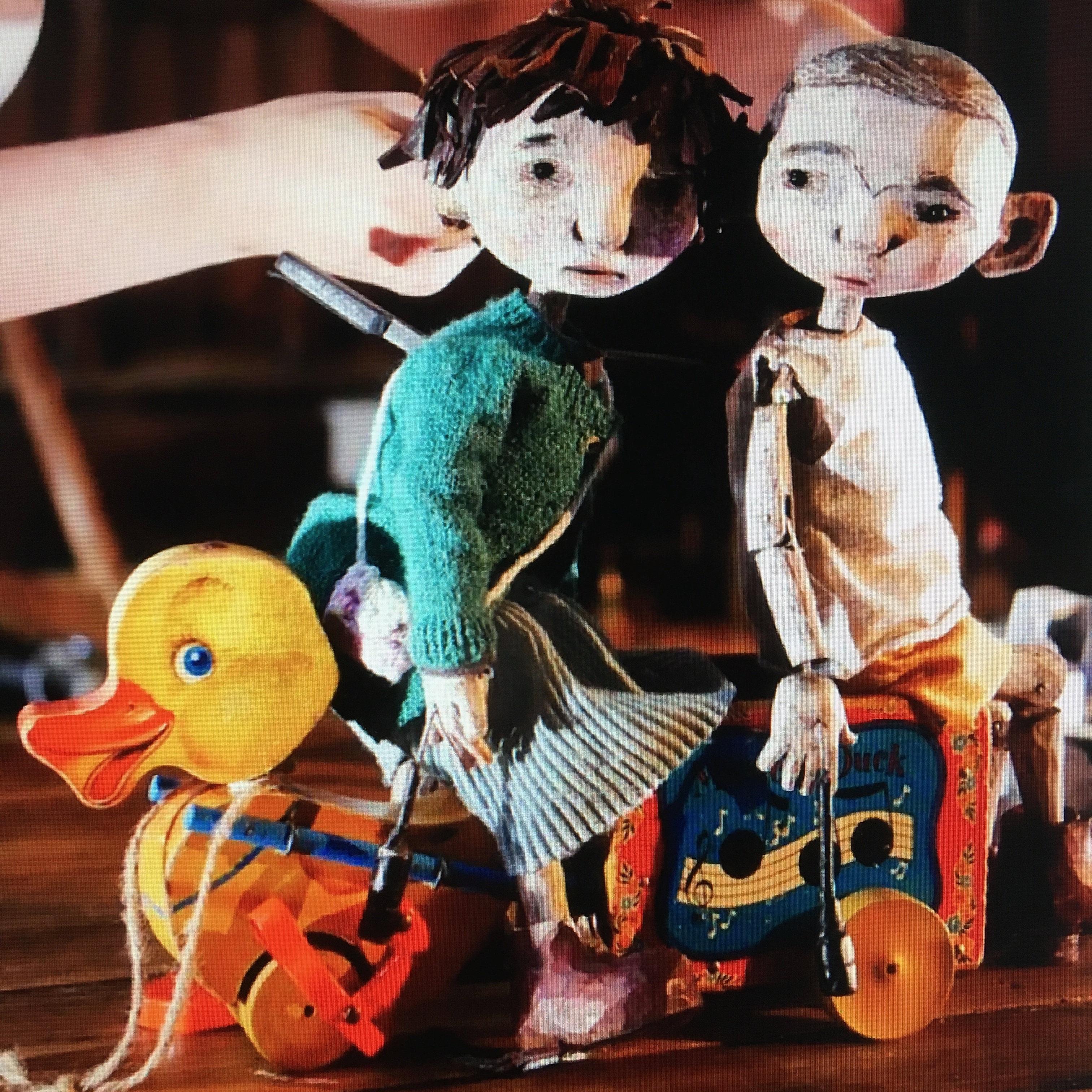
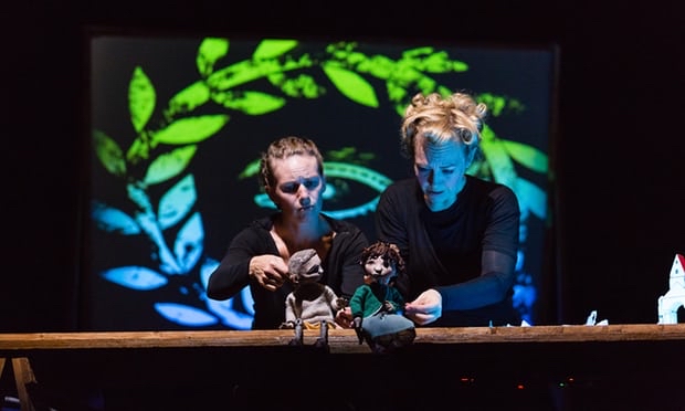
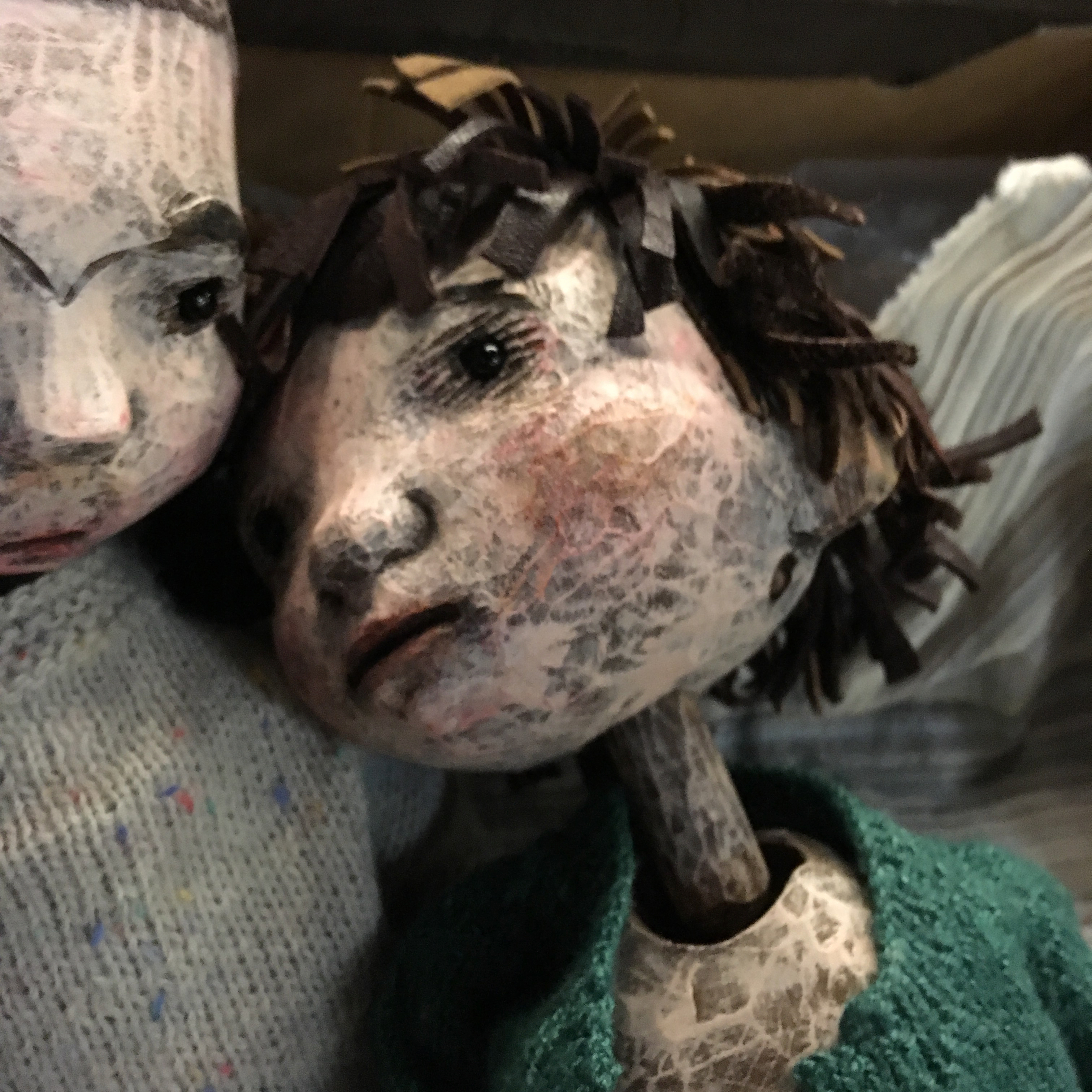
Simon Armitage invited me to Faber & Faber to illustrate the 2018 revision of his extraordinarily successful translation of Sir Gawain and the Green Knight, and in 2019 his reinvention of a fairytale, Hansel & Gretel: a Nightmare in Eight Scenes had only just been published by Design for Today with illustrations by me, when he was announced as Poet Laureate. There’s been a recent cover for Vintage’s Shakespeare’s Sonnets, and a new cover for Dylan Thomas’s Under Milk Wood. Last year Folio Society published a sumptuous edition of Beowulf in the translation by Catriona’s tutor, Seamus Heaney, illustrated by me. This year I’m illustrating a Folio Society double-volume set of Homer’s The Iliad and The Odyssey in translations by Emily Wilson.
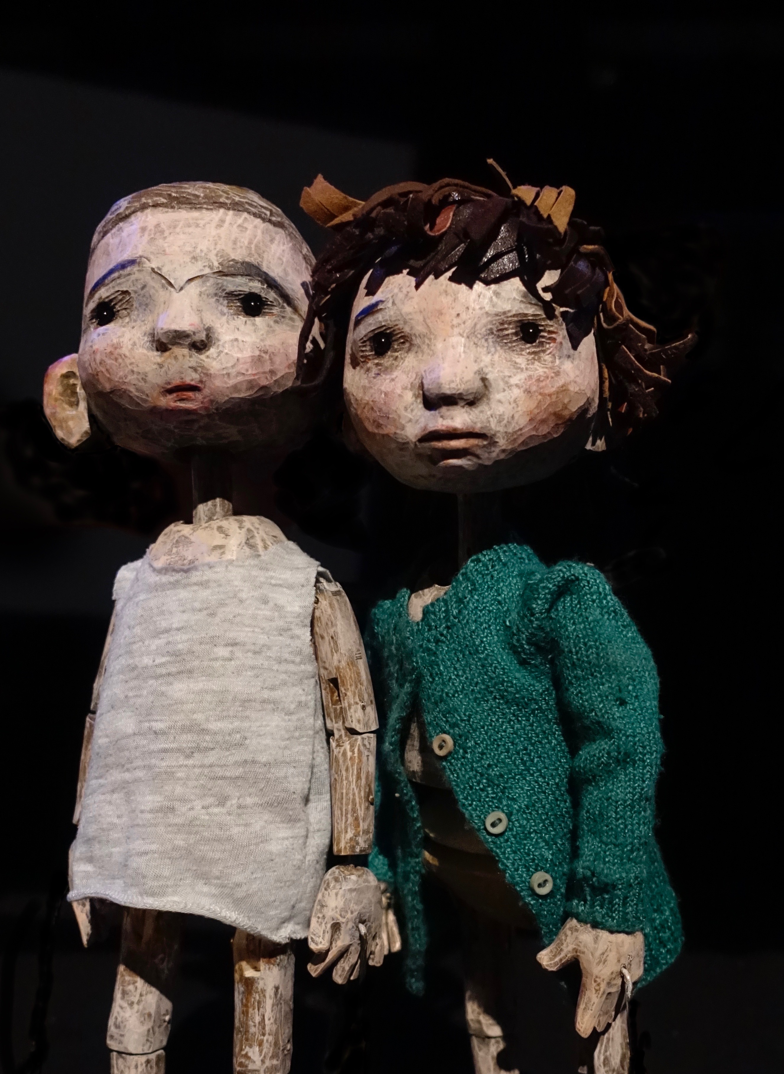
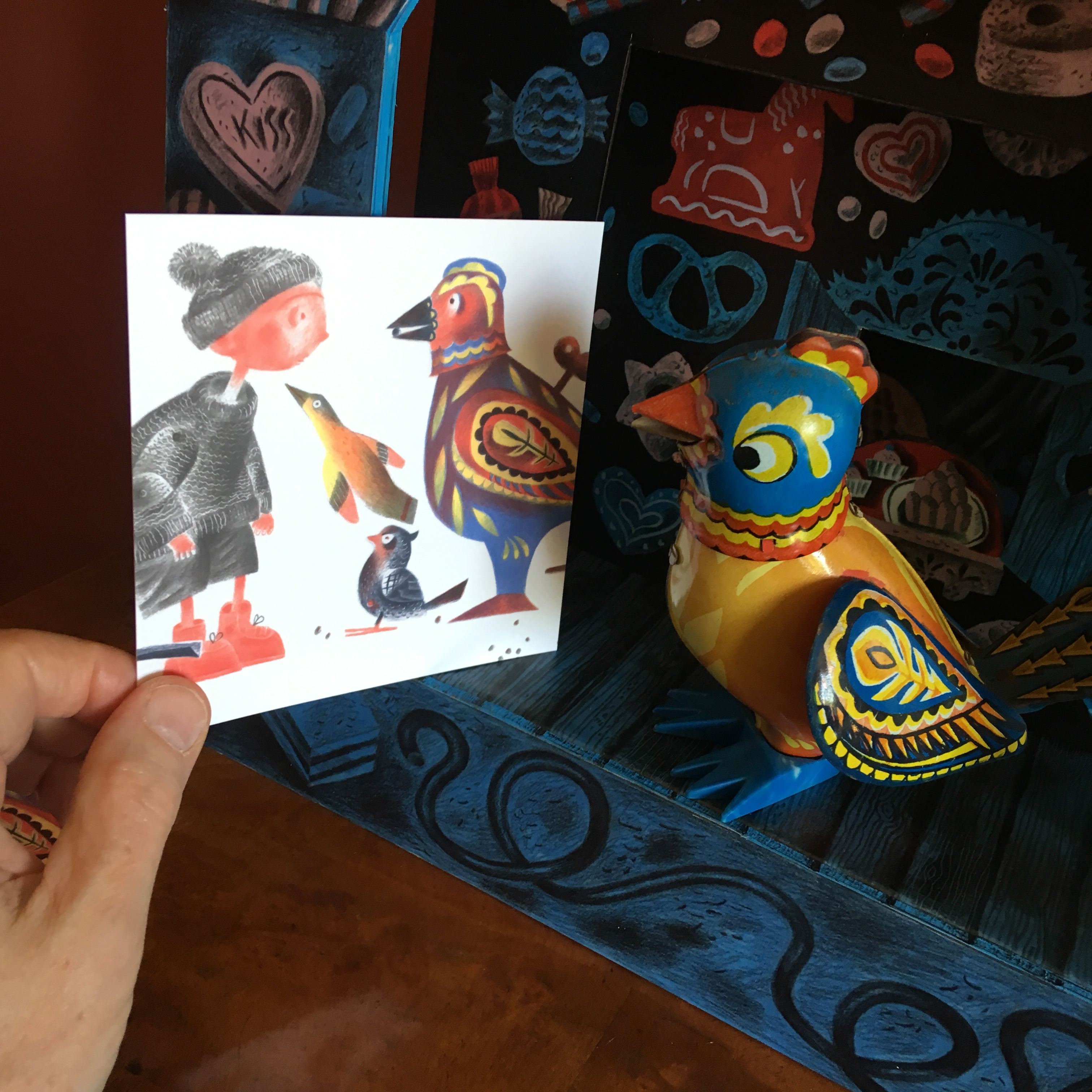
Catriona began this trajectory for me. Poets are my tribe, and I began to learn the art of making images to accompany words, with her. In my head I still share my projects with Catriona, talking things over with her and trying out ideas. Still we communicate, in the strange way that the living do with the dead when imagining the conversations that might have been were they still with us. Gifts she gave us are all around, in daily use. The narrow-loom Welsh blanket that’s getting so threadbare it’ll soon be more darn than weave, and the beautiful faience plate she’d thought to be English Delft but turned out to be Dutch. There’s the French slipware jug I’d spotted in a closed antique shop in Montrose that she and Ian went back and purchased for me as a surprise gift. I painted it in 2001, titling it ‘Catriona’s Jug’. In the background the tower of Tretower Castle, where I’d worked as a relief custodian in the interim years between the theatre and painting, where books of poetry were my companions in the long winter months of few visitors. There are the pieces of furniture Catriona and Ian brought to us, and on our shelves the countless books. I still smile when I look at the huge Nick Evans painting of a Welsh sin-eater offered at auction, which I badly wanted but had been unable to persuade Peter we should have because he wanted a Nick Evans mining painting. Without a word Catriona purchased it and then came to us with the bill, airily declaring she knew we’d love it and so just went ahead and bid on our behalf. No outraged glare from Peter could dampen her gleefulness over outwitting him, and her sideways glances warned me off admitting my part in the conspiracy when she was having so much fun. It was our secret until she died, at which point I confessed. I think he’s forgiven us!
My dear, dear friend, I miss you still. Every day.

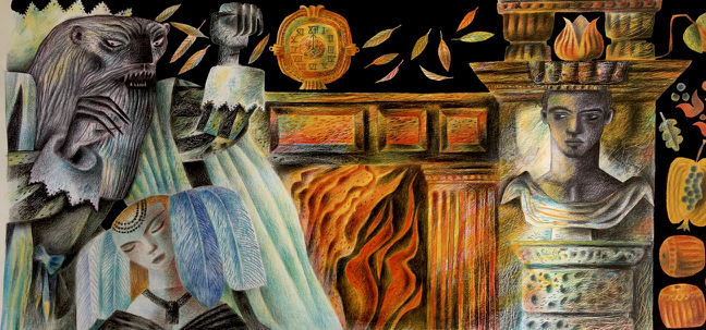
Above: Catriona’s Jug
.