Facebook messaging between Nick Yarr and me, 14/01/17
Nick Yarr
Exchange safely accomplished – I’m digesting the design – it is very intricate. I can’t believe my arm is that size flattened out – deceiving! The next stage will be getting my tattoo artist on board, and getting the design scanned. Any input as to where to look re scanning will be gratefully recieved! Thanks again, Clive.
Clive Hicks-Jenkins
It’s an interesting perception, the size of the arm, as I thought it looked rather small when the ‘wrap’ was flattened out to make a pattern. I was a little worried that it had shrunk over time. However, when I taped it around my own arm it was a reasonable fit. Neither of us are what might be called beefy, and so I’m guessing in terms of skin surface, our arms are similar.

This will be the first tattoo of the Skin project, and so I’ve no idea what the response of an ‘ink artist’ will be. There are a lot out there now who are both designers and inkers, and some of the star practitioners may well consider inking only their own designs. However I guess it’s the nature of of tattooing to be often transferring a specific design or image that the client wants. For this design, we need first rate copying skills married to the sense of interpretation that’s bound to be a part of the process of making a good transference from pencil drawing to inked skin. It’ll take a lot of subtlety.

Nick Yarr
Any thoughts on the scanning and where to start? I like the shading and three dimensional effect it gives. I like the flow and intricacy of the design, though the blue is something I’m becoming accustomed to!
Clive Hicks-Jenkins
Hansel & Gretel was scanned by Saxon Digital Services in Norwich. I think they did a magnificent job, which then transferred to the printing of the book. You can see all the fine etched lines in the printed illustrations which I’d worried wouldn’t reproduce well. I couldn’t have been happier with the result.
Regarding the blue. Throughout the design process I took images and digitally removed the colour, so I could check out how everything would look without the blue. The blue translates to a smoky shadow and you get a good sense of what the design would look like if you elected to go that way. Personally I like the blue, but the choice is there for you to forego it. Or if my blue is a tad bright for you, it could be pulled back to a more muted one.

Nick Yarr
Thanks Clive. I like the monochrome and the blue. I’ll give it some thought. I like the design very much. It’s what I was hoping for, but more extensive, if that’s the word, and extensive in a good way. Remind me of the reason for getting a digital translation. (This is a whole new world for a doctor – lol)
Clive Hicks-Jenkins
A detailed digital image might make it easier to download and show any ink artist what you you want to have put onto your arm. A good photograph or series of photographs might do initially, but at some point whoever you select will need to see a scale version or the original, given that it was designed to fit your arm.
Nick Yarr
I see – so I could also then translate the digital version onto paper so they had a full scale design to work with.
Clive Hicks-Jenkins
Exactly. Also, should you decide to go with a monochrome version, you can give the ink artist a scale image with the blue turned to tonal.
I recall in our original discussions, alone among all the participants you wanted something that was more pattern-like. More about mark-making. I remember being a bit daunted by your brief, because I’m essentially a narrative painter. But interestingly the past years have seen me working more frequently with patterns. They’ve always been there, in the flowery fields of the ‘saints’ paintings (Saints Kevin, Hervé and George) and in the rich diapering of textiles and backgrounds.
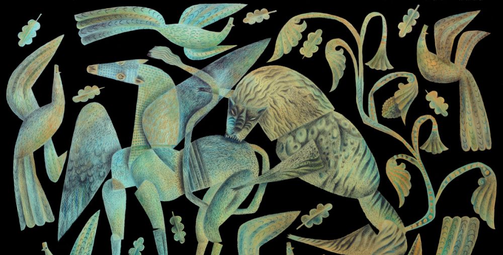
But now, in the Gawain series, they’re increasing foregrounded and given compositional weight to bear. In this gouache and pencil study for the print of The Green Knight’s Head Lives, the patterning of the horse’s caparison and the Knight’s tattoos, cover a good three quarters of the image, knitting it together and conveying the world in which the character lives.

So gradually I’ve became confident about what I could produce for you. (I am super aware that this is for life.) Had I been designing a tattoo for myself, it would have been the one I’ve made for you. I loved the idea of translating all the traditions of elaborate British historic embroidery and adornment into a tattoo. Your foliate design would serve just as well for the embroidery of an Elizabethan sleeve or doublet, as for a tattoo.

I want to take a tattoo tradition that’s been rather hijacked by tribal patterning, and make something elaborate and quintessentially British. Transposing what might once have been the embroidery of a sleeve, directly onto skin, feels rooted visually in the decorative traditions of these islands, while being married to the more subversive, modern expression of body modification. I love the idea of a reversal of what once was. The Elizabethan courtier wore his decorated splendour as an outer suit that could be peeled away to reveal the undecorated body. Now the dark suited business man can peel away his sober outer layer to reveal the foliate glories of his tattooed skin.

I think it’s drop dead sexy, this kind of male surrendering to beauty. Like a buck with a pearl earring. I don’t know how many people will get to see your tattoo, but I think it could be a gorgeous surprise, just poking out from under the cuff of a white shirt and skinny-smart three-piece suit. Hey ho Silver!!!

Nick Yarr
I agree that tattoos are sexy. Moreover this design is very different to the many tattoos I’ve seen, and that’s a very good thing! I think that finding an artist I’m happy to trust to do justice to your work will be the next challenge. I’ve a few in mind – so I’ll keep you posted! Thanks once more for the time and trouble you’ve taken. It is very much appreciated.
Clive Hicks-Jenkins
You might explain at some point that this a part of an ongoing art project. That might have an appeal for an ink artist who was interested in the profile generated by the project.
…

I’m not really into tattoos – I’m not a fan for practical reasons. Skin changes with age and the design will inevitably get tired without, at the moment anyway, any means to spruce it up, and frankly because, in our climate anyway, it mostly remains hidden. Which is a shame because all of your ‘textile’/surface designs are too good to be kept closeted under boring clothes.
You reference the glorious textiles sported by Elizabethan/Stewart gentlemen so I, for one, am rather hoping that somewhere out there a fabric manufacturer is up for a bit of a joint venture with you. Failing that, with digital printing available now, you could commission a short print run and find a dress maker to make an selection of beautiful HJ shirts. Laura Kemshall in Staffordshire has a printing sideline and then of course St Judes does fabrics too ( mega very big hint!)
Best wishes – Hilary xx
Yes, it’s a fact, Hilary, bodies and tattoos age. However, the overwhelming popularity of inked skin is a phenomenon impossible to ignore, and as artist I’m fascinated by the expressive possibilities of the form. At its best, the modification can be beautiful.
The Skin project goes back quite a few years, but it got put off because of the logistical problems of timing the outcomes for an exhibition. However Nick never stopped enquiring about what he and I had discussed by way of a design, and when it became clear that he really wanted his first inking to go ahead, we decided between us to proceed.
Interestingly, since I’ve been posting about Nick’s ink, some of the other original collaborators have stepped forward suggesting we pick up the threads of the project. I think it very likely that’s what I’ll do, though this time I’ll delay any arrangements for an exhibition until I have enough material to show. The original plan was for six to eight participants to brief me on what they wanted by way of ‘skin art’. I would then design to their briefs and produce images for approval, at which point the participants could proceed with, or step back from the project. Later, the exhibition would show the sketches and completed designs, photographs of the inkings in progress and painted portraits of the participants with their completed inkings. The exhibition text would comprise of the participants responses to the inkings in progress and when finished. It will be interesting to see the evolutionary process of Nick’s ink, from design to skin, and his experience will point the way for how the larger project might develop.
Regarding your suggestion, one thing is certain. I don’t have the time to design, produce and market either textile designs or a clothing line. Ha ha. Nice try, Hilary!
My picture book of Hansel & Gretel was produced by Random Spectacular, the publishing imprint of St Jude’s, and so if you’d really like to see an H-J textile design, you might express that interest where it’ll do the most good. Just saying. (-;
PS. I did work out a variation on the design that would interlock as a repeat in the way that would be necessary for a textile or wallpaper, and so there must have been some little seed of an idea in my head!
Ah ha – from little acorns etc. etc. And yes I’ve been following the adventures of Hansel and Gretel and was rather hoping Simon Lewin might drop be your blog and see my post. Sneaky of me?
What an awesome idea!! Clive has come up with several patterned designs over the years that would make an incredible line…
Oh!….’male surrendering to beauty’…. the perfect phrase (for me) for the inter male/female meeting of minds/bodies…..the total harmonious meeting together of opposites…the male ear sporting the pearl earring! I’m also reminded of work I did many years ago with young children looking at how clothes were put together – we ‘dissected’ a suit of male clothes…..looked at the bizarre shapes revealed, then made drawings/paintings of the results. I remember in detail how strange we all found the shape of the sleeve…..surely not the shape that covers our arms?? But, yes!…..exactly what this post describes! All power to the arm of the ink artist!
I think you and share similar views of beauty, Shellie, and of all the tantalising creative possibilities to be explored therein.
I’m knocked out by this design, what an awesome start to the Skin project. There’s some great contemporary tattoo art out there, but a great deal of it looks inspired by traditional styles or street or urban art. Thats not a bad thing but this design is something really exciting and new, it’s going to look absolutely amazing when it’s inked!
It’ll be interesting to watch it in progress, Phil. Nick is hugely enthusiastic. It’s really been all down to him that the project isn’t dead in the water. He’s always believed in it and has never stopped asking for the design. Ha ha! I had to make it or I would never have heard the end of it from him. If Skin ever goes anywhere, it’ll be because of his tenacity.
Actually, while not a fan of skin art ( see my comment above) you make a good point Phil. This would be a new look for skin art and definitely not your average biker design.
I’m hanging on for the “Cloth” project though. Poor Clive – am I nagging him?
Haha, poor Clive, we’ll have to clone him 😉
What a fantastic pattern!!! This is really perfectly balanced, such lovely pieces– there’s so much to reward study, which is not usually the case (as far as I’ve seen anyway) for patterned tattoos. Usually, you grasp the pattern at one glance, and it’s over. I love both the blue and the gray version, too, and that’s interesting!
Congratulations!! I can’t wait to see a photo of it on his arm?
Also, you had made a bear maquette for another tattoo, one I really was blown away by– whatever happened there?
The project stalled when the logistics became so complicated. The ink artists had schedules, the participants had schedules and I had schedules. Galleries have schedules too, and I just balked at aligning them all. The paperwork and organisation alone, without making the art, became a full time job. I lost momentum and then other projects stepped into the gap.
I still believe in the idea, and Nick’s commitment may well kick start the larger project into life again. But it would help were there to be support from a gallery or curator to pick up on the logistic elements that a full exhibition would entail. I can’t produce the work when I’m forever trying to align other people’s dates and diaries. We’ll see where this one goes.
I don’t think i will ever be brave enough to have a tattoo but I have enjoyed following the progress so far and look forward to seeing the finished skin work. Any chance of Nick getting some filming done of the process now he has the design. Together with an interview with you Clive it could make an interesting documentary.
Jacqui, one of the attractions of this project is its collaborative nature. The possibilities and opportunities for recording the processes of it are legion. I was particularly impressed by the way the original participants expressed their ideas on what they wanted and why. They gave me masses of material.