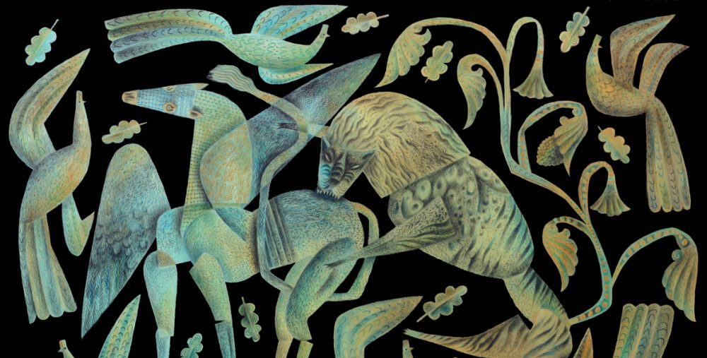
Here are the last images I have to offer in preparation for Marly’s book cover. In total there are now six coloured foliate heads, out of which of course only one can be selected. I find it impossible to effectively explore the full range of possibilities without making a whole body of work, though I’m sure the extra effort on this project will feed into others and so the time will have been well spent. Now Marly must make a choice of her favourite image, and Artlog visitors are welcome to have their say too.

…

…

…

The Queen of the Isles of Luck and Indecision is trembling in her boots…
What a marvelous difficulty, Clive!
Rebecca’s favorite for colors and cohesiveness of lots of elements is no. 3 here–she says it feels a little more complex, and she loves the eye. Second favorite was the red “gaping maw” one with pollarded tree-speech–I remember she really liked the structure of that one.
Meanwhile I am of course thinking of all the places in a book where you could put headsheadsheads!
You are no doubt snoozing at this instant, your head full of dream leaves…
I think the complexity of the ‘gold’ guy is what ultimately legislates against him. In this instance simplest will be best.
I did in fact have a dream-strewn night, and none of them featuring leaves!
These are ALL utterly fabulous!
That’s kind of you to say Nick, though I think that a couple of them are the front-runners.
I adore them all too. The second I love for its contrast and ferocity, and the third for its soft creative breath, pure magick!
They’ve been fun to do, though it has to be said that I could have filled a thick sketch book with foliate heads but for the time it would have taken.
Paul, as an artist who also illustrates, I wonder whether you have a trick of discipline when it comes to how long you allow yourself to work on a commission. I think in your shoes I’d be in a perpetual state of indecision and lateness!
Wow, I envy Marly for having such a wealth of beauty to choose from; I do not envy actually having to make such a Solomonic decision.
She may not thank me for giving her too much choice!
I almost envy myself! (And Leonard, I noodled around your blog and enjoyed looking at your paintings and the decorative work. And what a plenty of little doggies, too…)
Wow. This has definitely been time well spent!
Glad you thinks so Thom.
Dear Clive,
I almost hear you struggling and I really admire your vulnerability, showing all your sketches and asking for advice. I am a little embarrassed to give it, but on the other hand, anxious to do so for I like giving my opinion and love to hear why it could work or why not. And again I feel humble giving advice to the master. Enough!
I tend to favor the heads with teeth. I think they are more powerful. Silently screaming. The ones without the teeth smoke; rosebranches or dragons.
Green represents poison, red is anger and blue says…get ready for my explosion. Oh, I don’t know. Head with teeth, tattoed and curly branches coming from the mouth. That’s what I should aim for…I think.
Good luck,
Mathijs
Mathijs, I’m touched by your comment. However the reality is not one of struggling or feeling vulnerable, but rather that I enjoy the opportunities afforded on the Artlog to elicit responses and enjoy the diverse opinions of the commentators. My work is solitary, and the Artlog makes it less so. At the end of a long day I post images of what’s been achieved, and it’s so heartening thereafter to hear from the regular blog visitors who have become such valued friends. When I started the Artlog over two years ago I had no idea that such a thing would happen. It’s all been the most wonderful surprise to me. My thanks to all of you.
I agree with you about the teeth. I also very much like your unique take on the colours I’ve used in the images and what they suggest to you. Beautifully expressed my friend!
this place is a treasure chest!!
thank *you*!
i wanted to ask, are these greens bluer than the previous ones, or is that the light?
I’ll re-photograph them tomorrow in daylight Zoe and re-post. You’ll get a clearer idea of the colours then. The inks are acrylics.
I guess I like Part 3 and the first one in Part 2 the best — so I guess the first two of the six — though of course I don’t know which one would be the best fit with the contents of the book.
these are the best! only one? it’s criminal!
😀
my favorite is the middle one, although i may come back in 10 minutes to say something different 😀 they all have great impact, so it’s very difficult, but the expression of the middle one, and its angles and shadows, are exceptional.
what a wonderful collection you have created!