
…
Dear Beth
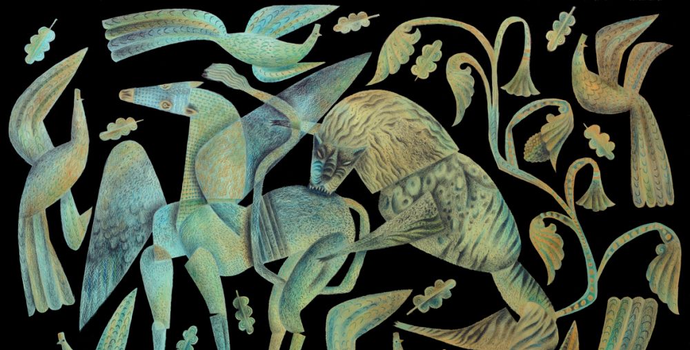
The decorations have become increasingly formalised in the idiom of the folk tradition. The more I read Thaliad the more I realise I shouldn’t go head to head with Marly when the drama gets gothic, or between us we’d be tearing the readers apart. (I found the same when I illustrated Peter Shaffer’s Equus for the Old Stile Press.) So I continue to boil down to an essential iconography that appears to be decorative in the most traditional manner, though comes with the barbs and stings that one might expect in a post-modern reinvention. Today I’m attempting to render the aftermath of a blood-letting in a way that gives a frisson while still flirting with the formally decorative. Saul Bass’s title graphics for Anatomy of a Murder spring to mind.
…

…

Knew you were drawn to that part, and it is so interesting to see what you make of it–that stylized connection/disconnection. I think this folkart-like mode brings out the idea of “twinning” that is literal in the case of the twins but exists elsewhere in the poem in a metaphorical way.
Good. I’m glad you think that.
For me Thaliad is so vivid in its creation of a completely plausible world, and so rich in language, that I felt anything getting too close to descriptive by way of decoration would be a mistake. I see it as my job to provide a visual mood, and the idiom of folk-art seems to be just the thing.
Completely plausible: good! You have been so involved with scripts and books of all sorts that you are adept at finding those special idioms. Also good!
i am constantly amazed, here…. fantastic how you take your style to everything!
I’m getting better at that, Zoe. At one time I didn’t know how to make any commission fit comfortably with my own ‘style’, but increasingly I seem able to negotiate that tricky territory.