
…
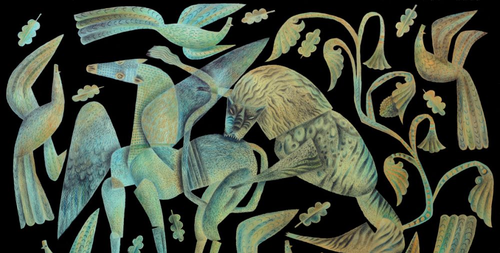
Over at Phoenicia Publishing, Elizabeth Adams is putting together a first draft of Thaliad incorporating my decorations. An exciting time. Please excuse the posting of images at a small scale, but they’re just printouts from my scanner and lack detail. When the work has been completed and published, then I’ll post some page openings at a more satisfying scale.
…

…

…

…

…

So wonderful to watch this three way collaboration take place. I can hardly wait for this, especially as Beth is also a dear friend whom I have met on a trip to Montreal once.
Thank you so much, Marja-Leena! New pages forthcoming, Clive — I’ve just finished the first-round proof..
Beth posted this: http://www.phoeniciapublishing.com/1/post/2012/06/a-peek-inside-the-world-of-thaliad.html#comments
That little vignette of the coastal scene is an absolute gem, what a gorgeous collaboration, can’t wait to get a copy when it’s out. I also like the title pages as it is, the lettering and the artwork complement each other nicely I think
It is going to be a very elegant volume. From what you have described of Marly Youman’s work, your art seems very sympathetic to the printed word. I’m sure both of you are as pleased as you ought to be.
I think Marly and I are well-paired, inasmuch as we love each others work and enjoy collaborating. The trust that comes from such a relationship is, I think, quite unusual between a writer and an illustrator.
And very dear! Of course, we knew each other via a period of intense letter-writing and sharing of work well before we ever collaborated on anything, and that’s probably a key element.
Clive,
Beth and Jonathan stopped by on their way back to Montreal, and I bought a Phoenicia hardcover (all the others I have are paperback) and have looked it over–I think ours is going to be fine! Though there are certain constraints with the printer (as, no matt jackets), I think that our book will be lovely.
I think I knew they hoped to see you again soon.
I’m sure Thaliad is in safe hands with Beth. She’s a most thoughtful book designer and publisher.
Oh, yes, definitely! I just had never seen what the hardcovers looked like–very interesting.
Very elegant Clive. I was a bit rushed to comment yesterday but I loved the miniature scene with the foliate edging.
Forgot to say, when we click on your images they come up larger so they are not too small to see.
Thank you Jacqui. I was pleased with that one. It came fast too, snipped and assembled in a couple of hours. Sometimes you just strike lucky and get a following wind.
Yes, the images come up a little bigger when clicked on. The intention is just to give a glimpse of how handsomely Beth is incorporating them into the text. When the book returns from the printer in the autumn, I’ll be able to make a better job of giving an impression of it at the Artlog.
it’s beautiful! congratulations to both of you 🙂
Thanks, Zoe! And to Beth Adams, grand high ruler of Phoenicia Publishing in Montreal… Clive, I hadn’t yet seen the title page with combined image and lettering. It does look lovely, doesn’t it? As did the .pdf pages, trala!
Beth had been wondering whether we needed hand-cut lettering for the title-page, as I did for the cover, but slightly more aligned because of the formality of the layout. But looking at what she’s done I rather like it the way it is. The font is elegant within the free-hand foliate frame, and I find that very appealing.
Yes, I like it too–there’s the sort of interesting contrast you see in old samplers between borders or images and letters, which tended to be much narrower and more clean-lined.
Thank you Zoe. All inspiration comes from the peerless Marly, and so she must have her due for firing us up to make a beautiful book.