
…
Elizabeth Adams to Clive Hicks-Jenkins: 15 June 2012 15:52:42 GMT+01:00
…
‘Dear Clive, Thaliad will be 6 inches wide by 9 inches high. I haven’t decided yet if we’ll do a hardcover edition as well; I’d like to. The one I did for Dick Jones’ Ancient Lights worked out well, and since this will be a special book — and is, after all, an epic in the long litrary and cultural tradition– collectors might be willing to spring for the hardcover. In that case there will be a jacket with end-flaps, but there’s no possibility within this printing method of doing anything with the endpapers themselves. However, there could be a decoration on the first page, or even an allover pattern if some aspect of your artwork lends itself to that. We don’t need to worry about that at this point, it’s just something to keep in the back of our minds.
Thank you so much for sending the pdf of The Foliate Head. It’s even more gorgeous than I had imagined, and I can’t wait to hold a copy in my hands and see those lovely pages on paper. The typography is very beautiful, and the “heads” are fabulous – each breathes with its own internal energy and spirit. It’s going to be a glorious book.
I’m mailing cheques today, including yours.’
…

…
Clive Hicks-Jenkins to Elizabeth Adams: 16 June 2012 13:19:58 GMT+01:00
…
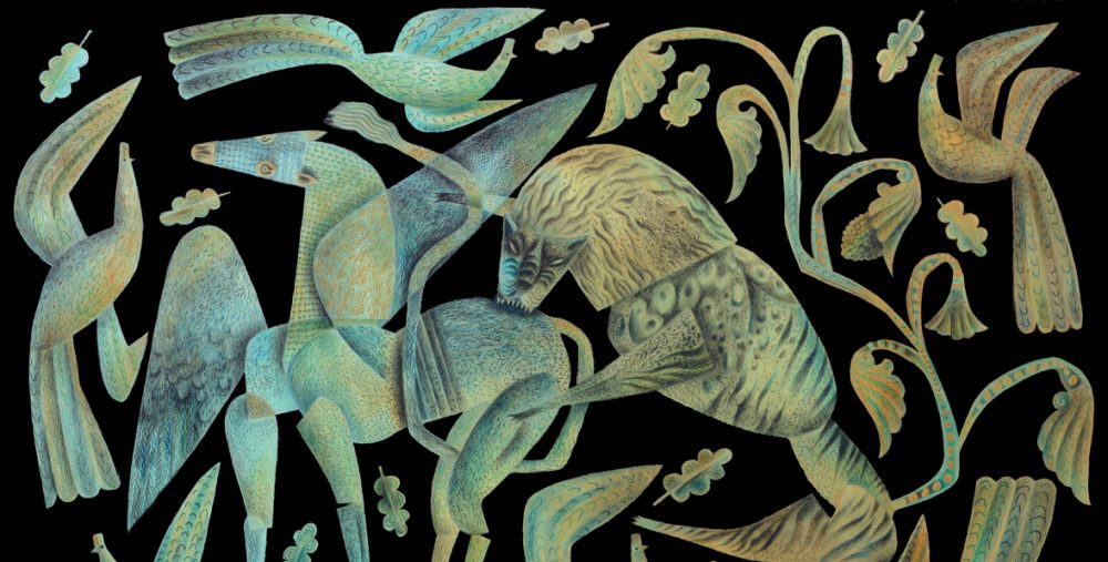
‘The cover for Thaliad is well underway. For a couple of days I made drawings that pursued the fatal fight between Samuel and Ran, because it was the episode that most caught at my imagination in graphic terms. Striking, though I was uneasy that it was rather too male and tough. But then suddenly the sense of nature and of knowledge learned and stored that’s at the heart of Thaliad gripped my imagination, and the cover image became something far more life-affirming and mystical. It is a portrait of Thalia, but not as you might imagine!!! More to do with inner worlds than outer ones.


…
Clive to Beth and Marly: 20 June 2012 08:24:54 GMT+01:00
…
‘Beth, Marly, there’s an image of the final paste-up on the Artlog today, though I plan on re-making the Y of Youmans to be a little ‘brighter’. Peter will photograph the artwork under proper lights when he returns tomorrow evening. This has all gone relatively smoothly, hasn’t it? Nothing like the clock ticking to concentrate the mind.
A good time to thank you both for passing this my way. It’s not often these days that artists get the opportunity to make the type of hand-crafted imagery for covers that I so enjoy producing. Photographs and photo-shop seem to have taken over at the big publishing houses, and to my eye the results are too often characterless. I guess I’m a dinosaur here, one of the old brigade.
The back cover artwork will follow later today. Quite simple, with plenty of room for blurb etc.’
…

…
Comment from Beth at the Artlog: 19 June 2012 15:17:14 GMT+01:00
…
‘Clive, we will do our best to make sure the book is indeed beautiful to look at, and does justice to this wonderful artwork. I too despaired of what to put on the cover, because the poem covers such a span of time and change. I had hoped you might settle on a portrait of Thalia, but didn’t suggest it — isn’t it odd how things work out? One of the aspects of the illustration I love the most, and was surprised by this morning, were those bright red lips. For me, they connect with the fruits– for Thalia represents life, and growth: sustenance received and sustenance given — but she also grows from girl to woman. Clive, it’s perfect, thank you so very much!’
…

…
Thaliad is available as a paperback or hardback, and may be purchased from the following sites.
Order from the Phoenicia Publishing online store
Order from Amazon.com
Order from Amazon.UK
Order from Amazon Europe

Aha I couldn’t put my finger on what is was and why I liked this vibrant front cover but after reading this I now realise why the artwork resonates with me. My sofas have the pattern of early crewel work and I have been very much at home with them for 20 years so no wonder Thalia appeals. Makes me look at my home again with new eyes and appreciate the things I take for granted just because they have been there a long time. I will photograph so you will see what I mean. It’s always interesting to see how work comes together and it has been a pleasure as usual to see and hear you working on Thaliad. The book attracted quite a bit of interest at school today as I was reading it at lunch time in the staff room.
wow, it’s fascinating how the ideas came together…the image really seems to be a distillation of the tale, and i see the vine traveling up as the path, the journey itself, which of course occurs within *and* without…
such a beautiful creation!
Thanks for lifting the curtain on the genesis and development of this wonderful cover Clive, it’s fascinating to read about how it came to be, about your early ideas for the colour scheme and your approach to the piece, such posts are what the blogosphere was made for I think. This is also a great snapshot of how a successful collaboration can be and how people can work together. I’m so looking forward to receiving my copy of Thaliad which should be on it’s journey to my doorstep right now