
The English Lion: interior decoration for Marly Youmans’ novel Glimmerglass, due from Mercer University Press in September
…
Images of my paintings, or details from them, have been chosen for the covers of quite a few poetry collections, novels, plays and textbooks. The usual process is for a publisher to approach me requesting the use of an existing image, and I just have to agree the terms. There’s no creative input on my part because the work is carried out by graphic designers. But while Marly’s The Throne of Psyche (Mercer University Press) carried a detail from one of my paintings, Touch, on its cover, the arrangement wasn’t repeated because thereafter we evolved more collaborative methods of working together.
…

…
To date I’ve made covers for Marly’s novel Val/Orson (PS Publishing), the cover and interior decorations for The Foliate Head (Stanza Poetry), the cover and decorations for her epic poem Thaliad (Phoenicia Publishing) and the cover and decorations for her forthcoming novel Glimmerglass (Mercer University Press). In every respect these have been collaborations, as what I do is always a direct response to her writing. I read her manuscripts repeatedly before making any preliminary sketches, annotating their margins with my initial ideas. Marly and I don’t much discuss what will be required for a cover or for the decorations. She and her publishers entrust the visual aspects of her books to me. I think she quite enjoys the surprises that come through this way of working.
…

Above: artwork for the back cover of The Foliate Head
…
I never aspire to ‘illustrate’ a Marly Youmans book, preferring my role as provider of a gentle accompaniment to her words. I make an introduction (the cover) and then she sings the melody while I play a few chords in the background (the page decorations).
…

…
It’s not the usual way for a writer to have much influence with a publisher over the choice of artist for a cover, and it’s perhaps because Marly elects to work with small, specialist houses, that she’s been able to bring me into the loop. At Stanza Poetry she even arranged for my brother-in-law, Andrew, to be the designer of The Foliate Head, because he and I are so in harmony in the matter of book design.
For Thaliad, the book was meticulously designed by the founder and editor of Phoenicia Publishing, Beth Adams, which made the entire process bespoke, rather than on the design conveyor-belt that is the modus operandi of most big publishing houses.
…

…
Increasingly I like to produce not just the image for the cover, but the whole spread with the text incorporated into it. I love the art of lettering, and usually work the titles and authors through the medium of collage. And because adding images to the inside of a book doesn’t add printing costs as long as the designs are in black, Marly and I have been able to persuade publishers to have page decorations in her books.
…

Above: chapter-heading for Thaliad
…
The brutal economics of publishing these days means that there is rarely an illustration fee with a small specialist publishing house. So instead I strike a deal for copies of the book. At the end of the day I own the original artworks, and they can be offered for sale with my dealer. I couldn’t make a living as a book illustrator if this was my only source of income, but as the process of collaborating with Marly is tangental to my career as a painter, I don’t have to rely on it.
I don’t think we ever set out to work together so regularly, this author and her ‘illuminator’. The processes gently evolved, and now there’s a familiarity to them that feels comfortable and ongoing. Marly barely approaches me any more with the outright suggestion that I might do a book with her. It’s more a case of her asking ‘Are you busy?’, followed by ‘Could you possibly make the time?’ And my response is invariably, ‘What’s the deadline?’, followed by ‘Ummmmmm, is there any wriggle-room?’
…

Above: cover artwork for Glimmerglass in progress
…
I’m strictly hands-on. I paint, draw and collage my designs together, having had no experience of rendering on a computer.
…

Above: work-book sketches for Glimmerglass
…
It’s not that I’d be averse to working on a screen, but I haven’t had the time to teach myself. I’d probably prefer to combine both ways of working, as I don’t like the idea of spending more time in front of a keyboard than I already do.
…

Above: a dragon for the cover of Glimmerglass
…
Marly and I had collaborations that preceded our work together on the three ‘decorated’ books. In 2011 it was Marly’s suite of poems celebrating my sixtieth birthday retrospective exhibition that kick-started the anthology The Book of Ystwyth: six poets on the art of Clive Hicks-Jenkins (Grey Mare Press/Carolina Wren Press/National Library of Wales), in which she was joined by Dave Bonta, Callum James, Andrea Selch, Catriona Urquhart and Damian Walford Davies. (The title of her poetry sequence loaned itself to the collection.) Additionally in 2011 she was a contributor to Clive Hicks-Jenkins: a monograph, published by Lund Humphries, with her essay Fire in the Labyrinth exploring my preoccupation with the ‘miraculous’.
…

…
There are other projects in the pipeline. I already have an anthology of her poems waiting on my computer desktop, and I have my eye on her forthcoming novel Maze of Blood, because who wouldn’t want to design a book with a title like that?
…


Pingback: menageries and twindom | Clive Hicks-Jenkins' Artlog:
Doh! I’ve been trying – and failing – to draw a lion’s head over the last few days and then up pops one perfectly formed on the Artlog. Thanks Clive, you’ve shown me how I was being too fiddly. The lettering is looking great as well, the colour is amazing. What a superb collection of work, it could be an exhibition all on it’s own
>
‘being too fiddly’ is what usually trips me up whenever embarking on a new subject. The fact is, Phil, that you need to work through all the wrong turns taken, and endure the subsequent cock-ups, before getting to the place where everything becomes simple and clear. I made loads of lion drawings when I was making that decorated plate you might recall seeing at Penparc Cottage quite a while back, and the lessons learned on it meant that I could just dive straight in when I noticed the reference in Marly’s text to an ‘English Lion’ in relief plaster on a ceiling.
Simplifying is always the goal whenever I begin new ideas, but the process takes time, and it can be disheartening when things go pear-shaped. Keep at it and it will come.
Bear in mind the process it takes for me to get to a painting
a) make life studies with a model in the studio
b) make a maquette
c) play with the maquette and develop it
d) make masses of thumbnail sketches of the maquette
e) make worked-up studies based on the thumbnails
f) make the composition. At last the painting can begin
See? Not fast!
This is why once I’ve figured out how to do something, I stick at it for a long time, working in series.
Glad that the little lion gave you a short-cut. (Or at least pointed the way to one.)
BIG TIP
Draw freely, and never stop looking at:
Children’s Art
Outsider Art
The Art of the Insane (The Prinzhorn Collection)
Historic Folk Art
Series… I also think you are gripped by story fever, so different angles and incidents keep appearing!
Yes, you’re bang-on there, Marly. I have ‘story fever’!
Dear Clive, thank you so much for your encouraging words, heartening peek into your own process and for your advice, always so generously given. Your words help and encourage enormously, as does looking at your work in these posts, your’re such an inspiration mister x
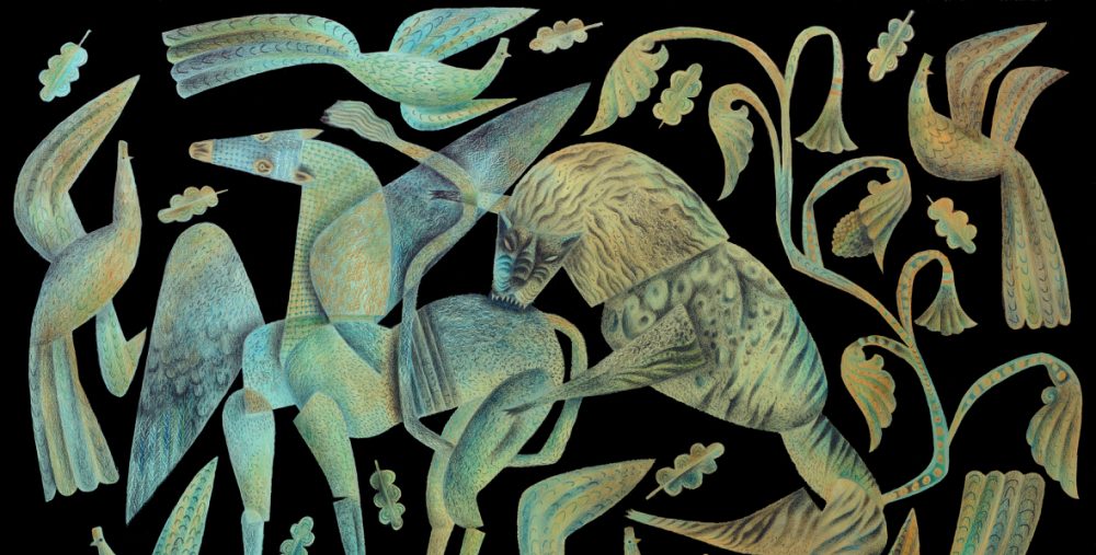
I think your collaborations are the Fred and Ginger of art/literary works! My favourite black and white vignettes so far are the horse you picture here and Noah’s Ark.
Well that’s an elegant observation. I think Marly and I would be very happy to be up there with Fred and Ginge!
Yes. Dancing in words and pictures . . . good! I’d never dare more with a fellow who started out in ballet school!
Wonderful to revisit these collaborations! How well your visuals work with Marly’s words, and vice versa – kindred spirits that you are. Looking forward to the upcoming books!
It feels kindred, Marja-Leena, in the sense that conscious thinking stops and intuition takes over. I always know that when I pick up a new text of Marly’s to read, I will never end up wondering… ‘Oh my! What will I do with this!’
mmmmm, i love that lion–you’ve made the best bestiary out of this book! it’s interesting to hear about the economics of it– publishing houses are upside-down. i think books should be a ‘total’ work of art. it’s not that this would be beneficial to my poor back, which hates my love of books, but i just think there’s something mesmerizing about the package, which can sort of act as a membrane you ‘pass through’ into the world of the book. as if looking at the book first can be a type of hypnosis or meditation.
I love that idea, Zoe, of the book-cover as a membrane through which the reader passes. Thank you. That makes all the effort taken, feel really worth-while.
I have a collection of paperback novels that while I love them, are titles that have never been graced with even half-way decent covers. Sometimes the covers are just so bad that I’ve had to jacket them to disguise the design horrors beneath. There are quite a few well-thumbed paperbacks on my shelves that have been re-covered in plain brown paper! Ha! Among the worst crimes, I would count anything embossed (I’m gagging here), and anything with ‘foil’!!! (Now I think I really am going to throw up!) Hanging offences!
Burt & Burt did “The Throne of Psyche” book design, which I thought quite elegant (it won a regional Addy award), so I’m looking forward to what they do with the images and “Glimmerglass.”
And thank you, Clive! (Also, hello to Liz! Wish we could rewind and do those days again. What a splendid time the retrospective was!) The vignettes are wonderful and so varied, as always…
The Throne of Psyche is very elegant indeed, and I was pleased for everyone concerned when the cover won an award.
Yes, that was a magical time, when you were all here at Ty Isaf in the Summer of 2011. Happy days.
Lovely to see all those illustrations again. I remember these well, because my introduction to them coincided with, firstly, Graham and I coming over to your retrospective and actually meeting the highly talented,and warmly amiable Marly. We also had a wonderful time meeting the other many friends you have made online and off, since our time in France. Secondly me signing up to be a (dedicated) follower of your artlog, around the time you were illustrating The Foliate Head. I do so enjoy getting glimpses of your workspace. To comment further, I particularly like the Val/Orson cover: so clever is the positioning of the heads. Bravo to all that you do!xxxL
I’d forgotten you and Graham had met Marly. Yes, she was in residence at Ty Isaf the week of the opening.
Glad you like the Val/Orson cover. It was my first for her, and I was on tenterhooks that she may not like it, or the publisher wouldn’t approve. Luckily everything went well. (Big sigh of relief!)
Thank you for being so supportive of the Artlog, Liz. It makes a big difference to know that people enjoy it.
The black and white illustrations you have shown here were the first images I saw of yours during a Google search and I remember thinking how beautiful and unusual they were. It was good to read about the process in the earlier posts. The English Lion is exquisite.
I am wondering what size these images are if you have to use tweezers to construct them.
I’ve just measured him, and the lion is 13 cm wide, and about 17 cm high including his crown. I needed to work at a scale that would fit the desktop scanner for ease of sending electronically to the publisher.
Not all of the images required tweezers. The lion didn’t as he’s made of a very few pieces. But with some images the work is fiddly, when I’m dropping in an eye or a tiny leaf, and then things can very ugly. (The wreathed horse image for Thaliad drove me nearly insane. Those twigs and berries had me all fingers and thumbs!)
Thank you, Priya. I know you and I share a love of black and white. Your own black and white illustrations were what first caught my eye, as I thought they were so beautifully conceived and executed.