The Green Knight Speaks, while a great title for the fourth print in the Gawain series, doesn’t quite fit my image as it should. In the finished study for the work, the Green Knight’s lips remain firmly shut, and so the title must change. Right now I’m toying with several options, none of them yet quite there. Suggestions if you have them, please.
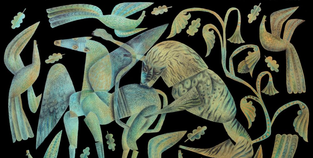
In the meantime work is underway on the stencils that will create the print. Each title in the series begins as a series of rough sketches in which I try out ideas. In this print, the Green Knight, having retrieved his decapitated head, holds it aloft to speak

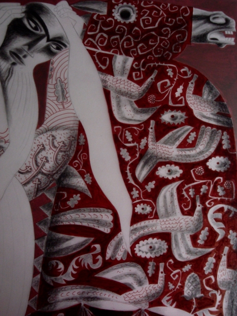
After the ideas have been hammered out in rough drawings, I make a fully rendered painting of what I propose for the print. The image below is a detail of the painting for this print, showing the embroidered caparison of his horse.

…
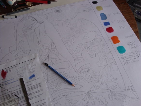
The next stage is to produce the ‘master-drawing’, the template that sits beneath the layers of transparent film on which I draw and paint to make the stencils. A master-drawing sometimes differs in detail from the painting, as it’s my opportunity to make any corrections to the composition.
Once the master-drawing is has been drafted, the stencil-making is a relatively straight-forward process of tracing and separating the elements of the image into layers according to colour. Here is a detail of the master-drawing that will underlie the drafting films to guide me through the business of making the stencils for this print.

I begin with the stencil that will print as black. In dark red opaque marker-pens which enable me to make the sharp outlines of the embroidered motifs, I trace the background of the textile on a sheet of transparent Truegrain laid over the master-drawing.

At the next stage I work with lithography crayon to soften and shadow the pattern, and then add a second stencil to print the green of the embroidered elements. A third adds the orange background.
I use two varieties of stencil. Trugrain has a granulated surface that produces interrupted colour and mark-making… a kind of glittering effect… while drafting film is smooth and can yield dense fields of colour and unbroken lines. The stencils are worked in tonal variations of red-oxide and black, using pens, crayons, pencils and paints. On each stencil I make a note of the layer of colour represented. As I assemble the layers of stencils, I have to imagine what the colours will look like when printed over each other. For this print there will be seven stencils: black, yellow, mid-blue, dark-blue, red, orange and turquoise-green.
…
…
The textile in this image is an invention in which I riff on traditions of Coptic and Romanesque embroideries. In the absence of any buildings or landscape in the background of the print to give it a location, the motifs of scattered talisman-like eyes, flying peacocks and scrolling tendrils bearing oak leaves and assorted fruits, fills one half of the composition with a sense of place and mystery. The Green Knight brings the wilderness into the halls of Camelot, through the decorations on his horse and the inking on his skin.
…

“The rest is silence”.
Love as ever
B xxx
Yes , l like that one xL
I think I shall have to ask for titles more often.
It’s from King Lear but of course the Story of King Leir (?) was older than Will Shakes’s days.
Going back to go forward?
Hugs
B xxx
Paul Jacobsthal writes on the Celtic cult of the head: “Amongst the Celts the human head was venerated above all else, since the head was to the Celt the soul, centre of the emotions as well as of life itself, a symbol of divinity and of the powers of the other-world.”
I think you have captured these echoes of an ancient religion perfectly in this image, so my suggestion for an alternative title would be “The Living Head”.
p.s. The textile is exquisite!!
The “coincidence” of this comment for various reasons, for me, is just too much– I second this title, what a perfect idea!
I like that title, Clive, you may have many titles for this image!
Good call, Sarah. Thank you.
I enjoyed inventing this textile. The peacocks were a bit of a surprise cross cultural reference, lending a sense of the greater world and fluid boundaries.
Maybe something about ‘the mute speaking’?’Blood-stifled mute’? Whatever, this is a fabulous piece of work…..press on with it, dear Clive!! xx
I have to say that this subject has worked its way into my dreams in ways I would rather it hadn’t, which is clearly a case of the subconscious at work. I had the most terrible nightmare in which I was decapitating lambs, sneaking up behind them with shears, and it was quite the most unnervingly visceral and detailed conjuring of what in reality I could never do! And this being a nightmare, they weren’t dead afterwards, and woefully rolled their eyes at me as I put their little heads on the Aga hot-plate to cook. This from the lifelong vegetarian! I awoke in a cold sweat and panic, and had to have a major hugging session with Jack to clear my head and re-establish order.
Absolutely fascinating Clive, what a feat! Although exciting it must be an exhausting process. I just love your attention to detail. The Green Head Listens?xxL
Oops I mean The Green Knight’s Head Listens!
It IS exhausting, Liz, in much part because the layered printing is new to me, and so I have to concentrate incredibly hard or I make errors. The worst ones occur when I forget which colour stencil I’m working on, and continue drawing/painting when I should be moving to the next one. Because of this I’ve taken to adding Post-it stickers to the stencils, bearing messages such as: ‘This is RED!’
Yes I know the problem, I continue to do it when working in Photoshop, I get so involved with setting down ideas I forget which layer I’m on, also it breaks the artistic flow when you have think about the mechanics, a lot of growling occurs. XxL
Respect! As a printmaker I appreciate how much work each screenprint is. A huge undertaking.
I find for me most of the work in this series lies in the preparation. Because of the narrative nature of the project I put a lot of time into building each composition and making a detailed colour study before starting out on the stencils. Once the master-drawing is in place, producing the stencils is all in the realm of mark-making and layering, and to a degree at that point I’m able to enter ‘the zone’, which is akin to driving at a fair lick along a clear, straight road.
Once complete the stencils go to Dan at Penfold, and a kind of transforming magic begins. There’s a period of silence as he processes the stencils into screens, and then a slow reveal as each stencil goes through its paces on the printing-press. This is the experimental stage, when Dan posts me images of various combinations of colour. Occasionally he’ll return the stencils to me with his suggestions for re-working and/or making additional ones. When he gets to a stage of being able to present proofs for discussion, they come through the post for me to examine and annotate. At this stage Dan often makes suggestions for how I might make improvements. Some proofs I overwork in coloured pencil, to indicate how I’d like to better balance the images, and at this stage I occasionally rework any stencil that needs further adjustment. We have long conversations on the telephone while viewing images on our computer screens. For the last time, annotated proofs and adjusted stencils go off to Dan for him to make a final proof or proofs for discussion. Once we have a result that we’re happy with, he begins editioning. The last stage is the formal one, when we get together to view, sign and number the edition. Job done.
It’s an incredibly elaborate and collaborative process, though made a good deal simpler than it once would have been thanks to the speed with which photographs of the many stages can be instantly downloaded and discussed. Time in the studio with Dan would be a bit of a luxury given the distance we live from each other, he in Yorkshire and me in west Wales, but thanks to Facebook messaging we can be in touch throughout the stages of making. While the detailed colour studies are the reference points for us throughout the processes of printmaking, there comes a point where the evolving print itself is the most important thing, and we set ‘the study’ aside. It’s not so much a process of reproducing an original artwork, but interpreting it. It’s interesting how much the finished prints feel like seamless blendings of Dan’s skills and mine.
It’s so lengthy, so expensive too! Have you seen the price on Truegrain? !
Ha ha! Thanks for that. MORE to worry about!
It can be reused, the surface is washable with care. I have done it a few times 😀
The Green Knight’s Head Challenges?
Anyway, it’s stunning Clive, the pattern on the textile is fabulous, quite hypnotic in fact, those eyes mesmerise me!
Thank you, Phil. I shall add that one to the list of titles for consideration.
I’ve enjoyed designing the textile, though it turned out to be a time consuming process.
Gorgeous; that pattern rocks! And the colors are amazing, you have really made it snap! I also really love the way the foliage both curls and angles. I am in love with this piece!!
And this process is really fascinating, thank you for sharing the steps here 🙂
Thank you, Zoe. One of the ways in which the master-drawing differs from the study, is in the angularity of the foliate arabesques in the latter, lending a little more of a contemporary edge. I find striking the right balance between historic reference and contemporary expression, is a crucial element of this series.