The Trajectory of a Visual Theme

Featured

In the print series Sir Gawain and the Green Knight, made in collaboration with Penfold Press, the image of the Green Knight hoisting aloft his decapitated head, had in its background his horse, decked out in a caparison of embroidered foliage, oak leaves, eyes and peacocks.

Above: gouache and pencil study for The Green Knight’s Head Lives

The peacocks in flight, together with the flying oak leaves, subsequently found their ways into a painting commissioned by the Musica en Segura festival in Andalusia, in which alongside several other commissioned images, it was projected to accompany a performance of Messiaen’s Quartet for the End of Time. I made the painting, titled Startled Peacocks, while listening to the music in my studio, the work evolving into a visual meditation of the triumph of brutality over reason and order. I was interested in making an image that was beautiful to look at, whilst not flinching from the idea of unthinking violence.

Startled Peacocks then became the foundation of a key illustration in Beauty & Beast, a collaboration with poet Olivia McCannon on an homage to artist/director Jean Cocteau’s film adaptation of the fairy tale La Belle et la Bête. In the illustration the peacocks have gone, but the leonine Beast has assumed the pose of the attacking lion in the previous work. Beauty and Beast was published by Design for Today in 2022.

The peacocks and oak leaves from the Gawain prints and the Messiaen concert re-emerged when I collaborated last year with Tinsmiths of Ledbury to create a textile design. In the first image a drawing is in progress on my desk, and in the second, as it appeared when printed onto linen. The design is being made in a variety of colour combinations.

The Tinsmiths textiles are due to be launched this summer.

The Giant Horse or The Siege of Troy

Featured

In 1985 Pollock’s Toy Theatres Ltd published a facsimile of one of the most ravishingly beautiful of Orlando Hodgson’s plays for the toy theatre, The Giant Horse or The Siege of Troy. Hodgson’s sheets were published in 1833, engraved from original ink and watercolour drawings by Robert Cruikshank (1789 – 1856), caricaturist and lesser known brother of George.

Robert Cruikshank drawing for Orlando Hodgson’s Giant Horse of Troy

Pollock’s Toy Theatres Ltd used a copy of the the play from the V&A Theatre Collection, producing it in an edition of 500, of which mine is numbered 456. The original ten sheets were enlarged so as to fit Pollock’s Redington stage front, and the edition included the original script and a leaflet of the history of the production, packed into a large paper and card envelope.

Pollock’s 1985 reproduction of The Giant Horse of Troy

Hodgson & Co had been a forceful presence in the world of printing for the toy theatre, producing between 1821 and 1825 close on seventy titles. But perhaps the pace and ambition had over-extended the business, because it then passed into other hands.

Robert Cruikshank drawing for Orlando Hodgson’s Giant Horse of Troy

Enter Orlando Hodgson, who emerged to relaunch the family business and reputation. After a slow start as a printer of ‘fancy stationary’, he reverted to the family tradition of publishing sheets for the toy theatre, and between 1831 and 1835 produced full productions of Aladdin, Chevy Chase, The Miller and his Men, The Maid and the Magpie, The Giant Horse and The Forty Thieves.

Robert Cruikshank drawing for Orlando Hodgson’s Giant Horse of Troy

The beauty of Orlando Hodgson’s toy theatre sheets notwithstanding, the rough and tumble of a trade in which others undercut and undermined his business by producing prints that were smaller and cheaper, were discouragements he couldn’t live with, and The Forty Thieves was his last title.

It’s sometimes said that the printmaker West, who came after Hodgson, surpassed him in terms of artistic merit, and that might be engagingly debated. He certainly made more of a success of his business. But for me, the Hodgson sheets have a delirious extravagance that remains hard to beat, and the Cruikshank drawings for The Giant Horse are proof of the lengths to which Hodgson went to ensure that the translation from drawings to printed sheets, were meticulously done.

Robert Cruikshank drawing for Orlando Hodgson’s Giant Horse of Troy

Christmas Raffle

In the lead up to Christmas, Penfold Press is running a competition. Anyone purchasing The Tiger’s Bride via the Penfold website between now and Christmas Day, will automatically be entered into a raffle to win this original study that I made preparatory to the print.

Measuring 20 x 20 cms and made in coloured pencil and ink on paper, the drawing has been mounted ready for framing. It shows an example of the ‘popular art’ so loved by the Victorians, those picturesque castles, follies, houses and cottages mass-produced by Staffordshire factories, their gleaming white brightened with vibrant brushstrokes of colour. Often made as spill-holders, pastille-burners or stands to hold pocket-watches, they embody a decorative charm that despite the fluctuations of times and tastes, has always found favour in people’s homes. Whatever the realities of life, a bit of Staffordshire can lighten the heart and add a splash of fairytale to a dark winter’s day.

The drawing was one of many made prior to my final work for the print. In the finished print I added a painted Polish folk-art bird to the left-hand tower. I love Polish folk-art and have a fairly big collection of these charming little birds, still made in rural areas of Poland.

The winner will be contacted via email. Good luck!

You can go direct to The Tiger’s Bride page of Penfold Press from HERE, and for anyone interested in Polish Folk Art and the little painted birds in the images above, Zara of the online shop Frank & Lusia always has a good selection in stock HERE. (Or has them for as long as the trade deal holds.)

The Tiger’s Bride

Launched today, my new print edition with Dan Bugg at Penfold Press, The Tiger’s Bride. It marks a return to a theme I explored in my first print with the Penfold Press, Man Slain by a Tiger. The two prints have a common interest in Staffordshire Pottery and in particular their ‘penny-dreadful’ celebration of awful events. Based on the Staffordshire group titled The Death of the Lion Queen, my print draws on the history of Ellen Bright, who in 1850 at Wombwell’s Menagerie entered a cage of mixed big cats for the entertainment of the crowd.

At just seventeen years old Ellen was a relatively inexperienced animal trainer, and on this occasion things did not go well for her. An eyewitness account by a doctor in the audience who attended her after the incident, records that she’d twice set her whip at the face of the tiger who attacked her. The wounds as described by him were catastrophic. She didn’t recover consciousness and he was unable to save her.

Ellen is buried in a grave she shares with her cousin William Wombwell, who the year before her death was killed by an elephant while working at another menagerie in Coventry. Surprisingly, the tiger continued its life as before at Wombwell’s, exhibited as ‘The animal which killed The Lion Queen’. However the law thereafter changed, forbidding women to enter cages with big cats for the purposes of entertainment.

Below: my first print with Penfold Press, Man Slain by a Tiger, 2015

There are several versions of The Lion Queen as portrayed in Staffordshire groups, with and without a title on the base, some with flowered hoops, and some without. The rearing animal is sometimes striped and sometimes spotted, presumably according the painter’s whim.

Ellen’s fate was recorded in broadsheets of the day, accompanied by chilling artist’s impressions of her death. But as a celebrated show person I think she would have preferred the Staffordshire commemorative figure group of a rose-cheeked soubrette in a pretty stage costume, flanked by big cats in thrall to her charms. My print nods to the Staffordshire group, but also to the traditions of the Victorian stage, toy theatre, folk art and my love of birds. And my love of Angela Carter, too, from whose riff on Beauty and the Beast I borrowed my title.

Below: pencil study for The Tiger’s Bride.

Conversations with Ed Carey: Part 1. the makers and how they make

Writer Ed Carey and I have become fast friends since being put in contact with each other by Katherine Davey, editor of the These Our Monsters anthology of short stories for English Heritage.

These Our Monsters_Covers A (2)

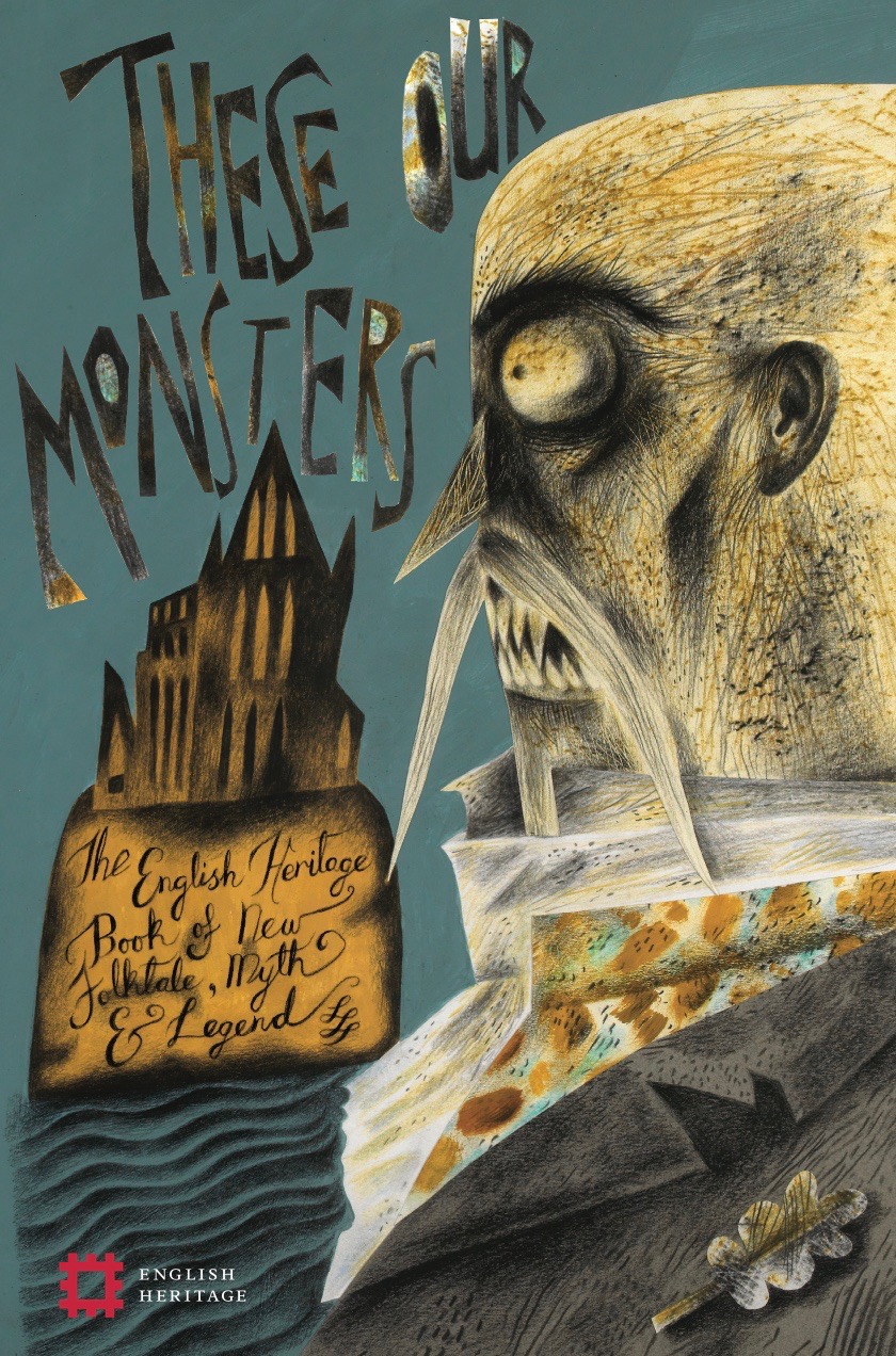
By way of preparing to make an illustration to accompany Ed’s contribution to These Our Monsters, I also acquired a copy of his novel of the French Revolution, Little, which I read at a headlong pitch and overnight became his biggest fan.

81UsxhO6MwL._AC_UL600_SR369,600_

In some ways the friendship is unlikely. Ed self-illustrates his published works and so his contact with other illustrators is limited. However he so liked the drawing accompanying his English Heritage story that he wrote asking whether he might have it, and so we arranged an exchange: he has my framed drawing of a goblin child above his desk, while I have his drawing of a maquette/puppet made for Little.


Below: my drawing for Ed’s story that loaned its title to the These Our Monsters anthology.

Illustration for 'These Our Monsters' – Version 2

Below: Ed built this life-sized maquette of a woman as preparation for his novel, Little. His original drawing of it that appears in the book, was the exchange made for my drawing of his goblin child.


IMG_5132 (1)

5 copy

img_8742 (1)

We met for the first time a few weeks ago at an event celebrating These Our Monsters at Hatchards, Piccadilly, and in order to extend our conversation without the distraction of a crowd, again the following morning, for coffee in Bloomsbury, just before he returned to the US and I to Wales.

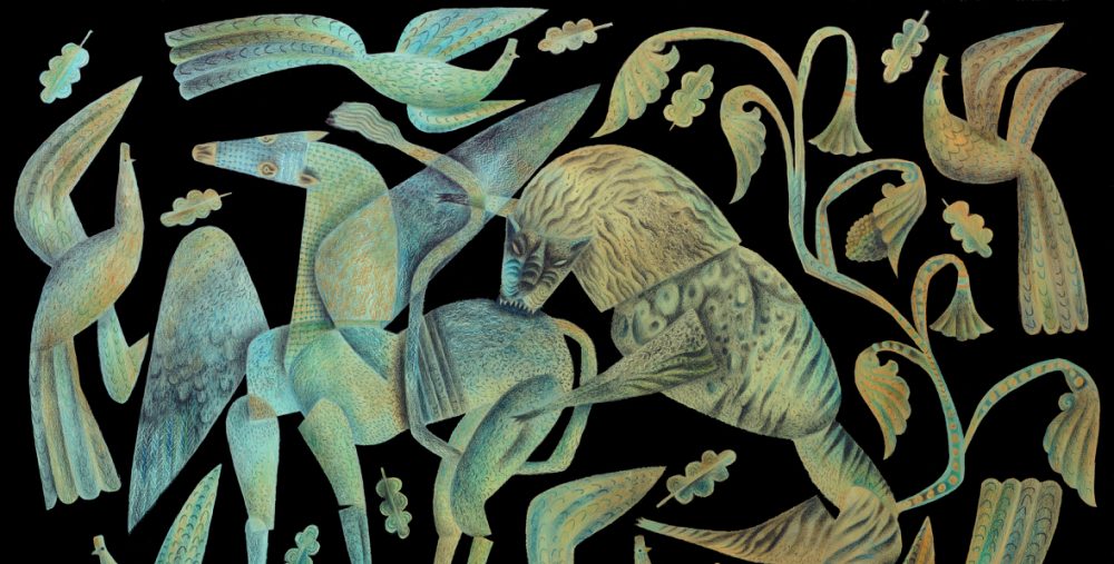
Dan Bugg suggested that an eavesdropped conversation between me and Ed might offer interesting insights about our processes of producing new work. The projects we talk about are my in-progress print,  The Tiger’s Bride, and Ed’s forthcoming book, The Swallowed Man.

Ed: Hello, Clive in Wales!
 

Clive: Hello Ed in Texas!

Ed: Clive, I’ve known and loved your work for years and over the last few months it’s been an absolute privilege getting to know you and even, last week, finally meeting you. What a joy to sit with you and talk about the Lewis chessmen for example.

Clive: Ed, I thoroughly enjoyed our couple of hours in a tiny coffee shop off Gt Russell Street last week. Even though some of the current events we were discussing are horrifying and daunting, we told stories and made each other laugh a lot. One of the great pleasures of illustrating These Our Monsters for English Heritage has been the several good friends made in the process: you, Alison MacLeod and the editor Katherine Davey. I arrived fresh to your writing with the project, but as I’d simultaneously set myself to reading your mesmerising novel of the French Revolution, Little, my responses to your English Heritage short story were being deepened by the wider sense of your creativity.

Ed: You inspire my work and make me think in new ways – to communicate directly is such a wonderful thing for me. And so here we are separated by a  pandemic and yet, thankfully, still able to communicate. 

Clive: That’s a generous comment. Thank you. The admiration is mutual. The neccessity –  or so I find it to be – of a solitary life for a writer or artist, is undoubtedly isolating. (And you, Ed, are both!) We hole ourselves up like hibernating bears because we need clarity and silence to function. However I find the immediacy and creative buzz of being able to bat ideas across great distances with friends and colleagues undergoing the same processes, and in an instant, to be a great joy and solace to what can otherwise be dauntingly lonely. Whether as rich as a prolonged joint creative endeavour, or a humorous two-liner to kick-start the morning before bending to the day’s endeavours, as a man who lives at the-well-at-world’s-end, the swift correspondences of e-mail and messaging have been life-changing for me. The entire process of making fourteen Gawain prints with Dan at Penfold Press was carried out through the medium of daily messaging and the exchange of photos made on our smartphones. I could fire images to Dan of a drawn image on a sheet of lithography film and within minutes be correcting it according to his suggestions. It was almost as though we were in the same studio space. You and I have been showing our individual work projects to each other in e-mails, confident of safely sharing our efforts and misgivings with a creative ‘other’ who understands. It works wonderfully.

Ed: I’m wondering, to start with, what would you say makes a project a Clive Hicks-Jenkins project and what doesn’t? What are you looking for? 

Clive: Narrative. Whether obvious or not, whether culled from a source or invented, narrative is always what draws me in. I am an inveterate story teller, and that’s always been my foundation, certainly as an artist but even before that, as a choreographer and director. 

Ed: And, specifically, did The Tiger’s Bride come to you or you to it. How did this all start off?

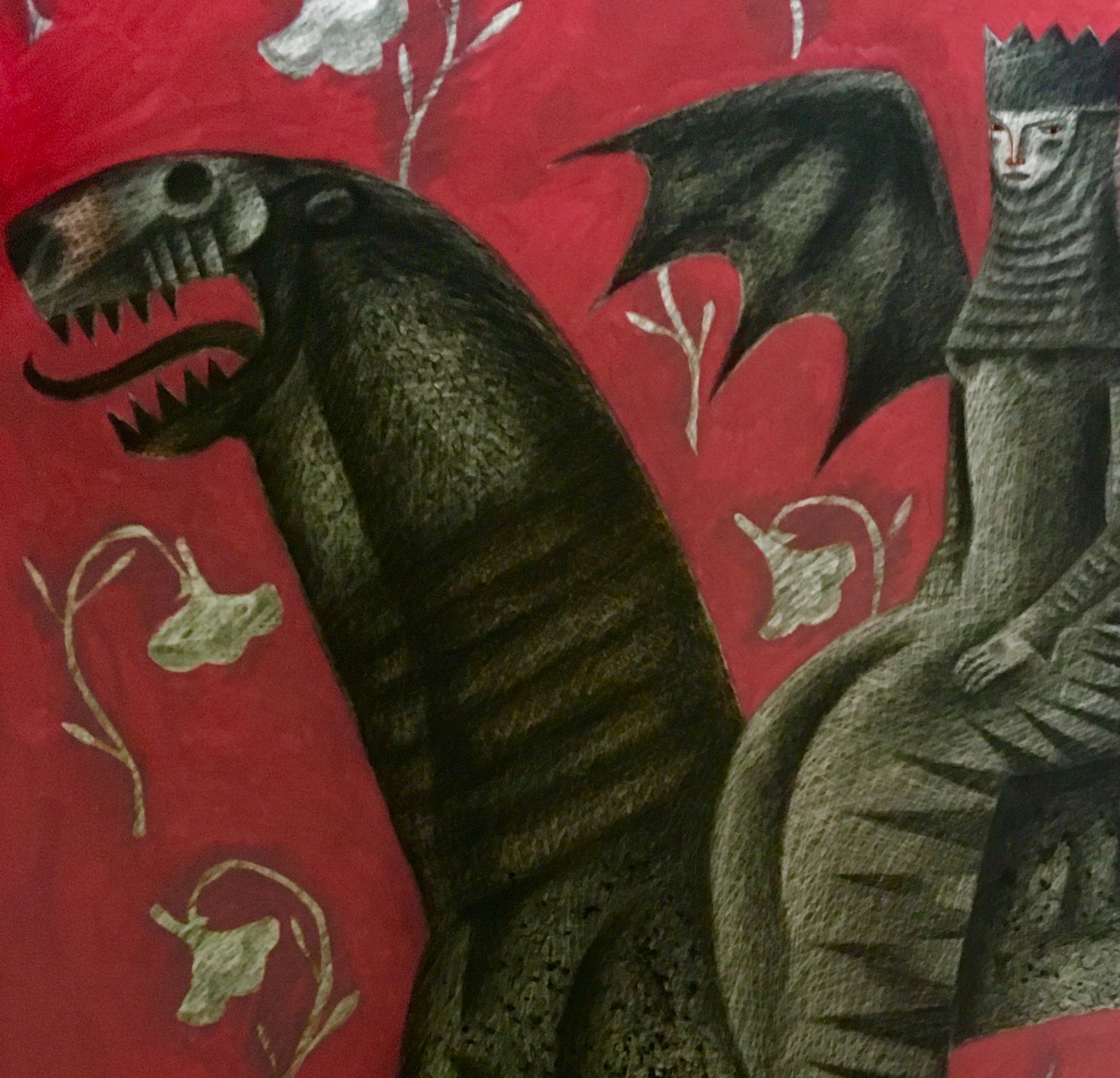
Clive: It started with my life-long love of Staffordshire. The strangeness of it appeals to me. It’s a uniquely of-these-islands combination of folk-art/fairy-tale/dream-world weirdness that always satisfies/disturbs me. The sheep and dogs the size of ponies in comparison to the human figures accompanying them. The theatrical fancy-dress that makes it seem that the handsome men and pretty women are on a stage. The flowers and the often cloying sentimentality, the cottages and castles, the follies and exotic beasts, the bright colours on shining white and the sense of sort-of-familiar yet elusive storytelling being played out on a mantelpiece. Every time I see a doll-like child perched on a monster-sized spaniel or pug, I think about the dog with ‘eyes the size of mill-stones’ in The Tinderbox. Then there are the Staffordshire ‘murder cottages’ and the penny-dreadful tendency to celebrate awful events, most notoriously the escaped tiger with a limp baby dangling from its jaws striding over the prone body of the mother from whose arms the child has been torn. My first print with Penfold took inspiration from the Staffordshire version of Tipu’s Tiger, in which a beast mouths at a slain man in a uniform. The child-like brightness coupled with horror is unlikely and yet compelling. 

11872674_1623274754618428_77315902_n (1)

The Staffordshire group titled The Death of the Lion Queen had long been catching my eye, and finally I took the moment to begin researching the story on which it was based. I couldn’t shake it. It lingered, took root and I was away.

156262 (1)
I like a long-term project. Gawain had been a nearly three year project. It wasn’t what I worked solely on, except during the last six months when Dan and I had to row like galley-slaves to get it to the finishing line in time to meet the Faber & Faber deadlines and the commitment to the Martin Tinney Gallery for the ‘completion’ exhibition. One of the pleasures of a dip-in&dip-out project is that it has the convenience of being easily set aside and yet ready to return to at the drop of a hat. It’s always simmering on the back-ring of the hob, never unappetisingly stone cold. All my projects tend to be worked on for long periods, and there are always several or even many on the go at any given moment. In the aftermath of Gawain I’d been compiling ideas for a print project that would combine several of my interests: vintage and folk art toys, Staffordshire figure groups, historic circus/fairground traditions and my fascination for toy-like buildings, whether Staffordshire follies and cottages, wooden building-blocks, doll’s houses or the foil and tinsel souvenir cathedrals produced in the city of Krakow. Somehow all this began to tie together with the notion of unspecified fairy stories, and New Folktales was born. The Tiger’s Bride is my riff on Beauty and the Beast, though I didn’t want that title anywhere near it. Angela Carter provided the solution. Here’s a piece I posted at Insta about the event underlying the Staffordshire group titled The Death of the Lion Queen, which was my starting point for The Tiger’s Bride.
“This image draws on the tragedy of Ellen Bright, AKA The Lion Queen, who in 1850 at Wombwell’s Menagerie entered a cage of big cats for the entertainment of a paying audience expecting to be thrilled by the spectacle of a girl commanding ferocious beasts. At just seventeen years old, Ellen was celebrated though relatively inexperienced, and it may be that on the day her ambition outstripped her judgement, because a reliable eyewitness in the audience afterward observed that from the moment she entered the cage the tiger displayed unmistakeable aggression toward her. At a sting to its face from her whip, the animal lay down. Ellen turned her attention to the lions, but then – perhaps for good measure, or perhaps because at that moment she intuited the dangerous state of the beast – turned back and stung it for a second time with her whip in its face. The tiger rose, reared and lunged at her head, seizing her in its jaws and bringing her down. 

Ellen sustained catastrophic injuries to her lower jaw and throat, and according to a doctor who was in the audience and attended her after the attack, she died within minutes without recovering consciousness. So horrified were the public by the tragedy that thereafter the law was changed, forbidding women to enter cages with big cats for the purposes of entertainment.” 
Below: contemporary illustration reporting the death of Ellen Bright at Wombwell’s Menagerie:
deathoflionqueen1850 (1)
The Staffordshire pottery workshops quickly produced, or perhaps adapted, an existing ‘Lion Queen’ group in order to commemorate the event, adding the wording ‘Death of the Lion Queen’ to capitalise on the public interest. (Ellen was not the first Lion Queen, as there had been several who’d gone by that title before her.) I’ve referenced elements from several Staffordshire groups of a girl performing with big cats, but have gone my own way in expressing the subject.
Below: early study and final layout-drawing for the print.
83558282_10157187795353198_895237197857292288_n (1)
IMG_9861
Ellen’s story is tragic, and not just because of how she died, but because large cats in 19th century menageries must have been driven insane by their ill-treatments and confinements. This piece is not about that – though the idea is running beneath it – but is an exploration of the fairytale theme of the beast/groom.
In the same way you’ve taken the novel of Pinocchio and used a lightly-touched-upon back story in it as the foundation of your new novel The Swallowed Man.
Pinocchio Carey
Do you find that using an existing theme/story as the bedrock for a new telling is a good method of creativity for you? Which came first for you here, Jonah and the whale or Pinocchio’s dad/maker? (I feel Pinocchio might profitably be examined in comparison with other ‘man/woman-making’ stories/myths, including Frankenstein and Galatea/Pygmalion.)
 
Clive
Ty Isaf
20/03/20

Kevin and the Blackbird

This screen-print of Kevin and the Blackbird was begun back when Dan Bugg of Penfold Press and I were galloping to the finishing line of our fourteen-print series of Sir Gawain and the Green Knight in time for it to be used to illustrate the 2018 Faber & Faber edition of Simon Armitage’s translation of the poem. As a result we set Kevin aside and agreed to return to the print when time allowed. It took two years, but now it’s done.

Kevin and the Blackbird by Clive Hicks-Jenkins.jpg

Kevin and the Blackbird

Screenprint signed by the artist. Edition size: 90, print size: 35 x 35cm, paper size: 45 x 44cm. 

This week Dan and I met up at the halfway geographical point between his home in Yorkshire and mine in Wales in order for me to sign and number the edition. Kevin and the Blackbird is available, either directly from the Penfold Press online store, or if you’d like to see it in person before deciding, there are copies at the Martin Tinney Gallery in Cardiff available for viewing and purchase.


Simon Armitage and Clive Hicks-Jenkins: the poet and his illuminator

29527605_10210781995442843_2047542184_o.jpg

I offered the term ‘illuminator’ to Marly Youmans some years ago when she asked me how I wanted to be described in terms of making images for her books. I went for the word used for the often anonymous artists who decorated early manuscripts with glowing intensity. I love being Marly’s illuminator, and we’ve been travelling hand-in hand for a long time now. I’ll be decorating her Book of the Red King for Phoenicia Publishing this year. There’s an ease and trust between us that’s creatively liberating.

The same comfort is in place with Damian Walford Davies, for whom I’ve made the covers of his trilogy of narrative poems, Witch, Judas and my yet to be released favourite, the ghost story Docklands. Simon Armitage is proving to be another easeful collaborator, leaving me and the team at Faber to get on with things. Trust, of course, is at the heart of such relationships. It’s either there or it isn’t. It can’t be negotiated or contractually enforced, and it’s at its best when the author knows the images don’t have to illustrate, so much as create a mood in which to set the words. Sometimes the images can even play against the text, without in any way disrupting the flow of meaning. It’s a magic thing, and it either happens or it doesn’t. Like all intuitive creative processes, I’m quite convinced that no practitioner could show precisely how to do it. I always know when I’ve got the idea right, and can move forward in confidence to see a book through to completion, but I find it impossible to explain why.

29692908_10210781978842428_2099612982_o.jpg

I’m not entirely sure what it is that so consistently brings me to work with poets. Saturday’s exhibition opening at MoMA Machynlleth was the culmination of the close-on three year task printmaker Dan Bugg and I set ourselves to make 14 screen prints inspired by Simon Armitage’s 2007 translation of this extraordinary narrative poem, but it was only after the first six images had been editioned and published that Simon saw the work and wrote to me about it. Two years on we’re in the process of adapting the images to Simon’s forthcoming revised edition of the poem, due out from Faber in the Autumn.

After two selling Gawain exhibitions with the Martin Tinney Gallery (Part 1 in 2016 and Part 2 in January this year), MoMA Machynlleth is hosting a three-month-long exhibition of the 14 prints plus preparatory material made over the period of the project, from sketches, maquettes and painted studies, to stage-proofs and the ‘drawings’ made on lithography film that produced the colour separations for the screen prints.

Simon is softly spoken and on Saturday he read from his Gawain translation with deceptive diffidence. Nothing declamatory or overly emphatic in his delivery, but a mesmerising eloquence and intensity that effortlessly bewitched the audience. He gave a masterclass in how to do more with less, and I’ll remember it always.

Below: the most important critics, Dan Bugg’s children, Alfie and Elsie take in the exhibition before the doors open. Both are pretty proficient in the printing studio, and so they have the insiders’ perspective.

29633820_10210781999322940_286871360_o.jpg


Print No. 13: The Sorceress

Morgan le Fay is the architect of magic in the poem of Sir Gawain and the Green knight. Here she evolves from drawing through the multiple stencils that will produce the layers of colour in the finished print.

The drawing is made on board and underlies the transparent stencils throughout the process of rendering them, providing me with a guide so that everything aligns. The plastic layers are held in place with alignment pins and punched tabs.

IMG_2277.JPG

I make textures using a scalpel to cut through lithography crayon.

IMG_2287.JPG

Opaque red oxide paint is used to create flat areas of colour in the finished print.

IMG_2297.JPG

The colour samples will guide Daniel Bugg when mixing the inks for printing.

IMG_2330.JPG

Texturising the beast’s pelt and modelling with shadow.

IMG_2328.JPG

When overlaid the layers of stencils get very dark. Everything will look completely different when printed in colour.

IMG_2346.JPG

The outlines of Morgan le Fay, her beast, the flames springing from the beast’s feet and the flowers diapering the composition, have to be carefully drawn around in order to create the background. Because the background is to consist of three layers of colour, the process has to be completed three times, which is both time consuming and a tad boring.

IMG_2362.JPG

IMG_2371.JPG

The flames are rendered to lend form.

IMG_2405.JPG

Here the image has been photographed with just three layers of stencils. There are seven stencils required for the finished print, but when the seven are layered they become so dark that the image doesn’t photograph well.

IMG_2410

SaveSave

SaveSave

SaveSave

Print No. 12, as yet untitled

Gawain stands in the Green Chapel. His elaborate armour was cleaned of rust and polished back at Fair Castle, but now it’s further transforming with burgeoning engravings of foliateness and a constellation of stars emerging on his breastplate.

IMG_1876.JPG

He reaches toward his helmet, removed in order to take the Green Knight’s blow, and out of which greenery is spewing.

IMG_1997Gawain has fulfilled the oath made a year ago in Camelot. He’s knelt before the Green Knight and submitted to his axe, but has escaped with nothing worse than a parting of the flesh at the back of his neck.

He’s staunched the wound with what he had to hand. Throughout the series of images items have fluttered upwards: pennants, cloaks and helmet plumes, and now the girdle secretly gifted to him by the Lady of Fair Castle streams out, an embroidered stand-in for what might so easily have been his life’s blood.

IMG_2061.JPG

IMG_2032.JPG

These stencils have been the most complicated to date, mainly because of all the background filigree work, duplicated on four layers. Now I await the first proofs from Daniel Bugg at Penfold Press.

Update on ‘The Exchange’

Back at the beginning of September I made a post about my work on the preparation for number ten in the Sir Gawain and the Green Knight series of prints I’m making in collaboration with Penfold Press. The post charted the progress of The Exchange from first sketches to completed stencils, the latter of which were dispatched to Daniel Bugg for him to begin the long work of transferring them to screens and beginning the proofing.

In my studio the image started as a sketch…

IMG_1032

… and ended as a set of stencils.

DSC01180 (1).jpg

Dan made two proofs to show me. While the first carefully matched my seven colours, the second was one of those happy accidents which sometimes occur and that you have to consider very carefully. For the second proof Dan had mixed varnish into one of the colours which then printed with far more transparency than he’d anticipated. While surprised by the effect, both of us loved the result. The jury is still out but I think we’re coming to the conclusion we should go with the flow and attempt to reproduce the accident in the edition. There’s something wonderfully ghostly about it. I particularly love the way it’s impacted the butchered stag on the right of the composition. I won’t show the whole print here. It still needs tweaking. Moreover we never reveal any print in its entirety until the edition is ready for publication. But here’s a detail of it.

FullSizeRender (14).jpg

Tomorrow I’ll make some adjustments to the stencils that Dan returned to me, and then they’ll head back to him for the editioning to begin.

SaveSave

SaveSave

SaveSave