Letter sent to the Beowulf team at Folio Society, 14/11/23.
“Today the most enormous box arrived from Folio Society. Packed immaculately, it took me a while to work my way to the contents and unwrap the top copy of the three books within. I’m not sure I have the words to express what I feel, but I’ll do my best.
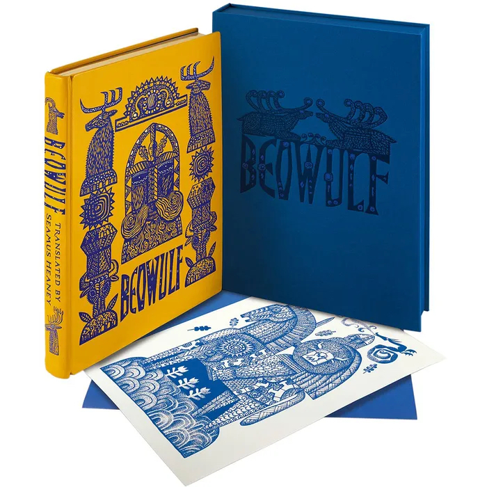
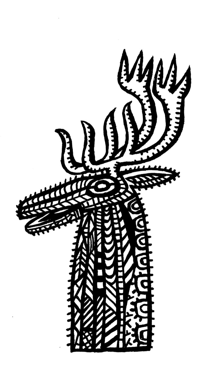
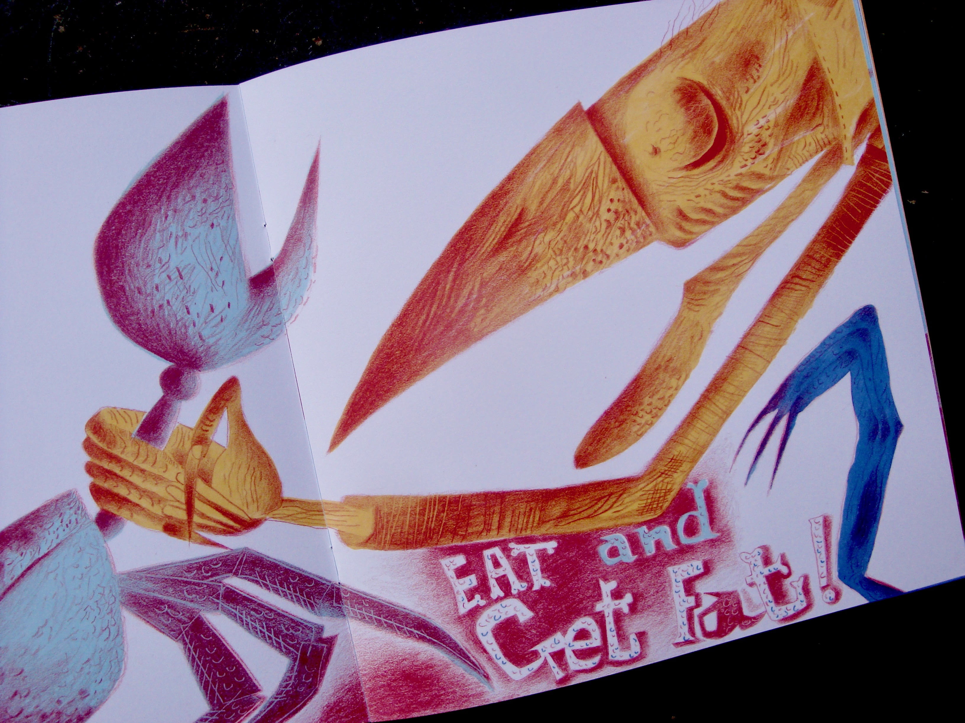
The edition is staggering, unarguably the most magnificent and significant creation of my career as an illustrator. My hands shook as I went through it page by page. The book design and text layouts, airily perfect. The translation from pen and ink artworks into illustrations, nothing short of a miracle. I worked on the drawings for many months, so I know what they look like in every detail because my nose was practically glued to them as I tapped away into the small hours rendering all that pointillism. But even though they’re all but tattooed on the insides of my eyelids, seeing them afresh and reinvented by the inversions and additions of colour, I’m knocked sideways. (The printing of the images is perfect in every way.) I’m so happy that the book is steeped in all the right traditions, and yet feels boldly contemporary. The binding and box are wonderful beyond all my imaginings and anticipation. Sumptuous in every way, the sensations of opening and turning the pages of the edition become visceral. Everything under the fingertips silky to the touch. The scents of the book, the leather, paper, glue and ink, all immersive and thrilling.
Sunday marked my seventy-second birthday, and Beowulf has been the best present. Not all book outcomes can be happy. I’ve made books in the past for which my hopes were high but things were not, in the end, done well. However all disappointments crumble before this edition of a text I love. Seriously, I could die happy knowing I’d made this one book.
Above: promotional animated video for Beowulf produced by David W. Slack
I had no idea just how lavish the book was to be when I first began work on it. It was only stage by stage that it began to dawn on me that the binding and clamshell box, built at the bookbinders Smith Settle in Leeds, were going to be works of art in their own right. I made all the illustrations at the size they were to be printed, so from the start I was aware that the edition was going to be on a handsome scale.
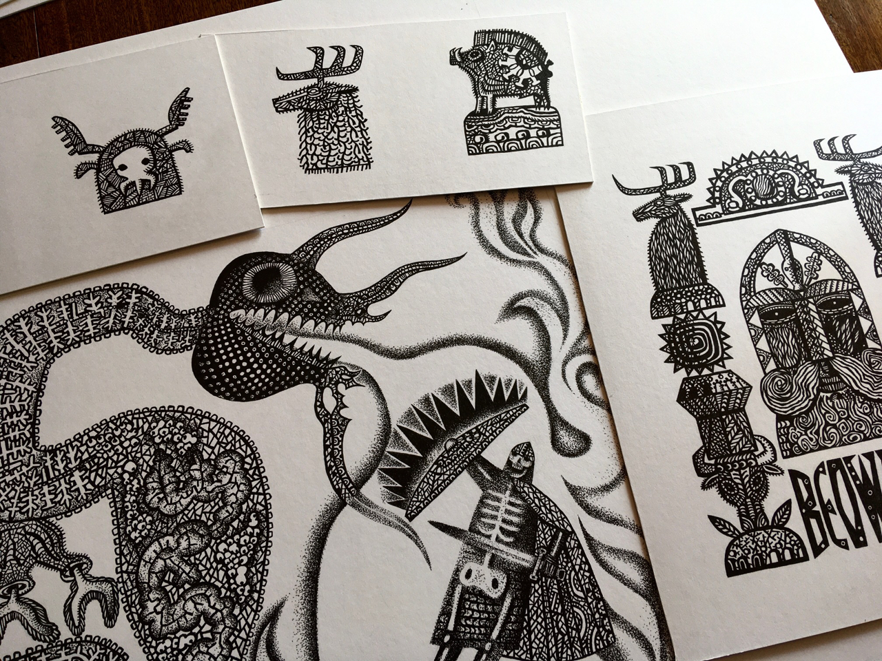
Above: Pen and ink illustrations in progress on my desk
Reviews from the Folio Society Website
Heroic volume for a heroic tale! I could smell the vellum the moment I opened the beautiful cloth-covered box. Wonderful. The book’s cover and the marvellous illustrations are reminiscent of Sutton Hoo without being exact copies. The thick, high quality paper is a joy to handle. The new Introduction is interesting. This is a volume to treasure. Really not too pricey considering its very high quality, the greatness of the tale and the beauty of the Heaney translation.
Review by Mr James Barry on 03/01/24 *****
Simply a stunning classic which I will hold for a lifetime and pass on to be enjoyed. The design and illustrations take you into the mythology with a powerful effect.
Review by a customer on 18/07/23 *****
A stunning book I can’t fault in any way.
Review by Steve Shaw-Wright on 21/07/23 *****
Extra large format book expertly produced with high quality components and materials. Not a single defect in craftsmanship. Oh, and my favourite translation by the way!
1. Where are you from and how does it influence your work?
I was born in Newport in Gwent. Hard to say exactly how it’s influenced my work as an artist. Countless ways, probably, if you trace all the threads back to source. I loved the place as a child, and there’s a sort of ghost version of Newport in my head, which is how it used to be. I realise at this distance how rich Newport was architecturally back in the 1950s, and how the character of the place and its topographies of streets and hills and contrasting neighbourhoods have stayed with me.
There was a fine covered market, a handsome and thriving high street with diverse businesses and many wonderful old cinemas scattered about the town.
There were the docks and the transporter bridge. In the neighbourhood of Maindee where I lived there were several small parks, a pint-sized library, a picturesque police-station complete with Dixon-of-Dock-Green blue lamp, my primary and junior school, a public baths and a cinema, all within an area you could circle on foot in thirty minutes. Later so much that was lovely was shamefully destroyed by ham-fisted planning and craven building developers. I remember my mother weeping when the bulldozers moved in on the old Lyceum Theatre at the bottom of Bridge Street.
Both my parents were from Monmouthshire and had deep attachments to its landscapes, so most weekends our family would go walking in Wentwood, the stretch of woodlands between Newport and Chepstow, having picnics and enjoying the views from the summit of Grey Hill. My dad had started his career as a land agent working for Lord Tredegar on the Tredegar Estate.
However after the war he hated the way the tenant farmers were being treated as his employer sold off the land, so he left to become a wayleaves officer with the South Wales Electricity Board. During school holidays I’d accompany him as he criss-crossed the county and beyond, negotiating easements with farmers and landowners. That informed my eye. He informed my eye. As a painter I would not have seen landscape the way I do without what he showed me.
2. Where are you while you answer these questions, and what can you see when you look up from the page/screen?
I’m in the library/study at home. Warm grey walls, full bookshelves, art.
A wall-mounted construction by my husband’s father, Dick Wakelin, a large Ernie Zobole landscape, a Ceri Richards ‘Heron’ print, a framed articulated maquette by Philippa Robbins and a preparatory drawing of mine for a book. My dog, Rudi, asleep in the armchair next to the window.
3. What motivates you to create?
At the heart of it, a need to make order out of chaos. (I’m talking about the universe, not the state of my sock-drawer!)
4. What are you currently working on?
Several illustration projects for a number of publishing houses, all of them for titles I can’t at this point reveal. Next year I have an exhibition at the Table Gallery in Hay on Wye to coincide with the Festival of Literature, which will focus on my work in the field of books. There’s a currently delayed exhibition of all my work on the theme of the fairytale Hansel & Gretel planned as the inaugural event at Oriel Myrddin when the current building work has been completed.
5. When do you work?
Every day. I like to start early when I can. But because the studio is in the house, I can work all night if it suits me or when deadlines are tight. There’s not much division between the various parts of my life at Ty Isaf. Work and maintenance of house and grounds intermingle, all flowing together.
6. How important is collaboration to you?
As an artist I’ve frequently drawn on literary sources. Even when working with a text by a dead writer, I regard the process to be a collaboration. When I’m taking something made by another person and reacting and adjusting to it, I feel a responsibility. When illustrating a book by a living writer, such as Simon Armitage, with who I’ve made three books and directed a stage production with a libretto by him, then the collaboration is necessarily more active.
For fifteen years I’ve been designing the covers of books for the American poet and novelist Marly Youmans, and for many of those books have made black and white illustrations, too.
Our relationship is tremendously close. We’ve been collaborating for so long that we imaginatively inhabit each others territories.
7. Who has had the biggest impact on your work?
I can’t give one answer to that. Life is not so simple. There are those whose early encouragement greatly helped me, chief among them the painter Dick Chappell who was generous with his practical advice. (Not all artists were as kind as he.) My partner – now my husband – Peter Wakelin, supported me as I became an artist. He took my work to the Kilvert Gallery, where the late Lizzie Organ gave me my first exhibition opportunities. But before all this, in my earlier days, there were the many teachers and mentors who set me on journeys I may not have taken without their encouragements, and those who gave me opportunities which changed my directions at several critical points. There are the artistic influences to be considered too. The painters and makers, anonymous and known, who taught me how to analyse and appreciate. Film-makers – cinema has played a significant role in forming me as an artist – composers, poets, novelists, historians and philosophers.
Animators and puppeteers, dancers and actors, directors and choreographers. I’ve fallen under the spell of many brilliant creators who showed me ways forward. Some I have known in person. I’ve been very fortunate in that respect.
8. How would you describe your oeuvre?
I am a narrative artist of diverse practices.
9. What was the first book you remember reading? I remember sitting on my father’s lap as he helped me read a Rupert Bear annual. He was good teacher and I was an apt pupil, so I could read before I got to school.
There weren’t a lot of books in the house, but such as there were I tore through. A few inherited ‘children’s’ books were on the shelves. I read a dense volume of Kipling’s short stories with not very exciting Edwardian illustrations that had been my father’s as a boy, and there was Ruskin’s The King of the Golden River in a slender edition illustrated by Fritz Kredel. My sister is six years older than me, and so I enthusiastically devoured her books because they were lying around, mostly novels about girls at boarding schools where the pupils had jolly adventures and illicit dorm tea-parties. Later when she started reading more adult fare, I got hooked on the Pan horror anthologies edited by Herbert Van Thal, read secretly by torchlight under the bedcovers because my parents wouldn’t have approved.
I was madly keen on H. Rider Haggard and Edgar Alan Poe, and the Greek myths, thanks to my mother who pointed me toward them.
I have an Oxford edition of Myths of Ancient Greece Re-Told for Young People (Oxford, 1951) by Robert Graves and illustrated by the wonderful Joan Kidell-Monroe (1951), and a later Larousse Encyclopaedia of World Mythology, both inscribed to me by my mother.
10. What was the last book you read?
The Mabinogi, in Matthew Francis’ poetic retelling published by Faber & Faber. (I’d kill to illustrate an edition of that!)
11. Is there a painting/sculpture you struggle to turn away from?
Hambeltonian, Rubbing Down by George Stubbs. It is the single most moving painting of a creature in extremis known to me. I’m mesmerised by the strangeness of it. I’d put it on a level with the Grünwald Christ. Stubbs homes in on the psychodrama underpinning the moment depicted. The racehorse is in a pose with both legs on one side raised, a stance not physically possible as it would just keel over. The artist knows that, but he does it anyway, because it’s right for the painting and the unease he wants to convey in this spectacle of an animal in a fearful state after a hard-won race.
The handlers are tender, but Hambletonian’s ears are laid flat, his nostrils flared, he sweats and his lips are pulled back to expose his teeth. He’s clearly in a bad way after the terrible exertion. The painting was a commission by Hambletonian’s owner, the twenty-eight year old Sir Henry-Vane Tempest, who dissatisfied with it refused to pay the agreed sum to the seventy-five year old artist, claiming to the court in the case brought against him that his reputation as a racehorse owner had been called into question by Stubbs having portrayed the horse in a state of exhaustion. Unexpectedly given the times, the Judge ruled in the artist’s favour.
12. Who is the musical artist you know you can always return to?
Singer, Nick Drake. Composers, Philip Glass and Ravel.
13. During the working process of your last work, in those quiet moments, who was closest to your thoughts?
I was illustrating Seamus Heaney’s translation of Beowulf in a new edition for Folio Society, so the text was at my elbow at all times. As I was constantly referring to it, I guess it could be said that Seamus Heaney was closest to my thoughts.
14. Do you believe in God?
No.
15. Do you believe in the power of art to change society?
I believe in the power of art to change myself. Society I’m less confident about.
16. Which artist working in your area, alive and working today, do you most admire and why?
If I’m candid, I’d be hard pressed to identify an artist working precisely in my area, given that I paint, illustrate, animate and direct. There can’t be that many. Also, I’m at that stage where so many of the people I most admired across the creative arts and looked to for inspiration, have died. Too many in the past few years. It broke my heart when Maurice Sendak passed, and Sondheim, too. Bowie and Glenda Jackson, gone. I can hardly believe it. These people were signposts and anchors for me.
17. What is your relationship with social media?
I harness it as best I can for work and making connections. It’s served me well for being able to reach out to people I admire, and that’s worked in both directions. Undoubtedly many of my projects of the past decade have had their foundations in collaborations begun online. I never liked or wanted to be a part of the way artists were traditionally presented by galleries in bibliographies, their lives reduced to lists of dates and achievements. In 2011 Lund Humphries published my monograph, for which I steadfastly refused to produce a bibliography. Instead I contributed a biographical chapter in which I presented, if not the definitive account of my achievements, then something which gave a sense of the journey. Since 2009 I’ve run a blog, the Artlog, at which I write candidly about my practices, my life, people I admire, collaborations and works in progress. In so many ways social media has deconstructed the tired old clichés of how things were once done, and as a consequence given artists – or the ones who choose to engage – the chances to speak for themselves
18. What has been/is your greatest challenge as an artist?
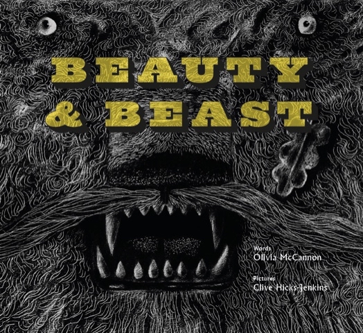
Getting up to speed quickly when faced with unfamiliar challenges is always a thing. But at this stage of my life I believe it’s fine when undertaking something for which I’m only partially equipped, to say “Look, I can do most of this, but these are the areas I’ll need help with.” I’ve been working for publishing houses over the past few years on several big projects, and I always kick off by saying to the art directors “You know I’m a dinosaur, right? I don’t do digital and so everything you’ll be getting will be analogue, made with hands wielding brushes, pencils and pens.” And it always is alright. I work with really skilled technicians. Laurence Beck has been my clean-up artist and colourist at Design for Today for two books, Simon Armitage’s Hansel & Gretel: a Nightmare in Eight Scenes and Olivia McCannon’s Beauty & Beast.
In the past couple of years I’ve worked very closely on publishing projects with David W. Slack, who is an artist in his own right, but has collaborated with me as a model-designer and maker, and recently worked as Animation Producer on the two films we were commissioned to create by Folio Society to promote Beowulf.
Back in 2016 I was invited by Dan Bugg at Penfold Press to work with him on my first screenprint, a process that to begin with utterly bewildered me. But Dan guided me through the processes of it all, and since then we’ve completed a phenomenal body of work, including the fourteen-print series that went on to accompany Simon Armitage’s acclaimed translation of Sir Gawain and the Green Knight in the 2018 Faber & Faber illustrated edition.
19. Do you have any words of advice for your younger self?
It’ll all be alright in the end.
20. What does the future hold for you?
I have enough exciting projects to keep me gainfully occupied for several years. Every time I think that maybe my moment has passed, then someone new comes knocking with a wonderful suggestion/opportunity. (One came yesterday with a proposition so exciting I didn’t sleep all night.) I’m grateful for that. It would be a good way to end one’s days would it not – hopefully some way down the line from here I should say – with something interesting in the pipeline? I don’t think I’d last long if the days stretched emptily ahead. I don’t know whether it’s true, but they say sharks have to keep swimming in order to stay alive. I think that might apply to me.
Please Click on the title above to watch the videos embedded in this post.
Above: click to view the book trailer for Beowulf
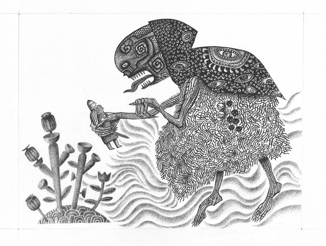
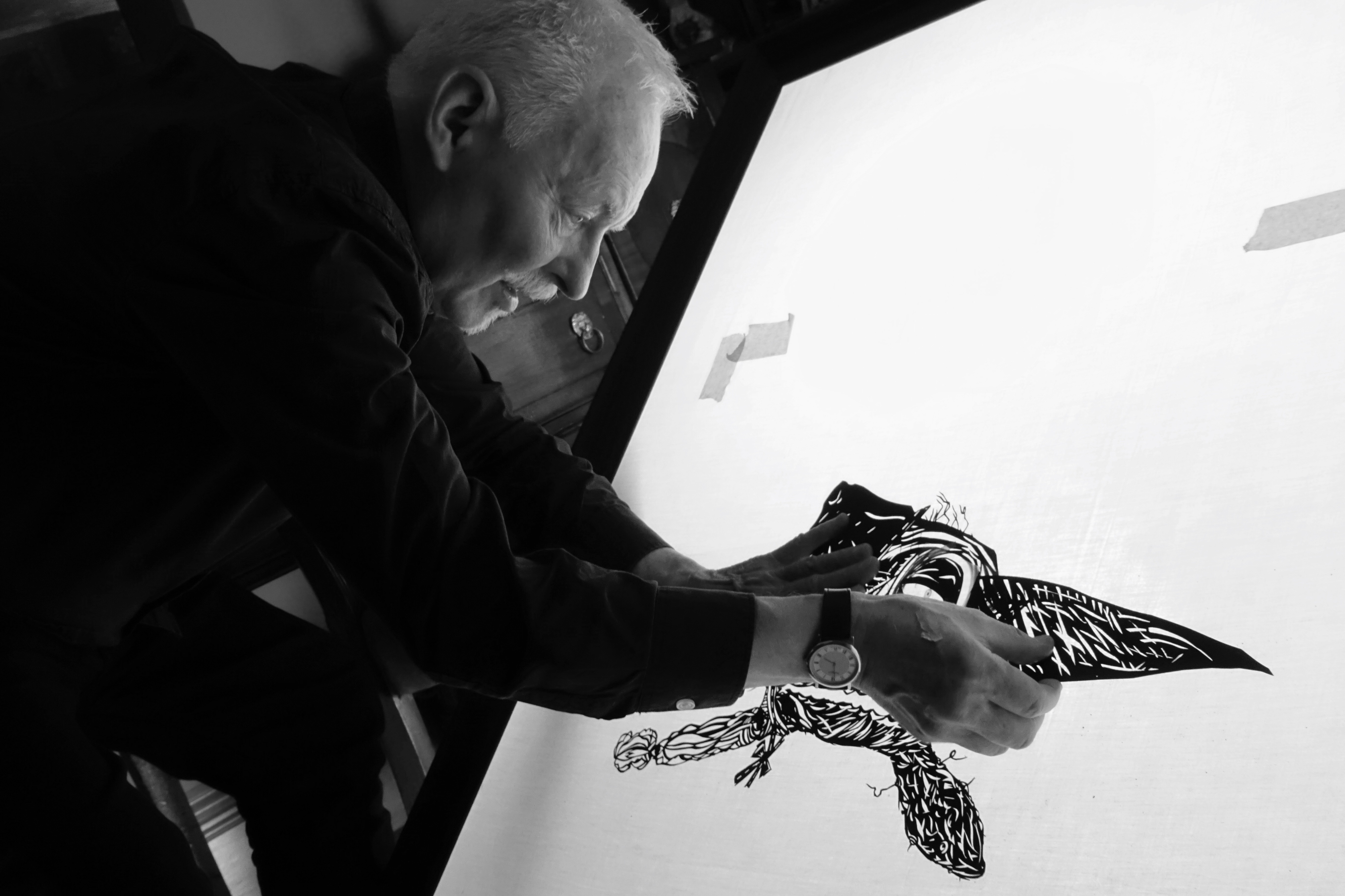
Clive: David, you were undertaking trial digital work for me while I was working on the illustrations for Beowulf. I made them in black ink on white board, but had it in mind to see how they’d look when inverted to white on black. What you produced provided me with inverted images of drawings and digital colourings of them throughout all the earlier stages of the book’s creation. Although the final additions of colour were done at Folio Society, you did all the preliminary ‘tests’ that enabled me to make the decisions ready to brief the Folio team.
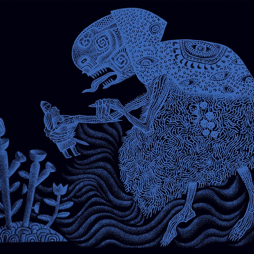
Above: detail of illustration from the book after image inversion and digital colouring by Folio Society.
Below: original ink artwork on mountboard with pencil trim guide, before inversion and colouring.
David: Oh it was such a joy to have a private viewing of your Beowulf drawings, and because I was messing around with them digitally, I could easily produce many different versions. It was fascinating wasn’t it, that some worked instantly as inverted images, while others were more powerful as you’d drawn them?
Above: finished ink drawings piling up on the artist’s desk.
Clive: In the end we included some drawings as made and some inverted. The combination worked well.
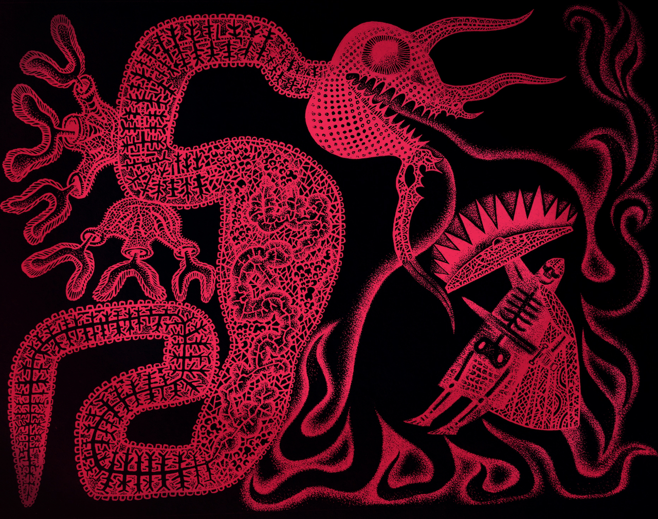
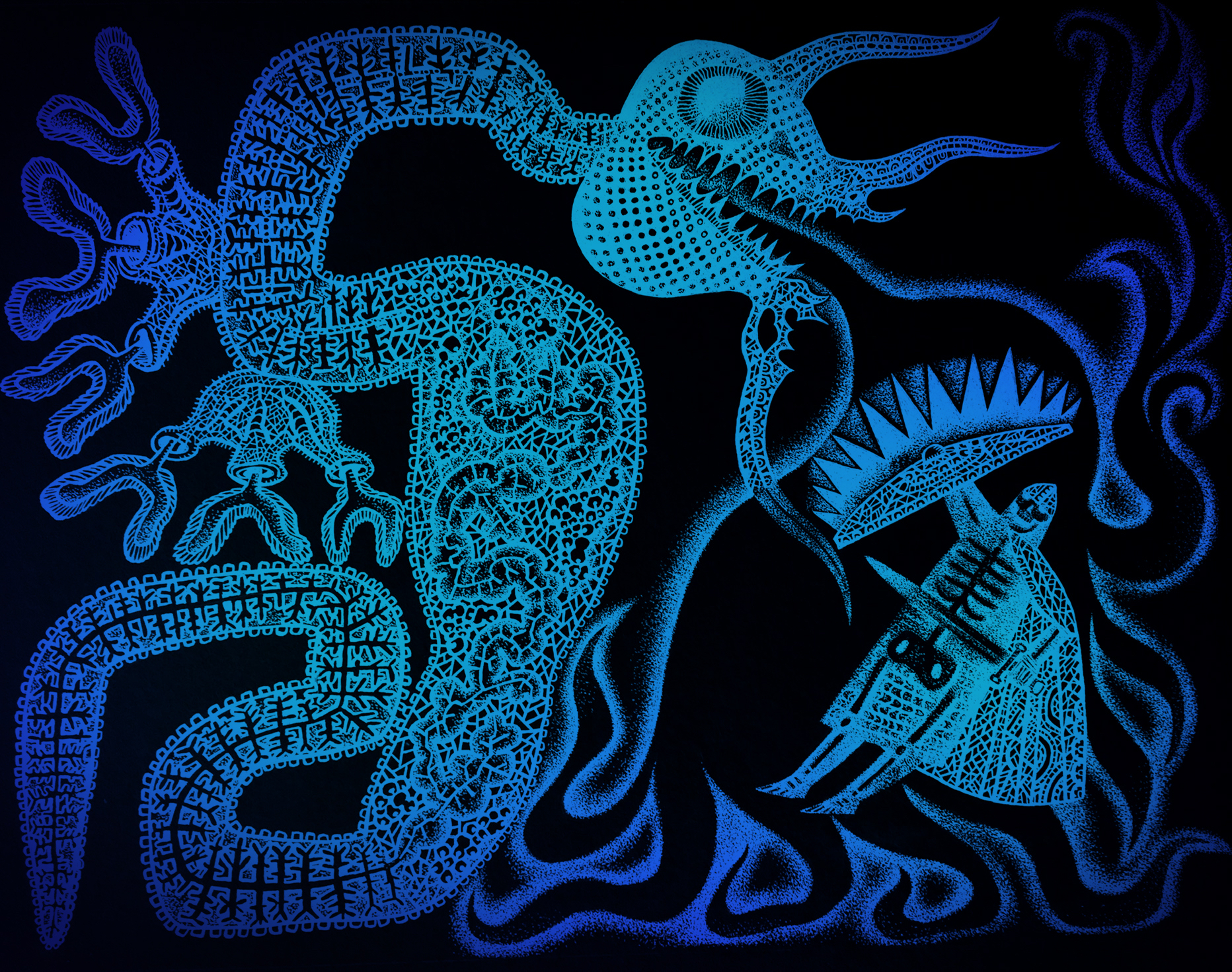
David: I made some red versions which were just OK, but I remember layering a deep spot-lit blue-green with the image for the first time, and it pulsed and sang immediately.
Below: trial colour images of inversions made by David.
But I think you had committed to the blue at that point, and the intensely saturated blue-on-black and black-on-blue that their production manager achieved in print for your full-bleed double-page illustrations, is way beyond anything I’ve ever seen in print. I’ve done a lot of printmaking through the years, but how they achieved that glowing deepest blue is beyond me. It pulses with some sort of other life and is just unforgettable. I know that you were blown away by the book when you saw it.
Clive: I couldn’t stop shaking when I received and opened my copy. I was anxious because I knew by this point the edition was printed, bound and boxed, and there could be no turning back. I’d seen many page proofs over the months, but between the last proof seen and the finished book the production manager had worked miracles. I was simply speechless when I saw the the quality of the printing.
Because of your contributions at preliminary stages, and because you knew the illustrations inside out, it was inevitable that at some point we’d start talking about the potential of the images to be animated into life, and that’s exactly what happened.
David: Well of course, what a gift this was! Your drawings for Beowulf were in a paper-cut style, and so ready-made for shadow theatre puppetry. I’d learned to animate a while back when we’d made an animated film to promote the Design for Today Beauty and BeastToy Theatre. With that experience under my belt, how difficult could it be to create a three or four second animation as a test run for a potential Beowulf book-trailer? I have to say that it was BLOODY difficult. I’m pretty sure that the learning curve was so steep that at more than one point my neuron’s firing registered on Google Earth. But anyway, this idea of a moment of animation er… well, it snowballed rather didn’t it?
Above: articulated paper maquette made as a compositional aid during the early stages of planning the book.
David: Much of your preparatory-stage work for illustration is built upon the idea of the jointed maquette, so animation is a perfect fit. And of course you’ve made many frame animations in the past, for example on your stage productions of Hansel and Gretel and The Soldiers Tale. By now you and I had made many animations together, almost all set within the bounds of a toy theatre. The images of Beowulf were so exciting to imagine unshackled and animated into life. They were perfectly suited to the medium.
Clive: Because we felt some animation sequences could enhance the promotional video Folio would be sure to make to launch the book, I decided to ask them whether they might consider permitting us to submit a couple of trial animation sequences by way of introducing the team to the idea. Luckily they were open to that and you began work almost immediately.
I recall conversations we had about the ‘character’ of the animation, degrading the imagery to make it look almost like ‘found footage’ with that sense of vintage film scratchiness and fluttering. You might have different recollections to me, but among references we discussed there was the idea to animate the dragon almost as if it were some kind of nematode worm being filmed on a slide under a microscope. I think I may have mentioned the title sequence for the film Seven to you, with its sense of flickering unease. And then of course there was our shared passion for Smallfilms and the work of Oliver Postgate and Peter Firmin. It’s just not possible to be in a world of Norsemen without having a conversation about Noggin the Nog.
David: Ah yes! The David Fincher/Smallfilms mash up. I loved your suggestion of a squirming dragon as a micro-organism under magnification. It adds an edge of discomfort to see inserts of a different texture, speed and animation style within the piece. I used the same concept in the jerking movements of the wolf and the tentacles whenever they appear.
Above: black original ink drawing and the digital translation to colour in the book.
David: Tonal changes are essential to my mind, especially when the piece is very dark, or heavily stylised. The most incredible imagery in a movie can actually become dull after a while, unless the viewer is shaken out of it – like a little hit of spice. I watched versions of scenes of the Beowulf animation without the degrading filters we talked about. Your drawings moving across the screen were so striking without the added optical effects that I found it tough to dull them down. Nevertheless I added scratchy inclusions of scrabbling colour to make the films glow and dull in turn, and the decision worked wonders in unifying the animations and the sequences of the book itself. One of the things I had to keep reminding myself was that this wasn’t a trailer for a movie, but for a beautiful book. (The Hitchcock in me was forever edging it to a movie trailer.)
Clive: We waited with bated breath once the sample shots had been delivered to the Folio team, but when the responses came they were wholeheartedly enthusiastic. Far from delivering a few short cuts to be edited into a promotional film, we were tasked with producing the whole shebang. After a briefing Zoom with the team at Folio we got working. There were to be 2 x 30 second films, one at a format for viewing on smart-phones, and a second for viewing on laptops and tablets.
David: Oh weren’t they wonderful? They showed such faith in us that I did feel confident about how it would turn out. Working with such carefully considered and rendered drawings I knew the results would be beautiful. Like cooking with the best ingredients. Although the brief was for 30 second films, I overshot and both edits came in at one minute and six seconds. I think just over the minute stands up very well. I would have been pushed to get the pace right in 30 second films.
Clive: I agree. 30 seconds would have been too rushed. As the films stand, each at just over a minute, they fly by when watching them.
As with all our animation projects, once we’d discussed I absented myself to concentrate on sourcing the music. You in the meantime were off like a rocket. I remember your utter confidence that you knew where to go with all this, waiting only on the music to provide the structures to the films. You were not just animator on the project working to my brief. You were now Animation Producer!
David: And a very cocky one at that, due in no small part to the confidence and enthusiasm you demonstrated in allowing me to hack up and rearrange your artworks.
While you researched the music, I got busy anatomising your Beowulf characters to assemble a cache of puppet elements. You always show an astonishing faith in me to infill the drawings when I amputate an arm, head or leg, or need to find fingers or a neck. I in turn feel safe in the knowledge that you’ll always find the perfect piece of music which will make the pace, depth and rhythm of the story appear clearly in my head. This time you found four tracks, one of which though amazing, we both thought a little too disturbing. (Maybe it’ll be right at another time for another film.) I viewed the films hundreds of times when making them, and have watched them many times since completion. I’m confident the two music pieces we settled on had just the right aesthetic, power, drive and primal drama. People report that they watch them repeatedly, and a big part of that is because the music makes them so moreish.
Above: click to view this animated book-trailer for the new Folio Society edition of Seamus Heaney’s translation of Beowulf.
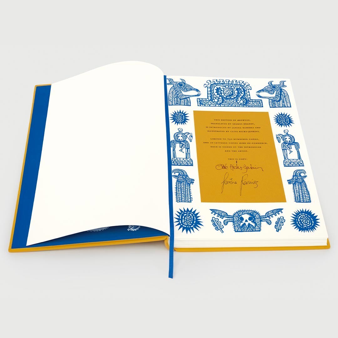
It’s with huge delight that I can reveal, at last, that my current big project is the commission to illustrate a new Beowulf for The Folio Society, in the acclaimed translation by Seamus Heaney. The illustrations must remain shrouded in secrecy until the book is ready for launch, and I won’t be showing work in progress. Suffice to say that I’m already deeply bedded in the project, awakening every morning excited to be in the thick of it and enormously enjoying the many discussions and planning sessions with my wonderful Folio Society art director, Raquel Leis Allion. But this little vignette is all you’re going to see before the book is published, because we’re keeping the images under lock and key.
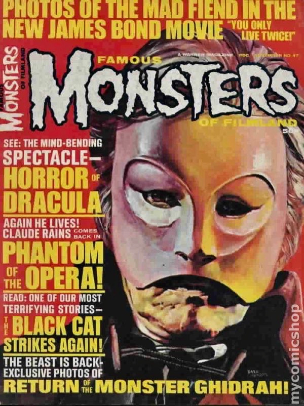
I’ve greatly enjoyed the notion of ‘the monster’, whether in novels, in film/tv or in folklore and mythology. Aged eight I was sold on the idea of the ‘Gorgon’ from the first moment I read about her, and the Hydra, too, and the three-headed Cerberus, guard-dog of Hades. As a child, when too young to actually see X-rated films, I pored over imported copies of Famous Monsters of Filmland, so I knew all about the Universal Studios monsters – which were vintage even back in the fifties when they were being given lush spreads in the magazine – long before I ever saw the films themselves. I thrilled to the images of Lon Chaney being unmasked in The Phantom of the Opera, of Bela Lugosi curling back his lips in a pasty-faced vampiric leer, and Karloff sitting in Jack Pierce’s makeup chair being transformed into one of the most iconic monsters of cinema history.
I’m not a fan of all ‘horror’ – in extreme form I find it distasteful – but when makers are creative in producing something that nails you to your seat, the ride can be thrilling. I particularly love it when the scary bits are not too in-your-face. One of the greatest strengths of Alien, is that it pre-dated CGI, and so the fully-grown creature is half-shadowed and all the more alarming for it. I think the best scares in Jurassic Park are in the kitchen where a pair of Velociraptors hunt down the children, because most of what you see is staggeringly clever animatronics and puppetry, made even better by masterful editing. When the monster is actually there, in close contact with the actors, and not just a man in green wielding a ball-on-a-stick to cue their eye-lines for special effects to be added later, there are worlds of difference in the performances.
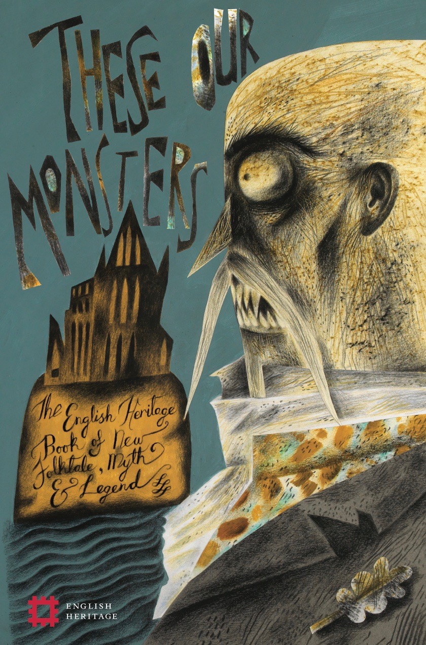
I’ve particularly enjoyed it when I’ve been given illustration opportunities to engage with old-school classic creatures. For the cover of These Our Monsters (2019, English Heritage), I was able to trace back to Bram Stoker’s account of Vlad Dracula, which was quite an eye-opener because the original descriptions are not remotely like any of the character’s film incarnations. (The cover image here is for The Dark Thread by Graeme Macrae Burnet, who sets his troubling and elegiac short story in Whitby at a time when the mentally fragile Stoker has returned to confront his own creation.)
There were entirely new monsters in the book, too, and I loved creating what Sarah Hall only suggests in The Hand Under the Stone, which is about as close as I’ve ever come to making a monster inhabiting a similar ‘between-worlds’ plane of existence to those found in the ghost stories of M. R. James which I love so much.
I’ve made several varieties of Witch for two quite different books on the theme of Hansel & Gretel, for a stage production in which she was presented via shadow-puppetry, and for a toy theatre for Benjamin Pollock’s Toyshop.
My first Hansel & Gretel book was a more or less textless picture-book for St Jude’s in which there was a Witch scary enough to require a warning for more sensitive readers. I made her glaucous-eyed and short-sighted – as witches traditionally were in some folk and fairy-tales, the Grimm Brothers telling of Hansel & Gretel included – but I dressed her in a garment embroidered with eyes to send out a different kind of message. (I stole the idea from a portrait of the first Queen Elizabeth in a gown embroidered with eyes and ears, as a coded message to her subjects – and more particularly her enemies – that the monarch saw all and heard all!)
A short-sighted Witch in a garment sewn with many eyes
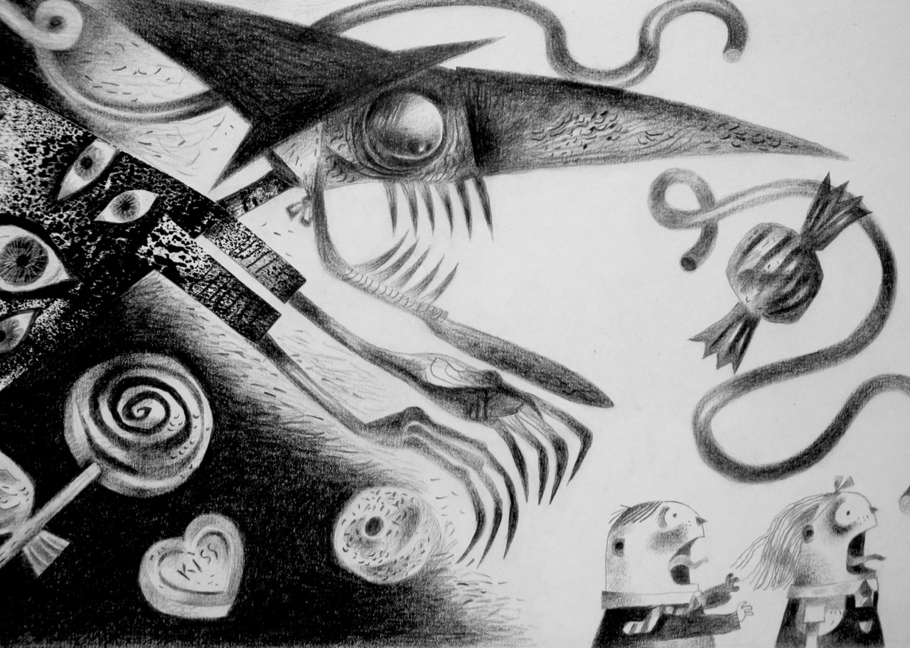
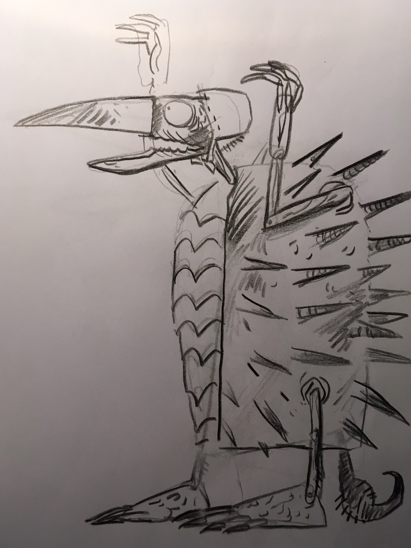
For the Simon Armitage version of the tale, Hansel & Gretel, a Nightmare in Eight Scenes, I collaborated with paper-cut artist Peter Lloyd, providing him with rough drawings that he then transferred into elaborate stop-motion shadow-puppets. To begin with Hansel and Gretel saw only a crone in a bonnet and cloak, but when the cloak came off, the full horror of a spiny crab-like carapace was revealed, reverse-joint legs – like a bird – and a tail with a stinger that snaked into view and coiled and thrashed about.
Guide drawing for Peter Lloyd’s shadow puppets
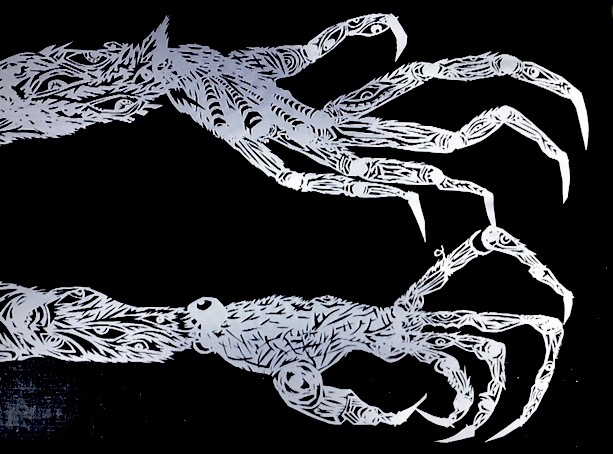
Close up hands for the Witch created by Peter Lloyd
Animating a large Peter Lloyd shadow-puppet Witch’s head, used for close-ups
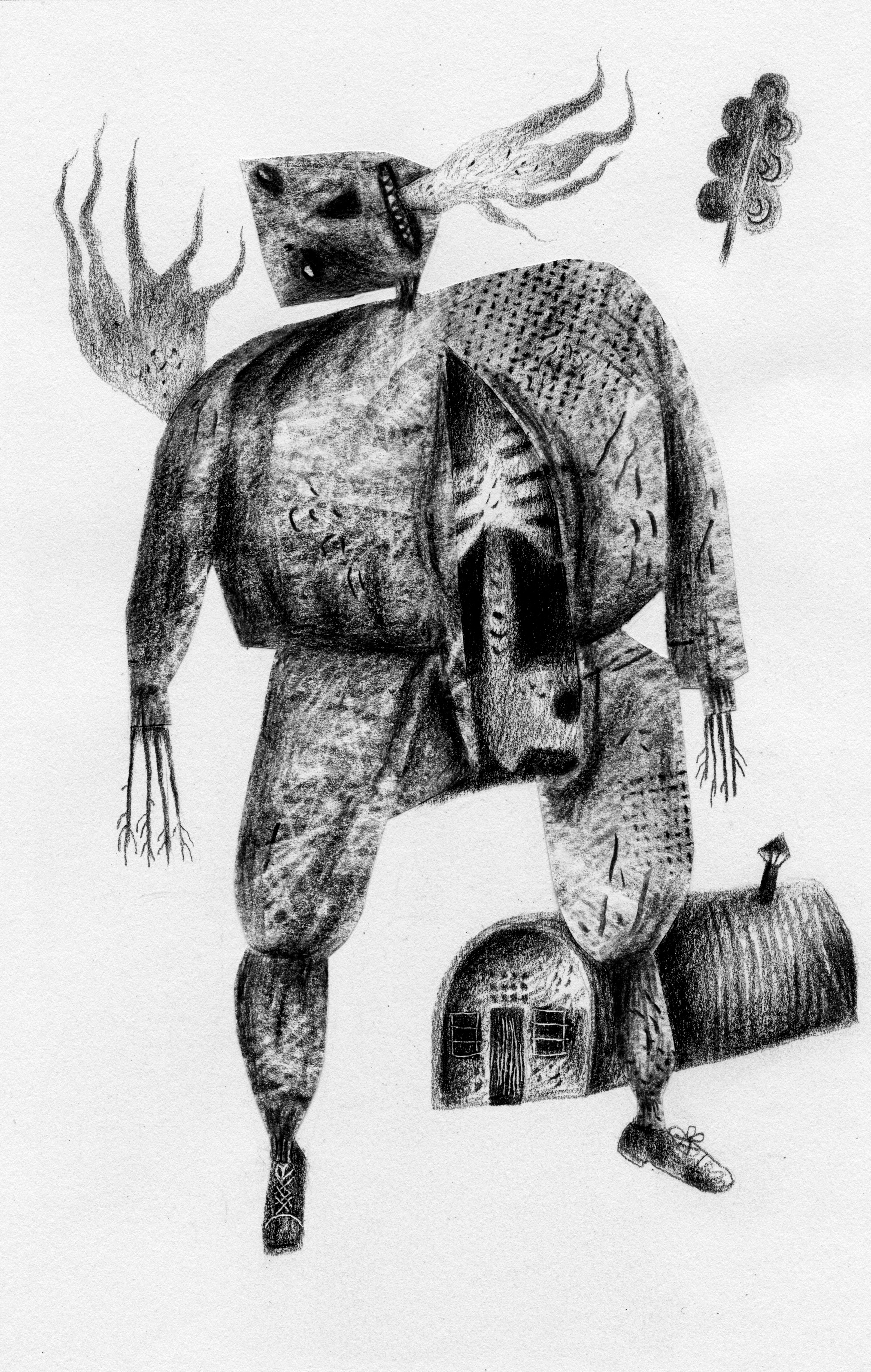
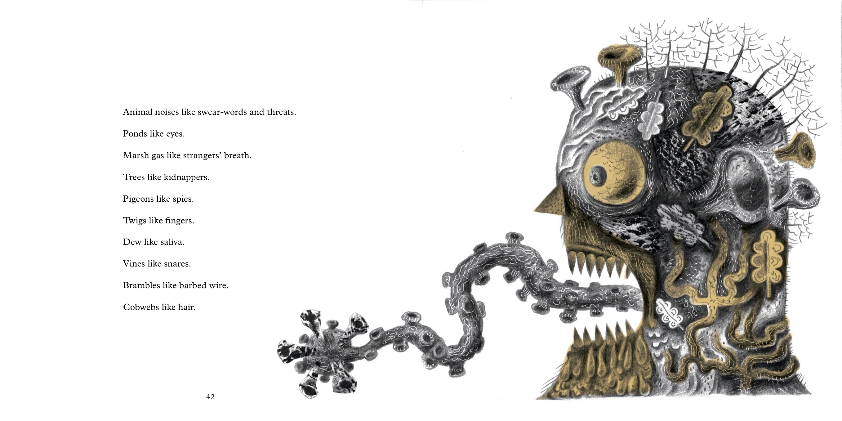
When Simon Armitage’s libretto for the stage production was published in 2019 as an illustrated book by Design for Today, I made a monstrous Witch – seen below as she’s turned into a gobstopper when Gretel pushes her into a cauldron of sweets boiled down into molten sugar – and a monstrous personification of the haunted forest, too, wonderfully described by the poet in a text that’s an illustrator’s dream.
The Witch transformed into a gobstopper
The personification of a fairytale haunted wood
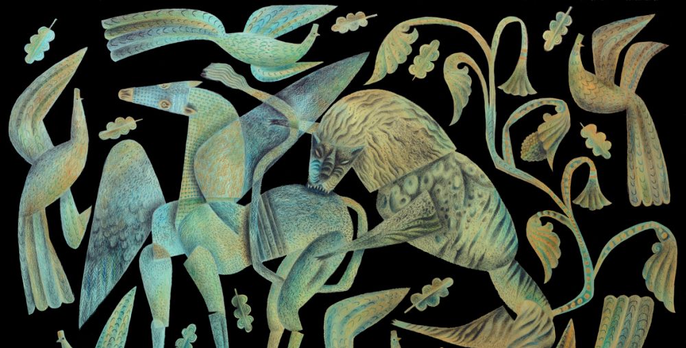
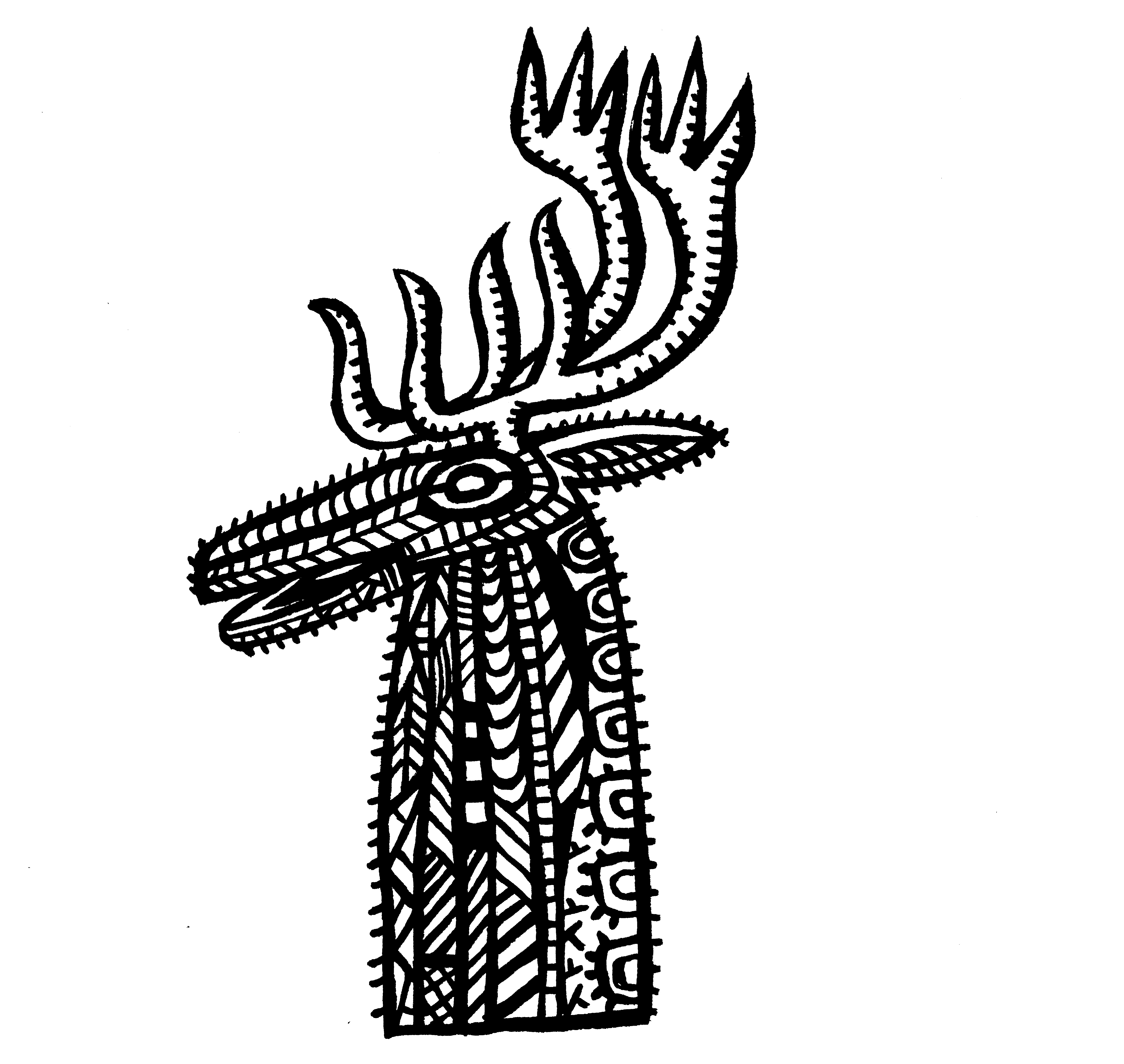
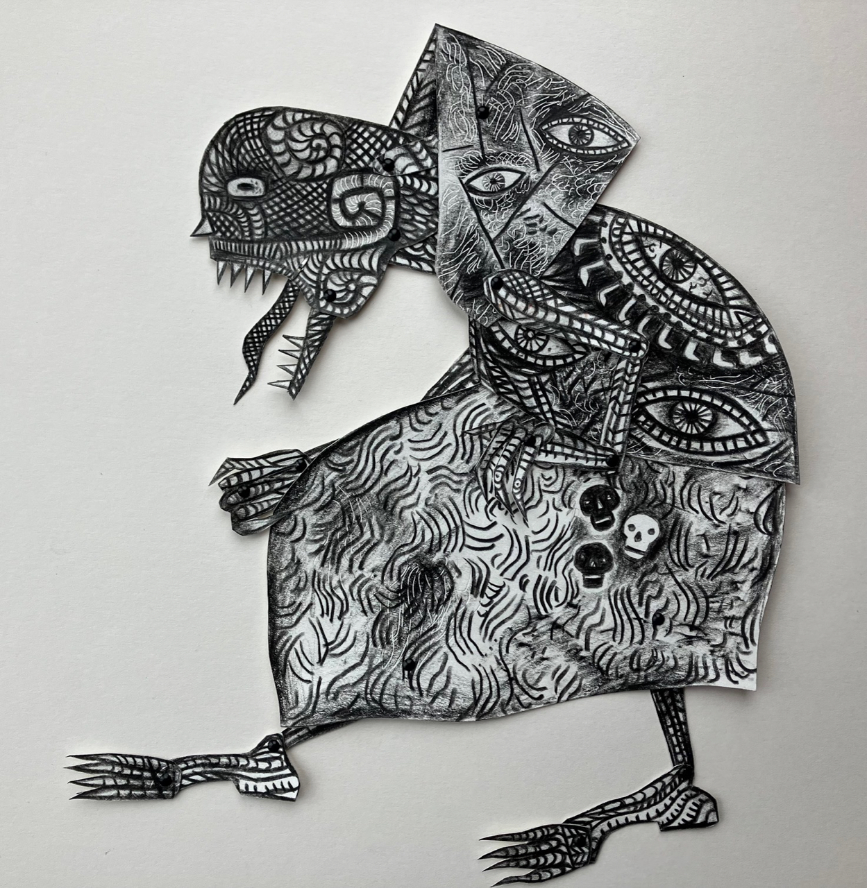
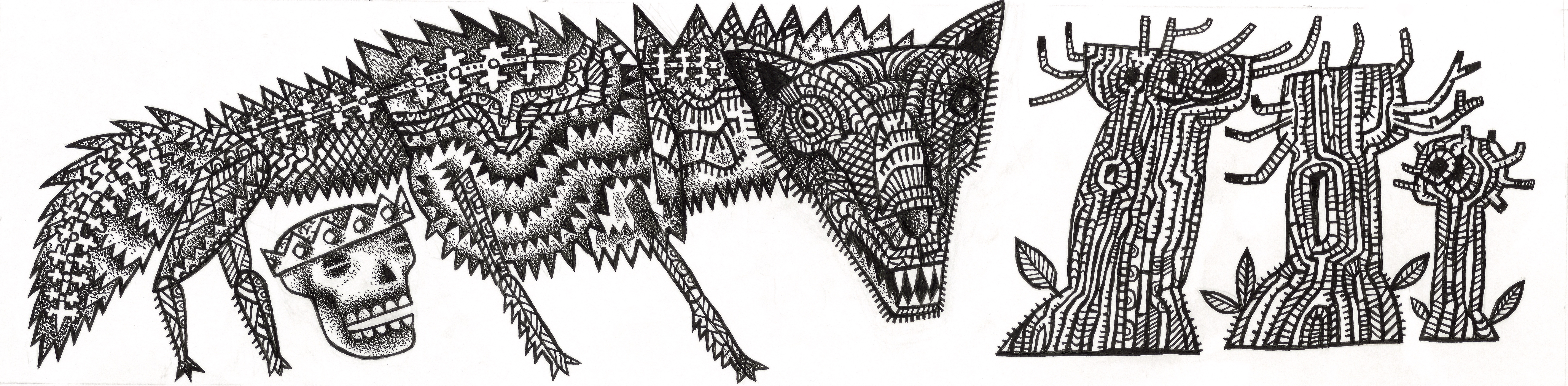
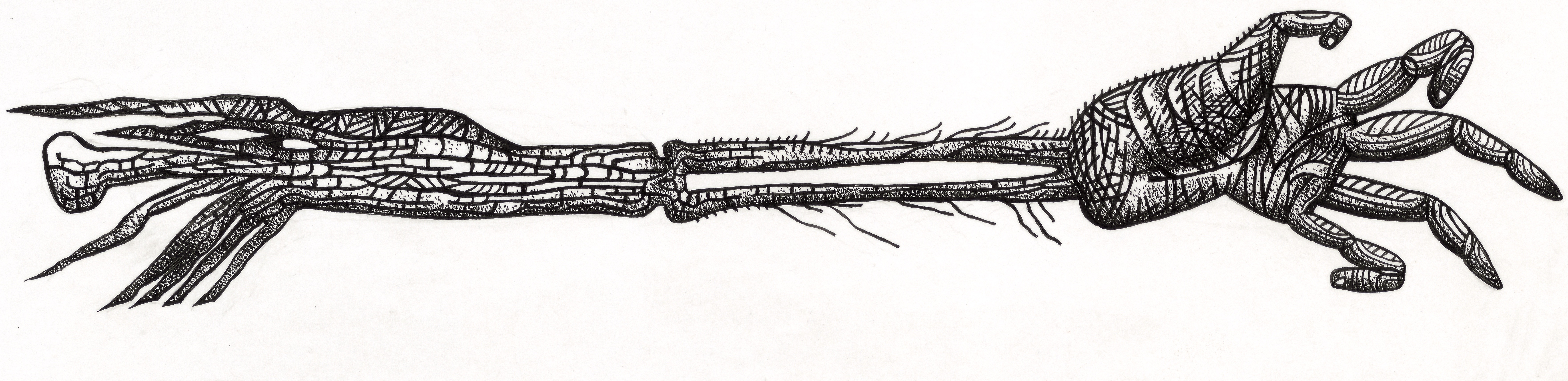
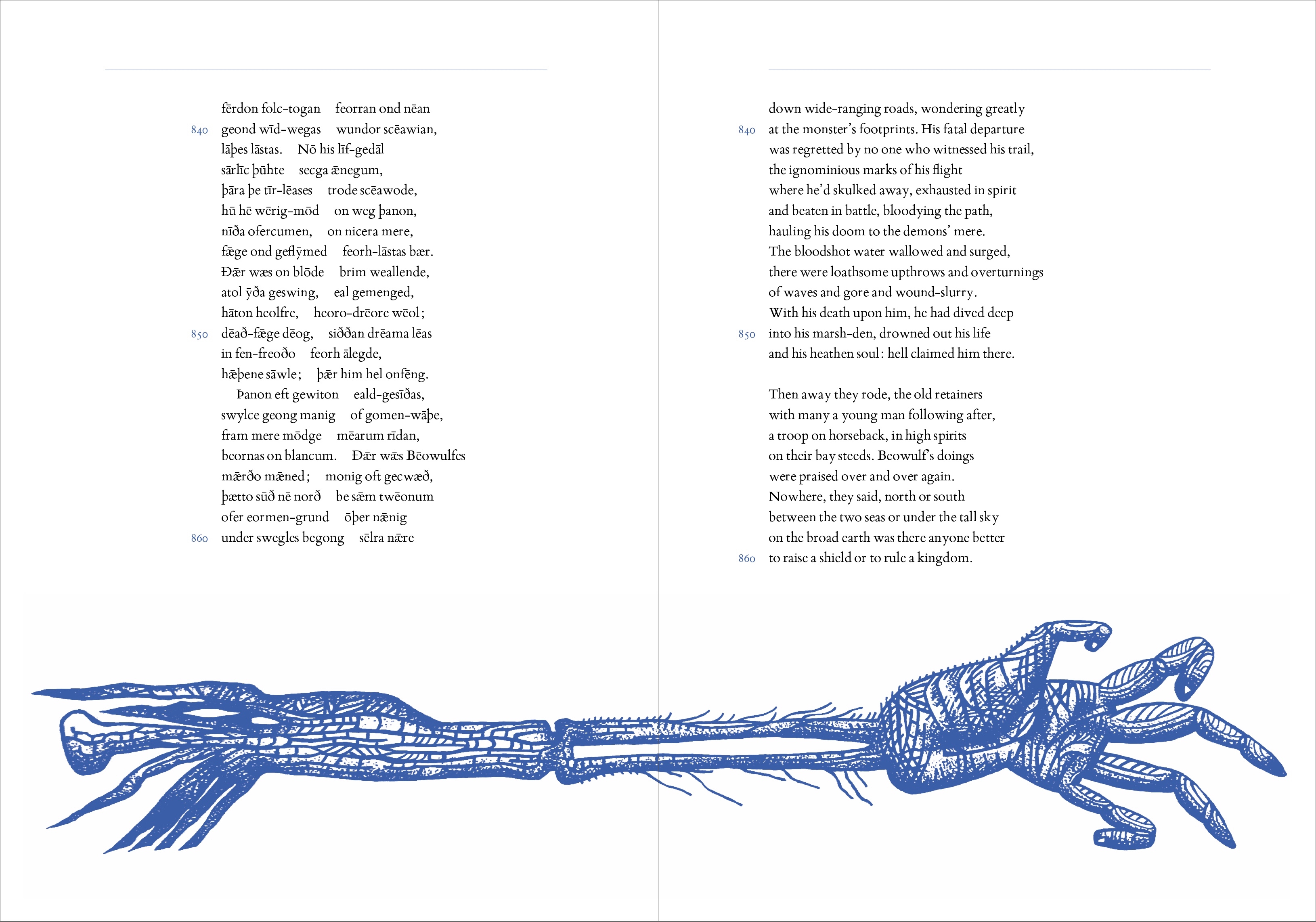
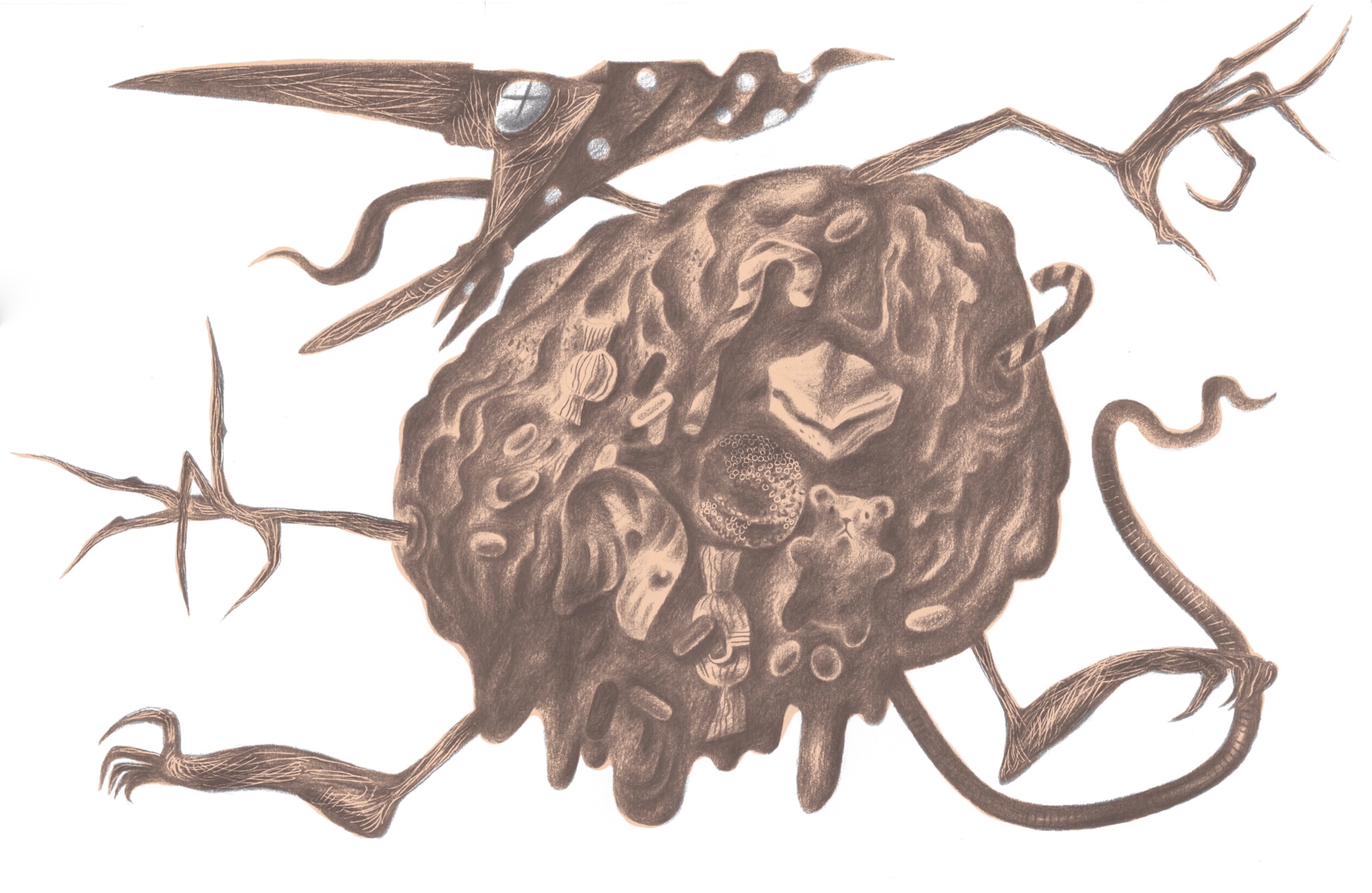
Beowulf is jam-packed with the eponymous hero’s encounters with monsters of many varieties. There’s a deep-sea-creature that drags him to watery depths, a dragon he slays – though he becomes fatally wounded in the process – and that arch-monster of literature and father of all horrors that came after him, Grendel, who is of a sufficient size to stuff thirty human corpses into a bag and make off with them. Beowulf tears off Grendel’s arm as a trophy, and the fatally wounded monster slinks away to die ‘off-stage’. We then discover there’s worse waiting in the wings, for Grendel has a mother, and she’s as wrathful as a nest of Asian Hornets on the warpath when she sets out to avenge her son’s death. (And you thought the vengeful mother was invented by the makers of the second Alien film. Turns out that she goes back to Anglo-Saxon literature, and before that to even more ancient mythologies and tales.)
So I am thrilled to be making images of these archetypal monsters, and hopefully in ways that will be unexpected and visceral enough to raise a few hairs at the nape of the neck. But in a good way, of course.
This screen-print of Kevin and the Blackbird was begun back when Dan Bugg of Penfold Press and I were galloping to the finishing line of our fourteen-print series of Sir Gawain and the Green Knight in time for it to be used to illustrate the 2018 Faber & Faber edition of Simon Armitage’s translation of the poem. As a result we set Kevin aside and agreed to return to the print when time allowed. It took two years, but now it’s done.
Kevin and the Blackbird
Screenprint signed by the artist. Edition size: 90, print size: 35 x 35cm, paper size: 45 x 44cm.
This week Dan and I met up at the halfway geographical point between his home in Yorkshire and mine in Wales in order for me to sign and number the edition. Kevin and the Blackbird is available, either directly from the Penfold Press online store, or if you’d like to see it in person before deciding, there are copies at the Martin Tinney Gallery in Cardiff available for viewing and purchase.