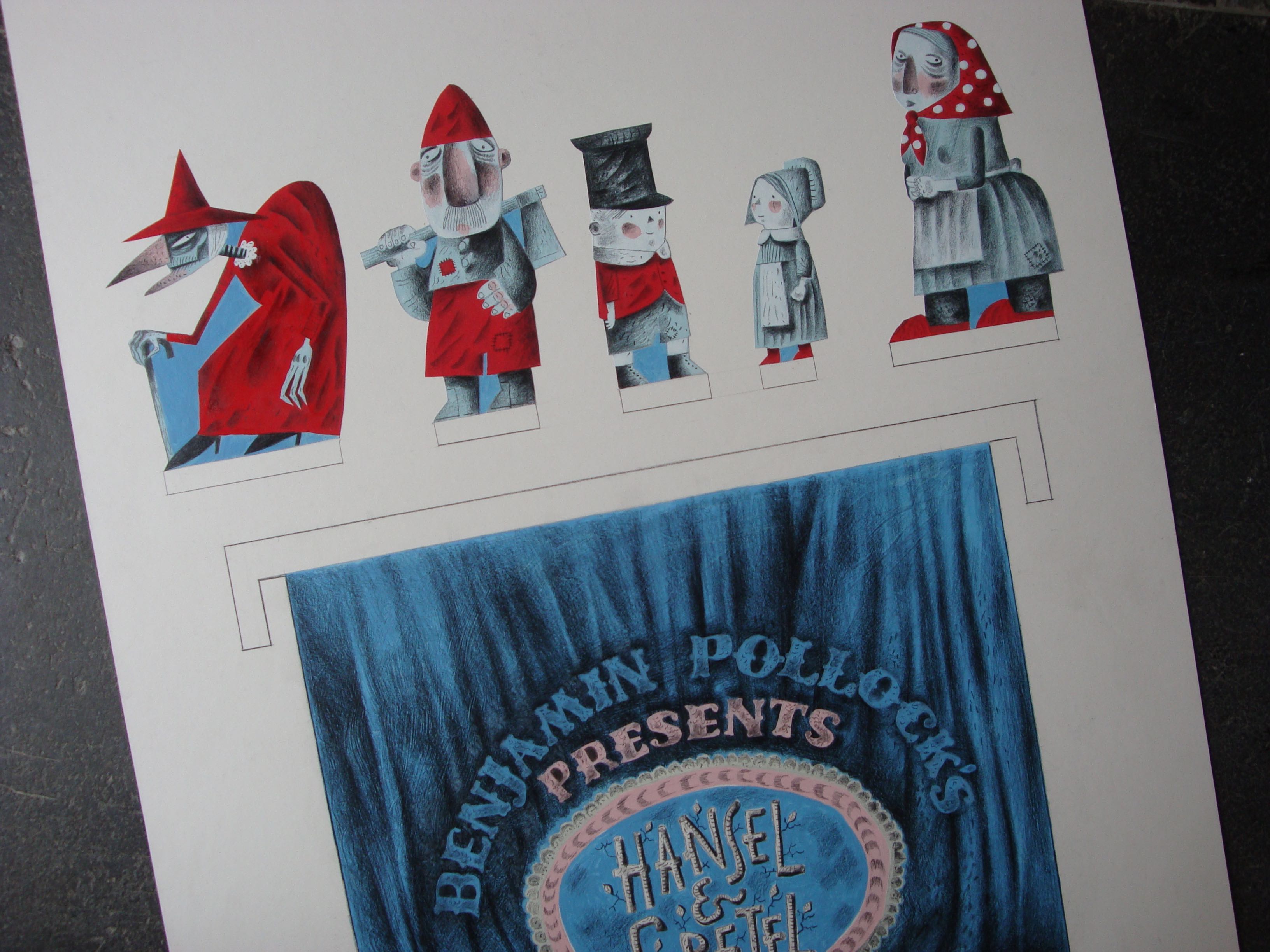
I designed the Hansel & Gretel Toy Theatre for Benjamin Pollock’s Toyshop in 2016 and it was published in 2017. It’s still available at the shop, having been re-printed several times. It comes as a 6 x A4 sheet kit in an envelope, requiring a craft-scalpel, cutting mat and glue to assemble. The original commission had been to create a ‘model’ theatre with a couple of scenes and characters to display, but by the end of the project I’d created a complete toy theatre at a small scale, with instructions for building the stage, together with scenery and characters to perform the play script I adapted from the fairy tale, and even a theatre poster to advertise a performance.
During the Covid lockdowns, in solidarity with the difficulties faced by all small shopkeepers trying to run their businesses, I gave the rights of the Hansel & Gretel Toy Theatre to Benjamin Pollock’s Toyshop, so the business would no longer be obliged to pay me royalties. It was a small but I hope significant gesture of support during very hard-to-negotiate times.
Simon was a wonderful interviewer. He’d undertaken meticulous and lengthy research and was well prepared to take me back along the pathway to childhood and the roots of my love of toy theatre. We could have talked for days about our shared passions for folk art, the Erzgebirge tradition of toys and the magic of toy theatre, but in the end we had to wrap it up in just under an hour. Simon is the artist behind the wonderful shadow-boxes published by Benjamin Pollock’s Toyshop, some still available at the Pollock’s online store.
In 2019 Olivia Ahmad wrote about Clive Hicks-Jenkins’ explorations of Hansel & Gretel for Varoom magazine.
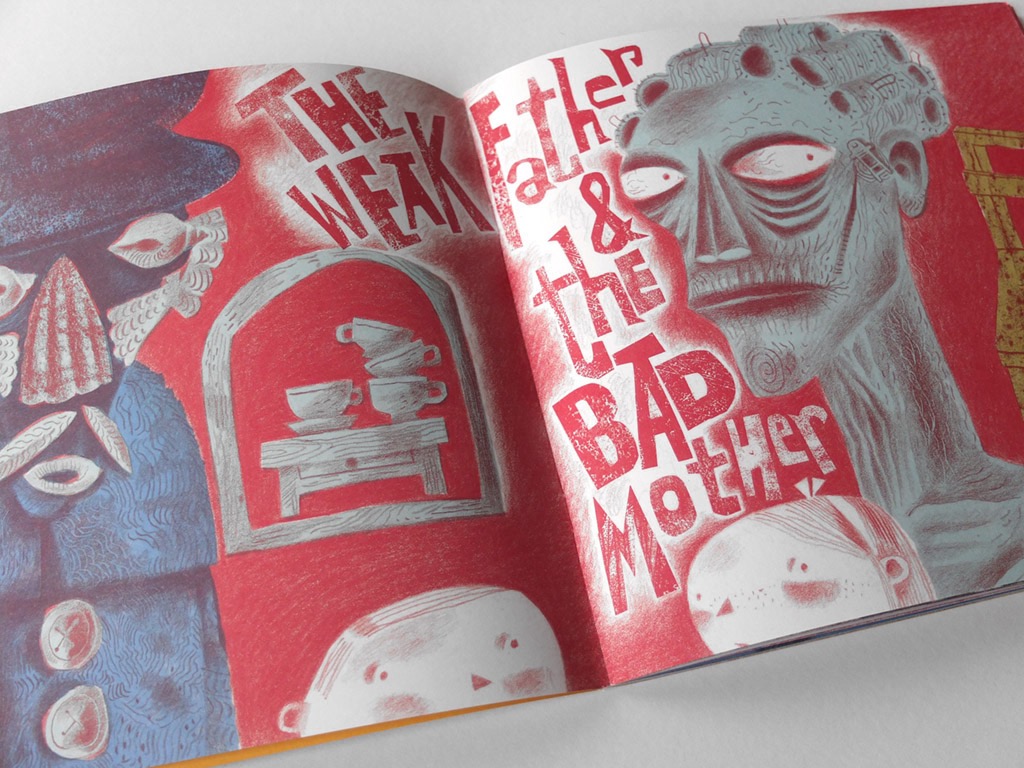
Clive Hicks-Jenkins’ retellings of classic fairy tale Hansel & Gretel have an edge. Taking in the original tale’s horrific neglect, abuse and murder, Clive has adapted the story into a picture book, toy theatre and original stage production. Olivia Ahmad looks at Clive’s startling manifestations of the familiar story.
“The boy was called Hansel, the girl was called Gretel – hence the title, Hansel & Gretel.” So the narrator opened Clive Hicks-Jenkins’ 2018 staging of his version of the European folk tale, first recorded by the Brothers Grimm in 1812. The performance had the subtitle a nightmare in eight scenes, which undermined any notion that Clive’s combination of animation and puppetry would be a saccharine adaptation of the story of the witch who tempts two lost children into her house made of gingerbread. “It’s a dark and brutal story”, he says, “the mother has been cruel and treacherous, and is dead by the time the children return home, with no explanation of what happened to her. Gretel has killed the witch in the most dreadful manner, which is not just something you can brush aside. There will be psychological scars. So the story is odd and downright nasty and has too often been glossed in endless re-tellings. It was just too good a chance to miss.”
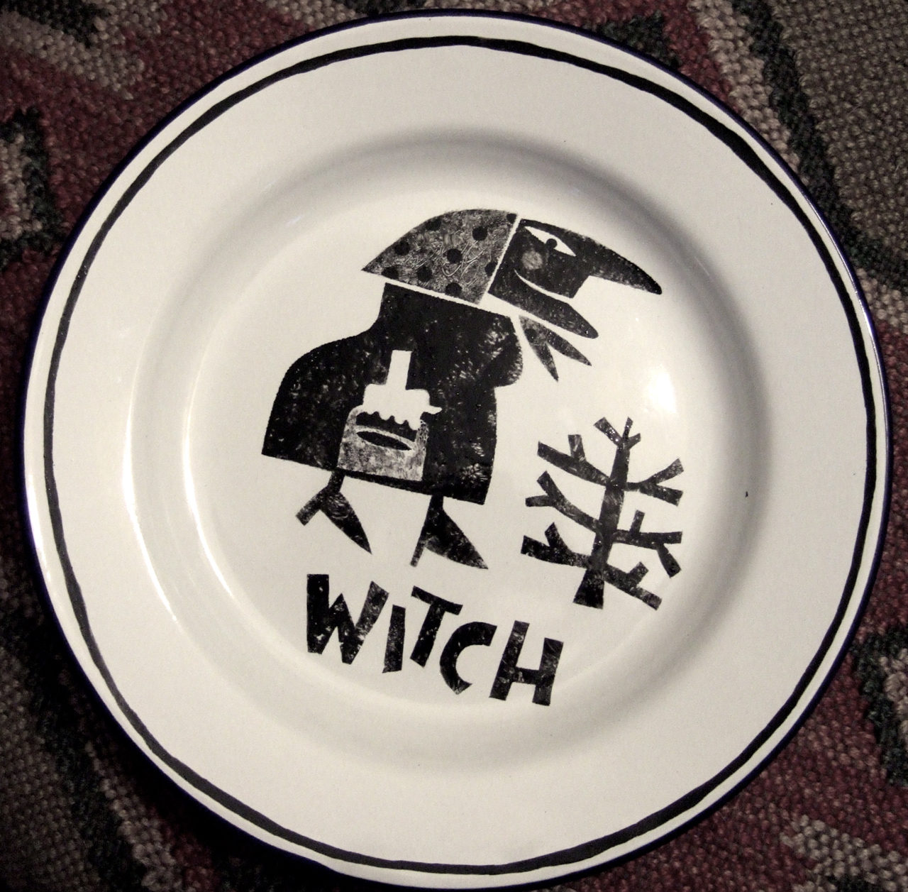
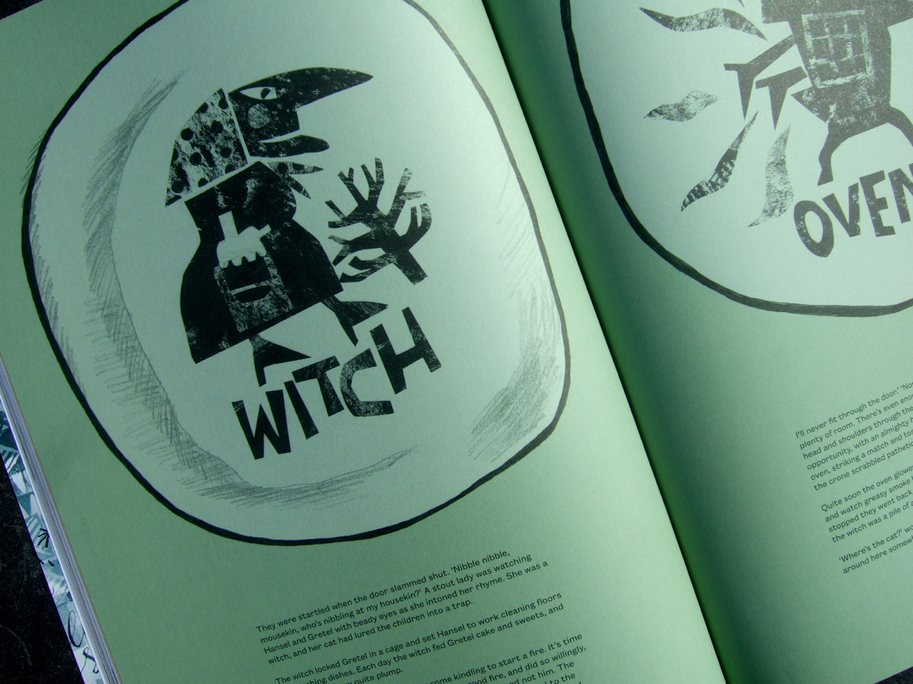
Clive first took up the chance to envision the story for a book in 2012, inspired by a childhood memory. “I had a Toby Twirl annual,” he explains. “There was a story of a witch who captured Toby and imprisoned him. The pictures of her terrified and enthralled me. She stuck like a burr in my imagination and she’s been there ever since. When in an idle moment some years ago I felt the need to be drawing a witch, I chose Hansel & Gretel as the vehicle simply because a witch was central to the plot. I painted the characters onto a set of enamelware plates for a bit of fun, for no other purpose than for use at home. And in so doing, I laid the foundations for the larger project, though I didn’t know it at the time.”
The plate designs, produced with hand-cut stencils reminiscent of European folk art, migrated from Clive’s kitchen shelves in 2014 when he adapted them into a series of illustrations for Random Spectacular magazine. After a passing comment at social media that he would like to expand the magazine piece into a picture book, Random Spectacular agreed to publish one. Clive envisioned a dark tale, one that asked difficult questions: “What happens to children who kill? What effect will it have on them?”
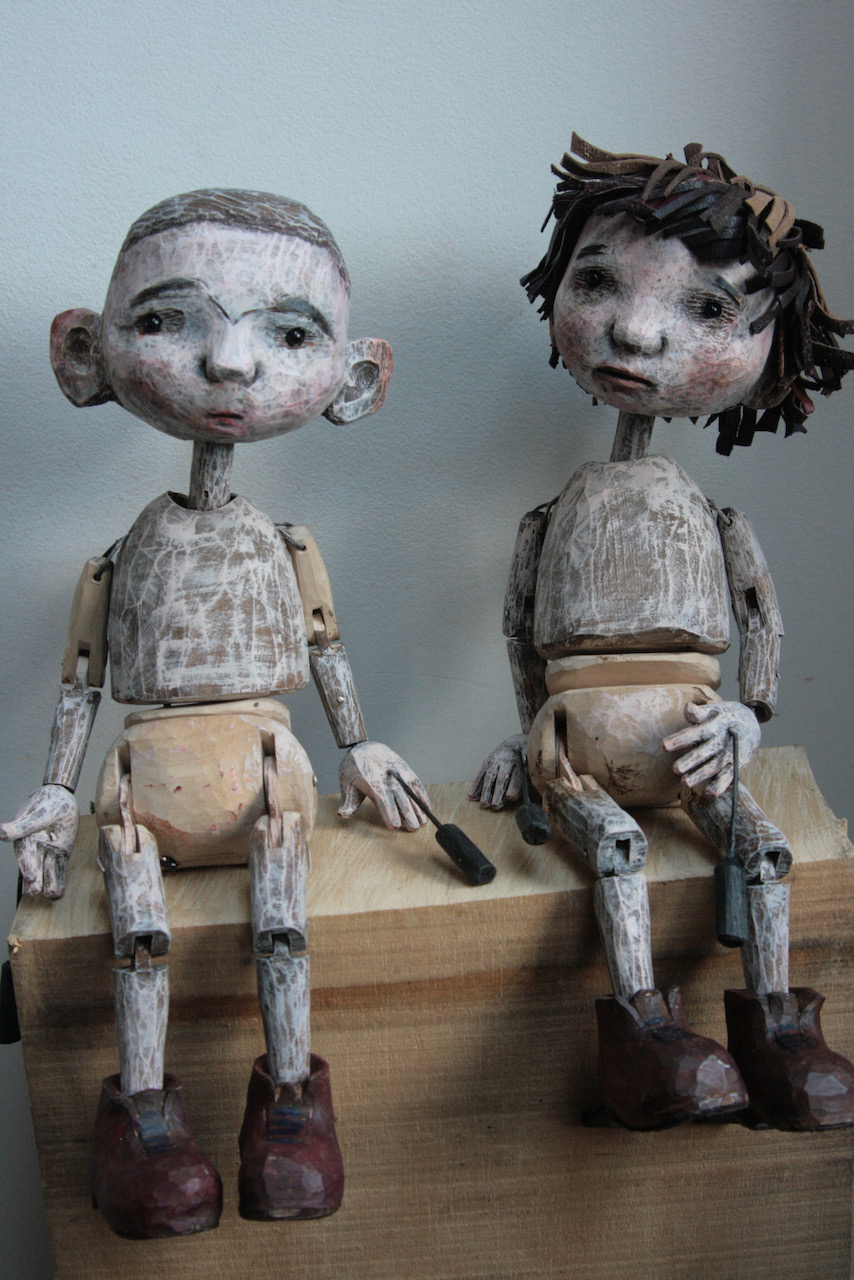
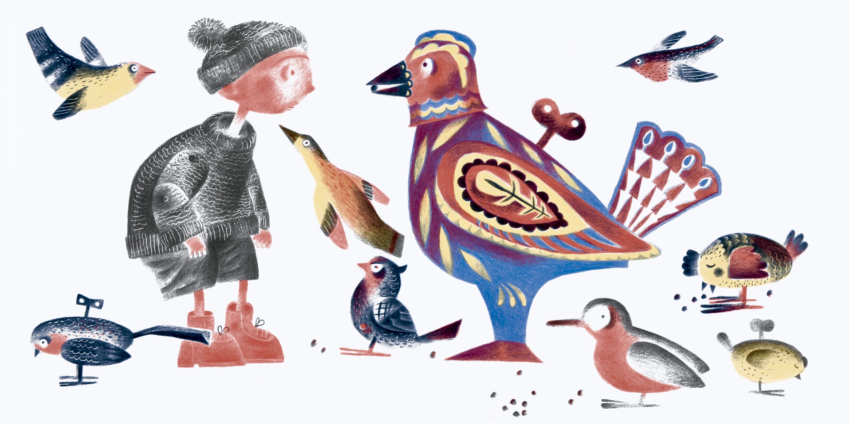
The character design of the siblings was vital to telling their story: “The children that I designed right at the start were really simple. There was a touch of St Trinian’s to them: short and pod-like with skinny arms and legs and dressed in school uniforms. Though caricatured there was a tenderness and bewilderment to them that was touching. Hansel is incredibly passive throughout, a poor lost puppy. Gretel appears meek, though later manifests an awesome inner Ninja.”
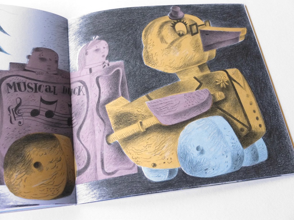
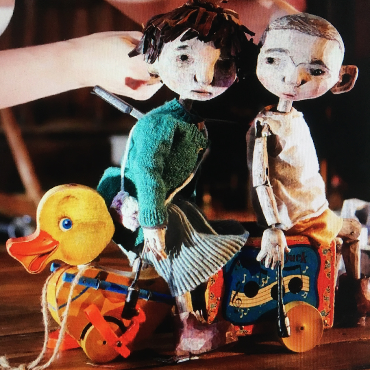
Alongside the cast of characters appear occasional motifs drawn from European toys and popular design ephemera that Clive has gathered over the years. “It’s not exactly a collection”, he explains, “but a loose gathering of objects that interest, intrigue and move me. Some inherited and some sought. I find that vintage toys worm their ways into my imagination and from there into my work.” While these elements represented a personal history, moments like Hansel and Gretel making their getaway with the aid of a duck based on a 1950s Fisher Price pull-toy, make Clive’s fantasy world uncannily familiar.
For the rendering of the book Clive made separations, a technique previously unfamiliar to him. Creating a drawing for each coloured layer of an illustration, the layers of drawings were then scanned and coloured digitally according to Pantone references he selected to create a sugared almond palette.
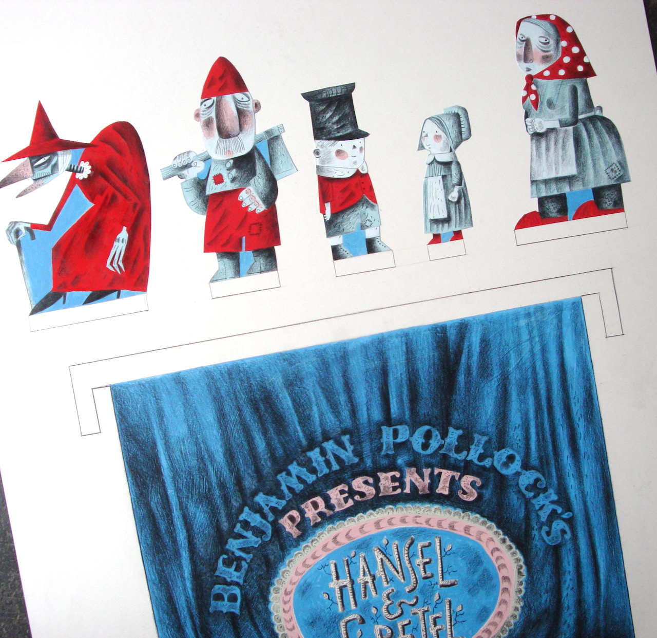
The Random Spectacular picture book was published in 2016, and the same year Clive was commissioned for another Hansel & Gretel project by Benjamin Pollock’s Toyshop in Covent Garden, which sells historic and contemporary cut-out-and-assemble toy theatres. The commission to create the Hansel & Gretel Toy Theatre resonated with Clive’s childhood: “As a boy I’d cut out, coloured in and performed Pollock’s productions on a home-made stage constructed from a cornflakes packet, and so this was a dream come true for me.”
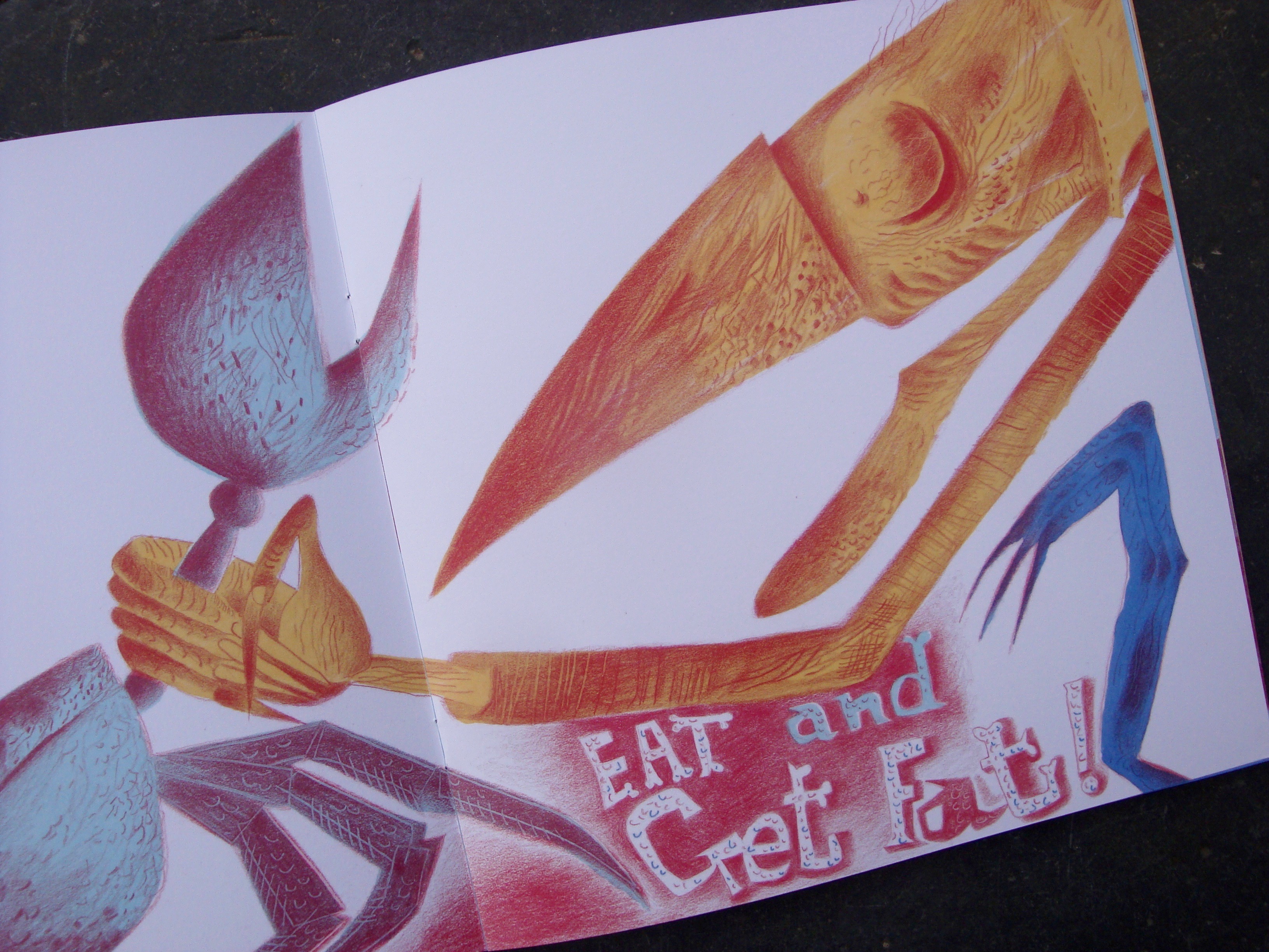
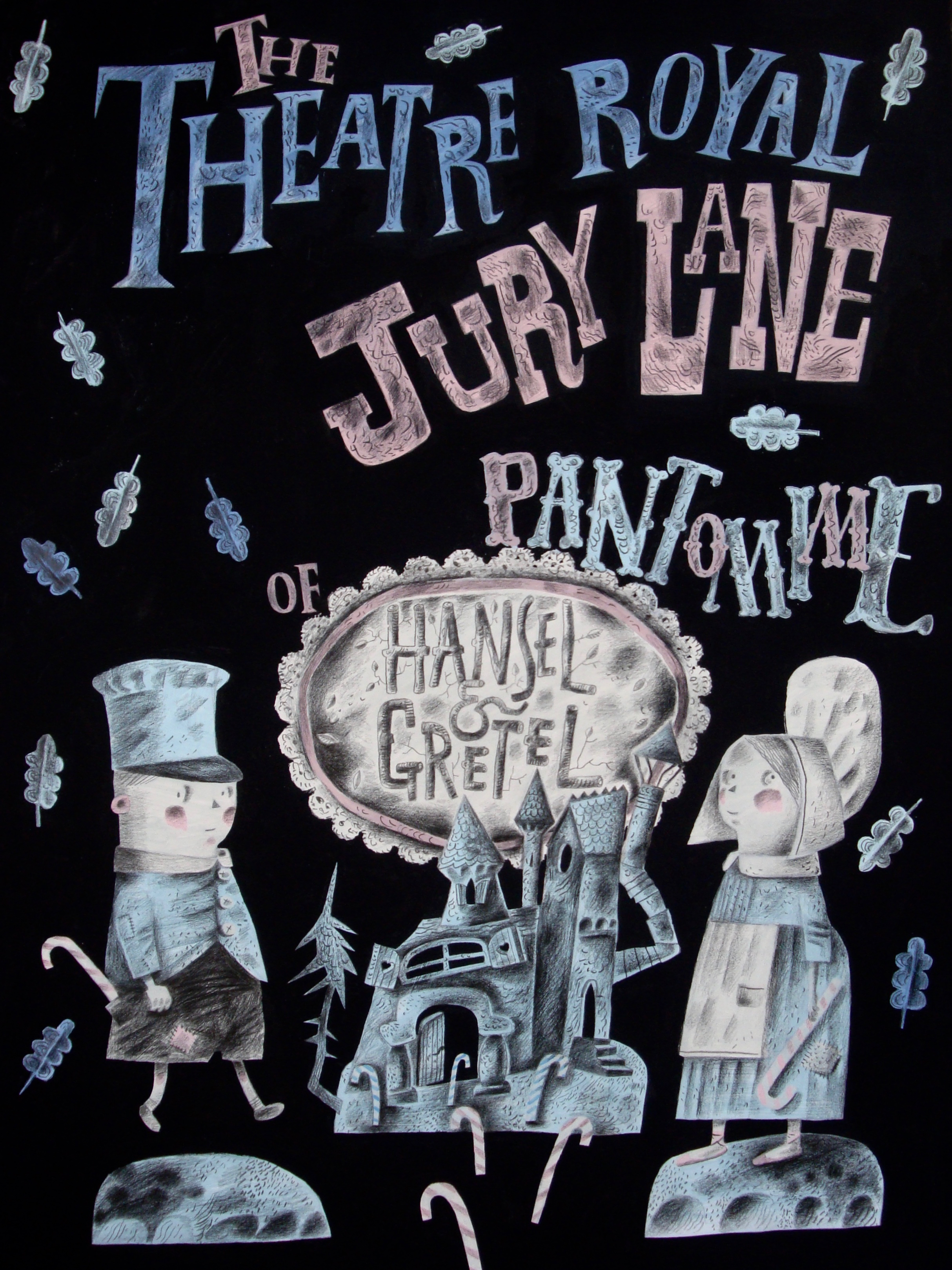
He initially suggested an adaptation of his Hansel & Gretel picture book, and while the Pollock’s project went on to incorporate some of the atmosphere of it, many of the more grotesque elements were considered “way too scary” for the toy theatre’s intended family audience. So Clive embarked on yet another adaptation of the story, re-fashioning it to create a meta- production in miniature, perhaps informed by his early career as a performer: The Pollock’s Hansel & Gretel Toy Theatre starts from the point where the picture book finishes. “Having survived the ordeal of the witch, the children leave home to make their way in the world. Arriving in the big city they’re picked up by a theatre impresario who promises fame and fortune if they sign a contact with him, and they duly end up starring in a pantomime version of their own story, though with most of the unpalatable bits edited out.
So no wicked mother ending up being murdered by their father, and a much tamer version of a witch who doesn’t have tentacles where her nose should be!” The performance takes place at the fictional ‘Theatre Royal, Jury Lane’, a play on word of London’s Theatre Royal in Drury Lane.
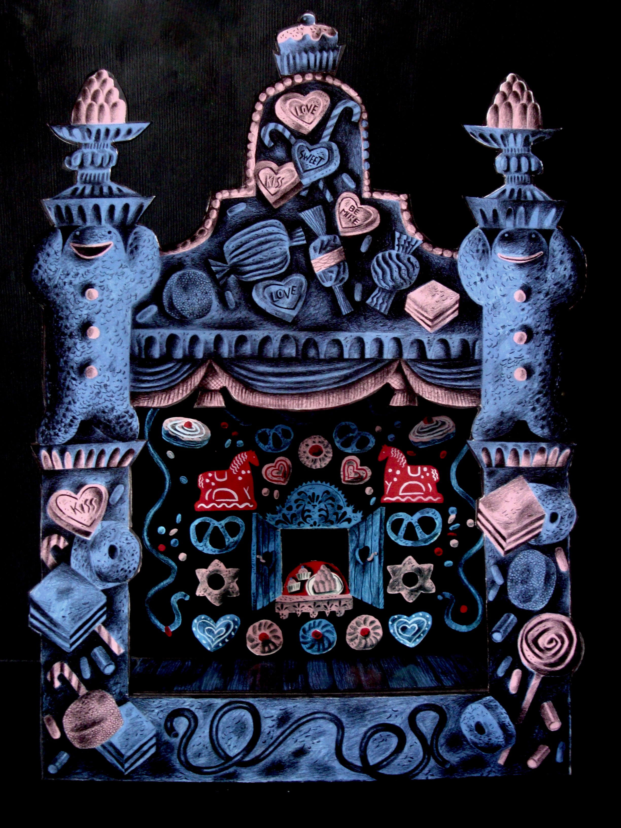
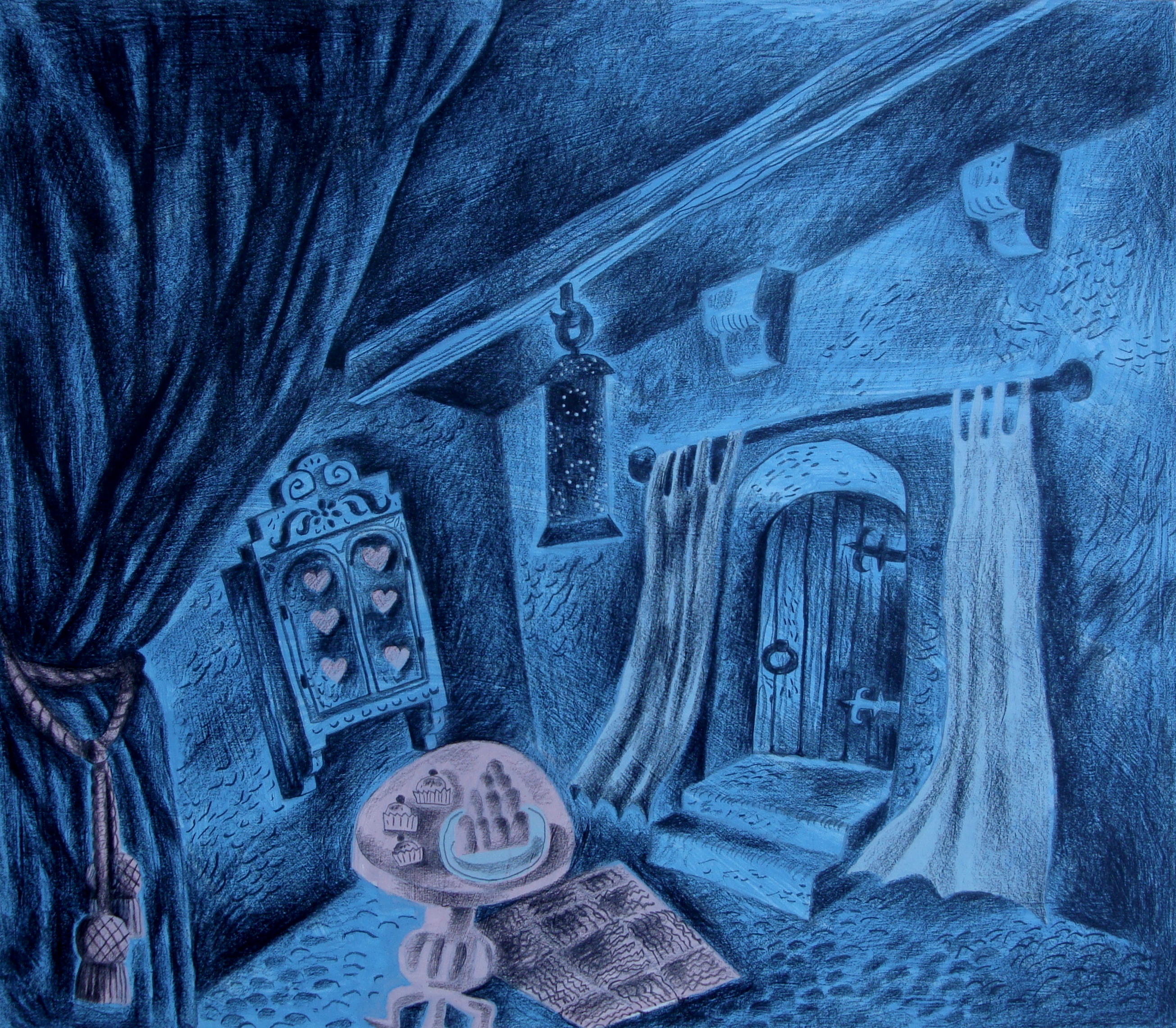
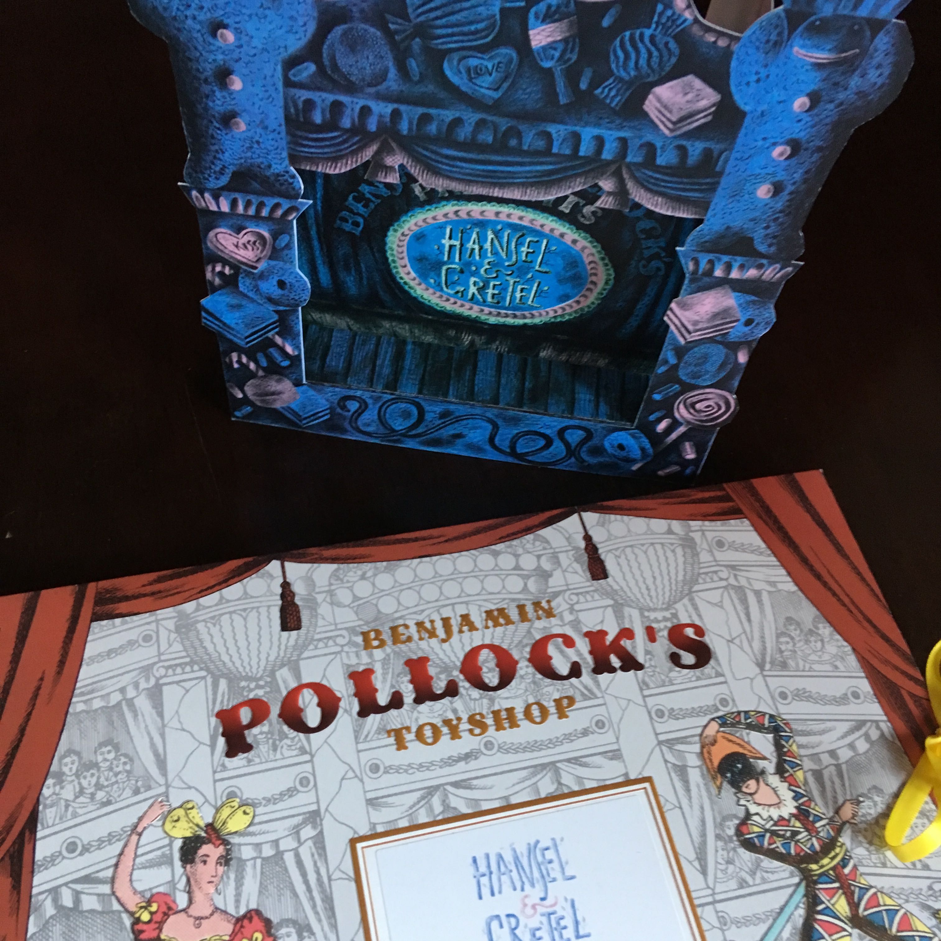
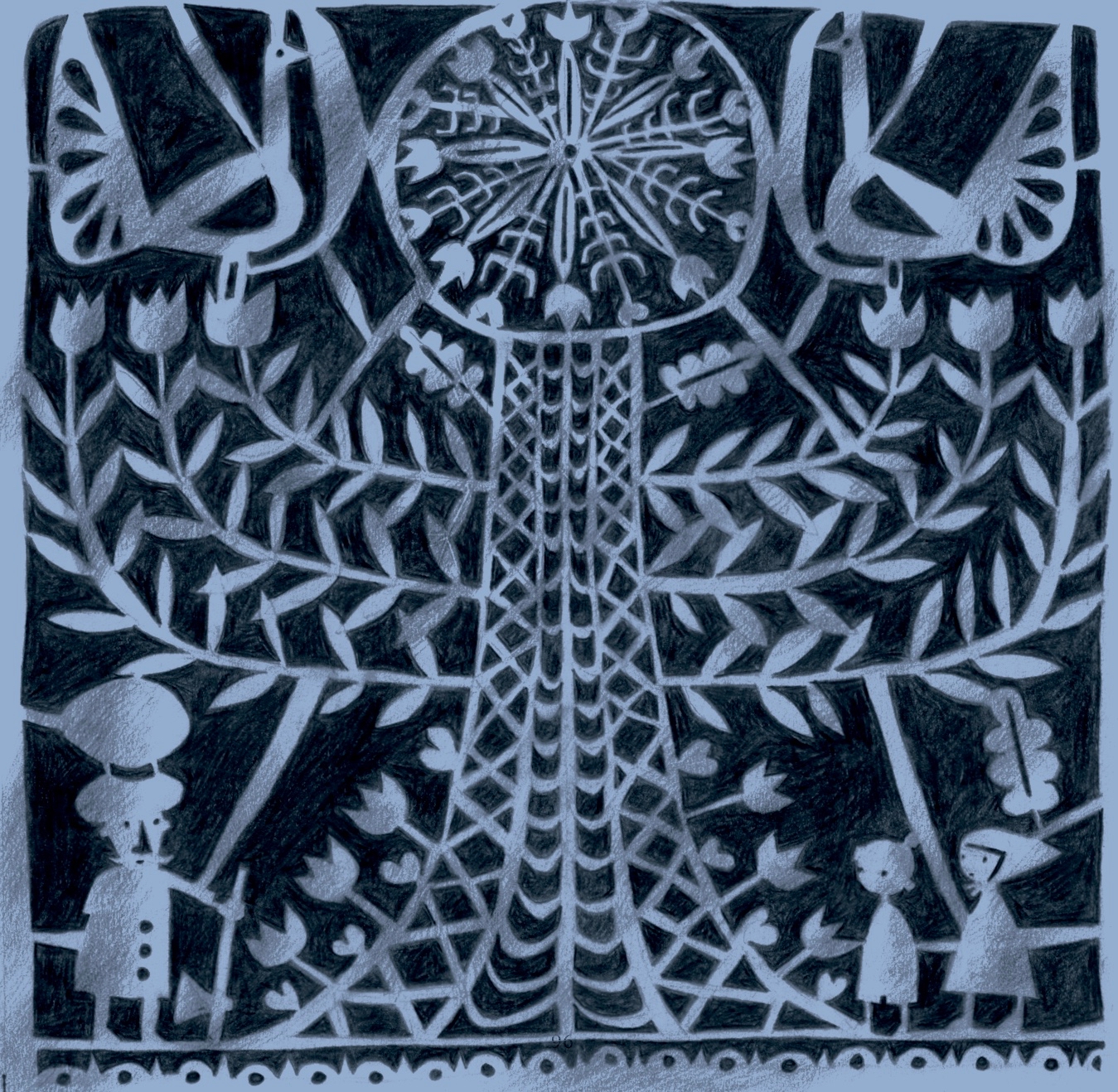
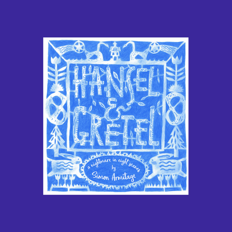
The Benjamin Pollock’s Hansel & Gretel Toy Theatre was published in 2017, and while light-hearted in tone, it retained some of the gothic horror of the picture book with its poisonous candy blues and pinks overlaid with a blanket of dark pencil hatching. The flatpack consists of a stage, proscenium arch, scenes, characters and props, along with a script and a poster to ‘advertise’ the production.
The following year, Clive’s Hansel & Gretel: a nightmare in eight scenes premiered on a life-size stage at the Cheltenham Music Festival. It subsequently toured the UK, finishing at the Barbican in London where a performance was recorded for broadcast Christmas week 2018 on BBC Radio 3.
For this his largest imagining of the story – a combination of live narration, music, animation and tabletop and shadow-screen puppetry – Clive collaborated with producer Kate Romano and the Goldfield Ensemble. The producer had originally visited Clive to discuss another project, but after seeing his Pollock’s designs suggested they make a music theatre production about the ill-fated brother and sister.
Clive recommended the producer enlist the poet Simon Armitage to write the libretto. Simon took the story in a completely different direction by placing the children into a contemporary context. “I think it was genius on Simon’s part to set the story in a conflict zone, and to rewrite the adults as loving parents fearful that their children might become casualties of war,” Clive says. “That changed everything for me in terms of how we relate to the family. They’re not dysfunctional, but find themselves in terrible circumstances.” The performance opened with animations of marching toy soldiers, which soon fall into the disarray of battle. Hansel and Gretel’s parents send their children away from this carnage in order to protect them.
However without their parents’ protection, they become enticed and ensnared by a witch. When she prepares to bathe them so they can be trafficked, Gretel fears that the hot water for the bath will be used for boiling them alive. “Everything that we see and hear is filtered through the overheated imaginations of the children who are full of fears and misunderstandings,” Clive explains.
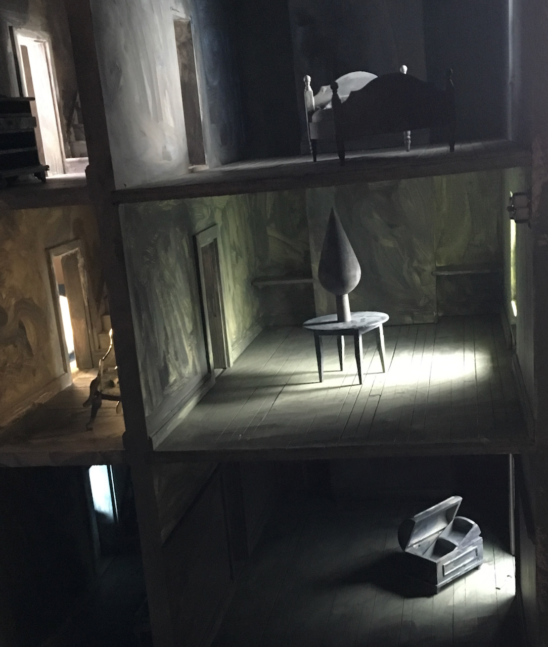
“Everything in the production, from the predatory witch and her grubby icing-sugared cottage, to the layout of its bleak interior conjured from a doll’s house, is how they see things.”
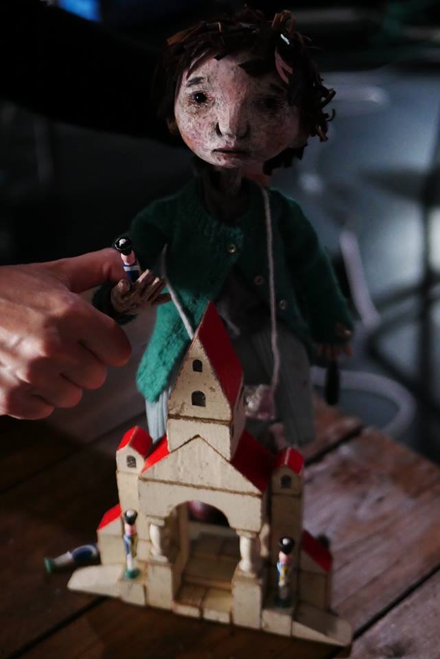
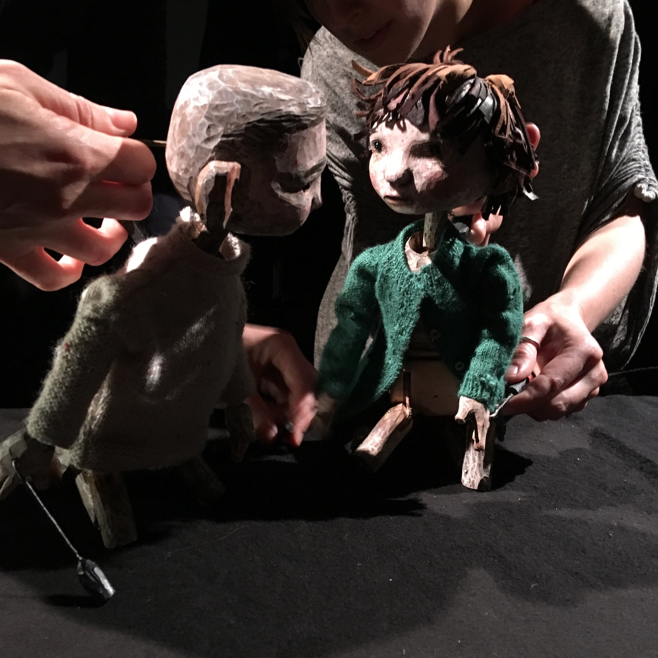
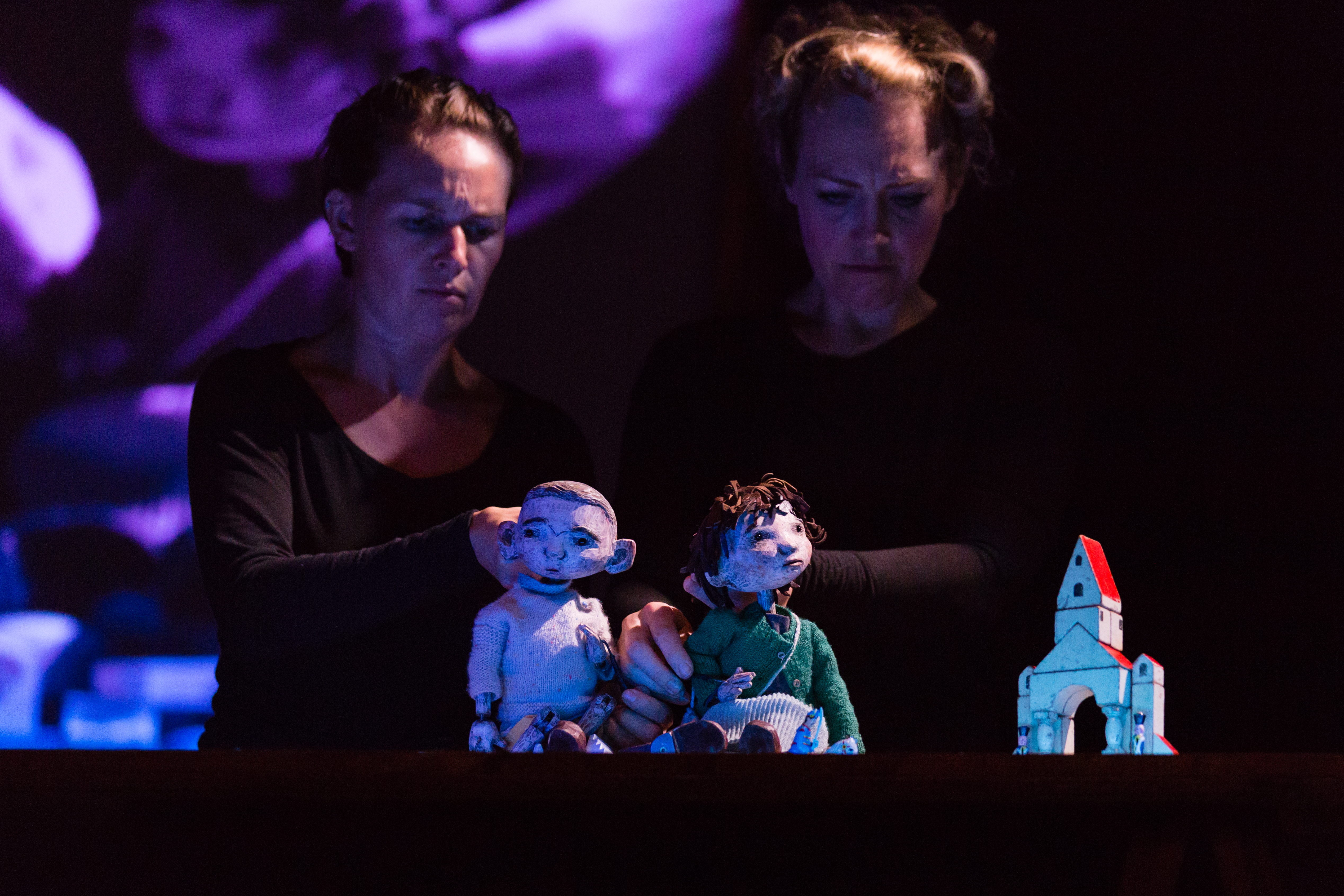
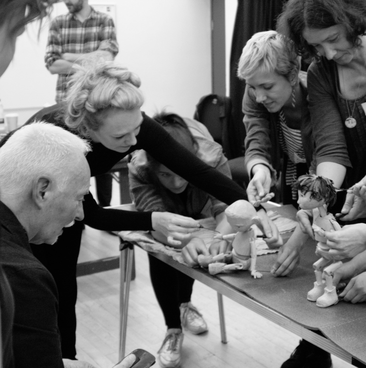
Hansel and Gretel were puppets designed by Clive and made by Jan Zalud. “I needed the puppets to function at a different level to their picture book counterparts, and be fully up to the emotional requirements of Simon Armitage’s text, ” Clive says, and his designs evolved from research on the experiences of children in transit camps. This approach was not welcomed by the Goldfield ‘project team’, who reported his drawings made them think of children in concentration camps. “I stuck to my guns,” he remembers, “because I knew the direction was the right one.”
Only one Hansel and one Gretel puppet appeared in the production, so the design and execution created appropriately neutral expressions for the puppet’s faces onto which many thoughts could be projected by audiences. Because the streaming would see them much magnified on the screen, they’d need an innate grace of movement so the moments of tenderness and vulnerability would withstand close scrutiny.
Several collaborators were assembled and directed by Clive to realise the project. The composer Matt Kaner had come to it through Kate Romano. Clive invited Peter Lloyd to produce shadow puppets of the children’s parents and the witch, Pete Telfer, to film the animations to be projected onto the stage, and his regular collaborator and assistant Phil Cooper, to be in charge of the model sets and painted backgrounds for the puppets. Puppeteer Di Ford came to the project at Clive’s invitation having previously worked with him on the stage production of The Mare’s Tale, and after a puppeteer audition and workshop, Lizzie Wort joined the company. Costumier Oonagh Creighton Griffiths was brought in to dress the puppets.
As director of such a broad team, how did Clive retain his vision of the piece? His earlier career was in stage direction and choreography, and so he knows his choice of collaborators is vital. “I mostly work with people I know well and feel at ease with,” he says, “the team are my professional family. When we’re all pulling together there’s not really a hierarchy. Once briefed I trust them. Sometimes they bring me what I expect, and occasionally there are surprises. There need to be the possibilities that some elements may exceed my expectations or bring something entirely unanticipated.”
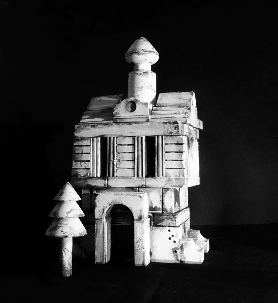
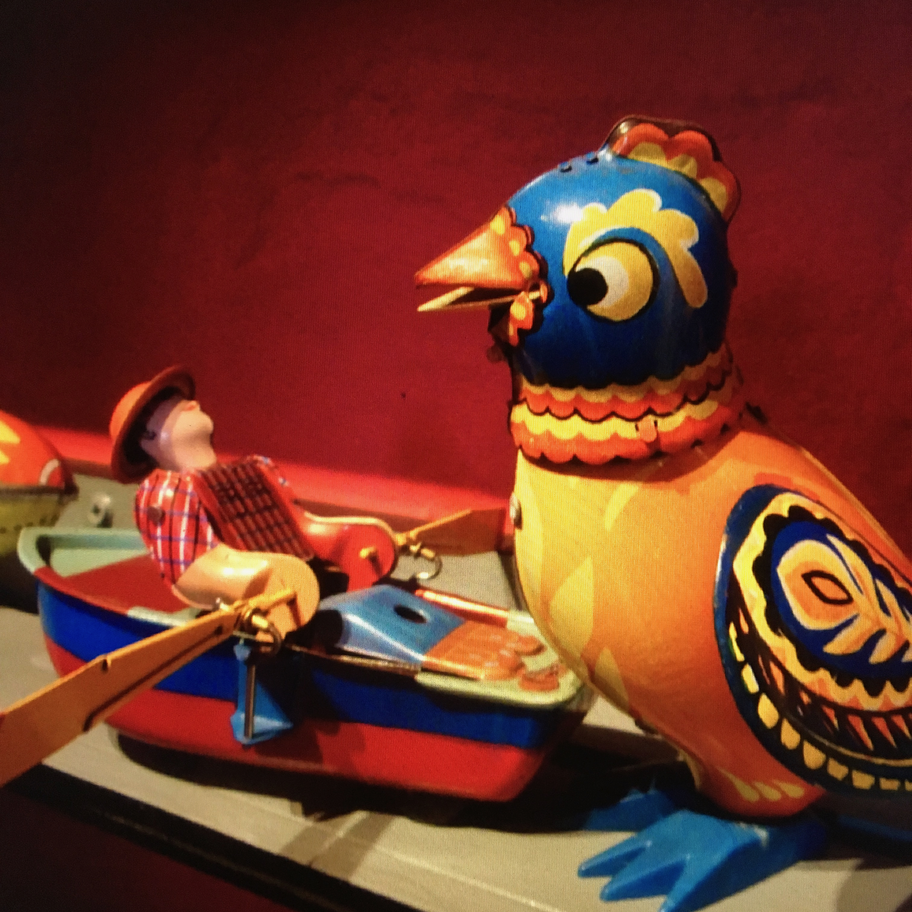
Clive’s own vintage toys played an important role onstage. One hundred year old German building blocks became the playthings of the children, and clockwork ‘pecking chickens’ stood in for the flock of birds that ate Hansel’s trail of breadcrumbs.
The chickens and a Russian clockwork ‘singing’ bird are also due to appear in Clive’s next iteration of the story: a richly illustrated edition of Simon Armitage’s libretto, produced by independent publisher Design for Today and due for release later this year.
“A toy,” Clive says, “can open your heart and make you remember what wonder feels like.” However his adoption of these tokens from the past is not an indulgence in nostalgia. “I’m not such a fool as to think that yesterday was better. I was there and it wasn’t! My explorations are all about objects being repositories of histories. They’re like radio dials, and if you twiddle them you ‘hear’ the past. That past can be anything, from sweet to despairing. It’s the focus that’s all important, and what the focus opens in the mind and heart.”
Olivia Ahmad, 2019.
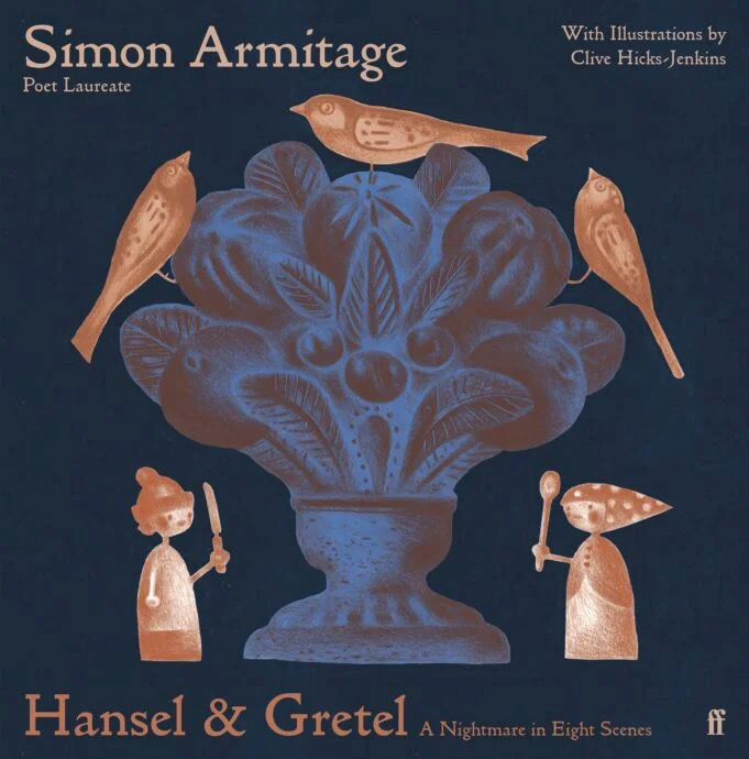
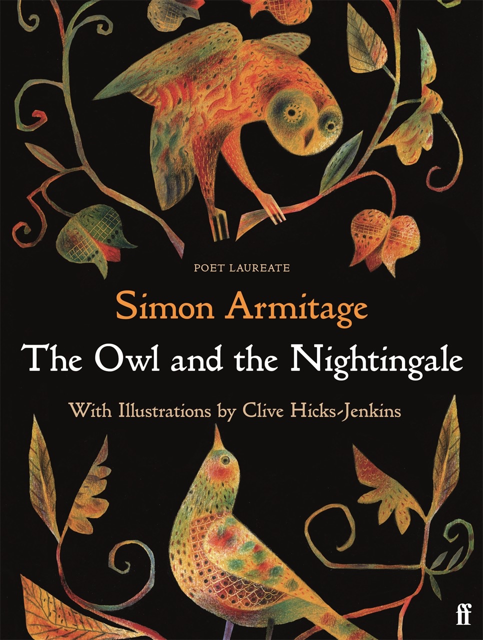
Hansel & Gretel was published subsequent to this article and in 2020 won the V&A Illustrated Book Award. It’s still available from the publisher at THIS LINK. In October a new hardback edition is due out from Faber & Faber.
Above, the 2019 Design for Today edition of Hansel & Gretel: a Nightmare in Eight Scenes, and below, the new edition forthcoming from Faber & Faber in October 2023.
The deeper I get into middle-age, and the more my time is swallowed up by the just demands of family and parish ministry, the more gruesome my crimes against literature become. Here is an egregious one: until recently, it had been far too long—probably years—since I’d read a narrative poem. But recently, I read Marly Youmans’ Seren of the Wildwood.
The poem came providentially, an unlooked-for eruption of goodness into my stacks of commentaries and sermon notes. Seren of the Wildwood is a thin place, a nexus between the waking world and that hazily surreal, maddeningly concrete, constantly shifting landscape of the dream world. Youmans’ gift for creating primordial archetypal images that stir the gut and fascinate the eye of the mind places her among the best of the poets. If you’re a connoisseur, even a lapsed or dilatory one, of narrative poetry, buy Seren of the Wildwood and read it today.
To begin with, the book, a stereotypical slim volume of poetry, is gorgeous. The work of illustrator Clive Hicks-Jenkins is fantastic—in the etymological and informal senses alike—in how he translates Youmans’ copious and varied imagination into a visual lexicon. The images interspersed through the text recall (inter alia) the doodles and illuminations of Irish monks, Greco-Roman sculptures, William Blake’s illustrations, and Van Gogh’s still-life paintings. Perfect harmony exists between text and image, even on the occasions when the image doesn’t obviously function as an illustration of some particular concept from the poem.
There is also a nice congruence between the poem and the page: each stanza fits perfectly onto a single 9” x 6” page. It’s almost as if Youmans planned her formalized stanza with the volume in mind. Most spreads have two stanzas; the rest include an image on one side plus a stanza and doodle on the other. The pages feel neither too empty nor too crowded—which is good, because by golly the poem itself is crowded, but I’ll get there later.
Above: drawings for the book’s illustrations underway, with a print-out of the poem as the artist’s guide.
Seren of the Wildwood begins not with a prologue, but with a prolegomenon. The difference is significant, for a prolegomenon is not merely informative, but schematic or methodical. It provides the interpretive key for what follows. My policy as a reviewer is to avoid spoilers at all costs, which (thankfully) in this case relieves me of the burden of explaining how to interpret Seren of the Wildwood—my children often ask me about my dreams, and however powerfully I experienced them, I find it difficult to explicate their deeper meanings. Nevertheless, the prolegomenon is deeply significant both in its proleptic function (which provokes the reader’s sense of dread and hope for redemption) and in the way it raises questions that will not be answered for quite some time, if at all.
Above: drawings for the book’s illustrations underway.
Youmans tackles two big tasks in the prolegomenon. First, she introduces the primordially mystic wildwood, the wholly ambivalent landscape that dominates the poem. In Youmans’ words, “The wildwood is a tough / Terrain, yet beauty springs / Like diamonds from the rough.” The rhyme of tough/rough gropes towards the ferocity of the place; the image of the emergent diamonds testifies to the painful possibility of redemption. The prolegomenon also complicates any interpretation of the poem with its maddeningly suggestive title, “Prolegomenon, in the voice of Wren.” Who speaks “in the voice of Wren” – the poet, Wren herself, or some other entity? I reckon answering that question (even with the likely answer of “Who knows?”) is an obvious starting place for any sort of critical reading of Seren of the Wildwood.
The prolegomenon is identical in form to the other 61 stanzas: 21 lines of unrhymed iambic pentameter followed by a bob-and-wheel metrically similar to that used in Sir Gawain and the Green Knight: a bob (one-foot line) rhymed into the wheel (four three-foot lines). That makes a total of 62 stanzas of 26 lines, and while my inner numerologist and medievalist are screaming about palindromic or chiastic significance, the still small voice of my inner editor exhorts me to move on. Perhaps some arcane consideration for mystic numbers impelled Youmans to end the poem where she did; I thought that it ended suddenly, and more like a motorway ending abruptly in the middle of a city than a trail coming out of a forest and halting on the edge of some precipice affording magnificent panoramic vistas of the illimitable ocean. A few more stanzas to round things off would, in my estimation, make the thing feel more like a conclusion than an ending.
That said, I suspect Youmans knew exactly what she was doing by ending Seren of the Wildwood as hastily as I felt she did. Although neatly assigning a genre to the poem may prove impossible—is it a fairy tale? a lay? a Greekish tragedy?—it certainly has strong affinities to medieval dream visions such as The Pearl or Confessio Amantis. But of course, deeply steeped in medieval poetry as Youmans is, she has recourse to a rich vein of sophisticated techniques for narrating the inner workings of the human soul. Seren of the Wildwood is nothing if not dreamlike—and not in a comforting way. The prolegomenon strikes a note of foreboding which swells perceptibly in the first stanza and dominates large portions of the poem. Reading the poem is like a feverish nightmare, in which some awful and awfully inarticulable sense of doom hangs over the reader as the scene shifts whimsically and characters flit momentarily across the periphery of vision while leaving a sharp impression, where everything seems startlingly new yet possessed of a familiarity that is simultaneously welcome and terrifying, where it feels like your feet are chained or weighted as you try to flee from whatever fell beast is pursuing you through the weirdest and most inhospitable terrain—and that terrain itself seems to be indistinguishable from all the nightmarish terror—when all of a sudden, striking through the disorientating web of dream, comes unexpectedly the blessed gift of waking to the birdsong of a bright morning of the incipient spring. Perhaps the sudden ending is Youmans’ mimesis of waking to the fragility of renewed hope.
A central component of Seren of the Wildwood’s mythical dreamworld is the ubiquity of primal archetypes. Rash words; woodside cottages; prophecies; unheeded warnings; god-kings; fertility religions; hermits; rites of purification by water; preternatural births; mountaintop gardens; dreams and visions—these are the threads with which Youmans weaves, and of which no lover of narrative poetry grows weary. What is particularly impressive about Youmans’ weaving is her ability to use such venerable archetypes freshly. Yes, I’ve met them all before, and given time I could tell you where. But meeting them in Seren of the Wildwood reminds me of the time a man I’d known for years shaved his moustache and became unrecognizable for a few shocking minutes. The effect was initially disruptive—for several seconds I knew I was failing to recognize a familiar face, a face I’d seen recently in different guise. Recognition came soon, but it was not particularly comforting to see the pale wide acreage of his upper lip. Something essential, I felt, had changed in the man’s appearance. The same with the landmarks and inhabitants of Youmans’ Wildwood; they seem hauntingly familiar yet disconcertingly strange. Her power simultaneously to defamiliarize and reenchant is enviable and deliciously enjoyable.
Even more so is Youmans’ willingness to venture into dark places—into the black heart of the Wildwood, no less—and return carrying a light. Terrible things happen to poor Seren, who becomes a sort of Job or Griselda (though without a YHWH and Satan or a Walter directing her testing in the background), yet she is neither bereft of friends nor devoid of healing. Youmans is neither sentimental nor nihilistic about suffering, but rather glimpses something of its obdurate inevitability and its redemptive capacities. The Wildwood is not just a dreamscape, it is a place where at some point in life every person wanders, torn and hungry, yearning for nothing more than to encounter the spreading horizon where the forest ends.
The poem is not perfect; only rarely does a poem of any length attain perfection, and I doubt a single poem anywhere near the length of Seren of the Wildwood avoids the odd misstep. Youmans’ vocabulary is rich and her syntax wonderfully fluid, but my feeling is that she sometimes goes too far in piling up synonyms. For example: “the shape was such / A wraith, phantasm, apparition” (pg. 42); “His fairy-story growth ferocious, fierce / Outlandish and preposterous […] It seemed satanic, manic, half insane” (pg. 45); “All the ground seemed jocund, jaunty, gladsome” (pg. 52). Such variation might delight some readers; it reminds me of P.G. Woodhouse dropping thesaurus entries into his prose for comedic effect, which rather blunts whatever edge Youmans hoped to wield. Also, a few phrases were unquestionably clunky. But Youmans’ shortcomings are few and relatively minor. After all, even Homer nods.
Distant are the days when writing excellent poems assured a poet of a place in the canon, or fame, or even public notice equivalent to the exploits of a D3 college football team. Such are our times—which is surely unfair on Youmans, who at the least deserves to be known as the creator of the Seren stanza. My first encounter with Seren of the Wildwood brought to mind dozens of my favourite poems, poems that over the millennia people have taken the trouble to read, copy, annotate, memorise, and perform. Seren of the Wildwood reminded me of them by way of family resemblance; the poem is at home among the poems that last. It is a good poem. A very good poem.
Here is what Seren of the Wildwood has done for me: it’s rekindled my love of narrative poetry. Once I have read several of my old favourites, I’ll read it again, and then I’ll move on to the rest of Youmans’ work. In the meantime, dear reader, put your order into Wiseblood Books and get to reading the instant your copy of Seren of the Wildwood arrives. If your literary tastes are vaguely similar to mine, you’ll enjoy it thoroughly.
1. Where are you from and how does it influence your work?
I was born in Newport in Gwent. Hard to say exactly how it’s influenced my work as an artist. Countless ways, probably, if you trace all the threads back to source. I loved the place as a child, and there’s a sort of ghost version of Newport in my head, which is how it used to be. I realise at this distance how rich Newport was architecturally back in the 1950s, and how the character of the place and its topographies of streets and hills and contrasting neighbourhoods have stayed with me.
There was a fine covered market, a handsome and thriving high street with diverse businesses and many wonderful old cinemas scattered about the town.
There were the docks and the transporter bridge. In the neighbourhood of Maindee where I lived there were several small parks, a pint-sized library, a picturesque police-station complete with Dixon-of-Dock-Green blue lamp, my primary and junior school, a public baths and a cinema, all within an area you could circle on foot in thirty minutes. Later so much that was lovely was shamefully destroyed by ham-fisted planning and craven building developers. I remember my mother weeping when the bulldozers moved in on the old Lyceum Theatre at the bottom of Bridge Street.
Both my parents were from Monmouthshire and had deep attachments to its landscapes, so most weekends our family would go walking in Wentwood, the stretch of woodlands between Newport and Chepstow, having picnics and enjoying the views from the summit of Grey Hill. My dad had started his career as a land agent working for Lord Tredegar on the Tredegar Estate.
However after the war he hated the way the tenant farmers were being treated as his employer sold off the land, so he left to become a wayleaves officer with the South Wales Electricity Board. During school holidays I’d accompany him as he criss-crossed the county and beyond, negotiating easements with farmers and landowners. That informed my eye. He informed my eye. As a painter I would not have seen landscape the way I do without what he showed me.
2. Where are you while you answer these questions, and what can you see when you look up from the page/screen?
I’m in the library/study at home. Warm grey walls, full bookshelves, art.
A wall-mounted construction by my husband’s father, Dick Wakelin, a large Ernie Zobole landscape, a Ceri Richards ‘Heron’ print, a framed articulated maquette by Philippa Robbins and a preparatory drawing of mine for a book. My dog, Rudi, asleep in the armchair next to the window.
3. What motivates you to create?
At the heart of it, a need to make order out of chaos. (I’m talking about the universe, not the state of my sock-drawer!)
4. What are you currently working on?
Several illustration projects for a number of publishing houses, all of them for titles I can’t at this point reveal. Next year I have an exhibition at the Table Gallery in Hay on Wye to coincide with the Festival of Literature, which will focus on my work in the field of books. There’s a currently delayed exhibition of all my work on the theme of the fairytale Hansel & Gretel planned as the inaugural event at Oriel Myrddin when the current building work has been completed.
5. When do you work?
Every day. I like to start early when I can. But because the studio is in the house, I can work all night if it suits me or when deadlines are tight. There’s not much division between the various parts of my life at Ty Isaf. Work and maintenance of house and grounds intermingle, all flowing together.
6. How important is collaboration to you?
As an artist I’ve frequently drawn on literary sources. Even when working with a text by a dead writer, I regard the process to be a collaboration. When I’m taking something made by another person and reacting and adjusting to it, I feel a responsibility. When illustrating a book by a living writer, such as Simon Armitage, with who I’ve made three books and directed a stage production with a libretto by him, then the collaboration is necessarily more active.
For fifteen years I’ve been designing the covers of books for the American poet and novelist Marly Youmans, and for many of those books have made black and white illustrations, too.
Our relationship is tremendously close. We’ve been collaborating for so long that we imaginatively inhabit each others territories.
7. Who has had the biggest impact on your work?
I can’t give one answer to that. Life is not so simple. There are those whose early encouragement greatly helped me, chief among them the painter Dick Chappell who was generous with his practical advice. (Not all artists were as kind as he.) My partner – now my husband – Peter Wakelin, supported me as I became an artist. He took my work to the Kilvert Gallery, where the late Lizzie Organ gave me my first exhibition opportunities. But before all this, in my earlier days, there were the many teachers and mentors who set me on journeys I may not have taken without their encouragements, and those who gave me opportunities which changed my directions at several critical points. There are the artistic influences to be considered too. The painters and makers, anonymous and known, who taught me how to analyse and appreciate. Film-makers – cinema has played a significant role in forming me as an artist – composers, poets, novelists, historians and philosophers.
Animators and puppeteers, dancers and actors, directors and choreographers. I’ve fallen under the spell of many brilliant creators who showed me ways forward. Some I have known in person. I’ve been very fortunate in that respect.
8. How would you describe your oeuvre?
I am a narrative artist of diverse practices.
9. What was the first book you remember reading? I remember sitting on my father’s lap as he helped me read a Rupert Bear annual. He was good teacher and I was an apt pupil, so I could read before I got to school.
There weren’t a lot of books in the house, but such as there were I tore through. A few inherited ‘children’s’ books were on the shelves. I read a dense volume of Kipling’s short stories with not very exciting Edwardian illustrations that had been my father’s as a boy, and there was Ruskin’s The King of the Golden River in a slender edition illustrated by Fritz Kredel. My sister is six years older than me, and so I enthusiastically devoured her books because they were lying around, mostly novels about girls at boarding schools where the pupils had jolly adventures and illicit dorm tea-parties. Later when she started reading more adult fare, I got hooked on the Pan horror anthologies edited by Herbert Van Thal, read secretly by torchlight under the bedcovers because my parents wouldn’t have approved.
I was madly keen on H. Rider Haggard and Edgar Alan Poe, and the Greek myths, thanks to my mother who pointed me toward them.
I have an Oxford edition of Myths of Ancient Greece Re-Told for Young People (Oxford, 1951) by Robert Graves and illustrated by the wonderful Joan Kidell-Monroe (1951), and a later Larousse Encyclopaedia of World Mythology, both inscribed to me by my mother.
10. What was the last book you read?
The Mabinogi, in Matthew Francis’ poetic retelling published by Faber & Faber. (I’d kill to illustrate an edition of that!)
11. Is there a painting/sculpture you struggle to turn away from?
Hambeltonian, Rubbing Down by George Stubbs. It is the single most moving painting of a creature in extremis known to me. I’m mesmerised by the strangeness of it. I’d put it on a level with the Grünwald Christ. Stubbs homes in on the psychodrama underpinning the moment depicted. The racehorse is in a pose with both legs on one side raised, a stance not physically possible as it would just keel over. The artist knows that, but he does it anyway, because it’s right for the painting and the unease he wants to convey in this spectacle of an animal in a fearful state after a hard-won race.
The handlers are tender, but Hambletonian’s ears are laid flat, his nostrils flared, he sweats and his lips are pulled back to expose his teeth. He’s clearly in a bad way after the terrible exertion. The painting was a commission by Hambletonian’s owner, the twenty-eight year old Sir Henry-Vane Tempest, who dissatisfied with it refused to pay the agreed sum to the seventy-five year old artist, claiming to the court in the case brought against him that his reputation as a racehorse owner had been called into question by Stubbs having portrayed the horse in a state of exhaustion. Unexpectedly given the times, the Judge ruled in the artist’s favour.
12. Who is the musical artist you know you can always return to?
Singer, Nick Drake. Composers, Philip Glass and Ravel.
13. During the working process of your last work, in those quiet moments, who was closest to your thoughts?
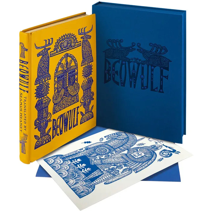
I was illustrating Seamus Heaney’s translation of Beowulf in a new edition for Folio Society, so the text was at my elbow at all times. As I was constantly referring to it, I guess it could be said that Seamus Heaney was closest to my thoughts.
14. Do you believe in God?
No.
15. Do you believe in the power of art to change society?
I believe in the power of art to change myself. Society I’m less confident about.
16. Which artist working in your area, alive and working today, do you most admire and why?
If I’m candid, I’d be hard pressed to identify an artist working precisely in my area, given that I paint, illustrate, animate and direct. There can’t be that many. Also, I’m at that stage where so many of the people I most admired across the creative arts and looked to for inspiration, have died. Too many in the past few years. It broke my heart when Maurice Sendak passed, and Sondheim, too. Bowie and Glenda Jackson, gone. I can hardly believe it. These people were signposts and anchors for me.
17. What is your relationship with social media?
I harness it as best I can for work and making connections. It’s served me well for being able to reach out to people I admire, and that’s worked in both directions. Undoubtedly many of my projects of the past decade have had their foundations in collaborations begun online. I never liked or wanted to be a part of the way artists were traditionally presented by galleries in bibliographies, their lives reduced to lists of dates and achievements. In 2011 Lund Humphries published my monograph, for which I steadfastly refused to produce a bibliography. Instead I contributed a biographical chapter in which I presented, if not the definitive account of my achievements, then something which gave a sense of the journey. Since 2009 I’ve run a blog, the Artlog, at which I write candidly about my practices, my life, people I admire, collaborations and works in progress. In so many ways social media has deconstructed the tired old clichés of how things were once done, and as a consequence given artists – or the ones who choose to engage – the chances to speak for themselves
18. What has been/is your greatest challenge as an artist?
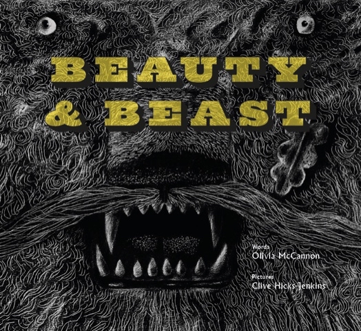
Getting up to speed quickly when faced with unfamiliar challenges is always a thing. But at this stage of my life I believe it’s fine when undertaking something for which I’m only partially equipped, to say “Look, I can do most of this, but these are the areas I’ll need help with.” I’ve been working for publishing houses over the past few years on several big projects, and I always kick off by saying to the art directors “You know I’m a dinosaur, right? I don’t do digital and so everything you’ll be getting will be analogue, made with hands wielding brushes, pencils and pens.” And it always is alright. I work with really skilled technicians. Laurence Beck has been my clean-up artist and colourist at Design for Today for two books, Simon Armitage’s Hansel & Gretel: a Nightmare in Eight Scenes and Olivia McCannon’s Beauty & Beast.
In the past couple of years I’ve worked very closely on publishing projects with David W. Slack, who is an artist in his own right, but has collaborated with me as a model-designer and maker, and recently worked as Animation Producer on the two films we were commissioned to create by Folio Society to promote Beowulf.
Back in 2016 I was invited by Dan Bugg at Penfold Press to work with him on my first screenprint, a process that to begin with utterly bewildered me. But Dan guided me through the processes of it all, and since then we’ve completed a phenomenal body of work, including the fourteen-print series that went on to accompany Simon Armitage’s acclaimed translation of Sir Gawain and the Green Knight in the 2018 Faber & Faber illustrated edition.
19. Do you have any words of advice for your younger self?
It’ll all be alright in the end.
20. What does the future hold for you?
I have enough exciting projects to keep me gainfully occupied for several years. Every time I think that maybe my moment has passed, then someone new comes knocking with a wonderful suggestion/opportunity. (One came yesterday with a proposition so exciting I didn’t sleep all night.) I’m grateful for that. It would be a good way to end one’s days would it not – hopefully some way down the line from here I should say – with something interesting in the pipeline? I don’t think I’d last long if the days stretched emptily ahead. I don’t know whether it’s true, but they say sharks have to keep swimming in order to stay alive. I think that might apply to me.
On June 27th Folio Society will be launching their ‘special edition’ of Beowulf, translated by Seamus Heaney and illustrated by me. Heralding this are two animated films to celebrate the event, produced by my regular collaborator of the past few years, David W. Slack. David is a painter in his own right, and it’s his breadth of knowledge and practice as an artist which strongly underpins what we make together. We first collaborated when I asked him to construct preliminary models for the Beauty & Beast Toy Theatre Kit I was preparing for publisher Joe Pearson at Design for Today. In this first of two recent ‘conversations’, David and I track how he went from model designer on Beauty & Beast to being appointed Animation Producer on Beowulf.
Clive: David, I first came across images of yours at Insta when you were ‘enhancing’ your copy of the Hansel & Gretel Toy Theatre I’d designed for Benjamin Pollock’s Toyshop. What first struck me was how good a model-maker you were, followed swiftly by how improved the model was by the curved stage-front you were adding to it. “Damn it!”, was my initial response. “I wish I’d thought of that.”
Above: David’s ‘improved’ Hansel & Gretel Toy Theatre, with the footlights and curved stage-front he added.
David: That model was really lovely. When it arrived I was amazed at how few sheets you’d managed to condense the entire story into, yet when cut and assembled it became a very layered and complex model. You sent me the additional scan of the stage floor so that I could print the floorboards I needed for my planned stage extension.
Clive: For the record you’re a better model-maker than I am, and I remain envious of your framed model of the adapted Hansel & Gretel Toy Theatre complete with lights and curved apron. Overworked as I was by this point, the idea of inviting you to collaborate on the Beauty & Beast Toy Theatre was already churning away in my head keeping me awake at nights.
David: I’d seen an Insta post of a beautiful architectural doorway you’d made for Beauty & Beast flanked by sinister white-eyed caryatids. Having contacted you to ask how you’d feel about my interpreting the idea into a painted wardrobe, you were extremely encouraging.
Below: preliminary work on an illustration of a garden door in Beast’s realm.
When I ventured further and wrote that a toy theatre might be fun, you admitted you were planning one, had a preliminary dummy on your desk at that very moment and were wondering whether I might help with it. After that it was just a case of me trying to jump onto the already speeding train!
Your work on the book of Beauty & Beast with writer Olivia McCannon was already well underway, and although that collaboration was quite separate to the toy theatre, the two projects were clearly intended to be viewed as a pair. From the start your advice to me was to “do less”, and it was much needed as my first response was to turn the model into the toy theatre equivalent of a big old Busby Berkeley number in a Hollywood musical. Fortunately, better understanding that a lighter touch benefits toy theatre, you stayed my hand. More sketches went back and forth to get us to the same starting point, and thereafter everything was much clearer. I outlined my understanding of my role as the facilitating designer who’d translate your evolving illustrations for the book into a working toy theatre model.
Clive: And that was a good starting point for both of us, though in fact your role quickly became much more than that of model designer. With sections of Olivia’s text for Beauty & Beast arriving daily I was up to my eyes in keeping apace with my illustration schedule, so it was a relief that you were able to efficiently keep me up to speed with what you needed for the model and when. You’d effectively become the project manager.
David: Once bedded in I began to lobby for an increase to the six construction sheets you’d advised were the maximum we could afford for the model. I hope I wasn’t too pushy.
Clive: I saw it more as a case of your enthusiasm for what we were making. However while excited by what was emerging from your desk, I was growing slightly anxious about the implications for the budget. It was time to explain to Joe the publisher that I’d gained a collaborator, and to sound him out regarding expanding the project from six to ten sheets. By now you were producing prototypes like a man on a mission, and with the tangible evidence of what we were achieving, Joe agreed to the new proposal.
David: SO many prototypes, yes. How my printer didn’t explode I will never know. I was desperate to get the maximum-sized model into the smallest space, so there was a lot of jiggery pokery.
That in the end we fitted so many scene changes alongside puppets and props onto just ten sheets still amazes me, because the toy theatre alone took four. More than anything else I wanted to include the scene of the disembodied candelabra-bearing arms in the entrance to the castle, and I was at the point of offering to personally underwrite any added expense for them when you came back with the news that Joe had agreed to the extra sheets. We were up and away.
Clive: It was quite a roller-coaster we were all on. This was new territory in nearly every respect. The project was complex and we were all aware of how it needed to fit with the main book, while also being separate and stand-alone. Already it was apparent there needed to be considerable adaptation from what I was creating for the book, to what would work for a toy theatre.
Always there’s the line to be walked between being prudent with the budget, yet open to where a bit of extra funding will give real added value. Joe kept everything under close scrutiny as we progressed, and his was the suggestion to present the ten sheets in a folder with pockets, instead of being bound into a book. The script and instructions could then be produced as a small pamphlet, which in the end worked beautifully and saved costs.
David: I was amazed at how quickly everything progressed. It was only later I realised what a frenzy you were in trying to keep up with me, all while I was feeling the need to go faster to keep up with you! But we steadied our nerves and in the end the toy theatre was made at an incredible lick, and it looked wonderful.
In the next post we move on to Beowulf and how David took on the role of Animation Producer for the two Folio Society films he was asked to create to promote the new book.
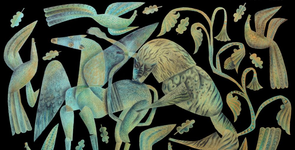
In the print series Sir Gawain and the Green Knight, made in collaboration with Penfold Press, the image of the Green Knight hoisting aloft his decapitated head, had in its background his horse, decked out in a caparison of embroidered foliage, oak leaves, eyes and peacocks.
Above: gouache and pencil study for The Green Knight’s Head Lives
The peacocks in flight, together with the flying oak leaves, subsequently found their ways into a painting commissioned by the Musica en Segura festival in Andalusia, in which alongside several other commissioned images, it was projected to accompany a performance of Messiaen’s Quartet for the End of Time. I made the painting, titled Startled Peacocks, while listening to the music in my studio, the work evolving into a visual meditation of the triumph of brutality over reason and order. I was interested in making an image that was beautiful to look at, whilst not flinching from the idea of unthinking violence.
Startled Peacocks then became the foundation of a key illustration in Beauty & Beast, a collaboration with poet Olivia McCannon on an homage to artist/director Jean Cocteau’s film adaptation of the fairy tale La Belle et la Bête. In the illustration the peacocks have gone, but the leonine Beast has assumed the pose of the attacking lion in the previous work. Beauty and Beast was published by Design for Today in 2022.
The peacocks and oak leaves from the Gawain prints and the Messiaen concert re-emerged when I collaborated last year with Tinsmiths of Ledbury to create a textile design. In the first image a drawing is in progress on my desk, and in the second, as it appeared when printed onto linen. The design is being made in a variety of colour combinations.
The Tinsmiths textiles are due to be launched this summer.
The Picasso Jug. 1998. Acrylic ink on paper. 24 x 43 cms. Private Collection.
I love the bleak uplands above Merthyr Tydfil. As a child I knew them through the eyes of my father, a wayleaves officer with the South Wales Electricity Board who often took me with him on his work journeys across the country. It’s a windblown, restless landscape of scrub and sky. Few trees, but sweeping vistas of land scoured and shaped by the weather and punctuated, back in his day, by the verticals of wire-looped telegraph poles and the glittering, alien giants of electricity pylons striding the hills. There were no abandoned and burned out vehicles then, vehicles in the 1950s being harder to come by and rarely abandoned when there was still mileage to be had out of them. But what thrilled me most were the parched grasslands of the late summers rippling across the curves of landscape, as though we were perched on the back of some great beast with a bleached pelt streaming in the wind.
Alas, I don’t have a Picasso Jug, and this one from a museum collection was relocated by me into the landscape I love. I felt that jug and landscape were a good fit.
On Tuesday, 28th March at 19.30 BMT, I’ll be ‘In Conversation’ with Rebecca Gibbs as a part of a programme of events organised with the Ecumenical ‘Lent Conversations’ team in association with Articles of Faith and Victoria Methodist Church, Bristol. There’s an exhibition of works from the Methodist Collection of Art, open from 6pm on the evening of the event, at which my painting, Christ Writes in the Dust, commissioned by the trustees of the collection, will be on view. Booking is free on Eventbrite.
The event is taking place at Victoria Methodist Church, 1A Whiteladies Rd, BS8 1NU. There will be a Zoom facility for those unable to attend in person, and details of that may also be found at the link above.
Below: chiaroscuro study for Christ Writes in the Dust.
The orchard behind the house is is thick with hoar frost, glorious in the winter sun. Despite the sharpness of the imagery in this video capture, what I experience is not what you see here, good though my I-phone camera is. Tiny irregularities on the surface of the human eye make the crystals of ice appear to glitter and flash as I move through the garden. It’s utterly beautiful. Dazzling.
Think back to the Golden Age of Hollywood. Whenever a screen goddess appeared in rhinestones or sequins, her image would simply be off the charts with the reflective sheens and sparks given off by them, because the lenses back then were a lot closer to the imperfect human eye, and their surface imperfections created the starbursts of dazzle which photographers and cinematographers turned into glamorous magic. Here Marlene Dietrich turns the ‘pixie’ hat into an accessory for seduction, with cuffs to match.
Watch any film or tv commercial today and glitter has been added in post-production, and frankly looks like it. Instagrammers add sparkles to their selfies, staring in soft-focussed self-absorption through storms of ‘glitter’ produced by an app. All those 20th century Christmas cards embellished with glitter-frost spoke to us because they looked the way we saw ice and snow crystals with our own eyes. Everything glittered and flashed. These days the Etsy merchants selling vintage Christmas cards ‘with glitter’ can’t reproduce them effectively to show at their online stores. Their cameras can’t capture the reality. Everything flattens out, the glitter/glimmer/sparkle vanquished.
I recognise digital sparkle the moment it appears. It’s unconvincing, not remotely similar to what we see with our own eyes. It isn’t even what cameras from an earlier age captured. I know it isn’t real, just as surely as I know when confronted with a CGI dinosaur, no matter the artistry involved in its making, that it isn’t real. The artifice makes me feel differently about what I’m watching, certainly on a conscious level but almost more so on an unconscious one. I’m just not as engaged/involved. In the first Jurassic Park film the stand-out episode for me was not one created with CGI, but rather the sequence with the hunting velociraptors in the kitchen, which was created with brilliant puppets and razor-sharp editing.
All this is to come to the elephant in the room, which is the AI generated imagery now flooding Instagram. So much of its candy-coloured allure and textural brilliance is leaving many illustrators, painters and stage and production designers feeling that their long-honed drawing and painting skills are going to become obsolete. How, they wonder, can anyone compete with AI capacity to take/steal existing materials and reassemble and embellish them to such clever effect? How can any artist with pencils and brushes compete at anything like the speed? While I don’t believe there will be any turning aside from the technology, neither do I believe it’s game set and match. Just as CGI continues to co-exist with analogue skills, so there will be things which people still do better than a computer programme. After all, old-style glitter is still defeating the apps.
It’s with huge delight that I can reveal, at last, that my current big project is the commission to illustrate a new Beowulf for The Folio Society, in the acclaimed translation by Seamus Heaney. The illustrations must remain shrouded in secrecy until the book is ready for launch, and I won’t be showing work in progress. Suffice to say that I’m already deeply bedded in the project, awakening every morning excited to be in the thick of it and enormously enjoying the many discussions and planning sessions with my wonderful Folio Society art director, Raquel Leis Allion. But this little vignette is all you’re going to see before the book is published, because we’re keeping the images under lock and key.
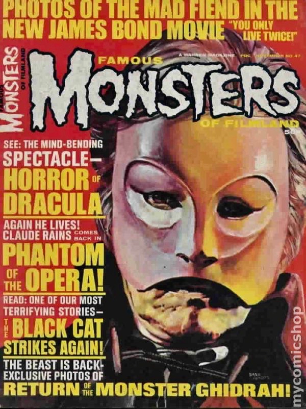
I’ve greatly enjoyed the notion of ‘the monster’, whether in novels, in film/tv or in folklore and mythology. Aged eight I was sold on the idea of the ‘Gorgon’ from the first moment I read about her, and the Hydra, too, and the three-headed Cerberus, guard-dog of Hades. As a child, when too young to actually see X-rated films, I pored over imported copies of Famous Monsters of Filmland, so I knew all about the Universal Studios monsters – which were vintage even back in the fifties when they were being given lush spreads in the magazine – long before I ever saw the films themselves. I thrilled to the images of Lon Chaney being unmasked in The Phantom of the Opera, of Bela Lugosi curling back his lips in a pasty-faced vampiric leer, and Karloff sitting in Jack Pierce’s makeup chair being transformed into one of the most iconic monsters of cinema history.
I’m not a fan of all ‘horror’ – in extreme form I find it distasteful – but when makers are creative in producing something that nails you to your seat, the ride can be thrilling. I particularly love it when the scary bits are not too in-your-face. One of the greatest strengths of Alien, is that it pre-dated CGI, and so the fully-grown creature is half-shadowed and all the more alarming for it. I think the best scares in Jurassic Park are in the kitchen where a pair of Velociraptors hunt down the children, because most of what you see is staggeringly clever animatronics and puppetry, made even better by masterful editing. When the monster is actually there, in close contact with the actors, and not just a man in green wielding a ball-on-a-stick to cue their eye-lines for special effects to be added later, there are worlds of difference in the performances.
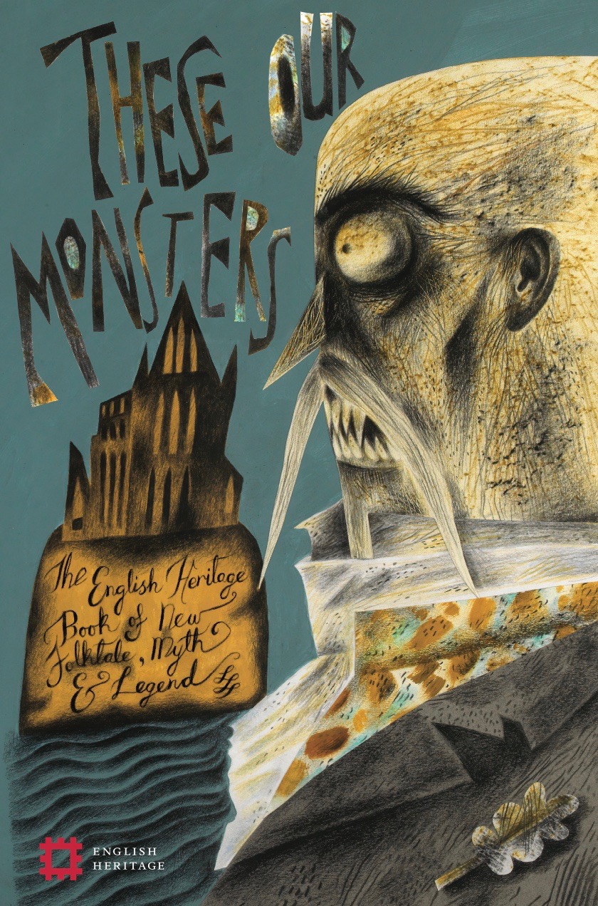
I’ve particularly enjoyed it when I’ve been given illustration opportunities to engage with old-school classic creatures. For the cover of These Our Monsters (2019, English Heritage), I was able to trace back to Bram Stoker’s account of Vlad Dracula, which was quite an eye-opener because the original descriptions are not remotely like any of the character’s film incarnations. (The cover image here is for The Dark Thread by Graeme Macrae Burnet, who sets his troubling and elegiac short story in Whitby at a time when the mentally fragile Stoker has returned to confront his own creation.)
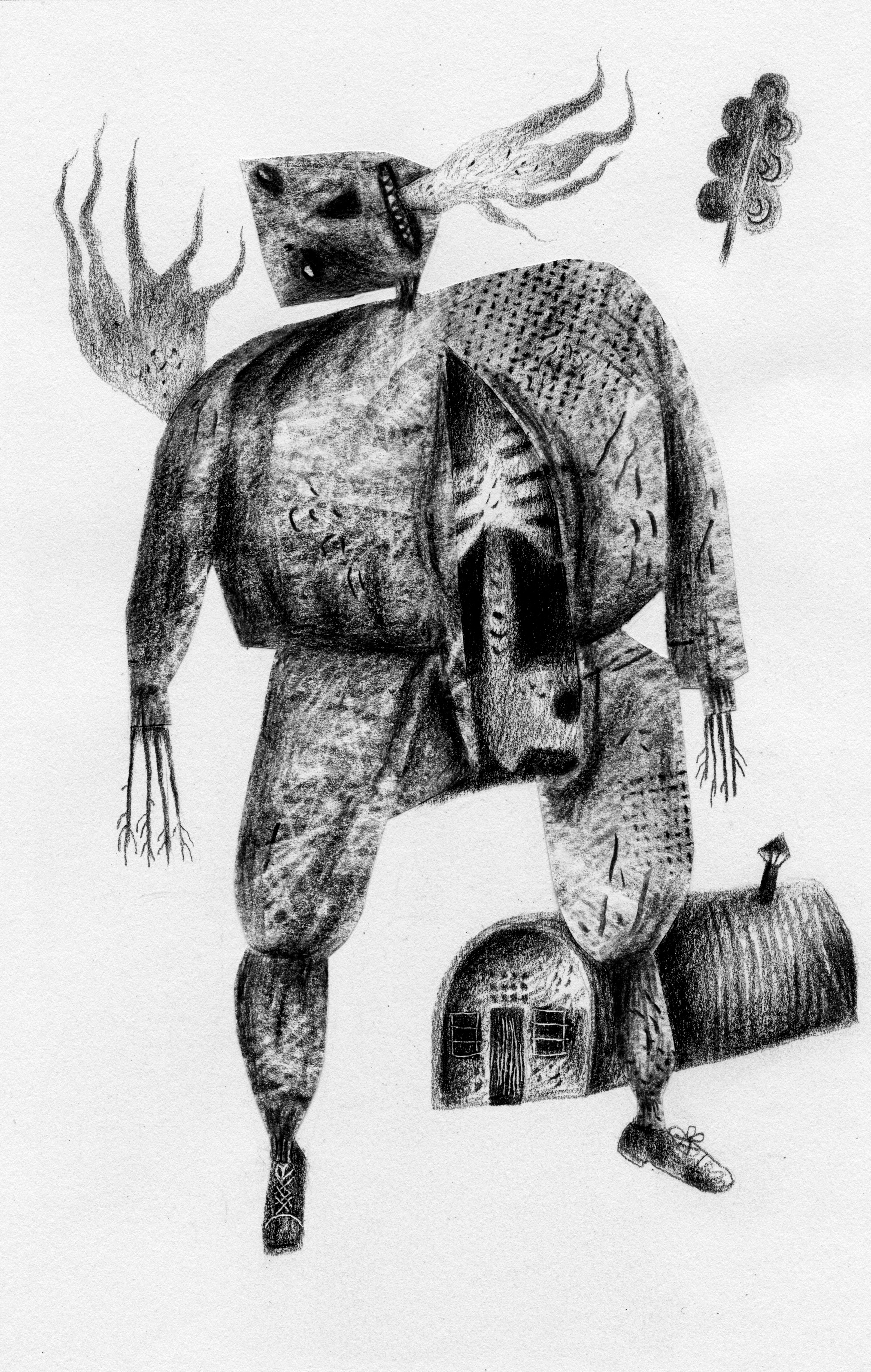
There were entirely new monsters in the book, too, and I loved creating what Sarah Hall only suggests in The Hand Under the Stone, which is about as close as I’ve ever come to making a monster inhabiting a similar ‘between-worlds’ plane of existence to those found in the ghost stories of M. R. James which I love so much.
I’ve made several varieties of Witch for two quite different books on the theme of Hansel & Gretel, for a stage production in which she was presented via shadow-puppetry, and for a toy theatre for Benjamin Pollock’s Toyshop.
My first Hansel & Gretel book was a more or less textless picture-book for St Jude’s in which there was a Witch scary enough to require a warning for more sensitive readers. I made her glaucous-eyed and short-sighted – as witches traditionally were in some folk and fairy-tales, the Grimm Brothers telling of Hansel & Gretel included – but I dressed her in a garment embroidered with eyes to send out a different kind of message. (I stole the idea from a portrait of the first Queen Elizabeth in a gown embroidered with eyes and ears, as a coded message to her subjects – and more particularly her enemies – that the monarch saw all and heard all!)
A short-sighted Witch in a garment sewn with many eyes
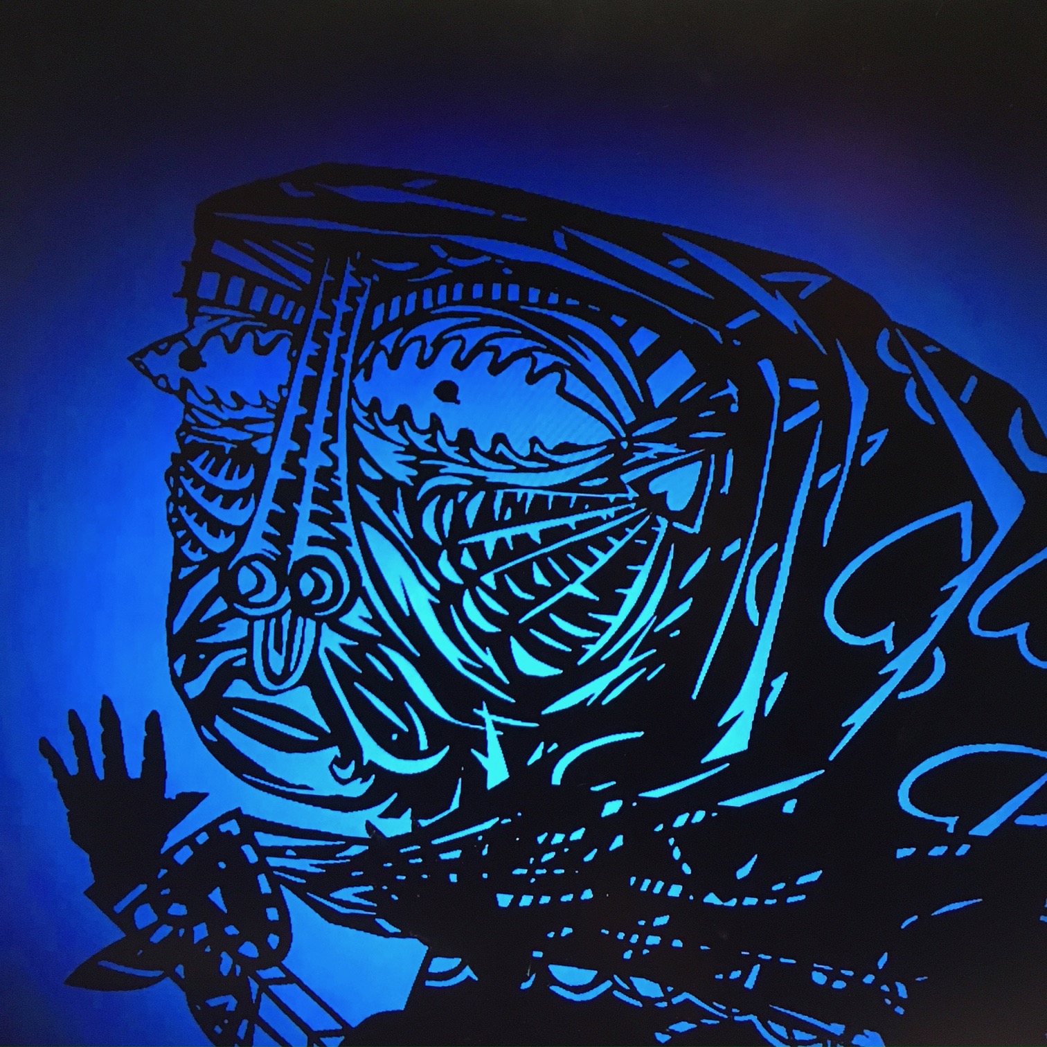
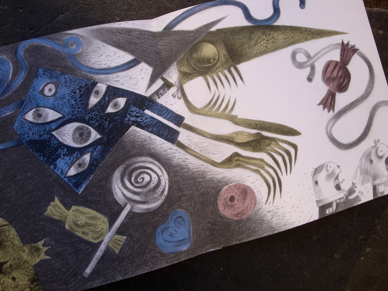
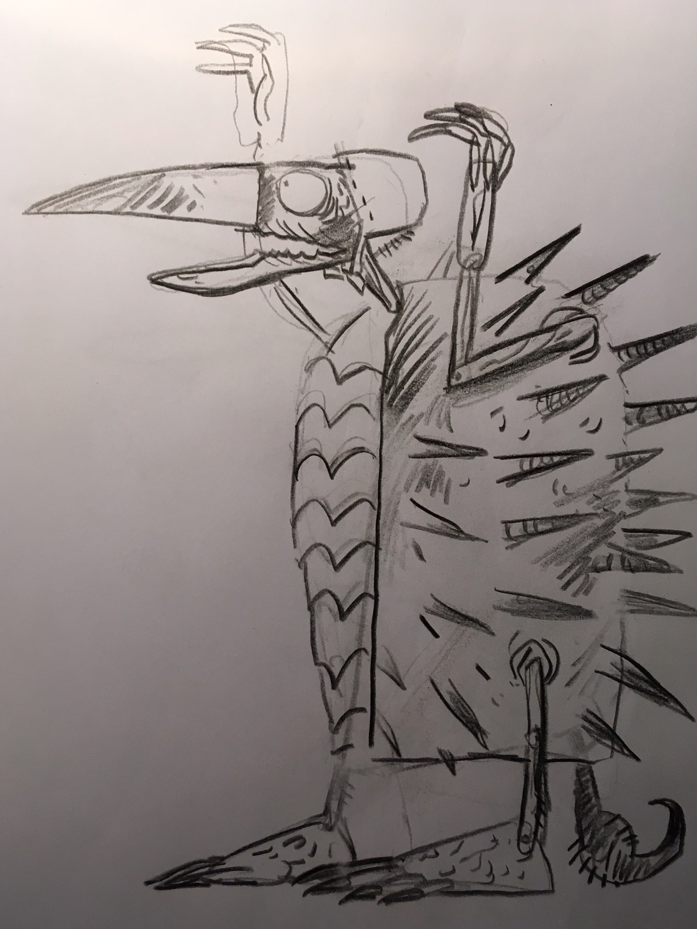
For the Simon Armitage version of the tale, Hansel & Gretel, a Nightmare in Eight Scenes, I collaborated with paper-cut artist Peter Lloyd, providing him with rough drawings that he then transferred into elaborate stop-motion shadow-puppets. To begin with Hansel and Gretel saw only a crone in a bonnet and cloak, but when the cloak came off, the full horror of a spiny crab-like carapace was revealed, reverse-joint legs – like a bird – and a tail with a stinger that snaked into view and coiled and thrashed about.
Guide drawing for Peter Lloyd’s shadow puppets
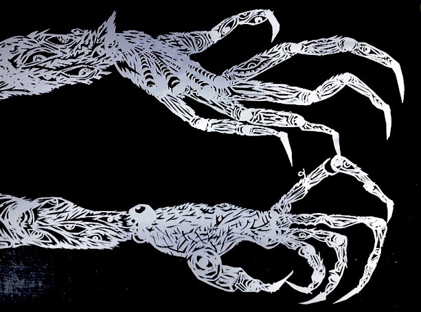
Close up hands for the Witch created by Peter Lloyd
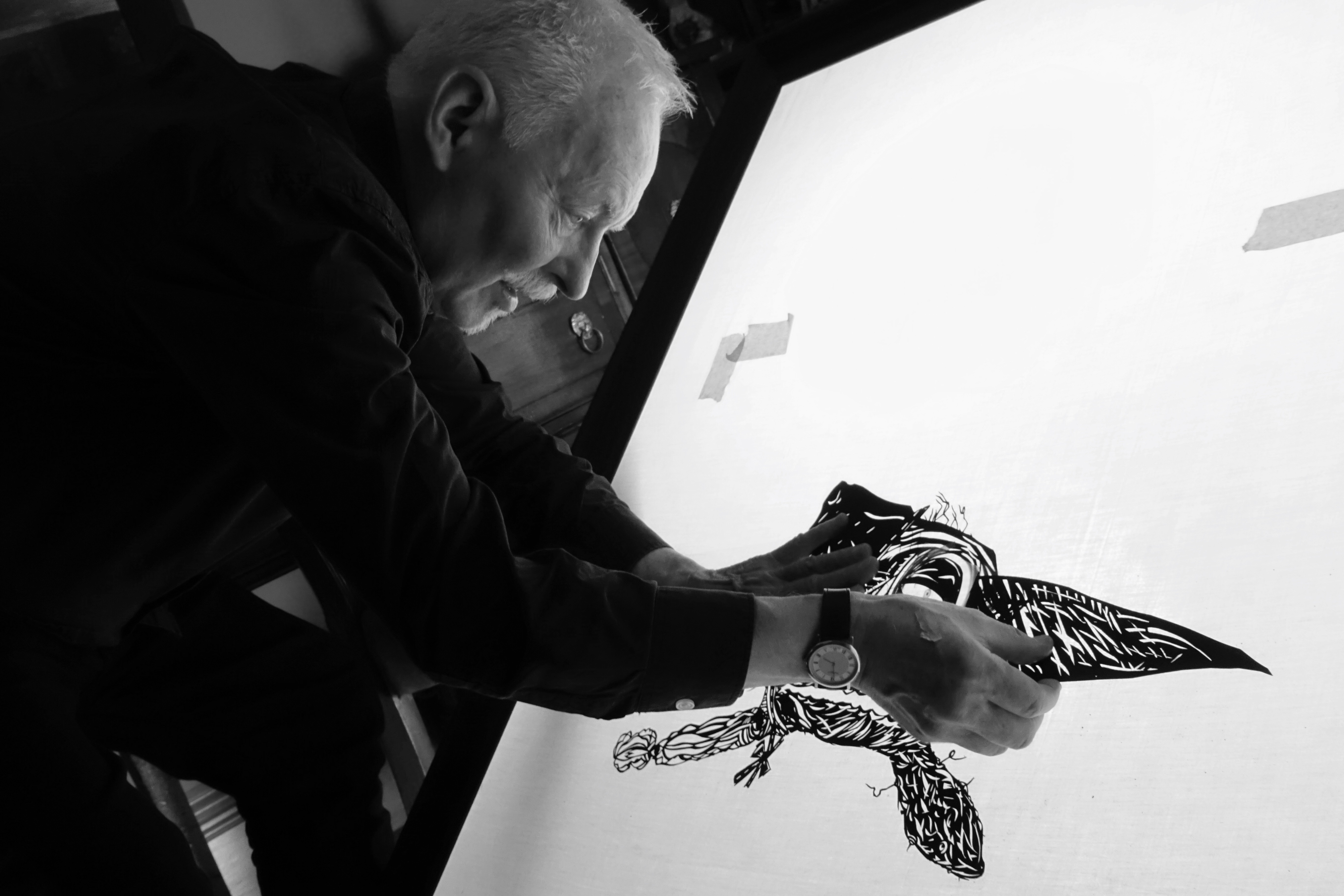
Animating a large Peter Lloyd shadow-puppet Witch’s head, used for close-ups
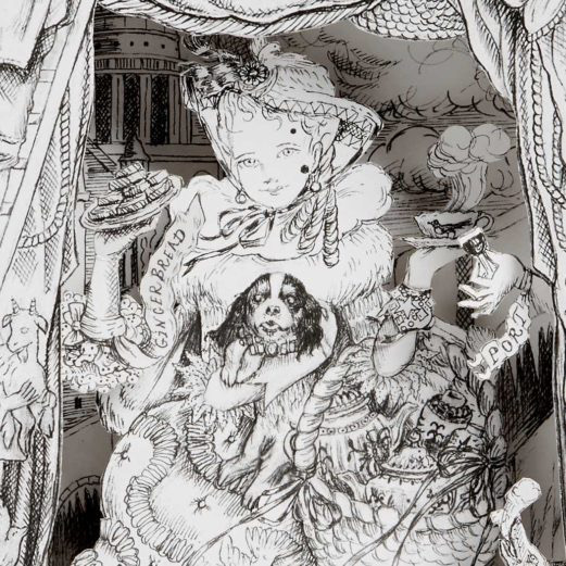
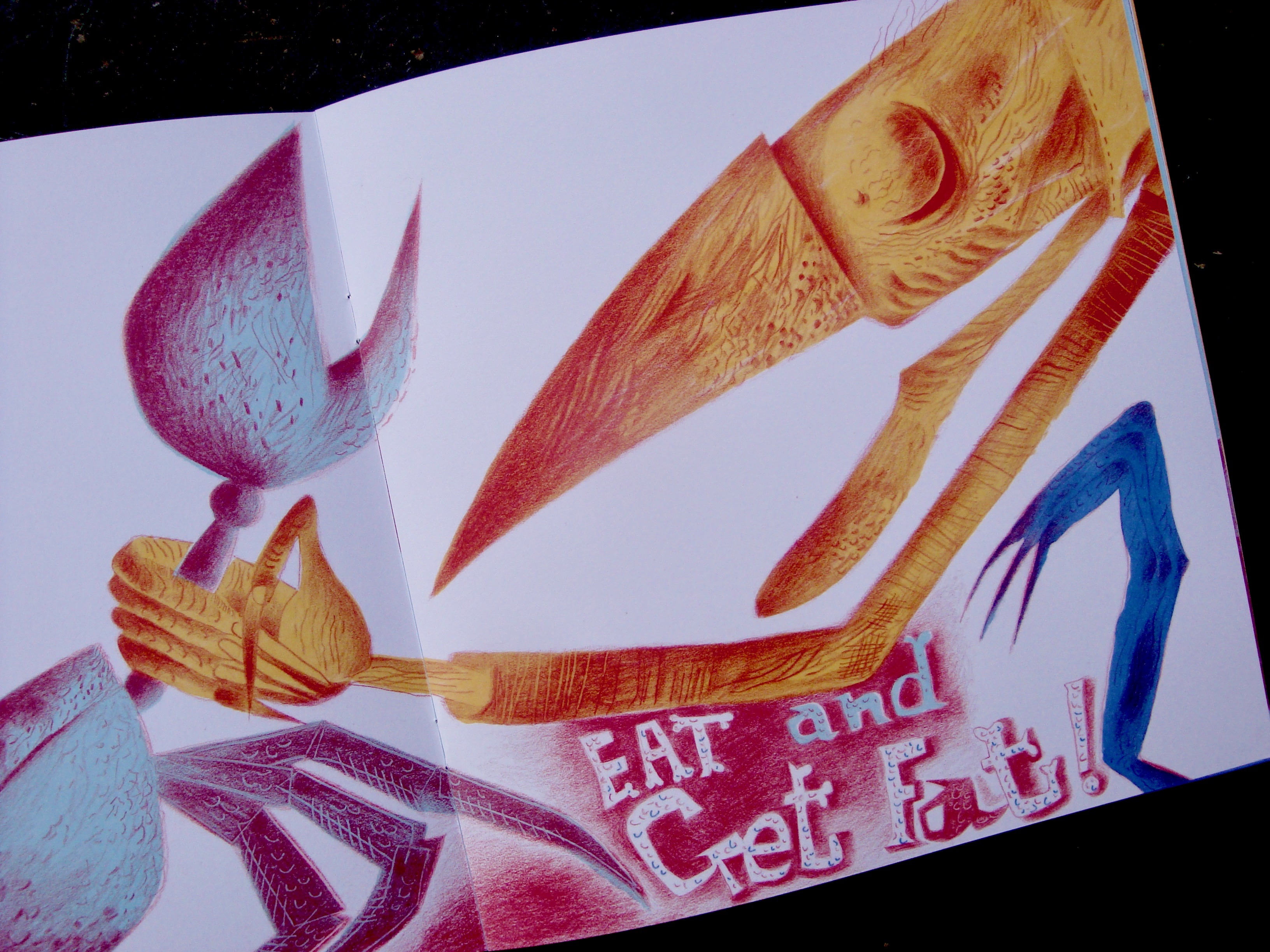
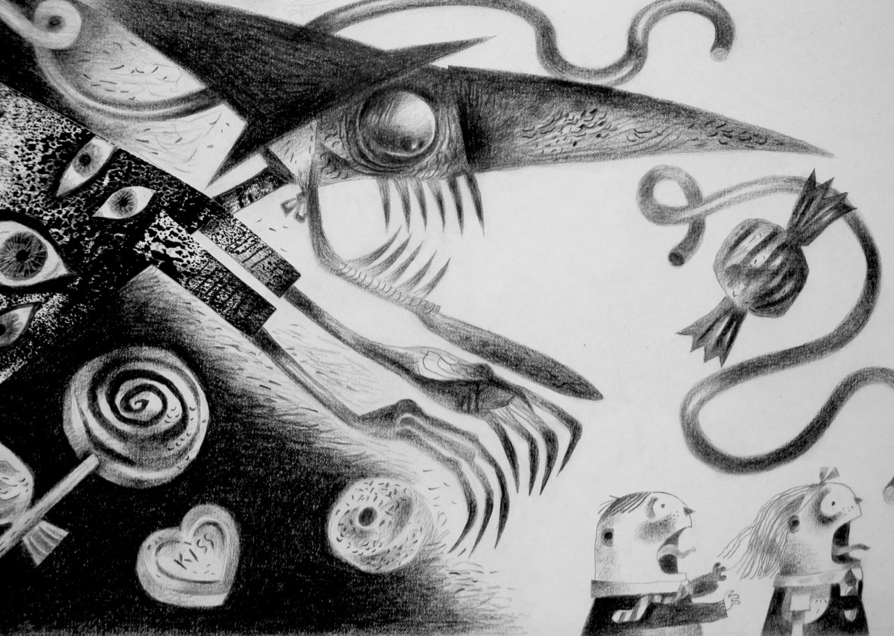
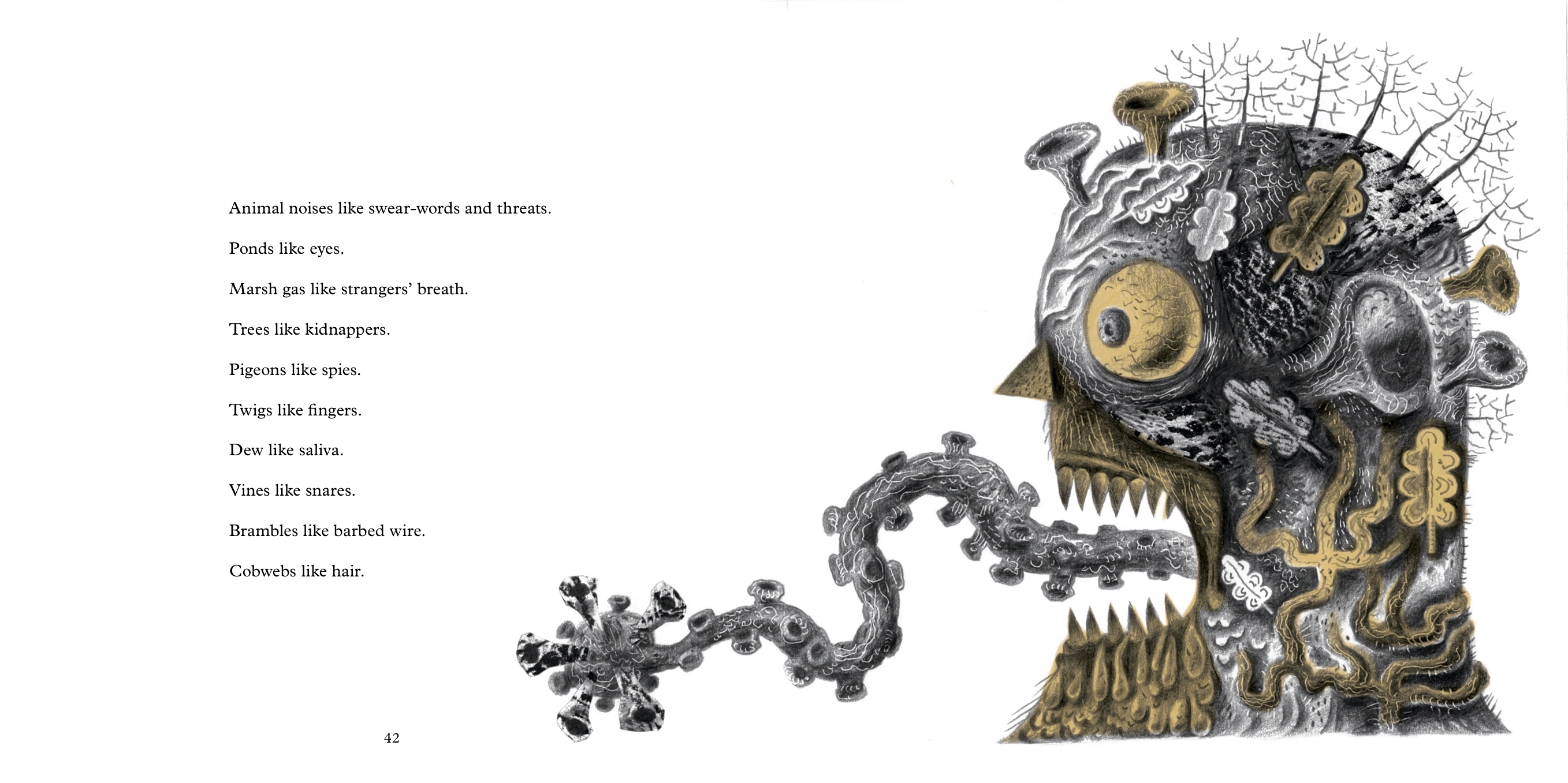
When Simon Armitage’s libretto for the stage production was published in 2019 as an illustrated book by Design for Today, I made a monstrous Witch – seen below as she’s turned into a gobstopper when Gretel pushes her into a cauldron of sweets boiled down into molten sugar – and a monstrous personification of the haunted forest, too, wonderfully described by the poet in a text that’s an illustrator’s dream.
The Witch transformed into a gobstopper
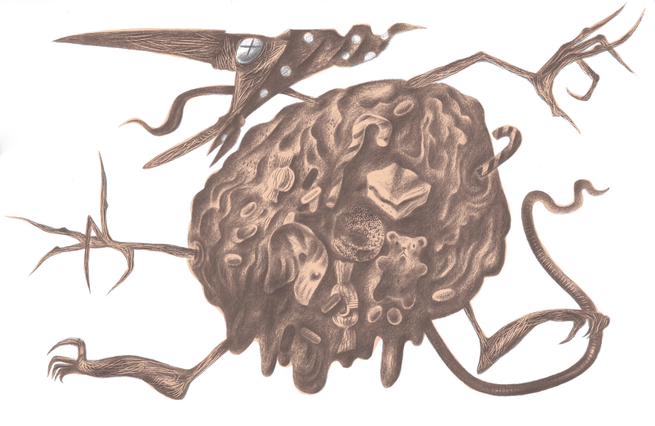
The personification of a fairytale haunted wood
Beowulf is jam-packed with the eponymous hero’s encounters with monsters of many varieties. There’s a deep-sea-creature that drags him to watery depths, a dragon he slays – though he becomes fatally wounded in the process – and that arch-monster of literature and father of all horrors that came after him, Grendel, who is of a sufficient size to stuff thirty human corpses into a bag and make off with them. Beowulf tears off Grendel’s arm as a trophy, and the fatally wounded monster slinks away to die ‘off-stage’. We then discover there’s worse waiting in the wings, for Grendel has a mother, and she’s as wrathful as a nest of Asian Hornets on the warpath when she sets out to avenge her son’s death. (And you thought the vengeful mother was invented by the makers of the second Alien film. Turns out that she goes back to Anglo-Saxon literature, and before that to even more ancient mythologies and tales.)
So I am thrilled to be making images of these archetypal monsters, and hopefully in ways that will be unexpected and visceral enough to raise a few hairs at the nape of the neck. But in a good way, of course.