Collaborating with David, part 2: Beowulf

Featured

Please Click on the title above to watch the videos embedded in this post.

Above: click to view the book trailer for Beowulf

Clive: David, you were undertaking trial digital work for me while I was working on the illustrations for Beowulf. I made them in black ink on white board, but had it in mind to see how they’d look when inverted to white on black. What you produced provided me with inverted images of drawings and digital colourings of them throughout all the earlier stages of the book’s creation. Although the final additions of colour were done at Folio Society, you did all the preliminary ‘tests’ that enabled me to make the decisions ready to brief the Folio team. 

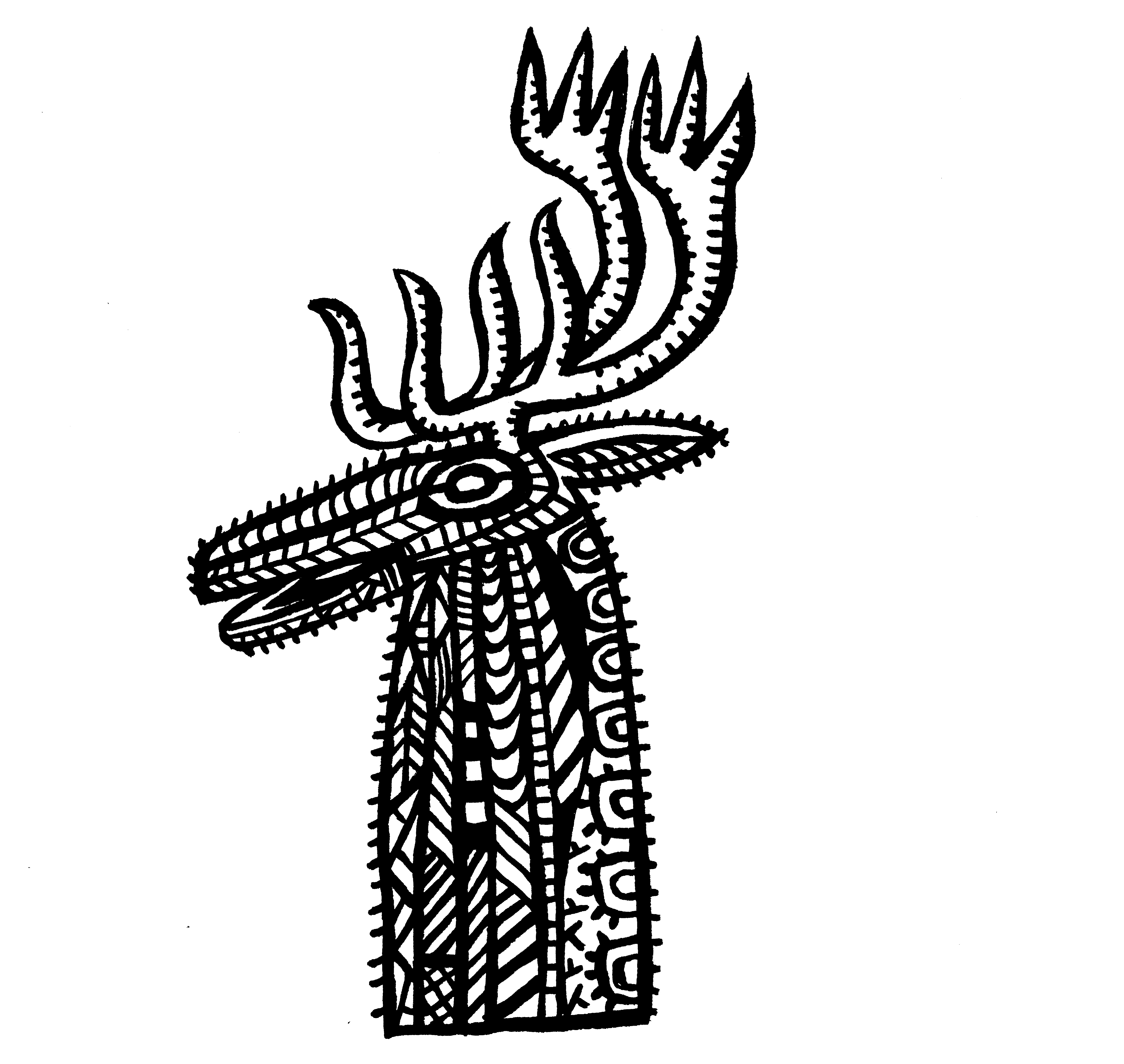
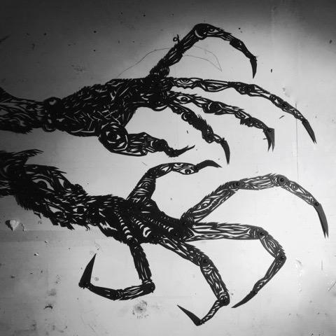
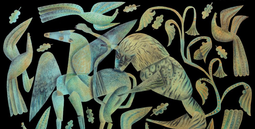
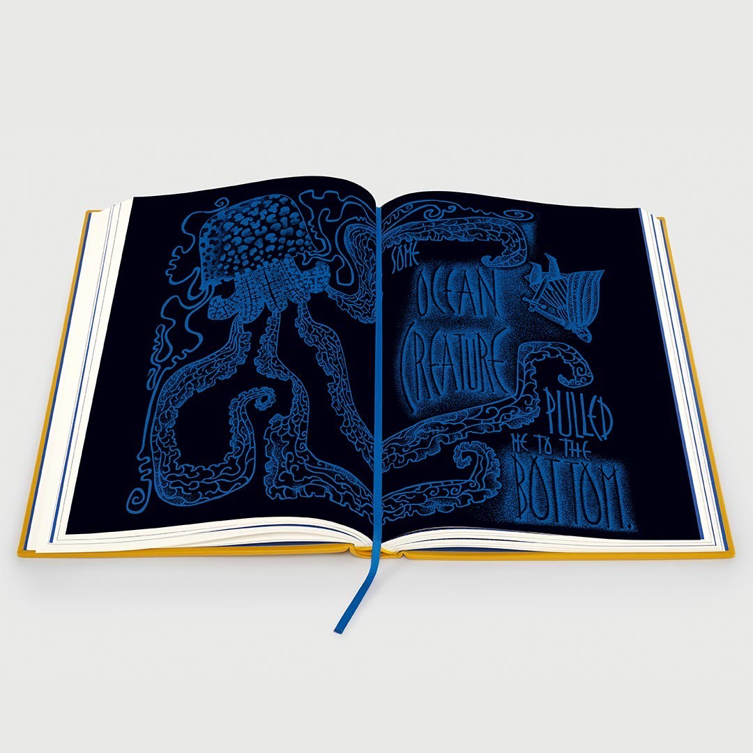
Above: detail of illustration from the book after image inversion and digital colouring by Folio Society.

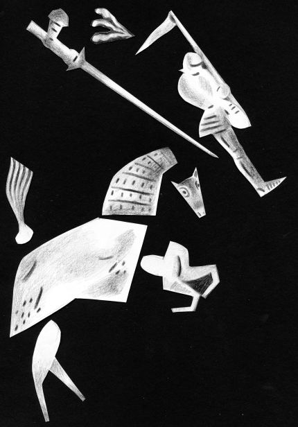
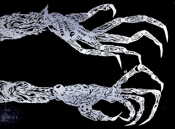
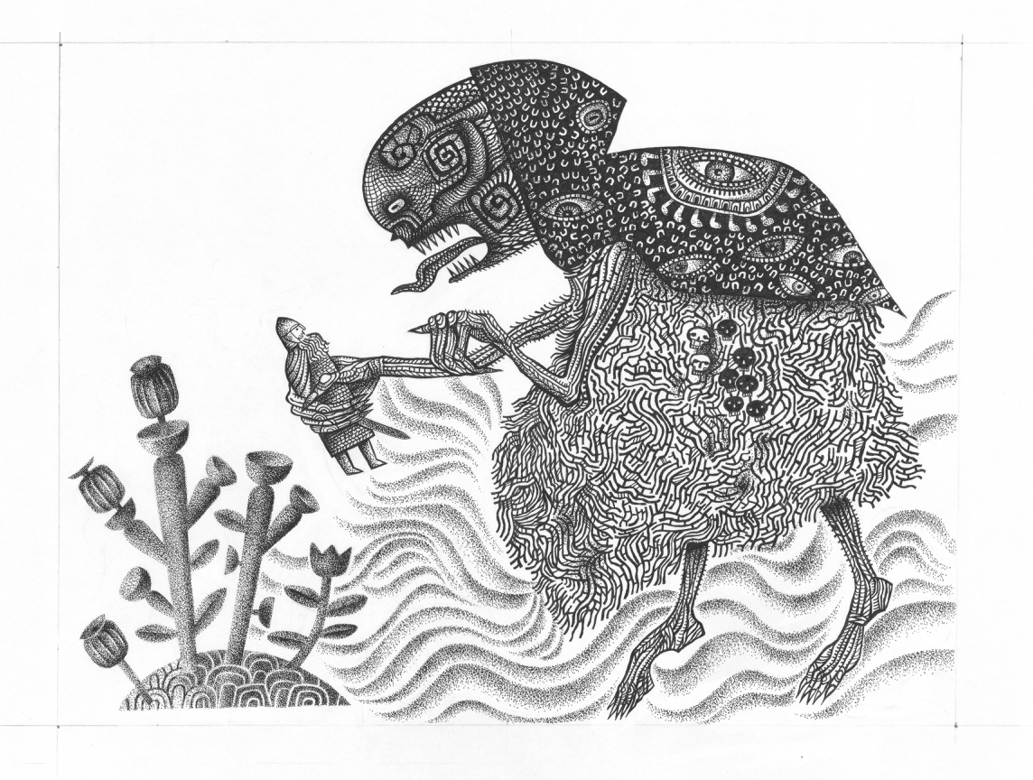
Below: original ink artwork on mountboard with pencil trim guide, before inversion and colouring.

David: Oh it was such a joy to have a private viewing of your Beowulf drawings, and because I was messing around with them digitally, I could easily produce many different versions. It was fascinating wasn’t it, that some worked instantly as inverted images, while others were more powerful as you’d drawn them?

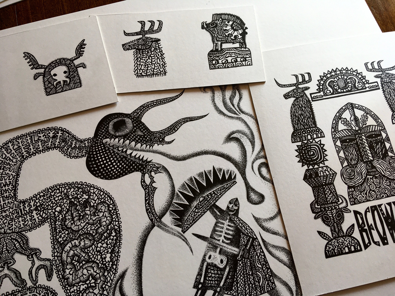
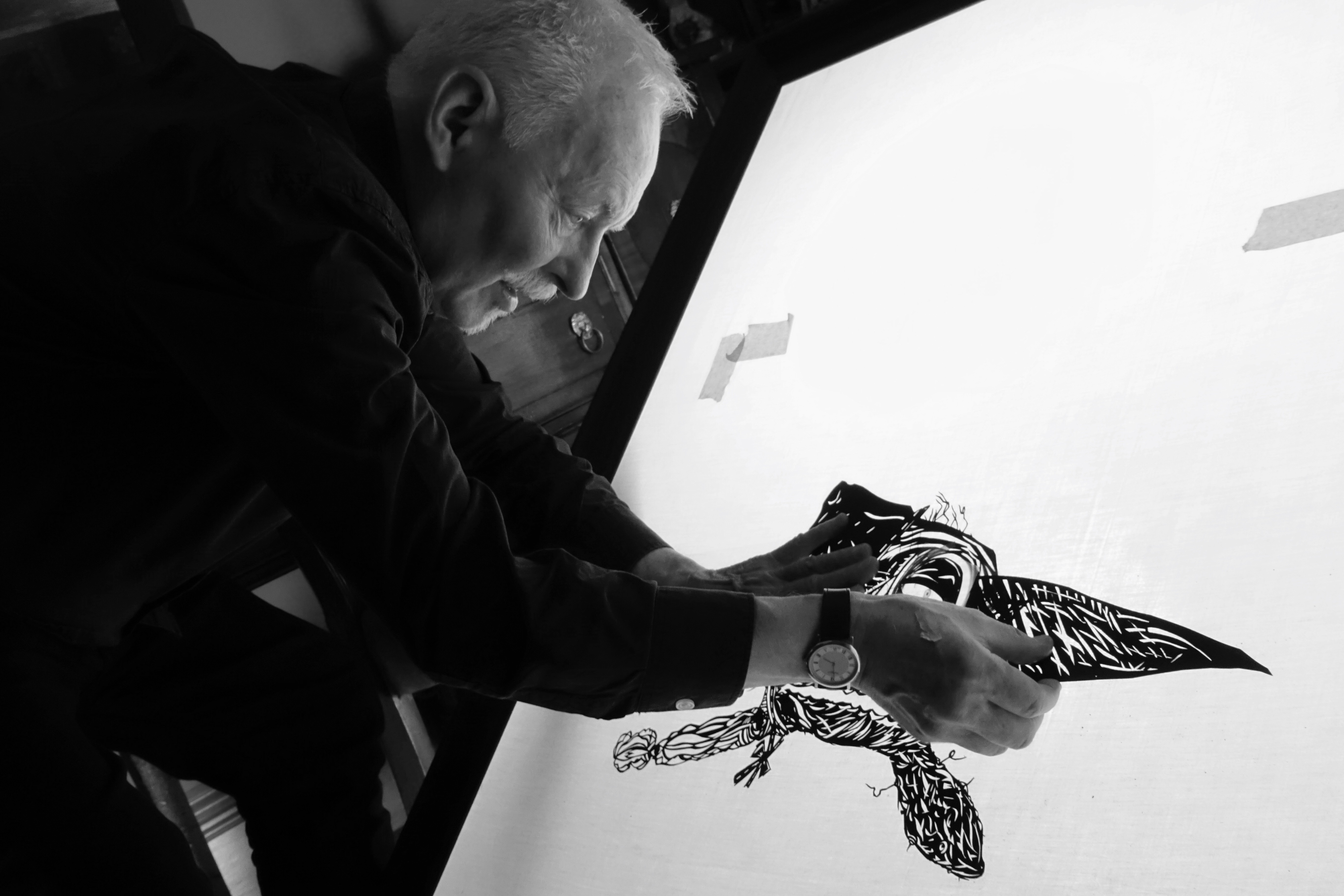
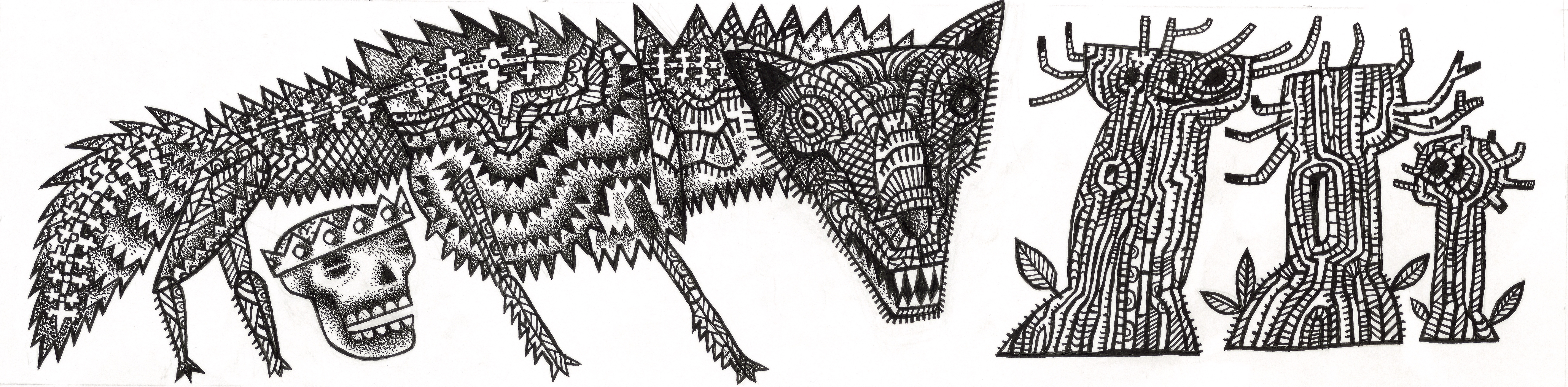
Above: finished ink drawings piling up on the artist’s desk.

Clive: In the end we included some drawings as made and some inverted. The combination worked well.

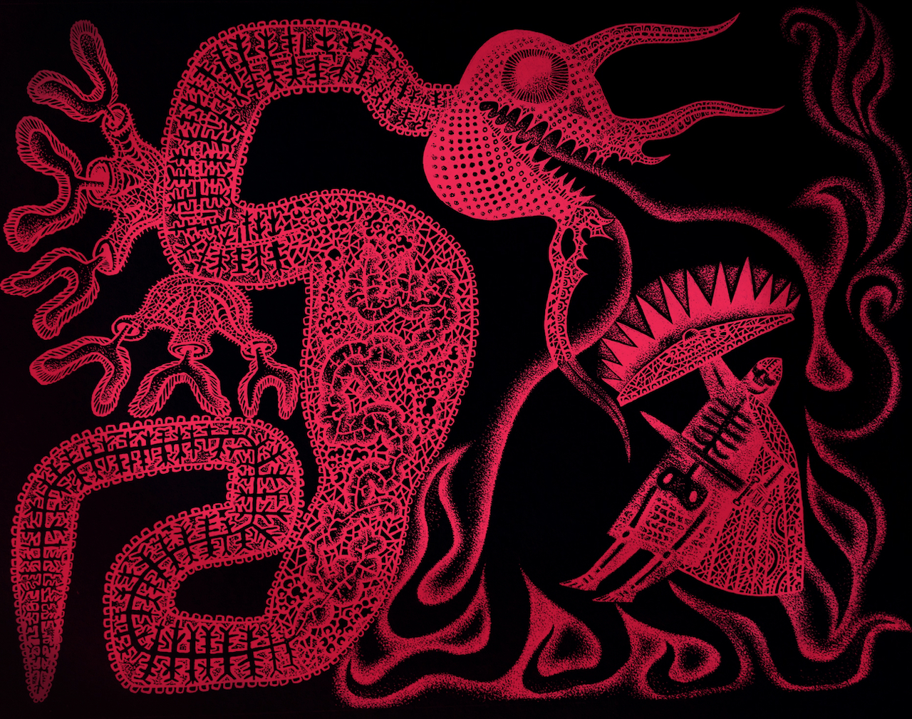
David: I made some red versions which were just OK, but I remember layering a deep spot-lit blue-green with the image for the first time, and it pulsed and sang immediately.

Below: trial colour images of inversions made by David.

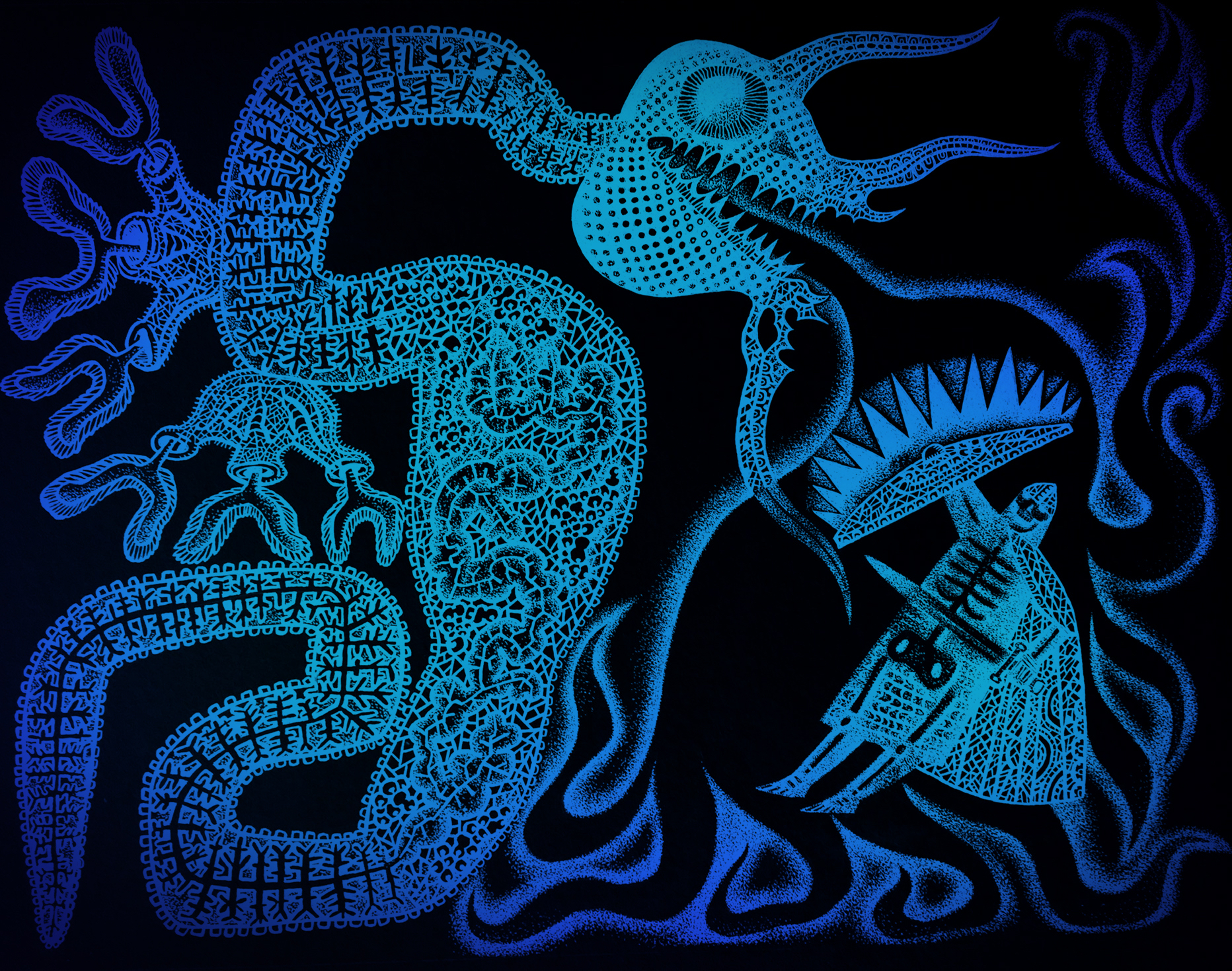
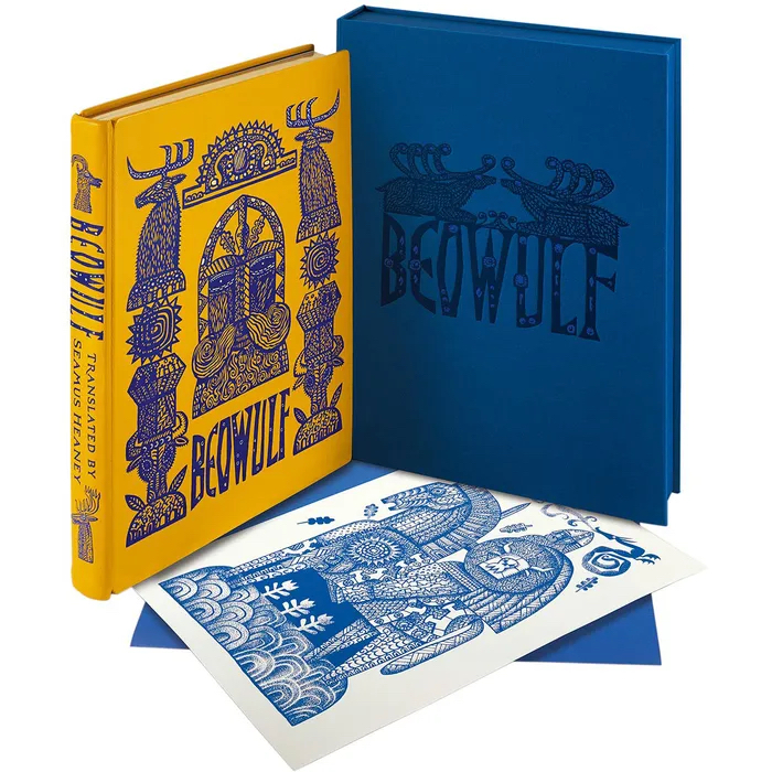
But I think you had committed to the blue at that point, and the intensely saturated blue-on-black and black-on-blue that their production manager achieved in print for your full-bleed double-page illustrations, is way beyond anything I’ve ever seen in print. I’ve done a lot of printmaking through the years, but how they achieved that glowing deepest blue is beyond me. It pulses with some sort of other life and is just unforgettable.  I know that you were blown away by the book when you saw it.

Clive: I couldn’t stop shaking when I received and opened my copy. I was anxious because I knew by this point the edition was printed, bound and boxed, and there could be no turning back. I’d seen many page proofs over the months, but between the last proof seen and the finished book the production manager had worked miracles. I was simply speechless when I saw the the quality of the printing.

Because of your contributions at preliminary stages, and because you knew the illustrations inside out, it was inevitable that at some point we’d start talking about the potential of the images to be animated into life, and that’s exactly what happened. 

David: Well of course, what a gift this was! Your drawings for Beowulf were in a paper-cut style, and so ready-made for shadow theatre puppetry. I’d learned to animate a while back when we’d made an animated film to promote the Design for Today Beauty and Beast Toy Theatre. With that experience under my belt, how difficult could it be to create a three or four second animation as a test run for a potential Beowulf book-trailer? I have to say that it was BLOODY difficult. I’m pretty sure that the learning curve was so steep that at more than one point my neuron’s firing registered on Google Earth. But anyway, this idea of a moment of animation er… well, it snowballed rather didn’t it? 

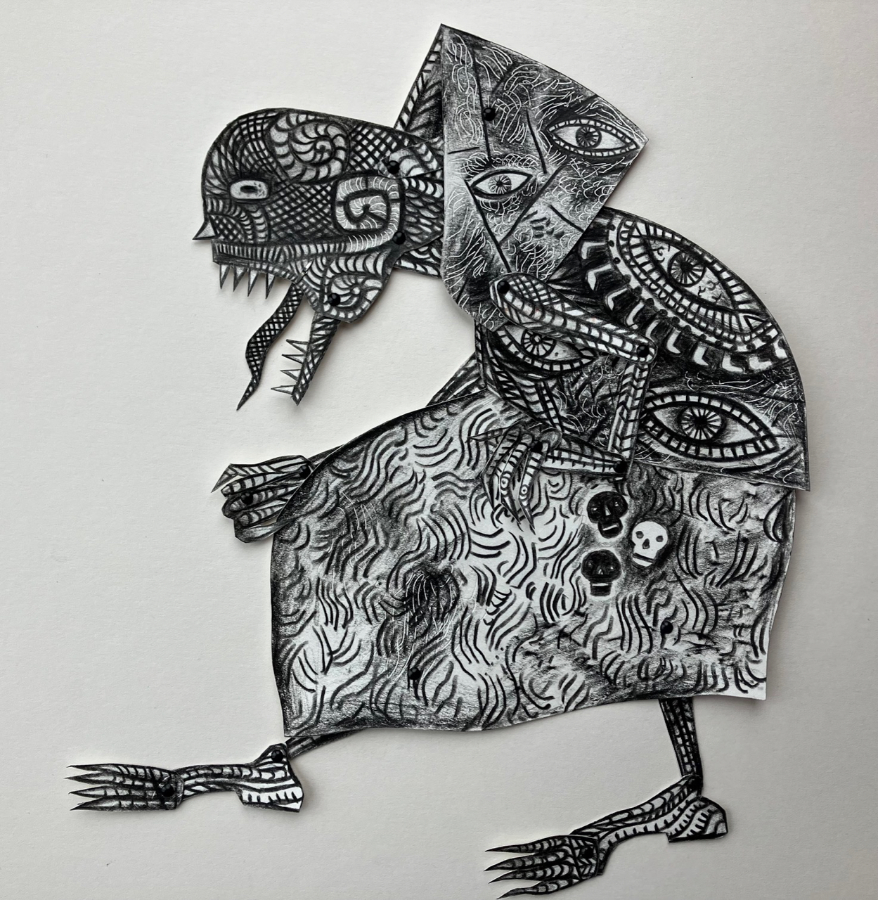
Above: articulated paper maquette made as a compositional aid during the early stages of planning the book.

David: Much of your preparatory-stage work for illustration is built upon the idea of the jointed maquette, so animation is a perfect fit. And of course you’ve made many frame animations in the past, for example on your stage productions of Hansel and Gretel and The Soldiers Tale. By now you and I had made many animations together, almost all set within the bounds of a toy theatre. The images of Beowulf were so exciting to imagine unshackled and animated into life. They were perfectly suited to the medium.

Clive: Because we felt some animation sequences could enhance the promotional video Folio would be sure to make to launch the book, I decided to ask them whether they might consider permitting us to submit a couple of trial animation sequences by way of introducing the team to the idea. Luckily they were open to that and you began work almost immediately. 

I recall conversations we had about the ‘character’ of the animation, degrading the imagery to make it look almost like ‘found footage’ with that sense of vintage film scratchiness and fluttering. You might have different recollections to me, but among references we discussed there was the idea to animate the dragon almost as if it were some kind of nematode worm being filmed on a slide under a microscope. I think I may have mentioned the title sequence for the film Seven to you, with its sense of flickering unease. And then of course there was our shared passion for Smallfilms and the work of Oliver Postgate and Peter Firmin. It’s just not possible to be in a world of Norsemen without having a conversation about Noggin the Nog.

David: Ah yes! The David Fincher/Smallfilms mash up. I loved your suggestion of a squirming dragon as a micro-organism under magnification. It adds an edge of discomfort to see inserts of a different texture, speed and animation style within the piece. I used the same concept in the jerking movements of the wolf and the tentacles whenever they appear.

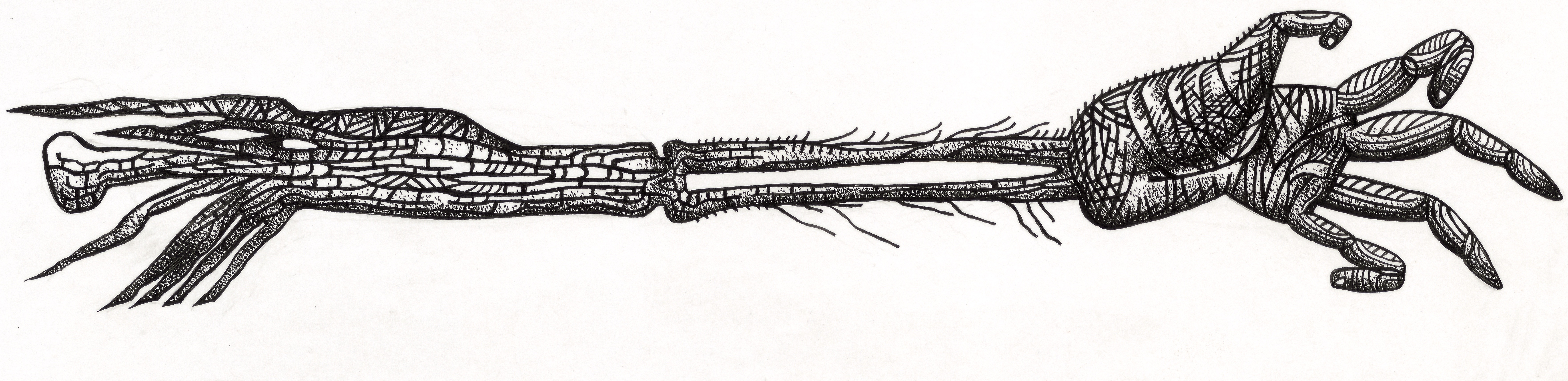
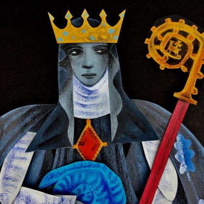
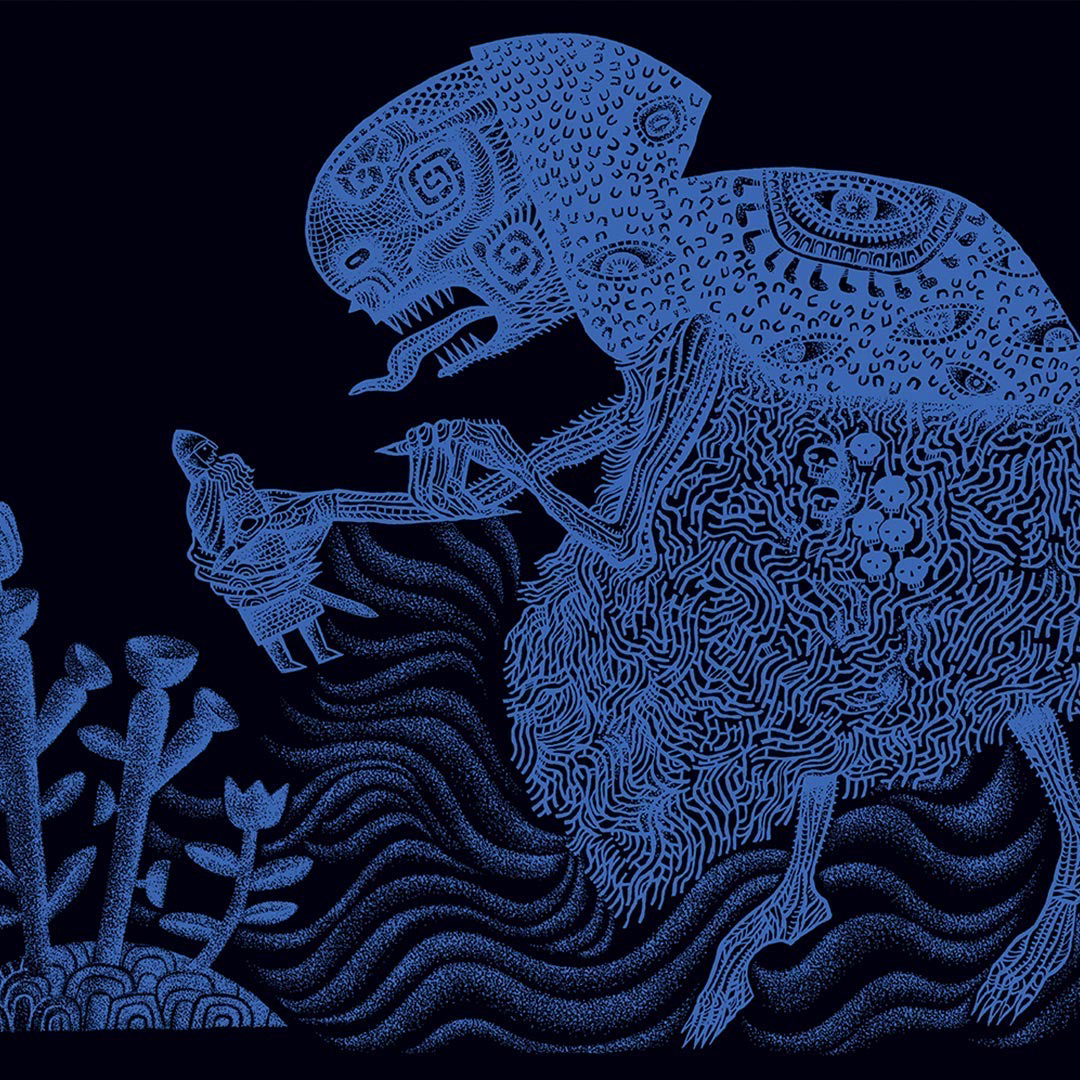
Above: black original ink drawing and the digital translation to colour in the book.

David: Tonal changes are essential to my mind, especially when the piece is very dark, or heavily stylised. The most incredible imagery in a movie can actually become dull after a while, unless the viewer is shaken out of it – like a little hit of spice. I watched versions of scenes of the Beowulf animation without the degrading filters we talked about. Your drawings moving across the screen were so striking without the added optical effects that I found it tough to dull them down. Nevertheless I added scratchy inclusions of scrabbling colour to make the films glow and dull in turn, and the decision worked wonders in unifying the animations and the sequences of the book itself. One of the things I had to keep reminding myself was that this wasn’t a trailer for a movie, but for a beautiful book. (The Hitchcock in me was forever edging it to a movie trailer.)

Clive: We waited with bated breath once the sample shots had been delivered to the Folio team, but when the responses came they were wholeheartedly enthusiastic. Far from delivering a few short cuts to be edited into a promotional film, we were tasked with producing the whole shebang. After a briefing Zoom with the team at Folio we got working. There were to be 2 x 30 second films, one at a format for viewing on smart-phones, and a second for viewing on laptops and tablets.

David: Oh weren’t they wonderful? They showed such faith in us that I did feel confident about how it would turn out. Working with such carefully considered and rendered drawings I knew the results would be beautiful. Like cooking with the best ingredients. Although the brief was for 30 second films, I overshot and both edits came in at one minute and six seconds. I think just over the minute stands up very well. I would have been pushed to get the pace right in 30 second films.

Clive: I agree. 30 seconds would have been too rushed. As the films stand, each at just over a minute, they fly by when watching them.

As with all our animation projects, once we’d discussed I absented myself to concentrate on sourcing the music. You in the meantime were off like a rocket. I remember your utter confidence that you knew where to go with all this, waiting only on the music to provide the structures to the films. You were not just animator on the project working to my brief. You were now Animation Producer!

David: And a very cocky one at that, due in no small part to the confidence and enthusiasm you demonstrated in allowing me to hack up and rearrange your artworks.

While you researched the music, I got busy anatomising your Beowulf characters to assemble a cache of puppet elements. You always show an astonishing faith in me to infill the drawings when I amputate an arm, head or leg, or need to find fingers or a neck. I in turn feel safe in the knowledge that you’ll always find the perfect piece of music which will make the pace, depth and rhythm of the story appear clearly in my head. This time you found four tracks, one of which though amazing, we both thought a little too disturbing. (Maybe it’ll be right at another time for another film.) I viewed the films hundreds of times when making them, and have watched them many times since completion. I’m confident the two music pieces we settled on had just the right aesthetic, power, drive and primal drama. People report that they watch them repeatedly, and a big part of that is because the music makes them so moreish. 

Above: click to view this animated book-trailer for the new Folio Society edition of Seamus Heaney’s translation of Beowulf.

Artist: Clive Hicks-Jenkins

Animation Producer: David W. Slack

Harlequinade Animations

Featured

The past months have seen me pleasurably employed in a second collaboration with Sussex Lustreware designing imagery for their forthcoming range, Harlequinade. This has been a bit of a dream project for me, and one which I suggested to Gloria on the coat-tails of our collaboration earlier this year, when illustrations I’d made as the chapter headings for Marly Youman’s 2020 novel, Charis in the World of Wonders, were re-purposed as lustre-embellished decorations on the Sussex Lustreware World of Wonders range. Gloria and I got used to working around each other on World of Wonders, and on Harlequinade her glorious freehand lustre embellishments suggesting the swags of theatre curtains and the flashes and arabesques that conjure the glitter and tinsel of the stage, are perfect companions.

For the yet to be released Harlequinade range of plates, bowls, trinket-boxes, mugs, jugs and a teapot, I used my life-long love of Victorian Toy Theatre as inspiration, turning to my collection of toy theatre ephemera for inspiration.

Neptune

All design from historic sources requires adaptation, and in order to make images that fit the various available spaces on the china, and to ensure that the designs have consistency across the range, I’ve reworked – and occasionally reinvented – material from many diverse sources. Toy theatres were produced by a host of print publishers over hundreds of years, who all had their favourite artists. Although overall the toy theatre ‘style’ had something of a consistency, close examination shows many different hands at work, and those wrinkles needed to be ironed out for the purposes of re-presenting the characters here, for a new generation to appreciate. Here you will find the stock characters that were originally lifted from the Italian Commedia dell’arté, Harlequin, Columbine, Pantaloon and Clown, together with a handful of interlopers such as the god Neptune, in his shell chariot drawn by mer-horses – because Harlequinades loved to have a good spattering of the mythic/fantastic – and the fairies so essential to Victorian (and contemporary) pantomime.

There are the tradespeople who had their goods filched by Clown, and the performing dogs and circus horses so appreciated by 19th century theatre-goers. (In the age before motor cars, trained horses were so popular that specialised indoor arenas were devoted to equestrian spectacles, and to this day some theatres bear witness to their previous lives in the name, Hippodrome.)

Equestrian Harlequinade
Entrance of the Bower Fairy

My collaborator David W. Slack and I have been busy together making some animations to promote Harlequinade in the run-up to its launch. I draw and David animates, though we could as easily reverse that as David is a wonderful artist as well as an animator, and I too am an artist who also animates. It makes the collaboration particularly pleasurable, as we always understand what the other is doing, and the challenges of the work. Watch this space. There are more on the way.

Making the Myths Map

Since February my working days have been pretty much filled with the Myths Map/Telling Tales project commissioned by English Heritage. My brief was to conceive and create artwork for an interactive map featuring myths, legends and folklore associated with selected E.H. sites. Working closely with Gravitywell, the Bristol-based digital agency charged with building the map, I’ve produced all its assets, including the English Heritage Myths Map logo through which the site is entered (see below), the map outlines, textures and topography, the settlements and the E.H. site icons.

screen_shot_2019-04-04_at_11.57.11.png

Below: George and the Dragon were built as paper maquettes and then scanned, digitally assembled and animated for the map logo

Anatomised George and Horse (1).jpg

Anatomised Dragon for Cartouche.jpg

IMG_7125.jpg


Below: drawn elements used to create the settlements of the Myths Map

Map settlements.jpg

Below: some of the many English Heritage site icons I produced for the map

IMG_6940 (2).jpg


Pendennis.jpg

Animated elements for the map and sea surrounding it, were made by me and digitally animated by Gravitywell. There are deer and birds for the land, and assorted sea monsters for coastal zones.

IMG_7137 (1).jpg

IMG_7136 (1).jpg

Below: Photo credit: © English Heritage/ Abi Bansal

CHJ32.jpg

IMG_7003.jpg

IMG_7006 (1).jpg

Below: Kraken maquette and ships

IMG_7038 (1)

IMG_7034.jpg

Below: in the studio I roughly layered elements to guide the animators

IMG_7039

In addition to the map assets, I’m making animation maquettes for use in films being produced by English Heritage about some of the sites and the myths and legends associated with them. The first of these is St Hilda of Whitby, who founded Whitby Abbey and according to legend asked God’s help to clear the site of vipers so the building work could be carried out in safety.

IMG_7310 (1).jpg

My attachment to the Telling Tales project extends to producing illustrations on the theme of Myths and Legends for English Heritage Magazine throughout the year, the first of which has been Saint George and the Dragon for the Spring edition.

St George (1)

No project of this scale can get to completion without the cooperation and collaboration of many, and the Myths Map teams at English Heritage and Gravitywell were sterling throughout. Enthusiasm and appreciation were boundless at every stage, which made the experience a pleasure even when the hours were long and the ‘to-do’ lists were endless. As an artist much of what I do is solitary, but on Telling Tales the sense of work carried out in partnership with enthusiasts, has been the chief pleasure of the project. I’m so pleased it came my way, and my thanks to those who sought me out to play a part.

Click HERE to visit the Myths Map

>><<

Soldier Blue


This animation sequence made for the stage production of Hansel & Gretel was unplanned, added to the last half hour of a day’s filming when the idea of marching the toy soldiers through the archway came to me. In the event only a flash of it appears in the production, which is a shame because the bit I like most – right at the end – was left out.

Filming was tricky. The model was very small and the narrow archway meant having to move the toy soldiers through it with tweezers. In fact the steps were so narrow and the soldiers’ bases so tiny that there were times when getting the little fellows in place and balanced long enough for a shot, was challenging. The model wasn’t fixed, but made of loose and unstable blocks, so my every clumsy nudge as I animated made the building appear to wobble in the finished footage. I don’t mind that, as I think it adds charm to the sequence.

IMG_3636.jpg

For me, the most touching thing about how this particular animation sequence came about, is that the little dogs were a tender gift from my friend Angela Beaumont, who sent them – ostensibly to Jack – to make me smile at a time when she knew I was worried about his deteriorating health. As it happened the miniature parcel arrived by post the day he died, and the pic of its contents lying in their wrappings next to Jack on his blanket in the window-seat, was the last photograph I took of him.

Over the weeks following Jack’s death, I made several arrangements of the vintage Netherlandish building-blocks (a gift from my friend Mathijs Van Soest), the tin cavalryman, the handful of toy soldiers (which are actually miniature skittles) and of course the pair of tiny dogs. Snow White and the Seven Dwarfs got into the picture too, though only temporarily. Ideas for the production were cooking. This is the way I often work as I prepare a project, whether a painting or animation or a model for a book illustration. I constantly build and re-build in different configurations, adding and removing elements, trying out unlikely combinations. It’s a process of play, and somewhere en route, a few ideas coalesce into something that I realise might be heading toward a solution. Simon Armitage’s text for Hansel & Gretel makes reference to the flags of opposing factions, and so I cut paper pennants to tape to the toy soldiers. I made numerous adjustments to the archway, tweaking and finessing.

IMG_4786.jpg


IMG_3640 (2).jpg

When the time came to film animation sequences of the children’s playthings and the war-torn devastation of their community, I realised I could use the building blocks, tin cavalryman and toy soldiers to represent both. Later I decided to put the building blocks and cavalryman on stage, as well as on film, so that Hansel and Gretel could play with them in their bedroom. (For the stage, I’d reversibly glue the blocks together so that the archway wouldn’t collapse during the live action.)

2018_CF_Music_PAC_Hansel_Gretel-54K2A7842.jpg

By animating the toys in the screened sequences, it was possible to bring them to life, suggesting to the audience the children’s imaginative powers to transform the devastation of war and bombings into something they could – at least in part – control.

IMG_4754 (2).jpg

Above: the devastation of war represented by ruined buildings, fallen soldiers and stricken animals.

Below: order (and life) restored through the power of play.

IMG_4814

I would have liked to explore more notions of the redemptive power of play. But a production of this complexity – text and music combined with live performances, puppetry and pre-recorded visuals – allows only so much time within its length to piece all the elements together to make sense. The stage performance of Hansel & Gretel lasts just an hour, and there must be the space within that for everything to work without any sense of it being too crammed with ideas. Images have to work alongside words and music, illuminating without overwhelming. I had to simplify.

The ‘making’ time we had on the production was extremely short, followed by all of the filming requirements scheduled into just three days, which is not much at all when you take account of the changes of camera and lighting set-ups, arranging the models and building and striking the heavy animation screen required for the shadow-puppet sequences. We filmed many models: the various set-ups of the forest, the exterior of the witch’s house and the four-storey ‘doll’s house’ used for the interiors, the many set-ups of  the ‘archway’, both intact and in ruins, the ‘mechanical bird’ and scores of ‘still’ shots used to in-fill animation sequences. There were large numbers of complex shadow-screen animations of the parents, of several versions of the witch, and of the extremely-difficult-to-film and labour-intensive ‘dancing Lebkuchen biscuits’, which slid about on the sloping animation board and created endless problems. Phil Cooper – who assisted with the animation – joined me in turning the air blue as we wrangled those damned Lebkuchen into submission!

Cameraman Pete Telfer and I have been working together now for many years and he’s always game for anything I suggest, helping me find ways to achieve the ‘vision’. But though we have a sort of shorthand that enables us to work creatively even when against the clock, this project was beyond any normal definition of ambitious. Phil wasn’t available for all the sessions, which slowed things down on the days he couldn’t be with us. The quality of filmed imagery I wanted for the production was extraordinarily diverse and complex to bring to completion, and in the end I overran the filming schedule by a day.

The editing was at the Moth Factory in Bristol. Jon Street, our amazing editor/vision-mixer, was heroic in finding solutions to the many problems I threw at him. He listened not only to what I asked for, but read between the lines at every stage, working away quietly to find solutions to things he knew I was worrying about though not voicing.

When all the visuals had been fitted to the music and words, we spent a long afternoon colour balancing and adjusting the tonal values of the footage, adding the rich blues we wanted to unify many of the model and papercut animation sequences, and enhancing the shadows.

Below: Jon at the Moth Factory, colour balancing footage of the forest.

IMG_4906.jpg


Later, in rehearsals, the film elements of Hansel & Gretel that had been edited to quite rough early recordings of the work, had to be re-shaped to the live music and words, and the editing was for the last time tweaked into shape. In the performances, Jon is behind the camera that streams images of the live puppetry to the screen, and there is no-one better suited to the job because he has such intimate knowledge of how all the pieces of this production fit together. So many people work to bring a project of this scale to the stage, and the individual contributions can’t be measured on a scale. But if there were one, he’d be pretty high up on it. Such insight, good judgement and multiple technical skills – combined with good humour, patience and infinite generosity – don’t usually come in a single package, though in Jon, they do. He’s a champion! We originally came to work together in 2014 on another music/theatre piece, The Mare’s Tale (music by Mark Bowden and words by Damian Walford Davies), and I have Pete Telfer, who was cameraman on that project too, to thank for the introduction. I wouldn’t want to work on any project like this without Pete or Jon.

In creative matters, one thing leads to another. When puppeteer Lizzie Wort watched the animation sequence of the toy soldiers marching through the archway, she went off by herself to work with the model, and produced a lovely sequence in which Gretel pushes soldiers through the archway. It makes for a wonderful reference from live-action to animation and back again, and it shows the rich levels of creativity that can develop when performers and artists are alert to each other’s work, delighting in and then borrowing ideas to run with them and build moments that link, rebound and resonate.

Clive Hicks-Jenkins. August 2018

Animating the Unspeakable

The Witch that appeared in the Random Spectacular published picture book of Hansel & Gretel (see above), had already been through a complex line of development from first ideas to finished illustrations by the time I came to re-think her for the stage production.

On the stage the children were to be presented as tabletop puppets made by the wonderful artist/puppet-maker Jan Zalud, based on designs that I’d produced as a guide and that the two of us continued to discuss in great detail throughout his process of making. The puppets’ wardrobes were supervised by Oonagh Creighton-Griffiths.

IMG_3878 (1)


IMG_7817

But the Witch was always going to be conjured as a shadow screen presence, and in the end was produced as several articulated papercut puppets that were stop-motion operated on a light-box in the manner of the silhouette films made by the great pioneer animator, Lotte Reiniger.

My friend, artist Peter Lloyd, created the papercut puppets for the production. He started with basic designs I provided, and then freely elaborated on them. Peter added the extraordinary detail of the many eyes worked into the surface texture of the Witch’s arms and hands, borrowing the idea from the garment stitched with eyes that the character had worn in my original picturebook. I knew from the moment I saw the papercuts that he’d gifted me with an amazing reimagining of the Witch from the book. A villain needs to be visually fascinating, whether an evil genius or a predatory alien, and the Witch in Hansel & Gretel is no exception. Peter Lloyd’s witchy hands – which as I recall were the first papercuts he made of the character – have a filigree orientalist quality that any animator would be happy to work with. Every finger-joint was articulated, so that when I came to animate the hands (assisted by another artist/collaborator on the project, Phil Cooper), I had the best possible range of movement.

28908310_10160010565060462_1786007848_n (1)

The Witch papercuts were filmed by Pete Telfer of Culture Colony as black silhouettes on a white screen, but were reversed to negative in the editing process, to create a more ghostly effect.

IMG_4380

It’s a fact that I simply couldn’t have produced silhouette puppets as elaborate as Peter’s, as his paper-cutting skills are magnificent and far exceed my own. He created three versions of the Witch: large papercuts of her head and hands for close-up shots, and full-length cloaked and uncloaked representations of her, the latter revealing her full, hybrid crab/scorpion appearance. (Her lashing, scorpion tail was restless in the animations, a barometer – rather like a cat’s tail – of her temper.)

30825346_10160170988160462_1594570988_o.jpg

Above and below: two of Peter Lloyd’s silhouettes for the Witch on his cutting board.

30945320_10160183189755462_1303579259_o

There were some minor adjustments to the puppets made during the filming. On the last day of shooting I cannibalised parts from two of them to make a fourth version, in order to present the character in her death throes. In addition, Phil Cooper and I added some eyelids to the large head of the Witch, to enliven her expressions in close up. (In animation, the mechanisms of blinking play a huge part in bringing a character to life.) I adjusted the principal pivot points of the full length puppets, adding transparent, swivelling animation-levers to enlarge their repertoires of movement. That included repositioning the hips and rearranging the legs so as to make the knees reverse-jointed, resulting in a more bird-like gait. (See below.)

IMG_4931.jpg

The loosely-jointed fingers on the full-length puppets proved unwieldy on the animation screen as they kept shifting when I didn’t want them to, no matter how careful I was. So instead I made a virtue of the problem, being sure to keep them moving at all times. Later, in the editing suite with Jon Street at The Moth Factory in Bristol, when we heard Matt Kaner’s music for the scene for the first time, it turned out he’d made unnerving use of plucked strings, and the effect perfectly matched the Witch’s twitching, restless hands, as though her energy couldn’t be stilled. Creepy!

Close collaboration between the participating artists was crucial on the project. From the outset I’d wanted to enrich the visual aesthetic of what I’d already created by way of the Hansel & Gretel picturebook for Random Spectacular and the toy theatre for Benjamin Pollock’s Toyshop, extending my earlier ideas by inviting those whose work I greatly admire to contribute to the stage production. Phil Cooper and I had already collaborated together on the video-trailer for the Random Spectacular picturebook, for which he’d made the set models. Peter Lloyd and Jan Zalud were both familiar with my work and well-prepared for the stage production, even though it departed from much of the material I’d made for the book. I made basic design templates that we all used to stay within the parameters of how the production would look, and they ensured consistency across the board. Everything was discussed at length. It was teamwork from start to finish.


Supervising Designer and Animator – Clive Hicks-Jenkins

Shadow Puppets – Peter Lloyd

Models, Background Paintings and Assistant Animator – Philip Cooper

Tabletop Puppets – Jan Zaud

Puppet Wardrobe by Oonagh Creighton-Griffiths


ORG__DSC7027 (1).jpg

Above: photograph courtesy of Philip Cooper


the tale told twice

Looking back it seems extraordinary that I made two versions of The Soldier’s Tale in eighteen months. The first for the Prince William Symphony Players and their performance in Washington DC, and the second for the Mid Wales Chamber Orchestra at the 2013 Hay Festival.

The two versions had certain cross-over elements, but as the second one developed, it became significantly more elaborate in ambition and different in tone to the first. Here are pairs of images. In each case the first image is from the Washington presentation, and the second from the one made for the Hay Festival.

Joseph and the Princess

 …

Joseph and his violin

The Devil as a Pedlar Woman

The Devil as a Butterfly-catcher

Joseph plays the violin

The Devil’s coach and horses

For the Washington performance I sent the images electronically to be edited into a presentation by the producer. I wasn’t present for the event, though my friend Anita Mills very kindly travelled to Washington to see it for me.

Below: There were no backgrounds for the Washington version, a deficit I made good for the Hay presentation.

For the Hay performance I worked with the film-maker and cameraman Pete Telfer, and the conductor of Mid Wales Chamber Orchestra, James Slater, to create a much more elaborate presentation of sequential images and animations. I was present at the performance to cue it from the score.

Click HERE to read a review of the Hay Festival performance.

Right now I’m making paintings based on the second version, for my exhibition at Oriel Tegfryn, Menai Bridge, later this year.

Interview with Barry Purves part 2: in the realm of the senses

Animator Barry Purves and his puppet for Plume

This is the fourth post of a week at the Artlog dedicated to contemporary puppeteers, and is the second of a two-part interview with the great animator Barry Purves, whose six minute film name-checking all the plays of Shakespeare, Next, I wrote about here recently.

C.H.-J. OK, yesterday we talked about the fact that in your stop-motion films you’ve not balked at stripping characters naked, and in Plume you made things even more difficult for yourself by having nudity and wings. In fact I can’t think of another animator who has elected to create so many artistic and technical challenges as you have done in the matter of eschewing garments. There’s a flash or two of nudity in Screen Play, in which I sense you were trying it out, and a great deal more in Achilles, where you push the envelope even further with man-on-man action. 
Achilles
B.P. The nudity isn’t particularly meant to shock, though it certainly pushes animation to the extremes. What excites me is a puppet in a pool of light telling a big story, which essentially is what we have in Plume. It excites me too that budgets have become smaller and smaller, because I like the creative challenges this presents. While I enjoy the richness of lavish costumes, budgets no longer extend to that. The puppet without clothes is the puppet at its most honest and open. And here’s an interesting observation: there are a lot of animators and artists who work naked. This is not about exhibitionism, but getting rid of any clutter, like sleeves that can get in the way. For an animator it’s cooler under the hot lights. I come back again to the sense of being open.
 
With Achilles the question was whether it was possible to bring eroticism into stop-motion, or would technique get in the way. I think it worked. There’s been little serious eroticism in animation. A lot of films poke fun at sex and flesh, but it seems to me that animation is an interesting medium for exploring our primal urges. I suppose you’re right, I do enjoy pushing animation into unchartered territories, and I certainly make the films that I would want to watch. 
Achilles and Patroclus
C.H. J. Your’e clearly an artist who takes no hostages in the pursuit of his vision. I’m reminded of Derek Jarman, whose homoerotic sensibility was the bedrock of his films. Has your commitment to taking stop-motion animation into previously uncharted realms meant that you’ve had to look harder for supportive producers? And was there any cost in terms of broadcasting the films, or showing them in festival? (There shouldn’t be, but it’s something that I’d like to hear your experience of.)
 
B.P. It’s a fact that the flesh on show in Rigoletto caused some concern from those who seemed to ignore that the opera is about an orgy, a rape and then a violent revenge. The gold nipples on the chorus upset various people, as did Gilda exposing her breast. (Just take a look at Renaissance art and you’ll see that exposed breasts are not exactly unusual.) But apparently the worst offender of all was the Duke with his gold codpiece. Rather than being seen as a status symbol and a piece of practical costuming, someone’s secretary remarked that it looked like a penis. (Not a penis belonging to anyone I know.) After that there was much consternation and much digital repainting, which in 1993 was pretty tricky. I guess the story points up the narrow-mindedness associated with animation. If I can do anything to break down such barriers and widen the field of subjects, I will.
 
 
While I have to rely almost exclusively on festivals for screenings, several of my films have been rejected/banned on the grounds of religious or cultural taste, which I guess is fair enough. However one of the joys of animation is that puppets can speak for those who don’t have voices, and can express ideas that live action cannot. It’s a frustration that my work isn’t better represented in the world. Naturally I would prefer to have the films seen by more people.
Ray Harryhausen and one of the skeletons from Jason and the Argonauts
C. H.-J. I saw Ray Harryhausen’s Jason and the Argonauts many times when I was a kid. I guess we all did. I went back to the cinema over and over again and sat through the programme repeatedly. (Remember the days before separate programmes?) I was in heaven not only because of that skeleton fight… and all the other amazing creatures Ray conjured… but because I thought Talos was pretty hot. When I watched your film Achilles for the first time, I thought ‘Wow! It’s as though someone has sneaked onto the Jason set after hours and shot hot sex scenes with Talos!’ 
j
Talos the Giant in Jason and the Argonauts
B.P. I was always impressed by the details in Jason and the Argonauts. On the shields, the tunics and the boat, everywhere the design is beautiful. It once worried me that the temples and other architecture shown were prematurely in ruins, but restoring the sites or building new ones would have been far too costly in the pre-digital age. There’s a moment too when someone cuts the ropes of a net to capture the harpies, and a big chunk of masonry flies off. That worried me at the time.
 
I think much of the eroticism of Achilles is down to the staging, the lighting and the masked chorus standing watching the action. It would not have worked if I’d used a more literal approach. I originally had the idea of using the Orpheus myth, but that was too straight, and in many ways too familiar. The relationship between Achilles and Patroclus has always been denied or circumnavigated by teachers, but you only need read The Iliad, or Shakespeare, or Chaucer, or listen to Tippet’s King Priam to recognise whats happening. The story seemed a good metaphor for illustrating the confusion when love betwen a couple is both expressed openly and yet simutaneously hidden away.
 
I had trouble trying to place the main sex scene. A part of me wondered whether it would be more tragic if it was only after the death of Patroclus that Achilles realised how much he loved him, expressing as much in his intimate handling of the body. There are details in the funeral preparations in The Iliad that suggest this, and the animation challenge of showing the difference between a dead body and a living one could have been exciting. As it stands there are a couple of shots where the dead Patroclus looks plausibly floppy and heavy in Achilles’ arms, and I often get asked how I made that happen. I think some people expect me to say I loosened the joints of the armature, but of course I didn’t. No tricks. It’s all in the animation.
C.H-J. Something similar happens to me regarding painting. People ask how I produce this rich colour or that soft light, as though there’s a shop I can give them the address of so that they can go and purchase the tube of paint that will do the same for them. I suppose when a quality looks as though it would be rather difficult to achieve, they find it easier to believe it’s just a trick. Sometimes I toy with the idea of telling them there is a trick, just to mess with their heads! Talking of trickery, you clearly relish sleight-of-hand in staging terms, and enjoy using diverse story-telling techniques appropriate to the cultures you’re exploring. I loved the Japanese stage-effects of Screen Play, with the wonderful use of sliding and revolving panels.
B. P. I’d always wanted to do something with a Greek chorus, and I suppose the film is quite bold in having the main characters acting on a suspended stone arena in a black void, while a chorus witnessing/narrating the story looks on. There’s minimal use of props and settings.
 
My films can be hard to read until you’ve understood the storytelling conventions. For all my lofty ambitions they’re just animated shorts, but then again animation can tackle these big ideas, and the fact that we are having this conversation, suggests something positive in what I’ve achieved.
Achilles and Patroclus
I’m indebted to Barry Purves for his cooperation. He’s been endlessly patient as I’ve showered him with questions. I hope one day… when he’s recovered from my having mercilessly pestered him… to make a post about his work on Screen Play, which is a film I’m full of admiration for.

interview with Barry Purves part 1: in the realm of the birds

Pre-production photograph of the winged-man from Barry Purves’ film Plume.

This is the third post of a week at the Artlog dedicated to contemporary puppeteers, and is the first of a two-part interview with the great animator Barry Purves, whose six minute film name-checking all the plays of Shakespeare, Next, I wrote about here recently.

C.H.-J. Barry, I’m going to start with the fact that you and I share a common passion for one of the films of Alfred Hitchcock, The Birds. It’s my default film when I need something to comfort me. I’ve been watching it since I was about sixteen and I never tire of it. Tell me why it rocks your boat.

Avian elegance: Tippi Hedren in a posed shot for Hitchcock’s The Birds.

B.P. I love Hitchcock as every element is so considered; every shadow, every colour, every camera angle, every note of music is all there for a reason, each contributing to the story or character. I love the often twisted sexual tensions in the films, and the choreography of the set pieces. Favourite moments are the heads of the crowd in Strangers on a Train – all turning back and forth save one. In Marnie the theft from the safe by Tippi Hedren is unendurably cranked up by the presence of the cleaning lady who turns out to be deaf. But probably my favourite scene has to be the one with the jungle-gym in The Birds. The off-screen song of the children is evocative, contrasting with the unnerving silence of the gathering birds. Just watch Tippi as she constantly but elegantly flicks her cigarette and nervously looks to the skies. Everything is so right about that scene.

But most of all, the tension of the film is extraordinary and unsettling and Hitchcock does not explain anything in the end.

Melanie Daniels and the children pursued by crows.

 …

I have long wanted to do my own tribute to Hitchcock and have three short films all ready to be shot about him, but I’ve met with such indifference. This story will shock you but I went to a rather high profile TV station and acted out one of my film ideas in which Hitch performs The Birds from the perspectives of the female characters. I gave a good performance, and the trendy young commissioner behind the  desk politely laughed and explained that he didn’t really know who Hitchcock was.

 …

CH-J. Oh, for crying out loud. The barbarians have taken over! How could anyone worthy of the name ‘commissioner’ be ignorant of Hitchcock? That’s damned shameful!

The location work in the film is enormously improved by the great Albert Whitlock, and I’ve seen his name in a list of your favourite artists. You admire him greatly.

 …

B.P. The matte paintings that enhance the topography and the weather conditions of Bodega Bay turn the location into one of the characters. Even clouds become part of the story telling. But oh, the layers on that final shot of the film – breathtaking even by today’s standards.

C.H.-J. Have you read Camille Paglia’s BFI critique of The Birds? That woman is head-over-heels in love with Tippi Hedren. She describes with an admiration bordering on worshipful the sexual charge when the actress crosses those endless legs clad in impeccable hose, or lights a cigarette. It’s almost Birds porn! Sometimes I just read it for the buzz it gives me from the way Paglia evocatively describes the scenes. She’s great on Suzanne Pleshette too, who plays Annie.

 …

B.P. I have to confess I’m supremely jealous that Paglia got to write it. I could certainly fill a book or two about the film. (And if the BFI are reading this, I’d happily write about Jason and the Argonauts for the series.)

The Birds is an undeniably erotic film, and in Hedren, Taylor, and Pleshette, Hitchcock had three astonishingly beautiful and sensual actors. I recently noticed that Rod Taylor has his shirt off in the distance in a scene on the farm, contrasting nicely with the overdressed Tippi.

 …

C.H.-J. Of the many magnificent achievements in the film, for me the bird attacks are standout in both the visuals and the sound design. The grating of electronic crow cries and the mad flapping and shrieking of hundreds of songbirds plummeting down a chimney couldn’t be bettered. Though Hitchcock didn’t have todays CGI at his disposal to layer the elements of his film, the attack on Bodega Bay, starting with that high Albert Whitlock-enhanced shot of the fire at the gas station as predatory seagulls glide into view, is a masterpiece from beginning to end. High art of the cinema.

 …

The birds descend. In this photograph taken on the studio set, the characters are being terrorised by a very few attackers. In the film hundreds of birds were optically composited into the scene to create a shocking maelstrom of wings, claws and beaks.

B.P. One can nit-pick about the effects today, but any obvious process shots do not get in the way at all. The sound, with that metallic edge to the birds’ calls is still so unsettling. Among all the noises are some feather ruffling and shaking – the calmness making the atmosphere even worse.

C.H-J. Bernard Herrmann did a magnificent job on the film, creating a soundtrack of genius.

Tell me about the time you saw the green wool-suit that costume designer Edith Head dressed Hedren in for the film.

 …

B.P. The suit was included in the recent Victoria and Albert exhibition of Hollywood costumes, and this item above all else was the one I wanted to see. There was little sign of any distressing in the suit, so I assumed it was either one used early in the film before the birds attacked, or was a stand in suit. There was an irregular patch on the left thigh, a little raised ‘bump’ which I figured was down to recent handling. However, in a film-still showing Hedren wearing the suit, the same ‘bump’ appeared. In a flash I realised it was her suspender pressing through the cloth, its impact still there today. This was my Turin shroud moment. Strong tea and cake were needed after that.

 …

C.H.-J. I’m not surprised. I would have needed a lie-down in a darkened room!

Now let’s talk about Plume. I haven’t seen your film about a winged man, though I’m definitely going to seek it out. Might I be right in thinking that your love of the artistry on show in The Birds was an influence on your choice of subject? Maybe I’m being fanciful here.

 …

B.P. Wings have been a recurring image in all my films – flight is probably about liberation, or about transformation. My favourite image is of a naked body with an animal or bird head, or with wings.

CH-J. You chose to take on what have always seemed to me to be two of the most difficult animation challenges to pull off: wings and flight. Many an animator has stumbled at that hurdle.

 …

B.P. Maybe – I would have liked more time with the wings, but in all my films these wings are never realistic representations of how birds would use them, but are more symbolic in tone. In this way I feel free to create stylised movement. In Next, Shakespeare appears wearing gold wings in a reference to Cymbeline. In Screen Play the woman has a vision of her lover transformed into a bird and being shot down – again all very theatrical. In Rigoletto the bird masks and costume elements are there to convey an instant hierachy. In Achilles we get naked men as horses and bulls, though not birds. In Gilbert and Sullivan the characters wear fairy wings referencing Iolanthe. In Hamilton most of the characters are birds. Plume sees the central character raped for his wings, and finally in Tchaikovsky he echoes the movement of a swan and Swan Lake itself, suggesting an alternative life/escape as a swan.

C.H.-J. I’ve always felt that manufactured wings in general leave a great deal to be desired, whether as parts of costumes worn by actors, or attached to stop-motion puppets. The anatomy of wings is so complex, as is the motion. However the wings of your puppet in the pre-production photographs look gorgeous, and you’re such a consummate artist and animator that I’m betting you got the best movement out of them in the history of such things. I’d like to discuss this a little. Were the feathers real or manufactured?

 …

B.P. Wings are to me what spirals are to Tim Burton. For Plume we used a pair of wings from a duck and managed to remove the bone and insert an armature without damaging them. My producer suggested that as part of the narrative the wings should be the source of the light and should glow, and we all assumed they’d do so under UV. They didn’t, so we had to wash each feather in Daz with a toothbrush. We managed to preserve the texture and keep all the barbs intact. But on film the UV effect rather muted any appreciation of the delicacy of the feathers, and for the most part the wings just looked like white shapes. The UV did have a fantastic effect of reflecting light onto the other characters, but I did miss seeing the texture of the feathers themselves.

 …

C.H.-J. Birds fold and wrap their wings so that they become one with the shape and texture of their bodies, but wings springing from human anatomy are always, to some extent, going to look grafted on. However I see that in this photograph they’re folded across the chest, arranged more the way a bat holds its forelegs in that strange, praying-mantis-like position. That’s a fascinating and creative solution, and gets around the fact that bird and human anatomy are not a good fit.

 …

B.P. I animated them not as bird wings but more as a dog would use his tail to portray his emotions, so they could be contradictory, perky and then limp. They had a lot of character.

CH-J. Were you as creative in the ways you used them in flight? When I’m painting wings on angels I always work on the principle of not necessarily making the splice look real, as much as making it plausible.

 …

B.P. My idea was to give them as much variation as possible, so they start the film spread out to their maximum and are proud and erect. As the violence happens the wings get tattered and then ruined, until they hang limply and heavily from his body. They have no use and he makes an horrendous decision. That moment, combined with a great peice of music and the right sound effect, has most audiences crossing their legs in discomfort.

C.H.-J. How did you go about the matter of a rig to keep your puppet suspended? There are various ways you could have done it.

 …

B.P. The character had a rigging point in his back and on one side, but he was a heavy beast I have to say. That he was naked meant there was a lot of silicon flesh to add to his weight. For the whole film he is against black velvet, which is forgiving when it comes to rigs and shadows. Nevertheless I had to employ a degree of ingenuity in the flying sequences, particularly in a shot where he completes a 360 degree circle.

 …

C.H.-J. OK. Let’s now talk about nudity. No animator chooses the easy route by stripping a stop-motion character naked, but it’s something you regularly take on.

B.P. Yes, I’ll admit that if I can get a character naked I will. There are many reasons for this. There’s the pure delight of naked flesh and the sensuality of two naked puppets together. Then there’s the fact I want to test how little I need in order to tell a story. For me animation is all about the performance of the puppets, though the schedules that my budgets enforce are ridiculous and sometimes legislate against performance. I usually have to shoot about twelve seconds a day and I never feel I can get the what I need and that a more relaxed schedule would allow. I always feel my work is a decent rehearsal.

 …

C.H-J. Having myself laboured recently to get 12 seconds per day of relatively crude animation into the can, I can’t imagine how you achieve movement of such quality working to that schedule.

There must be a great deal of wear and tear on a puppet when there are no clothes to hide the damage.

B.P. Pale skin gets dirty very quickly through the constant manhandling, and I tend to push my puppets into large, open, bold gestures, which can cause splits in the material. We got through three penises on the Plume puppet, mainly because the skin was stretched in these big poses. I animated the penis as he fell from the sky, and then the wire in it would snap and so from time to time we had to replace it. If only real life were that easy. In Achilles, with the puppets suggesting Greek statues and acting out some overtly sexual scenes, I made the decision not to animate the penises. It’s odd when you have to have such discussions.

C.H-J. In the male characters of Achilles and Plume I see affectionate echoes of Talos the Giant from Jason and the Argonauts by one of your heroes, Ray Harryhausen. I’m assuming his films were your introduction into the arts of stop-motion puppets?

 …

B.P. Jason and the Argonauts is of course up there with The Birds (along with Cabaret, King Kong, Shakespeare in Love, Mary Poppins, Singing in the Rain, Les Enfants du Paradis and Some Like it Hot), and I can watch it time and time again. I just hear those opening phrases from Herrmann’s epic score and settle back. The film never disappoints. This of all Ray’s films, delivers most completely.

 …

C.H.-J. I agree. He nailed it in that one, though there are some standout sequences in The Valley of Gwangi that enthral me to this day. (I love the scene of the cowboys on horseback lassoing the dinosaur.)

Barry, I don’t know of a stop-motion animator working today who handles human movement as gracefully as you. Your Shakespeare in Next is a smorgasbord of refined animation. He moves like a dancing-master. Do you see yourself as a choreographer? (I once asked the same question of Ray Harryhausen, and he said “No, not really.”)

B.P. Sorry to disagree with Ray here, but oh yes, definitely. The animator is a choreographer and performer at the same time, without a doubt. He is the choreographer in the sense that he is creating the movement for the camera, using the body to tell the story, alongside timing, staging and rhythm. And Ray was a brilliant choreographer, even if that isn’t the word he used. The skeleton fight in JATA is beautifully staged. But I like that word choreography as it implies that our movement is not following realism but more rather enjoying the freedom of movement, using it creatively to tell a story. Shakespeare aims to move like a dancer in Next, as does Tchaikovsky. I’m consciously pushing movement away from realism. I can get a bit too elegant at times, but somehow it suits me.

 …

C.H.-J. My friend, I can’t tell you what a pleasure this has been for me. I should wind things up now, but I’d like you to say just a little about Screen Play. It’s a work of staggering invention and elegance.

Beautiful details in the film Screen Play. Screens painted with a peacock kimono and a wig, draw back to show a woman dressed in them.

B.P. Ah, Screen Play. What I thought would be a technical exercise still seems to move people. I wanted to make a film about visual communication and to do so included many narrative forms: theatre, film, dance, Kabuki, puppetry, mime, sign language, graphics, and so on, though despite all that it does seem to hang together well. Audiences and animators brought up on CG won’t understand the effort involved in the nine and a half minute take without a cut. It might seem indulgent, but it was my way of contrasting theatrical story telling with a more filmic approach. I’d like to reshoot and get the technical aspect better. The lighting is a little overbright and you can’t see the details on the sliding-screens, but there’s no going back now. That’s it. As with many of my films, I would like to stage this for real one day. It couldn’t be done exactly as it was in the film as there are too many unique animation tricks going on, but I could nevertheless do something quite impressive on stage.

The stage turns red with blood in Screen Play

Opinions vary as to whether I should have pulled back the camera to show it was a set, but without that the result would have been just a rather charming film about thwarted lovers. As it stands there are all manner of layers and acknowledgements of the creative process, and as you’ll see from my  list of favourite films above, I like art that acknowledges the artifice. Drawing this conversation full circle back to Hitchcock, the old master revelled in artificiality. Those puppet love birds swaying in Tippi’s car for a start. Animation is at its best when liberated from having to pretend to be realistic.

Part 2 tomorrow.

barry purves

As I prepare the animated Mari Lwyd sequences for the Mid Wales Chamber Orchestra commission of The Mare’s Tale (music by Mark Bowden and words by Damian Walford Davies), I’m recommending to Artloggers examples of  films from the animators I most admire. Following Yuri Norstein, Jan Svankmejer, Siri Melchior and Norman McLaren, comes British animator Barry Purves and his exhilarating romp through the complete plays of Shakespeare in under six minutes, “Next”. There is no-one who captures physical grace like Purves, and his wordless Shakespeare is as elegant as a dancing master as he presents his one-man mime/puppet show.

Above: Shakespeare the puppeteer.

Purves has elicited as clever and vivacious a performance from a stop-motion actor as ever I’ve seen, and I challenge any of you not to smile when confronted with a cross gartered Bard of Avon executing a flawless entrechat with more beats in it than you can count. (His feet are a blur!) As the music builds, so does the invention. There are simply too many stand-out moments to list, but I love the swift dispatch of the princes in the tower and the final glittering transfiguration. I promise you this wonderful film will lift your spirits!

Above! Shakespeare transfigured.

Click HERE to view “Next”.

the princess dances…

… and I reference everything from classical ballet…

… to Berlin Cabaret…

… to the Danse Apache of Paris nightclubs.

I guess once a choreographer, always a choreographer.

She’s quite a gal!