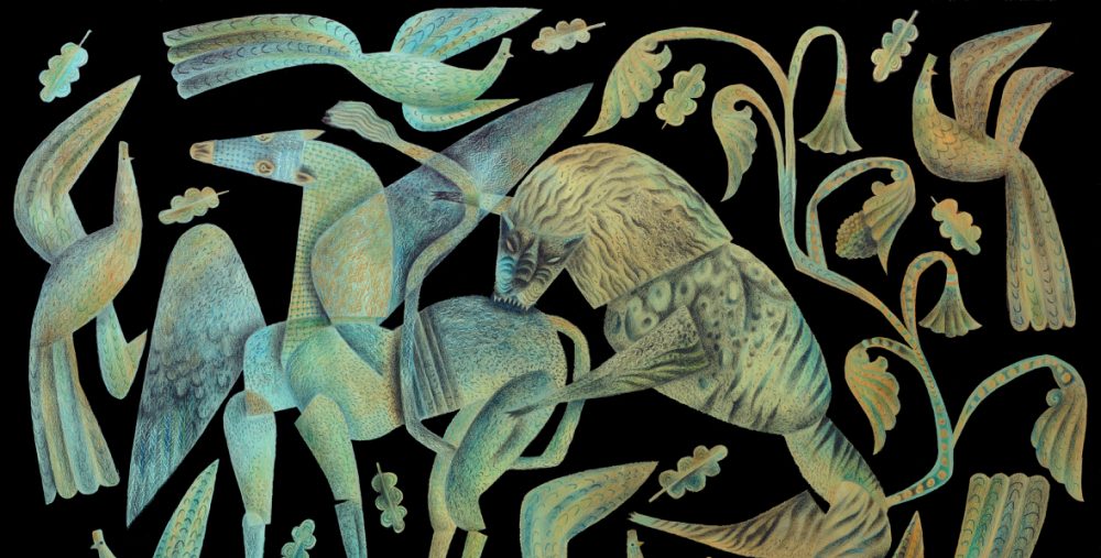
Great Pucklands by novelist Alison Alison MacLeod appears in the anthology These Our Monsters, published in 2019 by English Heritage. The story focuses on the close bond between Charles Darwin and his daughter Annie. I found myself deeply bound up in both the story and the history that underlay it. A print-out of what I believe to be the only known photograph of Annie sat on my desk throughout the work, though I had no intention of making a direct likeness of it for the illustration. Somehow that wouldn’t have fitted with what I wanted to convey of Alison’s story. I needed to absorb the mood of the piece and somehow create something that had Annie in it, but transformed. Here’s the drawing.
I loved making it, and I kept all the sketches and studies preparatory to it. The ammonite and trilobite are from my small collection of fossils. Sometimes a story gets under your skin, and you have an imperartive to serve it well and to do it justice. That was the case with this one. But I also wanted to honour the person at the heart of it. This image was made for Annie Darwin, who died aged just ten in 1851, one hundred years before the year I was born.
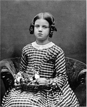
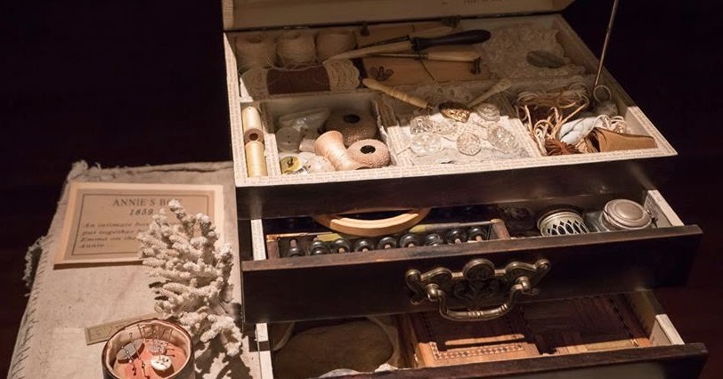
The only image of Annie is a lovely one captured in a daguerrotype. In a world where lives are charted every hour of every day, snapped on smartphones and loaded onto social media sites, and when it seems everyone on the planet is photographed incessantly from birth to death, a single, beautifully accomplished portrait of a child who clearly prepared and gravely composed herself for the momentous occasion, tugs at the heartstrings. Annie left behind so little: this photograph, a gravestone and the ‘box’ in which her parents preserved a small handful of mementoes. Perhaps it’s the modesty of what survives her that opens the door to creativity, because it gives the freedom to writers and artists to ‘imagine’ versions of her into life.
It was only back in 2019 that I spent a year as artist-in-residence with English Heritage, and yet it seems a lifetime ago. Anyone with the romantic notion that I spent a year motoring around the countryside visiting English Heritage properties in care and making artworks at a leisurely pace, would be way off the mark. It was deadlines from beginning to end, and I spent the entire time pinned to the worktable in my studio, creating images that were the results of my own research. There wasn’t time to visit a single site. Nevertheless there were exciting creations during the year, even when technically and creatively challenging in the allotted time.
The first project was to design and render all the ‘assets’ (artworks, to you and me) for the online, interactive English Heritage ‘Myths Map’ that was produced by the digital agency, Gravitywell, in Bristol. I suggested a cartouche of the type used on historic maps as a portal to the experience, and produced a number of rough designs to kickstart discussions with the Gravitywell and EH teams.
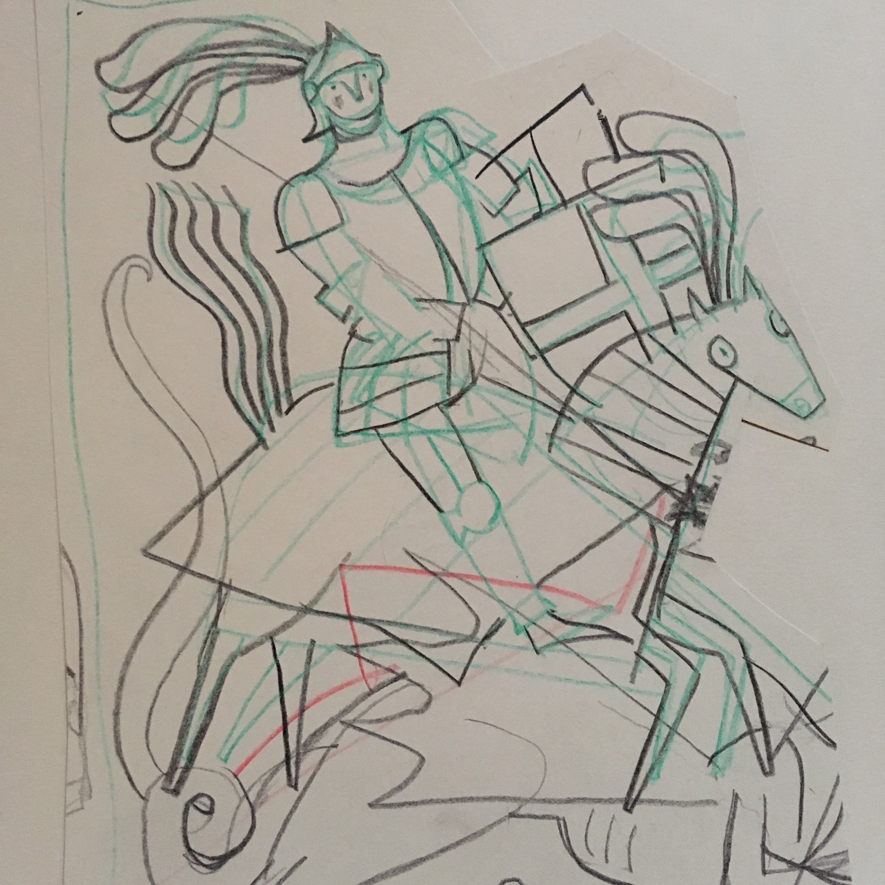
The EH team were very keen to use the iconography of Saint George and the Dragon, which I used to surmount the cartouche. They were also enthusiastic to include an animated element. Because time was incredibly short, I decided to render the image so as to look rather like a paper-cut, as it would have a graphic dynamic and yet be relatively quick to make.
All aspects of the map were initially made in black and white and the colour added later. It was such a complex project that it could have been misleading to decide the palette at the outset. It was much easier to assemble everything and then play with options.
The image had to be flexible enough for it to be adapted to several formats across various EH platforms.
The animated element was a gentle joust between the Saint and the Dragon, and the ‘maquettes’ I designed needed to be very simple as there would be no close-ups. The figures had to work pretty much as reverse silhouettes. I would have preferred to make the animation myself, but Gravitywell wanted to produce it in house, and so made the sequence guided by a thumbnail animation storyboard I created for them.
The puppets were designed and assembled by me and photographed in key positions. I then took them apart, scanned the components and sent the files to the company to be digitally reassembled and animated.
The animation was brief and added a little liveliness to the viewers’ experience. Once through the cartouche and sailing down to the map, there were animated cloud elements and passing flocks of birds to sweeten the interaction. Sea-monsters emerged from waves and a masted ship went down in the tentacles of a Kraken. I’m of the opinion that while tight deadlines and tight budgets are challenges to creativity, they shouldn’t necessarily be impediments.
There was a plan to make a more complex George and the Dragon animation for another EH platform later in the year. I’d made a trial, rough maquette of a dragon in preparation for that, but in the end it was cancelled. A shame as the maquette tests were good.
The 2019 English Heritage Story-Telling Competition
In 2019, while I was artist-in-residence for English Heritage, one of the briefs suggested to me was that I might create illustrations as prizes for the winners of the five categories of an English Heritage story telling competition. It was a new experience to consider, inasmuch that I’d have to agree to be involved from the start so that the announcement could be made at the launch of the competition. This meant that I’d be committed to the project before getting to read any of the stories, which is not my usual way of working. But because I thought the idea had the potential to be stimulating for the young writers, I accepted.
The 5-7 category winner was Sophie from the Midlands with her story of The Dragon and the Princess, set at Kenilworth Castle. Most of the stories submitted for the five categories were based on history, but Sophie had written one in which she had a protagonist who appeared to be channeling her inner Daenerys Targaryen – though without the attendant carnage.
I thought the story charming, and believed I could contribute something to it. In an ideal world I would have enjoyed having dialogues with the winners so that I could exchange ideas with them and have a sense of what they wanted for their stories, the way I would when illustrating a commercial publication. But this was deemed by English Heritage to be too complicated, and so I worked using only the winning texts as my guides and inspirations.
Below: developmental drawings toward the illustration for The Dragon and the Princess:
There were so many directions I could have taken with the illustration, and it felt limiting to produce only one when I could see so many possibilities. (I loved the idea that Perdita ‘torched’ the castle before setting off for her new life with Dennis, presumably so that there was no chance of her being forced to return!)
All five illustrations for the competition winners were started and completed during lockdown, framed and then collected by a specialised art-carrying service that delivered them to the recipients. There was no contact between any of us. But then quite unexpectedly Sophie’s mother messaged me at Facebook.
“Hi Clive, I’m the mum of one of the English Heritage short story winners that has received your wonderful Illustration of her story. She is absolutely thrilled with it – you have bought her story to life and she couldn’t be happier! Thank you so much for a wonderful bit of art that will stay with my daughter – and with us as a family – for ever!”
Later she added:
“Sophie would love to see the process you took, as would we. Her headteacher is very excited to see the illustration too, and so it is going into school on Monday to be shown in a full school assembly, albeit via Zoom ‘beamed’ into each classroom, but the excitement is still valid!“
Above: Sophie, the Age 5 -7 Category Winner of the English Heritage Storytelling Competition, with her prize of an illustration of Dennis the Dragon and Princess Perdita.
The Dragon and the Princess
Once upon a time, a king called Titon lived in Kenilworth Castle. The knights of the castle were fearless, the guards were strong, and the castle was expertly built. The king wanted it this way because of his big secret: his daughter, Princess Perdita. King Titon loved Perdita so much that he would have kept her in a little jewellery box if he could have! But he did not realise that this was bad for Perdita. She was lonely because her father wouldn’t let her do anything.
One day a fierce dragon by the name of Dennis came to the castle. He breathed out fire in rage as if he were in a terrible tantrum. Everyone in the castle was scared so the knights and guards started to fight Dennis. They fired arrows at him and tried to cut him with their swords, but Dennis was too strong and too fast. What they didn’t know was that Dennis was only angry because everyone he met was scared of him and he was sad because he was friendless.
The last few knights and guards fled, and they took the king with them. When they came to take Perdita too, she hid from the guards in a wardrobe. Princess Perdita looked out of the window and saw the last few guards and her father leave. She knew what it felt like to be lonely and understood Dennis’s feelings, so she ran downstairs and outside to meet him. Dennis went up to her, but he wasn’t angry anymore.
Princess Perdita bravely walked right up close and looked straight at him. “Hello, I’m Perdita. Would you like to be my friend?” she asked.
Dennis couldn’t believe his ears. “Yes, please!” he roared with a big smile on his face. “I’m Dennis. Pleased to meet you.”
Then Princess Perdita had an idea. She asked Dennis if he could breathe fire over the whole castle because she didn’t want to be a princess anymore. She would rather be a dragon’s best friend and fly on his back all over the kingdom. Dennis was so happy to finally have a friend he agreed at once. And that is how Kenilworth Castle fell into ruins.
Today I completed my final work for English Heritage on the year-long Telling Tales project that arrived entirely unexpectedly just before Christmas 2018.
It began with a commission via English Heritage Magazine to make an illustration of Saint George for a series of articles on English myths, legends and folk tales, and ended today with the last in a group of paintings commissioned as prizes in the five categories of a short story competition for young people, for which I made an illustration for each winning story.
One of the winning competition stories tells of an unhappy young Princess who makes friends with a fierce and much reviled fire-breathing beast, so my year with English Heritage began and ended with dragons.
Throughout it there has been a relentless schedule of deadlines. The first was to conceptualise and then complete all the visuals for an interactive ‘Myths Map’ that required daunting quantities of artwork from me, including producing thirty drawings of EH sites and designing and building the many puppets required for the map’s animation sequences.
Following that I designed retail products and produced illustrations for EH Magazine, for several educational projects and for the anthology of short stories titled ‘These Our Monsters’.
In November 2019 much of my output was on show in Grand Tour: Works Commissioned from Clive Hicks-Jenkins by English Heritage at Martin Tinney Gallery, Cardiff.
In some ways producing illustrations as prizes for the Telling Tales short story competition winners was the most challenging part of the project, because there was the added responsibility of wanting the experience for the young writers to be the best.
Telling Tales was English Heritage’s theme of 2019, designed to promote interest in the many sites around which the project had been built. Had it come a year later things would have turned out quite differently as right now all the sites are closed until future notice, and their retail outlets with them. Most of the EH team I worked with are on furlough. Even so a few weeks ago it was suggested I work on an extension to the project, and while pleased and flattered to be asked, I declined. Any commission is hard work, but this one was particularly challenging because the briefs were demanding and I was answerable to a great many stakeholders over a long period. Sustaining concentration and the energy to deliver to schedule throughout it was exhausting, and while I greatly appreciated being the artist entrusted with the challenges, now feels like the moment to be moving on.
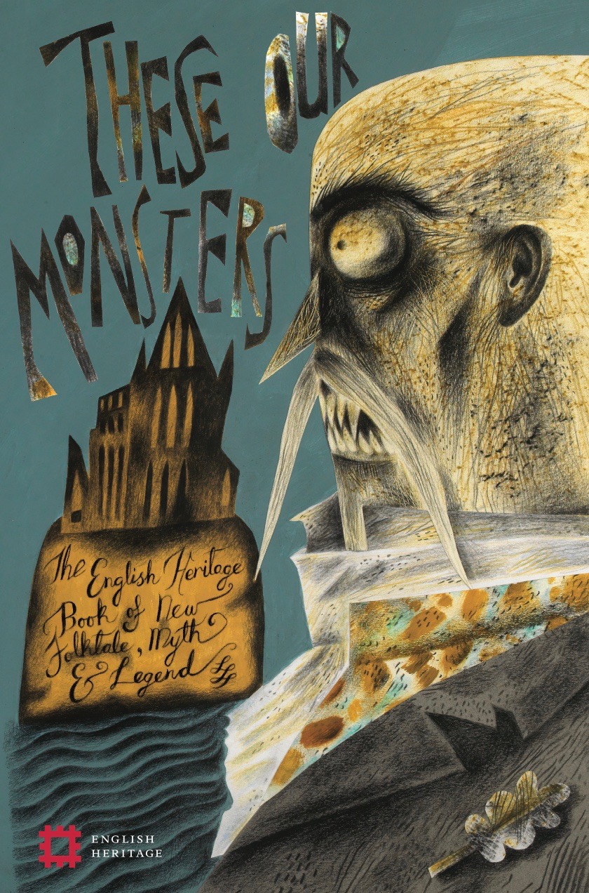
‘These Our Monsters’ is the only book for which I’ve been commissioned to make two covers in order to appeal to different markets. It was soft-launched in November with a cover bearing an image based on Graeme Macrae Burnet‘s Bram Stoker themed story set in Whitby, The Dark Thread, and now bears a cover with a hare from Paul Kingsnorth’s Goibert of the Moon. The two covers were a clever idea by Editor Katherine Davey that, with promotion and in circumstances other than we‘re currently in, would have been eye-catching. But with most English Heritage staff having been furloughed for the duration of the crisis, the change of cover has been slipped out unannounced, and I think the sleight-of-hand is now likely to go un-noticed.
The first cover was to catch the attention of a readership attracted to the horror genre. There was a lot of anticipation last year at the prospect of the new Mark Gatiss three-part adaptation of Dracula at the BBC, which I hoped our cover with the vampire count might benefit from by dint of zeitgeist. By contrast the second was a subtler mood-drenched image drawing on current interests in Folk Horror Revival that might attract those for whom the more overt grotesquerie of the Dracula cover was not so appealing. (Though look closely and those foliate elements are not as pretty or innocent as they at first appear, and the building on the back cover has been tweaked into the likeness of a skull.)
On the cover of the myths and legends-inspired short story anthology These Our Monsters just out from English Heritage, I depicted Dracula because both the undead Count and his creator, Irish author Bram Stoker, appear in Graeme Macrae Burnet’s The Dark Thread. Burnet’s brief Whitby-set conjuring of Dracula as imagined by his author sent me to my bookshelves to take a look at how the Count is described by Stoker in the 1897 novel. In films Dracula has been depicted as darkly handsome with a deadly allure and sensuality. But that’s simply not the way Stoker introduced him:
Below: the first ‘Dracula’ sketch in my These Our Monsters project-book
“His face was very strong, aquiline, with high bridge of the thin nose and peculiarly arched nostrils, with lofty domed forehead, and hair growing scantily round the temples but profusely elsewhere. His eyebrows were very massive, almost meeting over the nose, and with bushy hair that seemed to curl in its own profusion. The mouth, so far as I could see it under the heavy moustache, was fixed and rather cruel-looking, with peculiarly sharp white teeth.”
From Christopher Lee in the 1958 – 1973 Hammer franchise to Gary Oldman in Bram Stoker’s Dracula (Francis Ford Coppola, 1992) via Frank Langella reprising his Broadway success as the Count in a Dracula (John Badham, 1979) with a distinctly erotic charge, the ‘Prince of Vampire’s’ cinematic appearances have been constantly in flux, endlessly reinvented to suit the tastes of the age. But the bushy eyebrows and the mouth-obscuring moustache were left between the pages of the original novel, film-makers preferring the undead to be smooth-faced. (Gary Oldman sported a trim moustache and goatee with shoulder-length curls as he pursued Winona Ryder throughout much of Coppola’s film, more dreamy musketeer than vampire Count, so she understandably buckled at the knees when he swooped in for a lick!)
The changes wrought in translation are understandable. A film is not a book and an illustration doesn’t have to follow to the letter the text that underlies it. For my own Dracula I invented an ancient-parchment complexion, criss-crossed with lines. I ditched Stoker’s description of pointed ears (too Spock-like for a post-Star-Trek generation) but stuck with the straggly moustache because I liked the idea of the unholy trailing and dripping mess it would make when the vampire fed. I retained the unibrow, though replaced Stoker’s description of the Count’s sombre dark garments with the dandy’s delight in exuberant colour. My sartorial Dracula has a very fancy waistcoat!
Below: the cover art underway. Whitby Abbey is just an outline at this stage.
Stoker can’t have known and couldn’t possibly have imagined the popularity of his monster reinvented into a plethora of iterations, and that’s not including the Dracula-inspired inventions that go by other names in cinema and fiction, starting with director F. W. Murnau’s 1922 silent film Nosferatu which unwisely drew on the novel without acquiring permissions from the author’s widow. First she lobbied the producer with demands for compensation, but when it turned out there was no money to be had, gained a court order requiring that all the prints of the film be destroyed. Today there would be no Nosferatu had a few prints not slipped through the net.
The Count from Transylvania has stuck like a burr in the imaginations of creators and audiences. We can’t get enough of him. I loved honouring the tale on the cover of These Our Monsters. I read not only Burnet’s story in order to make the cover, but Stoker’s novel too. (Twice.) I’d illustrate it in a heartbeat were the offer to come my way.
Below: my first version of the cover, with the lettering given more space and the EH logo placed bottom left.
…
Below: wrap around dust-jacket in a storm of my trademark oak leaves.
Among the contributors to the short story anthology that’s being published by English Heritage this month, is Edward Carey. When I saw his name on the list of writers responding to some of the English Heritage sites with mythic/folkloric associations, I recalled reading a glowing review for his novel Little. I duly acquired a copy and read it.
Edward is both a writer and an artist. He makes images to accompany his novels. Little, illustrated throughout with many drawings, is a staggering feat of research married to imagination, a compelling, page-turning history of Anne Marie Grosholtz, better known today – thanks to waxworks attractions around the globe bearing her name – as Madame Tussaud.
The book nailed my attention. Here was a writer who’d uncannily entered the mind of a known eighteenth century woman, channeling her into a first person account with her character fully formed and vibrant throughout the narrative. The Marie of Carey’s Little feels utterly real and present. Moreover he magnificently and dreadfully sets her down in that bloodiest period of civil unrest, the Revolution. A clammy sense of dread pervades the second half of the book as Paris sinks into malign chaos. The aristocrats and their supporters may have been the first to be rounded up and executed, but in the ensuing upheavals of rival factions, civil dissolution and score-settling, you could go to the guillotine at the whim of a jealous neighbour because you’d violated a dress-code. The world had turned in on itself and gone mad.
It’s been said that in later life – and with her waxworks a famous attraction in London – Marie Tussaud’s published account of her early life may have stretched the facts to better make a story. She claimed to have been a teacher of art to the King’s young sister Elizabeth, living for nine years by invitation of the royal family in the palace of Versailles. She claimed to have known the King and Queen. Later, back in Paris in the cataclysmic turmoil of ‘la Terreur’, the story goes that she was forced to take plaster casts from the decapitated heads of people she had once known in order to make wax effigies of them to be displayed and ridiculed. Whatever the truth of that, Carey makes the idea viscerally plausible, and his accounts of what it must have been like to carry out such grim work are convincingly and startlingly detailed. If Marie Tussaud – a great show-woman and self-promoter – did partially manufacture her history, adding a darker lustre to justify the more outrageous elements of her waxworks attraction, then Carey has done a magnificent job of adding flesh to the bones. She owes him a huge debt of gratitude, because she’s now going to be better known as the Marie of Little, than as the Madame Tussaud of her biography. He’s even made her portrait for the book in a pastiche of her times, which will now be the one I feel most truly represents her.
Ed’s short story for the English Heritage collection gave me wonderful inspiration for the illustration I made to accompany it. A few weeks after I’d completed and submitted it, the editor Katherine Davey told me that he’d asked her to pass on how much he liked the image, and enquire whether I’d agree to be contacted by him. We started e-mailing each other almost immediately, and we’ve been e-mailing ever since. We’ve exchanged drawings. I’m now the owner of a delicate pencil image he made for Little, one of many in the book which are supposed to be the work of Marie’s hand. By way of exchange Ed has the drawing of a ‘goblin child’ I made for his title story of the English Heritage anthology, These Our Monsters.
It’s a wonderful swop. I particularly like that the drawing I have is of a model of Marie created – in the novel – by the young man she loves. It’s a rather grotesque wooden doll that could be mistaken for Mr Punch’s Judy, so it couldn’t have been better chosen for me given my passion for puppets. What a happy experience working on this project has been, and what a lovely drawing transaction.
This project for English Heritage has been under wraps for months but is now being publicised ahead of launch. It’s been a lovely to work on contemporary stories steeped in the traditions of folklore, myth and legend, inspired by eight sites in the care of English Heritage. I’ve made the cover and sixteen illustrations.
It’s been my great good fortune on These Our Monsters to have Katherine Davey at English Heritage as my editor. We’ve discussed all aspects of the book at every stage, and her unflagging enthusiasm has been a tonic during the occasionally gruelling schedule to get the work completed within the deadline.
The dust wrapper image is of Bram Stoker’s Vlad Dracula, who makes an appearance in Graeme Macrae Burnet’s story The Dark Thread set in and around Whitby. Macrae’s Count references Stoker’s original description in his novel Dracula, which is far from the darkly handsome vampire played Christopher Lee in the glorious Hammer Horror films of the 1960s and 70s. Women willingly surrendered themselves/swooned into the enveloping folds of Lee’s crimson-lined cloak, whereas Stoker’s Count is monstrous without a hint of sex-appeal. However, to make up for his parchment-like skin and dreadfully straggly moustaches, I’ve dressed him with the dandy’s attention to detail in all things sartorial. A high-collared shirt, a well-tied stock and a waistcoat to die for.
The authors and the English Heritage sites they selected are:
My thanks to Gravitywell, the award-winning digital media company in Bristol, for sharing this example of how my artwork for the English Heritage Myths Map was layered by them to create an interactive experience across diverse platforms. This is just a small corner of the map, but you can experience the full effect by clicking on the link at the bottom of the page.
I produced all the artwork for the map, and the entire project was designed, built and launched by Gravitywell in a six week schedule. There were times when it seemed an almost impossibly short time in which to achieve everything, but we did it!